Participating Frequently
December 29, 2018
Answered

Color Saturation not correct on Premiere Pro

  • December 29, 2018
  • 5 replies
  • 21379 views

Hey everyone, I am needing some help with my Premiere program.

The issue that I am having is that the Software for premiere is reading the color of my footage differently that how the footage truly is.

The footage the premiere is showing within the software is more saturated and seems to be already color corrected, when in fact it is not.

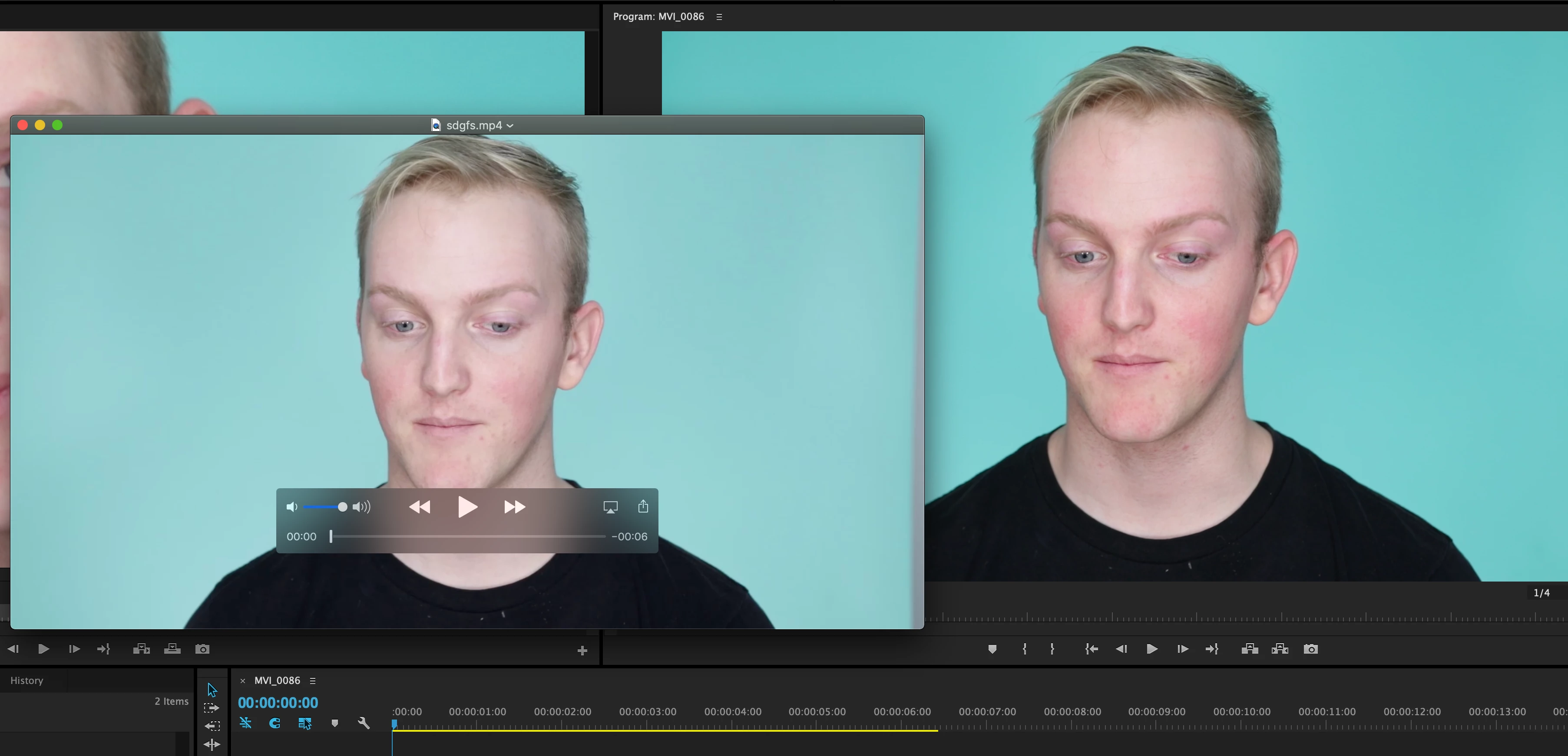
I'm going to post a photo below that has a side-by-side of what I am explaining. The image on the left is the footage directly from the SD card, the footage has not been imported or tampered with. The image on the right, is within the Premiere software, after I import the footage.

When My projects are complete, I export the project and open it up to view it, and it returns to the same dull saturation from its original state before import.

This leads me to think that the software is just portraying the colors differently.

When I'm editing with premiere, I would like the colors to be true to what it is, because it is deceiving while I'm trying to color correct all my footage. Please let me know if you've had this problem and know the solution. I can screenshot anything you need within the software for help.

Correct answer Baabs626

Hey Daniel, I was having the same issue and almost pulled all of my hair out trying to figure it out BUT I did. Here is a non condescending fix to the issue. Also tons of people are still trying to figure this out so I hought I should share. Basically the issue for me was that my color display settings on my Macbook Pro were set to "Color LCD" so my video I was looking at from my SD card using Quicktime was less saturated like yours. Then when imported to Premiere it looked super saturated in the project window but then when I exported and saw it again on my macbook display it looked the same at the file on my SD card. So I figured since Premiere displays video in REC 709 then I would have to change my settings on my macbook from "Color LCD" to "Rec 709" so everything matches. Everything matches now. All you have to do is click on the left corner Apple logo>system Prefrences>Displays>Color>HD709-A This should match the colors on your Macbook to the project in Premiere. You can then color grade to your hearts content in Premiere knowing that when exported it will look the same as the project window you were working on. Side note: The reason this happened in the first place was because i plugged in my movie projector to my macbook and it automatically changed my color settings on my Macbook so nothing was matching up when using premiere pro since it displays rec709 and my display was set to LCD Display. SO FRUSTARTING.  HAHA Hope it helps. If youre on a PC Im positive theres the same explantion so just change your display color to rec709.  ALSO, if you dont have the rec709 option on your macbook just choose sRGB its pretty much the same. 

5 replies

R Neil Haugen
Legend
August 29, 2021

Donny,


That YouTube is worth exactly what you're paying for it ... nothing. Go to the second part on PC ... he is so wrong it's stunning. Such as telling people to use full range on their video card settings.


Rec.709 standards are clear: all YUV Rec.709 media is 'limited' range. The only 'full' range is the RGB media which is typically 12-bit and/or DPX. Very little video is RGB.


If you want further clarification on that, you can go the the LightIllusions.com site, and go through their documentation. They produce one of the high-end pro calibration software/hardware solutiions for color managment.


Or ... go into Davinci Resolve. Their 'auto' setting for Rec.709 media assumes that all YUV media is limited range, and that is the expected way to run the app.


So Matt tells everyone to set their computer up wrong to begin with.


Then he says PrPro uses 'full' range ... also exactly wrong, opposite of the truth.


PrPro follows strict Rec.709 standards ... all YUV media is limited, RGB is full. Which the hardware will also follow IF you leave that setting in the Nvidia card control set to limited, btw.


So ... he tells you to set the computer wrong, tells you exactly the opposite of what PrPro does, and then gives a LUT to correct his two mistakes.


Look, the stuff I rant on about color is NOT my opinion. I get it from some of the more experienced, knowledgeable people in video color management around. NOT some YouTuber.


If you don't like accurate information, well ... I can't help you.


But for those who actually want to learn, which is really all I care about, there is a ton of good material out there.


Neil

Everyone's mileage always varies ...
R Neil Haugen
Legend
August 29, 2021

Here's a bit of information on what "full" and "limited" range actually mean. Which is not what most people "know". And certainly not understood by the creator of the YouTube referenced above.


Full vs Limited Range History


This came about from early digital imaging, mostly using tape-based systems for broadcast purposes. By encoding the signal between 16-235, it left the 0-15 and 234-255 values for encoding other data into the video stream. At that time, their equipment used that other data for setting proper broadcast settings.


It had nothing to do with displaying media at those values, but only encoding media for those values. The screen was always set to (essentially) show 16 at 0 and 235 at 255.


It's been quite a while since really anyone has used such tape-based equipment. But using 'limited range' encoding for video material was necessary in early digital cameras for matching the expectations of the broadscast systems.


And so it was established in the standards, standards that were put out for both capture and playback equipment. And that all video camera makers complied with. And even when digital tape finally went the way of the dodo, the original standards were still used.


It works when setup as expected. It seems silly or plain stupid it's still "a thing", but it is. It's the way the entire system works as a system. Follow the standards correctly, everything simply ... works.


As expected. And yes, the cameras, GPUs, and displays all understand this system and work together correctly if it is followed. Dumb as it may be, YUV encoded as 'limited' is still the only game to play for expectable results.


Working Full or Limited ... which and why?


The standards for Rec.709 media ... which is nearly everything that isn't HDR ... are still the same. And are applied to "both" kinds of media. Most cameras are set to only use YUV encoding. The other "kind" is RGB encoding, which is only used typically for 12 bit and higher formats and for image-sequence formats like DPX.


So unless you are shooting a 12 bit 4:4:4:4 file from your camera, you are shooting YUV and the camera is encoding it as 'limited' range. And there are very few cameras that can shoot 12 bit 4:4:4:4. So if you don't know about your camera, you ain't.


YUV media is all supposed to be 'limited range' encoding ... while RGB media is all expected to be 'full range' encoding. Note I say "encoding", and not displaying. The two are not interlinked. (And this is clearly something the YouTube person refereced in a previous post does not understand.)


With a properly setup color managed system for working with Rec.709 media, both 'limited' and 'full' range media will be displayed by the monitor as 0-255.


This is something to really understand: the system will automatically display YUV limited range files as 0-255, and it will display RGB full range files as 0-255. As the standards are designed to function.


Set your system to limited range ... period. Again, it will automatically correctly display media.


Working Nvidia cards with PrPro and Resolve


This is the way Davinci Resolve's color management works when input is set to 'auto', and it is what colorists are taught to do unless they have specific reasons not to. Such as media using a different gamut (not gamma) or dynamic range, which they are working into their system.


But changing those settings can cause a world of hurt if you don't know exactly why you're doing so. And unless you have specific and non-standard media to work with, you are better off staying away from those settings.


And your Nvidia card SHOULD in all cases be set to limited/16-235. It will then function correctly with both YUV 16-235 media and RGB 0-255 media, helping your display handle both in a displayed 0-255 manner.


If however, you set your GPU to  'full' for everything ... what you will end up with is dark Rec.709 shadow values, and typically totally crushed shadows for all RGB 'full range' files. Because the display will most likely then take value 16 (8 bit) or 64 (10 bit) and display that as 0.


Think about that ... you have now told your system to really drop the dark values in the crapper. It's bad enough for the YUV media, but completely mangles any RGB media you might ever view or work with.


And further, if you work on such a system, and set your media to look good on that system: guaranteed it will be off on every other system out there.


Is this different from the Mac issues of shadow values?


Yes, they are two completely separate issues.


Unfortunately the Mac Colorsync color management utility was designed to mis-apply the Rec.709 standards. There are two things that both add together to create the problem:

  • There are two transforms required by the Rec.709 standards, the scene-referred transform, and the display-referred transform added in Bt.1886. ColorSync only applies the first, the scene-referred transform, and does not apply the also required display-referred transform.
  • The gamma for Rec.709 media with properly applied transforms as above is 2.4 for "semi-dark room" work, and 2.2 for 'bright room' work. Unfortunately, the gamma chosen by Apple is 1.95, which is not part of any video media standard. Period.


Those two problems piggy-back to create the difference between what is seen within PrPro on a Mac system (with the display color management system preference properly checked) and what is seen on any player that allows Colorsync to control color management on that Mac.


This includes QuickTime player and several browsers.


Being as that difference is caused by the color management of the computer running counter to 'normal' Rec.709 work, there's no way for any application to get around it. Neither Davinci Resolve nor PrPro can change this as it is a Colorsync issue.


Users on Macs with Colorsync, when using players that allow that utility to set CM, will see files differently than they will be seen on Rec.709-compliant systems. Sadly.


Neil


Everyone's mileage always varies ...
Inspiring
March 14, 2021

DanielzROTFL

Plug your camera directly into an HD TV. Does it look more like Premiere Pro or the Quicktime Player?


All software handles color space different. If you need to deliver to a Mac that will be using a Quicktime Player the video below might be helpful. DR, AVID, OBS and Quicktime all handle the color spaces differently.

Participant
March 13, 2021

Gonna try to follow Baabs626's lead and post some non-prentious stuff here. I've found Premiere specifically is terrible at displaying accurate colors. It's not you, it's not even really your Mac and their P3 pension for oversaturdation--Premiere is a joke with color accuracy. One thing you can do to mitigate this is hit Cntrl Tilda on the Program monitor to fullscreen it while bypassing the PR UI when you're color grading. This seems to bring the colors closer to some semblance of what most people out there will see. If you can get your hands on a second monitor like one of Asus's $200 Pro Art displays (forget all the other nonsense posted here about needing super expensive gear or a pro-colorist or reference monitors or anything like that, get real people) and set it in one of its reference modes you can use Mercury Transmit to send a fullscreen image to it that will be closer to accurate. You'll still find once it goes out to youtube, social media, clients etc that Premiere has been showing you oversaturated garbage all along but at least you won't have been working with something quite so cartoonishly inaccurate all along.

R Neil Haugen
Legend
March 14, 2021

On a system with accurate calibrated monitors ... Premiere is dead on with color. As shown thousands of times per day in pro suites, which is what it's designed to be used with.


When used without proper user-controlled color managment, yea, things go wonky.


That's beause of the system it's displayed on, not the app.


And yes, I've seen vids that were "wrong" out of Premiere, then sent to someone with a full-on calibrated setup, and gee ... that vid exported from Pr was dead-on.


We've had people here and elsewhere complaining about how bad Pr was with color, who finally setup their system ... and suddenly, there wasn't a problem anymore.


There are issues with a couple specific things, particular format/codec mis-applications by Pr. Other than that, the underlying code is correct.


Neil

Everyone's mileage always varies ...
Participant
March 15, 2021

So when I said "feel free to keep gaslighting people here" I didn't actually mean it. This is a real problem. Coming in here determined to defend Premiere at all costs and offer no tangible advice to people is just a waste of everyone's time. Here's the issue; no color professionals trust Premiere (there's a reason Resolve is the standard and more and more solo content creators are moving to Final Cut). It's the small non-pro or semi pro creators that just need to have some basic level of trust in the colors of their edit that need good color management from Premiere. What are almost all of them using? Macbook Pros. The fact that you have to pull up a friggin screen shot and create adjustment layers as An dy 1968 is suggesting means THERE'S A PROBLEM. It's awesome that this online community is willing to post workarounds but coming in here and telling everyone that it's their fault and the "code is fine" in nonsese. If you can't get even remotely accurate colors on a stock Macbook Pro with your software you have a ease-of-use problem. Blaming users for not being hardcore enough about color calibration is just silly. I've never met a collection of less helpful tech support people in my life as those for Premiere. Sheesh.

Baabs626
Baabs626Correct answer
Participant
January 16, 2021

Hey Daniel, I was having the same issue and almost pulled all of my hair out trying to figure it out BUT I did. Here is a non condescending fix to the issue. Also tons of people are still trying to figure this out so I hought I should share. Basically the issue for me was that my color display settings on my Macbook Pro were set to "Color LCD" so my video I was looking at from my SD card using Quicktime was less saturated like yours. Then when imported to Premiere it looked super saturated in the project window but then when I exported and saw it again on my macbook display it looked the same at the file on my SD card. So I figured since Premiere displays video in REC 709 then I would have to change my settings on my macbook from "Color LCD" to "Rec 709" so everything matches. Everything matches now. All you have to do is click on the left corner Apple logo>system Prefrences>Displays>Color>HD709-A This should match the colors on your Macbook to the project in Premiere. You can then color grade to your hearts content in Premiere knowing that when exported it will look the same as the project window you were working on. Side note: The reason this happened in the first place was because i plugged in my movie projector to my macbook and it automatically changed my color settings on my Macbook so nothing was matching up when using premiere pro since it displays rec709 and my display was set to LCD Display. SO FRUSTARTING.  HAHA Hope it helps. If youre on a PC Im positive theres the same explantion so just change your display color to rec709.  ALSO, if you dont have the rec709 option on your macbook just choose sRGB its pretty much the same. 

Baabs626
Participant
January 16, 2021

Also, found this article from Premiere Pro that explains exactly what I just said : https://premierepro.net/color-management-premiere-pro/  OK See ya. 😃

R Neil Haugen
Legend
December 29, 2018

The problem isn't Pr ... it is that you are completely unaware of the process of displaying colors on computers, TVs, and other devices ... or you wouldn't be asking about this. I'm not being rude, this is a complex issue and so many starting out have expectations that are simply not possible in this or any multiverse potentially in existence.

First ... the data off the camera is just a series of NUMBERS ... no images whatever. Those numbers are then interpreted by the OS/software/hardware to create images on screens.

Second ... there are many color spaces to begin with, that media or OS or monitors/screens can be expected to 'see' images within. No screen except for expensive pro-level broadcast screens come calibrated either. They all need to be set correctly for the space of the media used, and calibrated to those specs.

If the user does not take control of the multitude of variables here, the user HAS no control over how they see the images.

So ... have you chosen a screen for it's color space to make sure it works with your media? Have you calibrated it to the space/profile of your media? And are you only viewing your media in apps that apply appropriate color-space/profile interpretation to the media they display?

If you answer 'no' to any of those three questions, well ... you have a problem.

Almost assuredly, the device recording that image data did so assuming that it was to be worked and viewed within the standard that is the vast majority of use now ... Rec.709, which specifies that the media should be displayed on a screen set to video standards sRGB, and calibrated to Rec.709 at 100 nits brightness. Pr is designed to work within those specs ... rigidly.

As you're showing Apple screens, I would guess you're on a Mac ... duh! So ... is it an older one, or a newer one with the P3 very-wide gamut monitor? I'm guessing the P3, as when you take an image 'plotted' for one color space, and plop it on a much wider color space, you "lose" visible contrast for both the luma and chroma data. Ergo, it looks less saturated and less contrasty.

The problem isn't that Pr isn't showing the "original" colors/tones, it's that your monitor and any calibration are not set to show the original media's chroma/luma properly.

Pr attempts within the app to show proper video sRGB/Rec709 treatment of the media. Though it cannot over-ride your OS, monitors, or other apps of course. If you were working on a system set for b-cast standards, you woudn't have the trouble. Someone may pop in and say that FCPx seems to work fine ... well, Apple being Apple, they 'juice' their in-house apps to work specifically with their OS. Every other app company ... and of course the Mac users of those apps ... need to work to make sure they also have proper display on a Mac.

Colorists go to very expensive lengths to set up systems that show them precisely calibrated chroma/luma info ... images ... on their very expensive screens. That is the only way of course to guarantee you are seeing the actual data as it was expected to be shown. Monitors all above $5,000, more than that in calibration gear/software, all signals to monitors run through external boxes that have various LUTs developed by the calibration systems to adapt that monitor to whatever color space/profile is needed at the moment.

Check out the info ... pages & pages ... on this sort of thing from Light Illusions ...

https://www.lightillusion.com/viewing_environments.html

Since Apple decided to stick their users with an admittedly gorgeous (with the right material) but not-heavily used color space, without a lot in the way of user choices for getting the system to properly show video sRGB/Rec.709, Mac users have some head-scratching to do. The Pr team did add an option in the Edit/Preferences menu, 'enable display color management', that can help display the video-level sRGB/Rec.709 of Pr more correctly on the Mac P3 monitors. For some, this helps a lot. Because although Pr is trying normally to display images correct, they cannot change the monitor. What that option does is attempt to apply a generic setting to convert the image to display on a P3 monitor.

However ... each size of P3 Mac monitor has a different actual profile as a group and as always with screens, no two screens of identical manufacture are ever actually totally alike. So a 'generic' setting is somewhat limited in what it can do.

Another misconception is that the user can control what others see on their screens. Give it up, ain't happening. Not one colorist EVER ... working a suite with many thousands of dollars of specialized gear ... has ever been able to do that.

It's against the laws of physics actually, let alone manufacturing/viewing environments/settings/OS/and around a thousand other variables. Which is actually why they have all that gear ... they work to Standard, so that when put out "in the wild", it will appear similar to other material professionally produced to Standard on whatever device/screen it is viewed on.

Learn about standards. Apply them as much as possible to your working setup and your working environment ... then do your work and move on.

Here's my setup ... without the spendy Flanders monitor I'd love to have, but still ... carefully chosen upper monitor used for "confidence" monitor, using the transmit-out option in PrPro. Calibrated weekly with puck & software. ALL auto-crap turned off, levels set for proper calibration. You can see the difference light showing on the wall behind, set to 10% of the reflective brightness of the transmitted whites from the confidence monitor ... in a nearly darkened room.

Is it full b-cast guaranteed? No. But my stuff shown on a colorist's screens was spot on. IF I were going to send anything to b-cast though ... it would go through a friend's setup to make sure it was all legal and close to "pretty" at least! But ... I doubt I'll ever do b-cast.

Neil

Everyone's mileage always varies ...
Participating Frequently
December 29, 2018

Ok, I did not need to read all of this... and it was very unhelpful.

I understand I can't help what people see on THEIR screens, and all that. I am talking about the difference between the footage on my camera and the way the Premiere is presenting it in the software. All these numbers and hyperlinks your throwing at me mean nothing to me. Respectfully, I'm glad you have a bunch of knowledge but I don't need you to throw up on me.

This is the issue I have, and I need a solution. Like in maybe one or two paragraphs, not a semester's worth of information that means nothing to me.

Premiere Pro is incorrectly displaying the saturation of color on my screen. The comparison that I have screenshot is how the footage is viewed from FinalCut Pro, My iPhone, and directly from the SD card. I want the footage that is displayed on Premiere to export the EXACT SAME WAY it is viewed within the software. As soon as I export it, it immediately looses its saturation and results back to its color from the SD card.

How do I correct the color being presented within the Premiere software to be exactly how it is exported. Look at my reference photo.

MyerPj
Community Expert
Community Expert
December 29, 2018

Yeah, your not getting it.

Both versions in your screenshot are being viewed as you said via 'software', though you seem to think only the Adobe side is software. I also notice you feel it is the adobe side that is in err...

Neil gave you the full version. The short answer is your viewing software is the problem, not Premiere.