
RH 2017 - How to fix squished topic text in Adobe's responsive HTML5 layout?
Hello my friends,
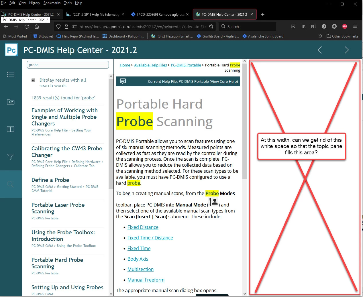
The Responsive HTML5 Layout that comes with RH 2017 has a bug that our customers are complaining about where the topic pane is quite squished at certain browser widths, but there's a good chunk of free white space to the right that is unused. Is there a way to make it so that the topic pane stretches to the right and fills that space?
To reproduce:
- Set your screen resolution to 1920 x 1080.
- Set your browser's width somewhere between 1290 to 945 pixels wide to where the navigation bar slides to the left of the screen
- Then click Search or Index, and you'll see the topic pane get really squished.
Feel free to try it out here in our public help file:
https://docs.hexagonmi.com/pcdmis/2021.2/en/helpcenter/index.htm#t=mergedProjects%2Fhelpcentertopics%2FUsing_the_Online_Help.htm
I know I can go change the width smaller or larger to make it go away, but I think it should work within the above defined range of widths as well. Does anyone have a fix for this?
Thank you in advance!

 AdChoices