
RoboHelp 2017 Responsive Output
I have a pretty customized version of the charcoal gray responsive layout. Everything is (now) working fairly well, but for one odd corner case. It may not be a huge issue, but we have a couple of users with very large screens, and when you open the help on those screens, the index does not take up all of the available space or produce a scroll bar.
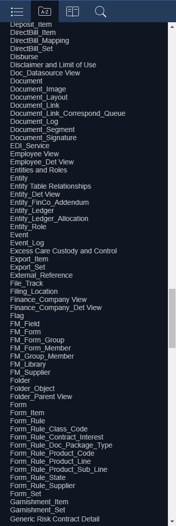
Here's a normal view, after loading and scrolling a bit to show that yes, there's plenty of stuff in the index:
Now, when the user with the huge monitor (think 40") loads the index in the same browser (chrome v. 62.0.3202.94), it looks like this:
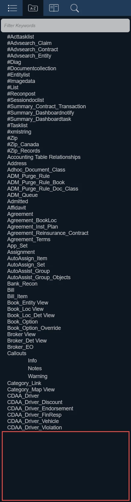
See all of that empty space on the bottom?
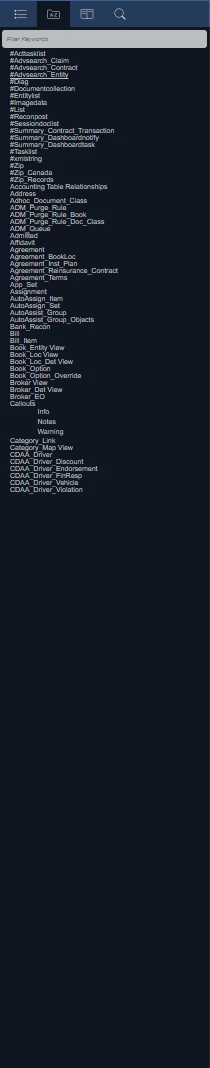
Now, I can replicate this on my machine by making the magnification level very small:
So, I looked for a max-height in the css, there is none, and adding one, no matter what I set it to (I tried 50,000 em!), it actually makes the problem worse.
If anyone has any ideas, I'm willing to try! I haven't tried in a non-customized version of the layout, but may later... but I don't think I changed anything that would have any effect on this. This only happens in the desktop view, and changing to mobile, viewing the index, then changing back to desktop fixed it on the large monitor, but not on my magnified replication.

 AdChoices