Participating Frequently
February 4, 2020
Question

Graphs are jumbled when converting from PPT to Adobe.

  • February 4, 2020
  • 1 reply
  • 3926 views

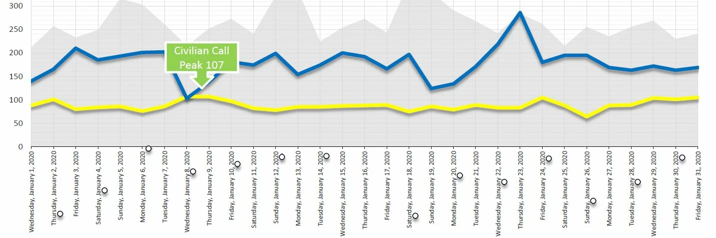
I've been using PPT to design all my reports for years. Suddenly, when I convert to Adobe PDF, the charts are all jumbled and the data points scatter over the page. See below how the data points appear in the X axis instead of on the graph where they belong? Any fixes out there?

This topic has been closed for replies.

1 reply

ls_rbls
Community Expert
February 5, 2020

What method are you using to convert to PDF?

SCAnalystAuthor
Participating Frequently
February 5, 2020

I am choosing FILE > Save as Adobe PDF


Also: File > Save As > Choose PDF from dropdown menu.


Thanks!

Bevi Chagnon - PubCom.com
Brainiac
February 5, 2020

That's odd that your data points are scattering outside of the chart itself, also that only some of the data points are visible at all (some "o" are missing).


Are they letter "o"s or zereos (which are font glyphs), or circles (which are graphics)?

Was the chart, including the data points, created with  PowerPoint's chart/graph tools?


I'm assuming that you have Adobe PDF Maker installed, which is the more robust method of exporting a PDF from MS Office products. From the Acrobat Ribbon, choose Preferences which controls how the PDF will be exported. Follow the instructions here to embed all fonts. https://community.adobe.com/t5/acrobat/exporting-from-word-to-adobe-pro-dc/m-p/10659176?page=1#M221357 


FYI, given that you tried both an Adobe and MS conversion utility, I'm leaning toward the problem lieing with the PowerPoint graphic.

|    Bevi Chagnon   |  Designer, Trainer, & Technologist for Accessible Documents ||    PubCom |    Classes & Books for Accessible InDesign, PDFs & MS Office |