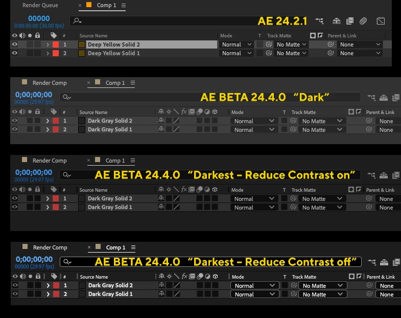
BETA: UI changes lose “sweet spot” for contrast
The new UI changes in the current BETA version seem to have lost the sweet spot for the contrast between text and UI background color. Also only to have three options for the UI brightness is unfortunate in my opinion. At the moment I use a dark version (in the released version) that sits right between the new proposed “Darkest” and “Dark” setting.

The “Reduce Contrast set to off” for some users might be just a bit too much and the “Reduce Contrast On” makes it just a little too low contrast.
Also I think the highlighting for some UI icons is not better in the new version. Like the Toggle for transparency and masks.

PLEASE keep the sliders to adjust the UI!


