nishu_kush
Community Manager
Community Manager
October 14, 2024
Question

The New Spectrum UI in After Effects 25.0

A Fresh, Modern UI
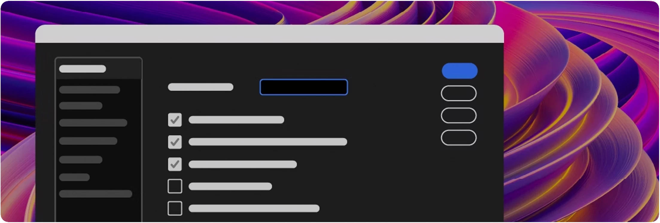
 

Adobe Video apps are getting a fresh, modern, and consistent design with the new Spectrum UI. 


Key Features


Here are a few key features that become available with the new Spectrum UI


Cleaner Design

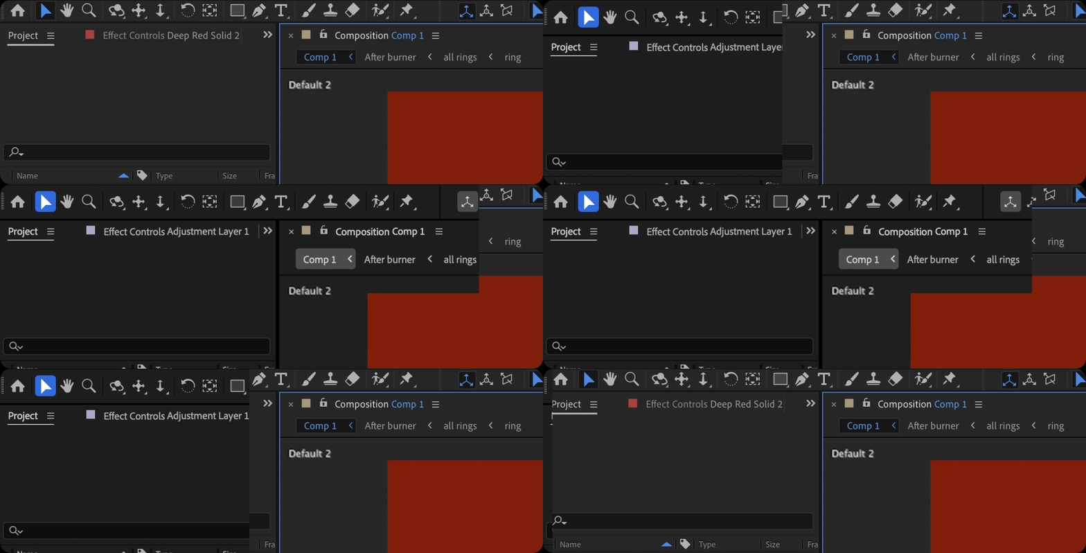
You get cleaner fonts and typography for better legibility and consistency with other Adobe Creative Cloud apps. That means you’ll spend less time re-learning how to use tools in our different apps and more time creating. 
 

Switch to High-Contrast

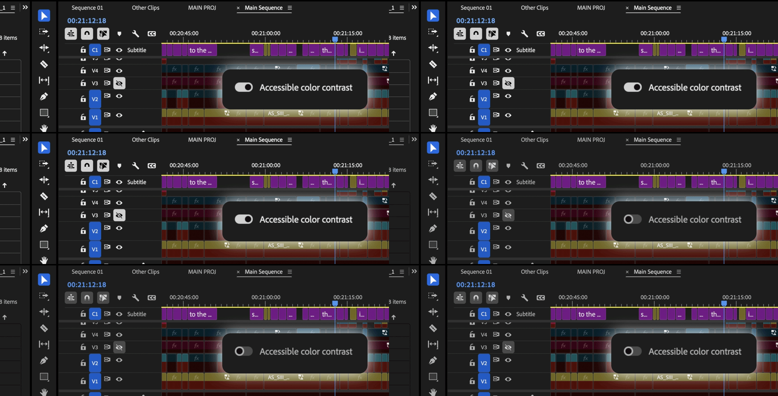
There is now a new toggle for switching between a high-contrast mode for easier visibility and accessibility or a low-contrast mode for focusing on your content. 
 

Color Themes

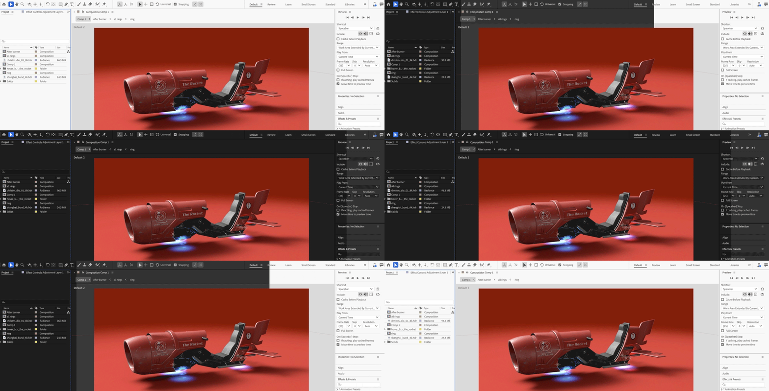
With Theme modes—a standard dark, darkest, and high-contrast accessibility mode—you can customize the look and feel of After Effects to your preference. Switching between these modes gives you the flexibility to select the setting that best matches your environment and personal preference, whether for enhanced readability or improved visibility based on current lighting conditions.
14 commentaires

Known Participant
February 20, 2025

Is it possible to add more margin to this line of buttons so that when they are activated they do not overwhelm with the blue line of focus? Thanks team


Participant
February 3, 2025

The UI sizing is much too small for a 4k monitor. Not giving an option for adjustment in this version is an embarrassment.

Community Manager
February 3, 2025

Hello @T_riley,

AE will respect OS scaling on mac and windows. Beyond that we are investigating additional application sizing overrides to support users who want more app level control vs an os wide setting. 


All the best,Jessica McMillan - AE Engineering
jackthegiantkiller
Inspiring
January 9, 2025

Just checked out latest beta...how on earth has your team not managed to, at the very freaking least, made some adjustments to the Color Themes?!?!? I now have to work using your mid-range "Dark" mode because it's the only one with reasonably subtle contrast. Normally I would have chosen "Darkest" but the ridiculously contrasting buttons and pulldown menus make this pallette absolutely unusable, and even worse if you click "Accessible Color Contrast". Seriously, get your team together and at the very least make one more freaking option in there!!!!!! Call it "Darkest Sans Insane Contrast" or something, ANYTHING.

Participant
December 25, 2024

Why does pressing Enter now select the latest clicked button in a dialog window, instead of validating the choice?

For example you're in the color picker, press the eyedropper and pick a color, in the past you'd hit enter to close the color picker. Now it selects the eyedropper again because it's highlighted, so you have to waste your time clicking OK with your mouse. 

Participant
April 21, 2025
 
  1. This change is likely due to recent UI updates where the last focused or highlighted button remains active, causing Enter to trigger it instead of confirming the dialog. It’s a frustrating shift, especially in workflows like the color picker where speed and efficiency are key. A possible workaround is to use the Tab key to refocus on the OK button before pressing Enter. For more tips and updated workflows addressing these changes, the Adobe Training Guide includes practical solutions to streamline your experience.
johnalmightyx
Known Participant
December 3, 2024

With the growing pains of working around deficiencies within After Effects and Premiere Pro, I think the last thing on your guys' list is getting rid of the ability to customize the color for our UI. 

As a creator who spends MANY hours in both programs, the least you guys could do is give us our own choice to pick which color the interface has... 

Please give us enable_theme_colorizing back, please!!!!!

Participating Frequently
December 3, 2024

Indeed, thank you.
I can't imagine any serious creator caring about their tools looking 'flashy', over them being productive.  If it ain't broken, don't fix it Adobe!


PS My PPro keeps intermittently reverting back to the 'darkest' option. As if the 'dark' option isn't bad enough.

johnalmightyx
Known Participant
June 21, 2025

I enjoy making my job fun as a animator... colors, UI matters the most. Why do you think iPhones outsell Android? Because of UI

mihimaruGT
Inspiring
November 5, 2024

Please don't waste time on features that are not AE's strengths, such as 3D models.
Smooth window zooming should be added, with a zoom interval of 10%, thank you

Participant
November 1, 2024

The highlight effect on layers is completely off. Please change it.
I select the "end" parameter now. It looks the same with the layers below that but they are not selected. So weird man. Every layer looks like it was selected.


Known Participant
November 5, 2024

@Jessica McMillanalso, could you increase the indent for the expressions pickwhips, which are almost in the same column as parenting pickwhips, yet both have different functionality.

And, could you publish for scripting the fields of pickwhips that are currently unusable, such as for PointLight.castShadows and 3D layer's MaterialOptions.acceptsShadows. Or, for the sake of decluttering the UI, remove those pickwhips at all - afaik, they have no point.

Community Manager
November 6, 2024

Hello @bullet.train and @CucaramblaX ,

I am bringing your thoughts to our AE designer to get input on your concerns and where/how we might make modifications.

Thanks for bringing your concerns foward.

All the best,
Jessica
AE Engineering

All the best,Jessica McMillan - AE Engineering
Participant
October 28, 2024

Can't change the highlight color now. Can you bring this feature back? In previous versions, Cmd + F12 and enabling "Enable_Theme_Colorizing" lets user change highlight color in "Settings - Appearance"

Inspiring
October 25, 2024

Overall I think the spectrum overhaul is a step in the right direction. Peformance is improved and the UI looks a bit more consistent overall. There is however a lot of room for improvment 


Especially in terms of Windows UI performance but still a ways off from a fully responsive app. Once you hit about 50 keyframes, things still stutter pretty badly behind the cursor which is jarring. Not nearly as bad as it used to be but still a lot of room for improvment. I get we are touting this as a 4X improvement but a 4X improvement over 1FPS is only 4FPS. 


There are some nitpicks that were pointed out in the beta but were not addressed:


hese toggles no longer being blue is a bit harder understand when things are turned off or on:

T


Its not like blue highlights have been depreciated fully in spectrum ui, the tool bar still uses them:


Column dividers in the timeline panel are nearly impossible to see on darkest, unless you have high contrast turned on. I almost never know where to grab I just have to wait for my mouse to switch icons. 

Properties panel still basically useless for shape layer functions 

- cant add modifers from properties panel or access their properties

-cant add dash, taper, or wave stroke options

-very incomplete. 


Still too many holes in parts of the App that need to be plugged with scripts on every install.


Day to day issues I have to work around in AE: 

-no way to change default easing for easy ease [33% is a pretty bad default]

-no easing panel of any type, [always have to install Motion script]

-no way to dynamically stagger keyframes or layers without using the tedious sequence layers dialog [need script] 

-figma integration lacking [rip figma aquisition, AEUX is buggy at best]

-no native or viable variable font support [Ai and Photoshop have had for years]

-graidents in illustrator can't be converted to shape layers 

-shape layers not rendered on GPU afaik

-basic 3d not rendered on GPU, causes comps to be rendered single threaded many times

-have to use a script to scale comps to different frame sizes

-no color swatches or dyanmic color without a lot of expression overhead 

-no grouping of layers in timeline 

-no grouping of keyframes except by color 

-2GB frame buffer size is getting pretty limiting when clients are now asking for 8K deliverables 

-calvary has lapped AE when it comes to dynamic design 


This is why many users get upset when 2012 level 3D gets added or a fresh coat of paint, (honestly Element3D is still better) or a new whizbang Ai feature gets added when there ia a huge laundry list of basic functionality missing from the animation and design experience. I don't want to have to own and maintain 30 scripts just to get AE to a functional place in 2024. I want a 2.5 engine that doesn't stutter or render like a potato. We are trying to do our job but we have to mod the app 100 times just to get going. 


I love AE, but the more time I spend in it the more aware I become of its many flaws.


Participant
October 26, 2024

as you can see, the fonts and the icons are bluury , very much not readable for me...the 2024 style was better...

i cant work with this version i see blurred ui and my brain hurts....

jefubbudu
Known Participant
October 21, 2024

I came here to see someone else's comment, but I guess they deleted it?
in any case, I have to agree, and I guess I'll reiterate what they said.
The adobe devs have lost the plot.

the UI is a dark grey for a reason- it eases eyestrain on long days and makes colors clearer, and breaking from what the other guy said, making it darker increases contrast past a certain point and increases eyestrain, too. It was in a  perfect spot of medium contrast, dark, but not overly contrasted UI.
sure, white and black is good for accessibility, but there are reasons it was the way it was, and the devs don't seem to understand that what we have is the result of decades of tiny changes that everyone agreed on, not some grand idea to differentiate version 25 because nothing else has changed.


and that's my take on it. he mentioned the protestant reformation and the 95 complaints, and that's basically how I feel, and I imagine most people who use After Effects feel for an extended time feel, too.
we want it to be faster, not slower
we want more export types, but we've actually lost many over the years.
we don't need to eat 100GB of RAM just for a 2 second preview 
After effects can't even play a RAM preview at 24FPS, so what's even the point of it?

why don't we have 32 bit effects?

why do so few effects use GPU? this is a graohics software, get with the program!


there are so many reasonable requests that Adobe just seems totally incapable of, and at this point, I can't consider it an accident. they're trying to end After Effects, and I honestly would support that. it's time to stop.

Multipasser
Inspiring
October 23, 2024

Omg I hate the 'hover' over the Video/HideVideo or Lock slots.

It's so confusing! I turn of the visibility of a layer, the eye was white, but because your mouse is still over the box it will show a greyed out eye.. But it seems like it's not turned off.. very confusing :((

As you see below, the last 'eye' is disabled but still it seems activated.


Remove this function please.

Community Manager
October 24, 2024

Hello @Multipasser,

Thanks for the feedback. We will take it back to our design team.

We have had many instances in the past where users had a hard time seeing that they were over the toggle box they wanted to click on. The hover behavior of all the boxes in the timeline is to help with that issue. Your response indicates that this isn't helpful for the visibility and locking columns for yourself. Do you also dislike it for all other columns or just these in particular? Would it be better if the active and hover shades were further apart? Maybe it could be adjusted so it could still assist in seeing which check you are over but not be mistaken for active state when hovered.

Thanks again for providing feedback on the update.
 
All the best,
Jessica
AE Engineering

All the best,Jessica McMillan - AE Engineering