Participant
July 4, 2018
Answered

How to fix the color/saturation difference between Bridge previews and Photoshop images?

  • July 4, 2018
  • 1 reply
  • 6951 views

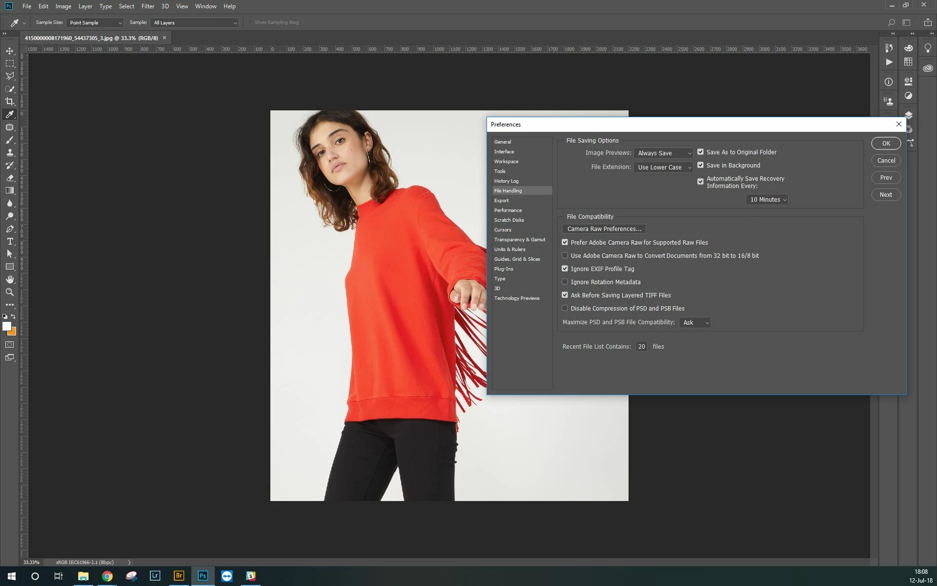
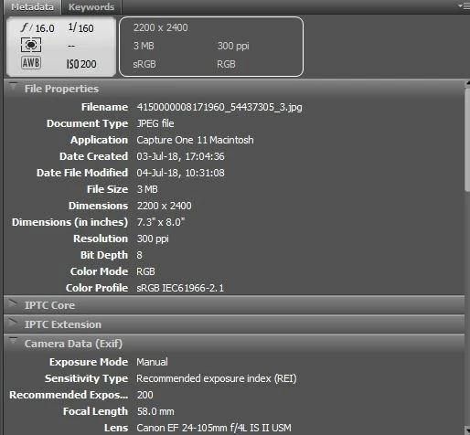
I thought Bridge was supposed to handle the color profile used for all the Adobe family, but when I preview files on Bridge, I have a big shift in color/saturation which is making it really annoying to use (and I don't want to check my files using Photos on Windows for instance even if that one is giving me more accurate colors).

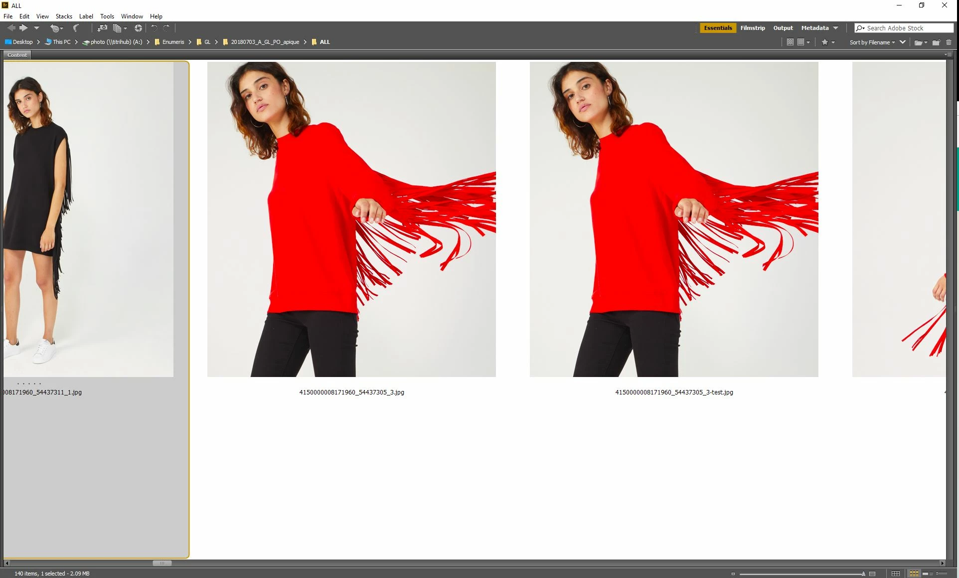
Why? I am missing something? I've checked on (old) discussions started about that with no answers, so I decided to start a new topic when I came across this example today which is pretty striking and embarrassing (left and right are the same image - source file in PSD is also a JPEG so no risk of quality loss when saving in final JPEG):

This topic has been closed for replies.
Correct answer Stephen Marsh

Hi,

Thanks for your quick answer. So I did what you suggested here with no changes... My problem, anyway, isn't on Photoshop which seems to render the true colors but on Bridge.

So here is the Photoshop view with the information you mentioned and below the Bridge Metadata one.

Also, I've saved the JPEG after deactivating the EXIF option as you mentioned. With no visible changes:


I’m not sure if it is file/setting related or not anymore, perhaps change your monitor profile to another and or recreate it to see if this has an effect.

1 reply

Stephen Marsh
Community Expert
Community Expert
July 4, 2018

Please provide an uncropped screenshot, showing the image profile in Photoshop and in Bridge. In this case one image is PSD and the other is JPG, so they probably have different colour profiles.

What can also confuse the issue is the preference under file handling “EXIF (colour) Profile Tag” option for images without an ICC profile. This setting exists in Photoshop but does not exist in Bridge which can lead to some confusion.

Participant
July 12, 2018

Hi Stephen,

Thanks for your answer. You'll find below the same JPG opened in Photoshop on the left and in Bridge on the right. You'll see that we have the same issue here:

Here also are the color settings in Photoshop:

And here in Bridge:

What I don't get is that it looks like Bridge is automatically converting all our files (whatever the format) to a different color profile than the original one with more saturated colors. Even Windows Photo doesn't do that and get more accurate colors, which is quite annoying as I find otherwise Bridge so useful for previewing and checking files... Here is Windows Photo with the same picture for example:

So how to make sure that Bridge isn't giving these extra saturated previews?

Thanks for your help.

Stephen Marsh
Community Expert
Community Expert
July 12, 2018

Sadly the key info is missing.

The Photoshop image does not show the ICC profile.

Plus File handling prefs would be helpful. Try turning this setting on and off and see what the result is in Bridge vs. Photoshop each time.

Nor does the Bridge image show the ICC or the same image in Photoshop.