Known Participant
January 16, 2020
Question

Titles Under Thumbnails In Bridge Left Aligned Instead Of Centered

  • January 16, 2020
  • 5 replies
  • 2046 views

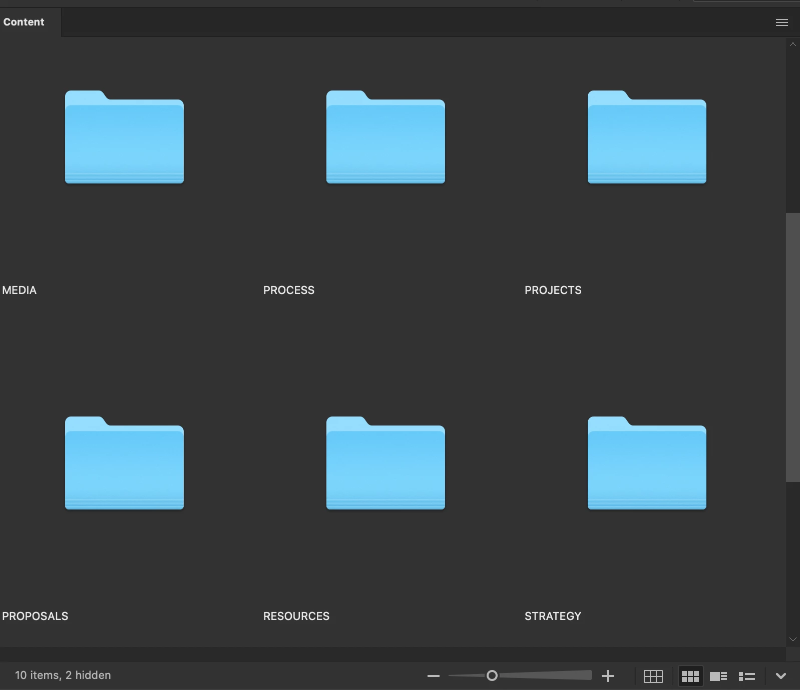
After updating to the latest version of Bridge CC, the titles under the thumbnails are no longer centered, but left aligned. It's difficult to believe this is the intended behavior, but I can't find any setting in either preferences or tools to change it. In combination with the enormous padding around the thumbnails, it makes for a very disjointed interface.


Is there a way to improve the flow of the titles?


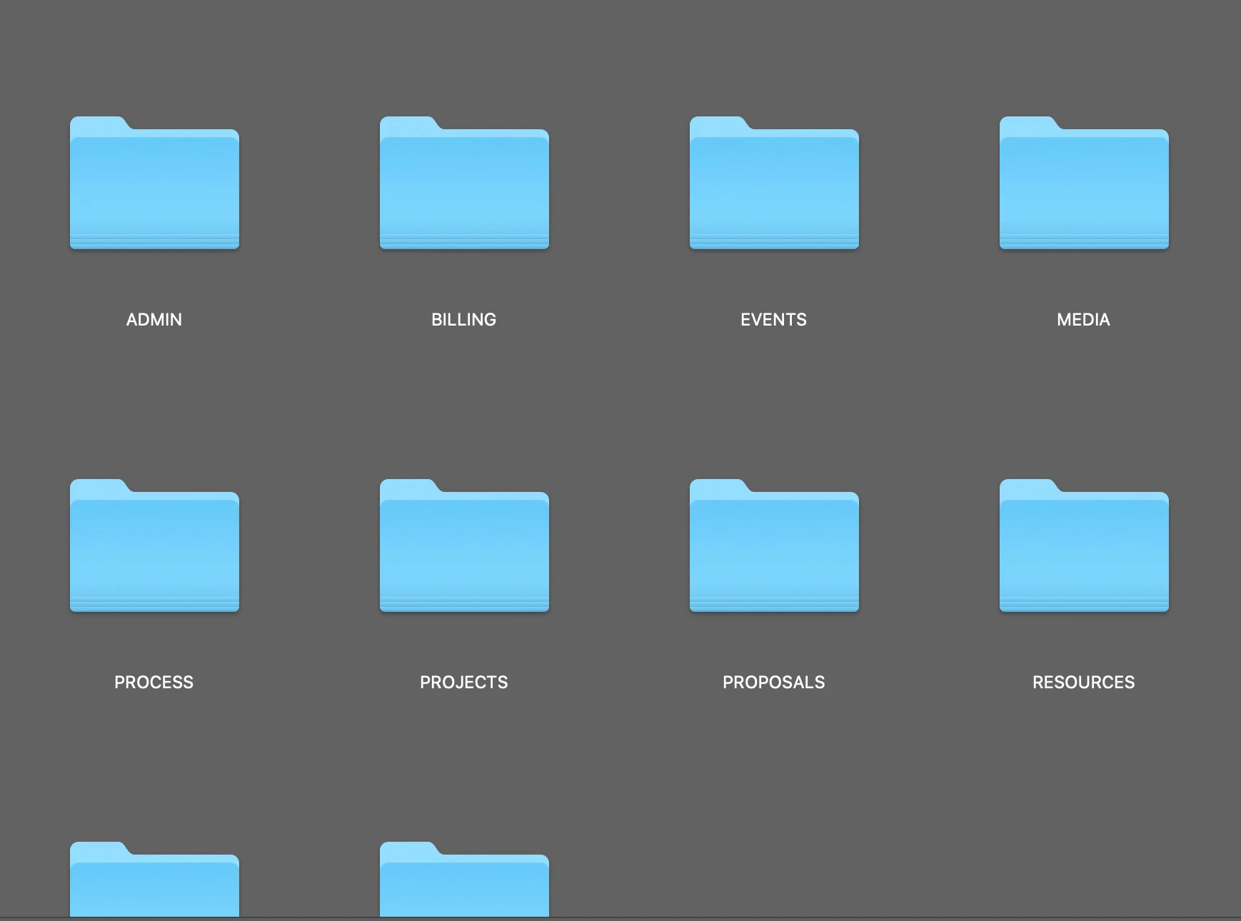
Compared to the previous interface, nice and tidy


This topic has been closed for replies.

5 replies

Participant
May 28, 2021

I just updated to CC and I'm having the same issue! Has anyone figured out how to center the image titles?

Known Participant
May 29, 2021

I spent quite some time on this and finally just went back to using 2018. No more issues.

matthewmorgan
Participant
February 6, 2020

Came here with the same issue.  It is a terrible eye sore with the new change: left-justified titles.   When browsing thorugh folder sometimes the titles fall in between one anotherand it's very disorienting.  


To the response below about checking/toggling "Thumbnails Only" box (or Command+T) to re-center the title: this is still annoying because when viewing image files (i.e. jpeg, raws, etc.) the title completely disappears in "Thumnails only" mode, making picture browsing more difficult.


Participant
February 4, 2020

While this still isn't ideal, I discovered if you checkmark the "Thumbnails only" box at the bottom right, it will center the titles - but also adds a shaded box behind it. I find this to be better than left justified at least.


If you checkmark the "Tiles" box next to it, it will put a shaded box behind the thumbnail and title both. Hoepfully this will work for you also as a temporary fix until Adobe provides an update that re-centers the titles.


gary_sc
Community Expert
Community Expert
February 4, 2020

Jeremy,


Clever approach but exactly which release are you using.


On the Mac that doesn't seem to work as when I select "Thumbnails Only," there is no text, thumbnails only. Also, my UI appears different, see below. It also shows there's no text when Thumbnails Only is selected.


Otherwise, there is no reason/excuse for there to be no option for left/center/right alligned text. Please go to 

 https://adobebridge.uservoice.com


and add to the list of folks wanting more options for the text.


Participant
February 4, 2020

I am having the same issue. Left justified file titles are awful and I am unable to find any setting to revert them back to centered also. Hoping that Adobe can provide a fix for this ASAP.

Legend
January 16, 2020

If you show the rest of the metadata lines, you'll see that it uses the entire tile width.


Known Participant
January 16, 2020

It sounds like you're saying I should clutter up my workspace with unnecessary data just to fill in empty gaps in the interface. I don't need to see metadata on every image, I can look over at the sidebar for that. Photography is just one use for Bridge, I also use it to organize and navigate my files and projects. Anyway, my screenshot is a panel of folders which don't have metadata. The titles are not easily seen because they are not aligned with the folders, and there's a 3/4" gap between them. Part of my work is being able to quickly navigate my files, which becomes more difficult when I have to scroll endlessly and dart back and forth to see what I need. This latest iteration of the Bridge interface is a step backward imo.

gary_sc
Community Expert
Community Expert
January 16, 2020

Hi Michele,


Very interesting issue.


I checked back and in Bridge 2018 the text was centered alligned but by 2019 I'm seeing left alligned. 2020 is only continueing what I'm seeing in 2019.


Neither in 2018, 2019, or 2020 are there any controls (that I can find) to change that allignment.


Now, all that notwithstanding, what you show in your screenshots is not good. It took me a while but I finally figured out that the problem you are seeing is because you are looking at Folders, not images. Folders do not fill up the quantum space that Bridge provides and THAT'S why the distance is so great. If you look at your images, the distance between the bottom of the thumbnail and the text is much less. 


There are several options I can suggest for you now to make it more palitable for the time being, but there is NO immediate fix for this. What I do suggest is that you go to Bridge's Uservoice, show these screenshots and make a request for a allignment request for this metadata. FWIW, I think that's a good idea and you have a very valid point. Go to: https://adobebridge.uservoice.com


OK, things you can do now:

1) decrease the size of the images using the slider on the bottom of the screen. That does bring them closer together.

2) Switch to View Content by Lists


Lastly, one other approach to consider is that you have both your Theme and Image Backdrop (in your Preferences under Interface) exactly the same and dead black. This makes the entire region the same color and makes it larger than it appears to be. You might want to play with the Image Backdrop slider and see if you can find a shade that works better for you for your needs.


FWIW, while I completely agree with your issue, the problem never came to bother me becuase I have my slider set smaller (which reduces the distance from the thumbnail to the text), As Lumigraphics pointed out if you have more text, it's less of an issue, and my Interface color and Image Backdrop shading is radically different than yours so these issues never came up to either of us.


So, please make your reqeust to UserVoice, explain and show why this is a problem, and hopefully (for everyone) something can come out of this. But please be aware that things move very slowly. This could be fixed to your needs in a few months or a year (if at all). If you expect a fix in a week you will be disappointed.


Let us know if any of the short term options work for you,