• Global community
    • Language:
      • Deutsch
      • English
      • Español
      • Français
      • Português
  • 日本語コミュニティ
    Dedicated community for Japanese speakers
  • 한국 커뮤니티
    Dedicated community for Korean speakers
Exit
0

How to add a auto-sized rectangle around text box?

Explorer ,
Nov 05, 2021 Nov 05, 2021

Copy link to clipboard

Copied

The orange box is a cut line. I initially add the box around the text manually and but it took me so much time to change the size of the box if I want to increase the font size. I followed the steps from this post (https://graphicdesign.stackexchange.com/questions/19824/illustrator-auto-sized-text-box-with-shaded-...), but the text became transparent when I selected Effect > Convert to shape > Rectangle. I don't know how to keep the text in black with the orange box around at the same time. I would like to keep the height in 0.35cm and the width should be the length of the text + 0.25cm. Does anyone know how to create an auto-sized rectangle around the text box :(?
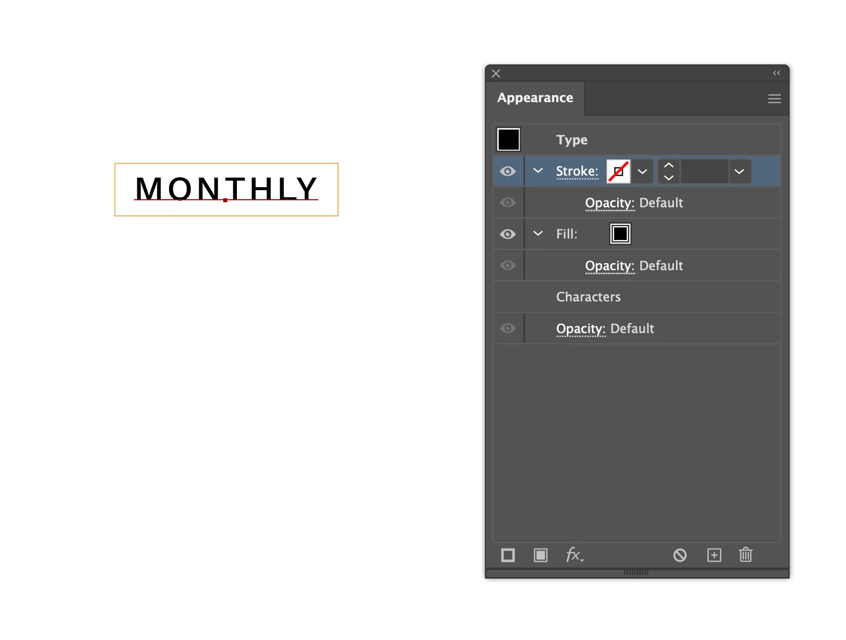
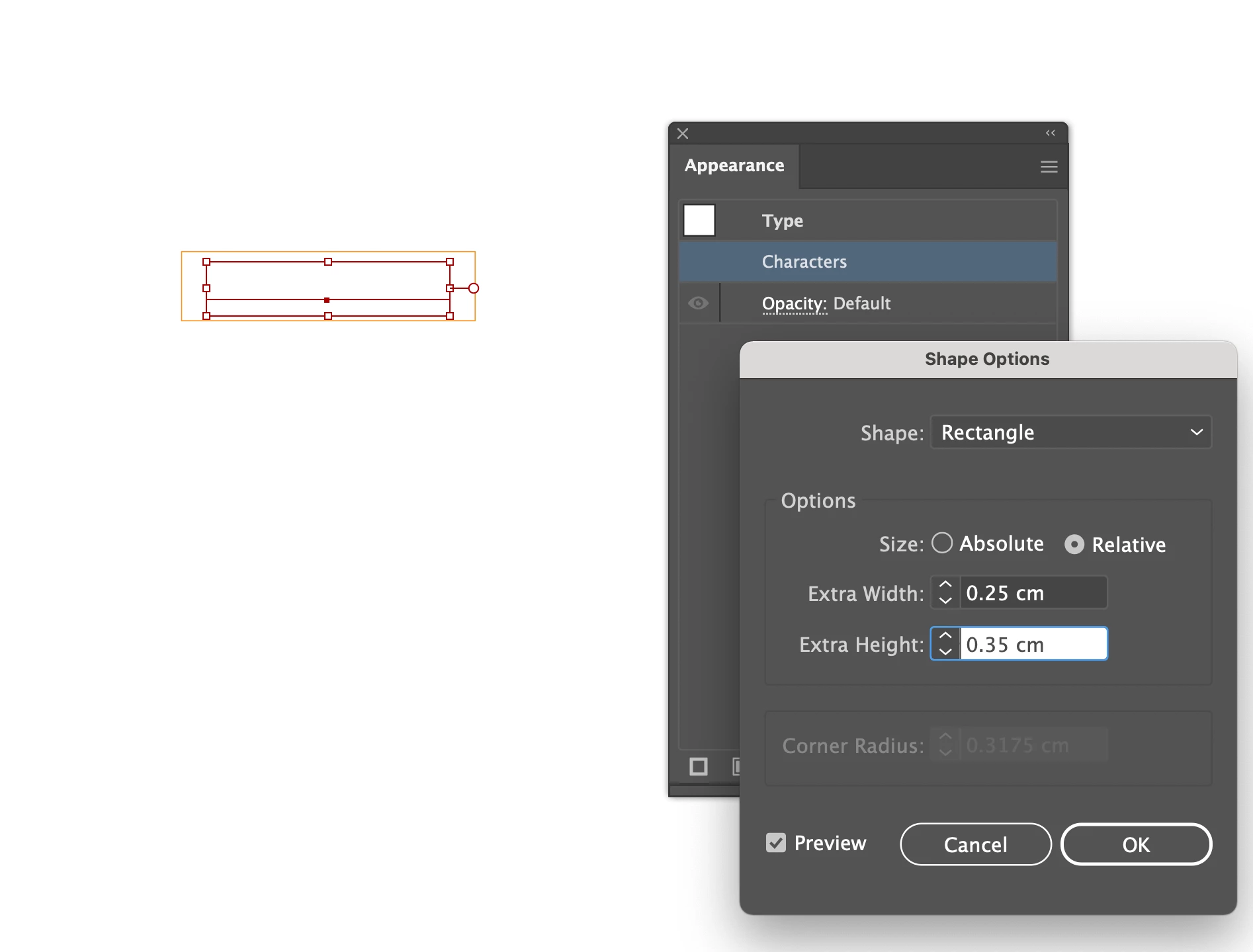
Screen Shot 2021-11-06 at 1.46.40 pm.pngScreen Shot 2021-11-06 at 1.54.26 pm.png

TOPICS
Tools , Type

Views

866

Translate

Translate

Report

Report
Community guidelines
Be kind and respectful, give credit to the original source of content, and search for duplicates before posting. Learn more
community guidelines

correct answers 1 Correct answer

Community Expert , Nov 06, 2021 Nov 06, 2021

coye,


Whatever is described, you can:


1) With the normal Type Tool create the text as live Type; you may wish to choose Align Center in the Window>Paragraph palette (bundled with the Character palette where you set the font and size);
2) In the Window>Appearance panel click Add New Fill, then drag that fill down below Characters and click it to have it selected; it will be highlighted;
3) Set the desired background colour, you may use the Window>Color palette or something else;
4) Effect>Conver

...

Votes

Translate

Translate
Adobe
Community Expert ,
Nov 06, 2021 Nov 06, 2021

Copy link to clipboard

Copied

coye,


Whatever is described, you can:


1) With the normal Type Tool create the text as live Type; you may wish to choose Align Center in the Window>Paragraph palette (bundled with the Character palette where you set the font and size);
2) In the Window>Appearance panel click Add New Fill, then drag that fill down below Characters and click it to have it selected; it will be highlighted;
3) Set the desired background colour, you may use the Window>Color palette or something else;
4) Effect>Convert to Shape>Rectangle (or Rounded Rectangle), then Click Relative and set the width and height to be added to the live Type; you may try different values in Preview to see how it works.

This will give you the text as live Type so you can edit it (you may add text, even more lines, hence the Paragraph choice), and it will stay centred on the background, and the background will adapt to the text.


Edit: I just had a closer look at your screenshot, and it seems that the crucial part is to perform step 2) in full.

Votes

Translate

Translate

Report

Report
Community guidelines
Be kind and respectful, give credit to the original source of content, and search for duplicates before posting. Learn more
community guidelines
New Here ,
Oct 01, 2024 Oct 01, 2024

Copy link to clipboard

Copied

Reviving this thread with a follow-up question:


When I do this, the text is not perfectly aligned to the rectangle, due to it aligning to the em box instead of the glyph bounds, even if I select the glyph bounds options in the Alignment panel.


Any help? Thanks!

Votes

Translate

Translate

Report

Report
Community guidelines
Be kind and respectful, give credit to the original source of content, and search for duplicates before posting. Learn more
community guidelines
Community Expert ,
Oct 02, 2024 Oct 02, 2024

Copy link to clipboard

Copied

aferwardsness,


Thank you very much for your reviving this thread and your giving me the opportunity to elaborate for a fuller solution.


One more step is needed, so here is the fuller instruction, with the addition of steps 0) and 5):


To add an auto-sized and auto-aligned background rectangle round a text (box), you can:


0) If you wish to align the background rectangle with the visible bounds of the characters rather than the Em box, Tick Use Preview Bounds in the Genereal Preferences;

1) With the normal (Point) Type Tool create the text as live Type (you may wish to choose Align Center in the Window>Paragraph palette bundled with the Character palette where you set the font and size), then use the Effect>Path>Outline Object (inserted after Ton made me aware that it was missing, see this post and the Edit edit in this post below);

2) In the Window>Appearance panel click Add New Fill, then drag that fill down below Characters and click it to have it selected; it will be highlighted;
3) Set the desired background colour, you may use the Window>Color palette or something else;
4) Effect>Convert to Shape>Rectangle (or Rounded Rectangle), then Click Relative and set the width and height to be added to the live Type; you may try different values in Preview to see how it works;

5) Untick Use Preview Bounds in the Genereal PreferencesIf if you have Ticked it in 0);

6) If desired, edit the Type by using the Type Tool; start by Clicking carefully on top of the Type to avoid creating a new Type object.


This will give you the text as live Type so you can edit it (you may add text, even more lines, hence the Paragraph choice), and the background rectangle will stay centred round it and adapt to changes in the text.


Similarly, you can use a Rounded Rectangle or an Ellipse as background.


Below is shown a set of live Type with Use Preview Bounds was applied to the lower original Type without and with background, and with changes/additions made to the Type.


Click to get closer

Votes

Translate

Translate

Report

Report
Community guidelines
Be kind and respectful, give credit to the original source of content, and search for duplicates before posting. Learn more
community guidelines
New Here ,
Oct 02, 2024 Oct 02, 2024

Copy link to clipboard

Copied

Thank you so much for the quick reply!


Regarding step 5, is there a reason not to just keep Use Preview Bounds turned on?

Votes

Translate

Translate

Report

Report
Community guidelines
Be kind and respectful, give credit to the original source of content, and search for duplicates before posting. Learn more
community guidelines
Adobe Employee ,
Oct 02, 2024 Oct 02, 2024

Copy link to clipboard

Copied

Hi there!


Thank you for reaching out. Regarding your question about keeping “Use Preview Bounds” turned on, it ultimately depends on your design needs. Keeping it enabled may give you a more accurate representation of your text’s visual bounds, which can be beneficial for some designs. However, if you notice alignment issues, turning it off can help align the text more closely with the rectangle. It’s always good to experiment with both settings to see which one works best for your specific project!

Jacob might be able to provide more detailed insights, but this is my perspective!

Best,
Anshul Saini

Votes

Translate

Translate

Report

Report
Community guidelines
Be kind and respectful, give credit to the original source of content, and search for duplicates before posting. Learn more
community guidelines
Community Expert ,
Oct 02, 2024 Oct 02, 2024

Copy link to clipboard

Copied

Use Preview Bounds can be helpful when you want to know the size of an object including attributes and effects.

But it is easily forgotten and can give problematic results when changing the size in the Transform panel.

It would be nice to have it selectively applied to some objects, but maybe that will add to the confusion.

To add to Jaobs suggestions, you can also add an Effect > Path > Outline Object effect to the type without needing the "Use Preview Bounds" option.

Screenshot 2024-10-02 at 20.10.07.png

Votes

Translate

Translate

Report

Report
Community guidelines
Be kind and respectful, give credit to the original source of content, and search for duplicates before posting. Learn more
community guidelines
Community Expert ,
Oct 02, 2024 Oct 02, 2024

Copy link to clipboard

Copied

You are welcome, aferwardsness.


In addition to what Anshul said, Use Preview Bounds has a wide range of effects, sometimes rather troublesome; in many/most cases it is either needed or troublesome.


To mention some of the effects, in connexion with stroked paths, Use Preview Bounds adds the outer half of the Stroke Weight to the size of the object, which can be seen in the Transform palette, such as a nice regular rectangle such as 200 x 100 pt which will become 201 x 101 pt; for a similar rectangle of 200 x 100 mm will become an even less nice number. Effects such as Gaussian Blur and Drop Shadow will add the extension of the effect, for the latter even moving the centre of the object in the Transform palette. When distributing objects to be abutted by side, the outer bounds of the strokes will be abutted rather than having the strokes overlapping. All of these can be against the desired workflow.


All that said, it is important to be aware of the outer bounds when you create raster images, especially when you have strokes/effects, and ensure nothing is missing, either by having Use Preview Bounds on or by adding to the size.


Edit: And what Ton said while I was delayed in answering.


Edit edit: Actually, Ton made me aware of the serious ommission I made in the text in my answer above.


Step 1) should have been:


1) With the normal (Point) Type Tool create the text as live Type (you may wish to choose Align Center in the Window>Paragraph palette bundled with the Character palette where you set the font and size), then use the Effect>Path>Outline Object;


This is necessary for the instructions to work, and this is what I actually did in the second line of the image.


And this is exactly what Ton suggested.


The "Tick Use Preview Bounds in the Genereal Preferences" in step 0) and the follow up in 5) only apply "If you wish to align the background rectangle by the visible bounds of the characters rather than the Em box,"


Without step 0) and step 5), the rectangle will be aligned by the centre of the Em box instead of by the visual bounds, and the difference can be important.


I will correct step 1) in the answer above, with a note pointing to this.


Votes

Translate

Translate

Report

Report
Community guidelines
Be kind and respectful, give credit to the original source of content, and search for duplicates before posting. Learn more
community guidelines
Community Expert ,
Oct 02, 2024 Oct 02, 2024

Copy link to clipboard

Copied

Generally, when I'm vertically aligning a type object with a background container such as a rectangle I'll almost always align the text using the capital letter height as the reference. That makes the most visual sense. Overshoot from ascenders and descenders (or the overshoot from rounded letters) doesn't matter as much as the cap height.

Votes

Translate

Translate

Report

Report
Community guidelines
Be kind and respectful, give credit to the original source of content, and search for duplicates before posting. Learn more
community guidelines
Community Expert ,
Oct 06, 2024 Oct 06, 2024

Copy link to clipboard

Copied

LATEST

aferwardsness,


As a further addition, here is the latest thread where Use Preview Bouds has caused trouble for general workflows:


https://community.adobe.com/t5/illustrator-discussions/illustrator-is-measuring-the-size-of-the-drop...

Votes

Translate

Translate

Report

Report
Community guidelines
Be kind and respectful, give credit to the original source of content, and search for duplicates before posting. Learn more
community guidelines