Fletch45
Known Participant
February 12, 2019
Answered

Pantone Spot Color Issue

  • February 12, 2019
  • 4 replies
  • 4111 views

Hello, I am fairly new to Illustrator and I've run across a scary problem that I can't solve.

I am trying to update some of my company's old ai files right now, but the spot colors are not working right.

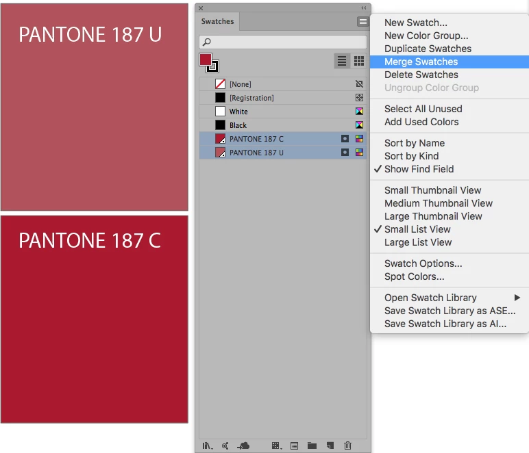
Here is a screen shot of the old ai file showing the color:

This red color is PANTONE+ 187 U that goes on the logo.

Now, when I drag this logo into a new ai file, the color gets muted. But the frustrating part is that Illustrator is still defining that muted red as PANTONE+ 187 U!

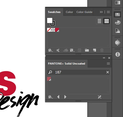
Here is a screen shot of the new ai file:

And what's even more confusing is that in the old ai file, the swatches panel shows that rich red, but when I open up the PANTONE+ Solid Uncoated color book, it shows the muted red (As shown here).

I've checked and both my documents are in CMYK, neither of them have overprint preview on, and they both have PANTONE+ color books. All of the other spot colors I've tested are the same hue in each document. The only thing I can think of that might be the cause is that the old file was made in CS5 vs my new document is CC 23.0.

Please help me, I am very lost!

Thanks so much,

Fletcher

This topic has been closed for replies.
Correct answer Mario Arizmendi

Why are you using pantone 187 U ?   (U means uncoated) wich is mate.

You should use Pantone 187 C (C means coated) wich is bright

Try this

1. Open your swatches libraries and load the Pantone Coated swatch, find 187 C and add it to your swatches panel

2. In the swatches panel, drag the pantone 187 C on top of the Pantone 187 U, nothing must be selected

3. then select both and merrge swatches as you can see in the picture attached

4. Done

4 replies

Brad @ Roaring Mouse
Community Expert
October 25, 2019

If you are updating your files going forward, my main advice is to go with the "new normal", and use the latest Pantone color books, but also, make separate files for use in Spot and Process applications, using the "C" Coated for the former, and the Color Bridge CMYK for the latter. As has been mentioned before, the difference between the C and the U (oh, and historically there used to be an "M" for matte coated) is how they look on the screen to approximate how the 187 ink appears on different types of paper.

There used to be a need in some big corporations for their particular "corprate colour" to match closer across the different paper stocks by actually choosing different Pantones for each use and make THAT their graphic standard, e.g "Use 187 for coated stocks, but use 485 for uncoated stocks". This doesn't sound like your issue, so avoid using "U" going forward.

Mario Arizmendi
Mario ArizmendiCorrect answer
Brainiac
February 12, 2019

Why are you using pantone 187 U ?   (U means uncoated) wich is mate.

You should use Pantone 187 C (C means coated) wich is bright

Try this

1. Open your swatches libraries and load the Pantone Coated swatch, find 187 C and add it to your swatches panel

2. In the swatches panel, drag the pantone 187 C on top of the Pantone 187 U, nothing must be selected

3. then select both and merrge swatches as you can see in the picture attached

4. Done

Fletch45
Fletch45Author
Known Participant
February 13, 2019

I am using uncoated because we are going to have someone print our logo on uncoated paper. So I'm using uncoated to in order to best represent the outcome of the print job.

Isn't that why there are coated and uncoated Pantone libraries? Maybe I'm missing something.

Mario Arizmendi
Brainiac
February 13, 2019

Fletch45  wrote

I am using uncoated because we are going to have someone print our logo on uncoated paper. So I'm using uncoated to in order to best represent the outcome of the print job.

Isn't that why there are coated and uncoated Pantone libraries? Maybe I'm missing something.

You are not missing anything

So if you are going to print onto an uncoated paper, it is ok you use the Uncoated Pantone Book, cause that is the way your print will look, muted and you get a better representation in your screen.

Inspiring
February 12, 2019

I just checked one of my Pantone swatch books and that 187U is a rusty red like what is shown in your "faded" reference screens.  The previous swatch from CS5 looks inaccurate.

Kevin Stohlmeyer
Community Expert
February 12, 2019

What color spaces are you using in the documents?

Fletch45
Fletch45Author
Known Participant
February 12, 2019

I'm not for sure what you mean... I'm using CMYK mode for both files.

I looked up what color spaces are, but I'm still a little fuzzy.

Inspiring
February 12, 2019

Color Space is either RGB or CMYK.  Color Settings are...

Neither are your issue ( I could be wrong, but I might not be ).  Whoever created the CS5 version could have chosen a different Pantone color and renamed it 187U.  Obviously something is not right.