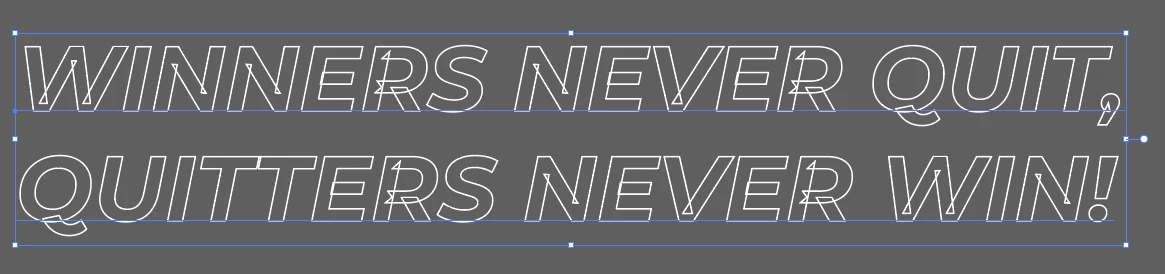
Copy link to clipboard
Copied
Can anyone tell why this stroke overlapping is happening, it just started doing this recently in illustrator. Before this never happened and it is happening with almost every font type I use.
I tried fixing it but I am not able to else I have to lose the editability.
Copy link to clipboard
Copied
Try applying the live Pathfinder effect "Add" to the type object (see Effect menu).
Copy link to clipboard
Copied
akash,
"and it is happening with almost every font type I use"
Maybe you are mixing with the wrong types (sorry, I was stronger than I).
With regard to the why, it seems that we are looking at the (cunning) way of building the letter shapes which remains in the form of (sloppy) leftovers instead of making a final version with letters consisting of single paths of outer boundaries.
You can say that it has the advantage of (potentially) making it easier to edit the font(s)/letters.
Edit: Hi Kurt, mostly autumnal here.
Copy link to clipboard
Copied
The lettering in the sample image was set using the OTF Variable version of Montserrat Italic. Stem overlaps are a common feature to many (but not all) Variable Fonts. The overlaps can be a production hazard in some work flow environments where the letters will be cut out of different materials.
One option for getting rid of the overlaps: use a "static" style of Montserrat Italic. If you downloaded Montserrat from the Google Fonts web site there should be a subfolder containing a bunch of static, non-variable font files. The static fonts don't cover all the weight possibilities of the variable version however.
Like Kurt said, you can use Pathfinder operations to fill in the overlaps. This would involve converting the text to outlines. If the Pathfinder operations don't fill over the overelaps, check the Attributes palette for the correct non-zero winding settings (I learned about that a long time ago when getting rid of overlaps in line strokes that were expanded into raw outlines).
If the text needs to be editable Ton's suggestion of adjusting the stroke and fill in the appearance panel would work.
Copy link to clipboard
Copied
Not quite, Bobby. The Pathfinder effect does not involve converting the type object to outlines. It will still be live and editable text.
Copy link to clipboard
Copied
Yeah, I'm used to clicking the "unite" button in the Pathfinder palette. That one doesn't work at removing the overlaps in variable fonts in live text. The live effect (Effect>Pathfinder>Add) does work on live text. If the lettering has a line stroke added the stroke will sit above the fill, which often doesn't look so good. Ton's suggestion to get rid of the stroke and fill and then use the Appearance panel to add a new stroke and fill allows the stroke to be moved behind the fill.
Copy link to clipboard
Copied
This worked for me. Uninstalled Google's Montserrat file and installed Adobes. The weird strokes went away. THANK YOU!
Copy link to clipboard
Copied
Every font?
So you are not applying any effect or transformation to this - like offset path?
What font is the sample?
Copy link to clipboard
Copied
The typeface is the Variable version of Montserrat Italic (available via Google Fonts). The overlaps are normal in the Variable version. Some OTF Variable fonts I've purchased don't appear to have any overlaps at all (TT Supermolot Neue would be one example). Others may have lots and lots of overlaps (Helvetica Now Variable is one example). I don't know all that much about how Variable fonts are created, but it seems like the overlaps are an often necessary feature. They seem to work off the same principals as a blend operation.
Copy link to clipboard
Copied
Montserrat bold italic
Copy link to clipboard
Copied
This is probably a variable font. Check if there is an update for the font or use the trick that Kurt suggested.
Copy link to clipboard
Copied
Another way would be to give the text no stroke or fill and add a new stroke and fill in the Appearance panel.
Move the stroke below the fill.
Copy link to clipboard
Copied
and I think you'll need to have Pathfinders "Add" effect too...
Copy link to clipboard
Copied
It may not be necessary if the stroke is moved below the fill. The fill would hide the overlaps. Still, using the "Add" effect wouldn't hurt.
Copy link to clipboard
Copied
This is true...
But I just had fun making a gif so I have to post it...
Copy link to clipboard
Copied
There have already been a few posts on this topic in the past. However, most of them were about variable fonts.
Two good suggestions have already been given by @Kurt Gold and @Ton Frederiks. These are solutions that have helped in the past.
see:
OUTLINE/STROKE Issue inside font/letters
and/or
Copy link to clipboard
Copied
Expanding to Object and using Merge in Pathfinder tool worked for me
Find more inspiration, events, and resources on the new Adobe Community
Explore Now