Copy link to clipboard
Copied
Hi,
There is a table in Id.
I exported it to EPUB.
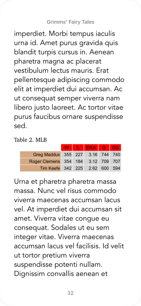
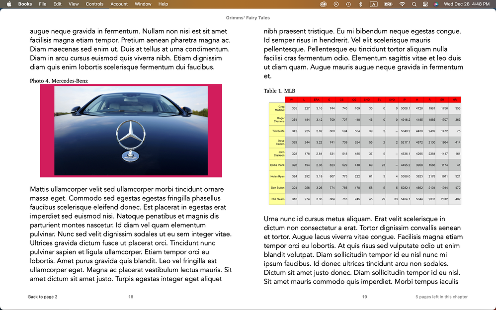
The table looks OK on iPhone (Books app).
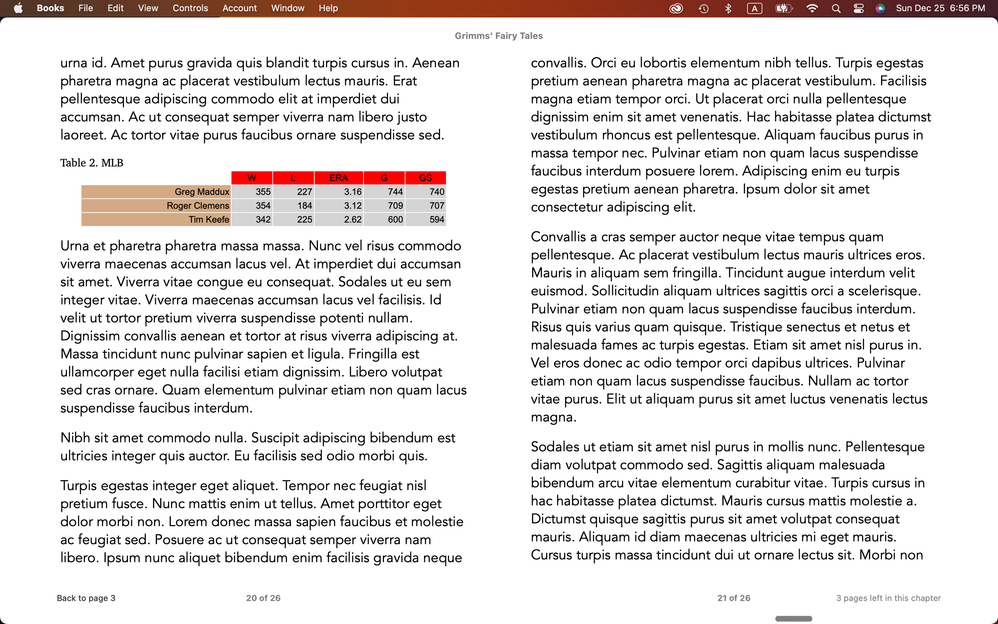
There is an alignment issue on Mac (Books app).
Do you have any comment on it?
Hosun


 15 Correct answers
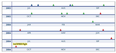
Most ePub creators suggest that in a Reflowable ePub you should use an image for tables.
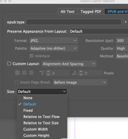
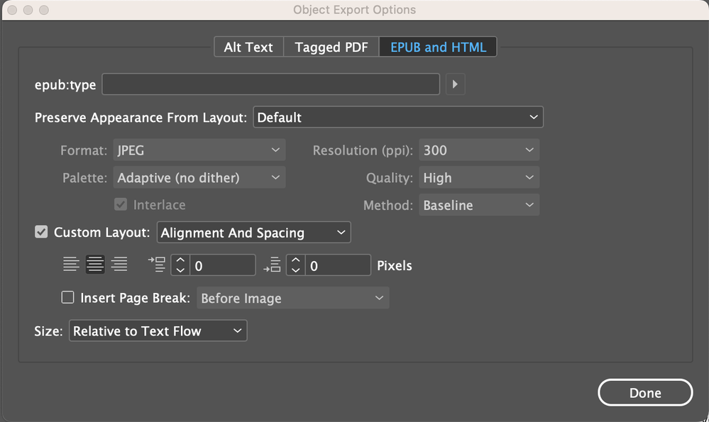
Have a look at Object Export Options.
Using an image is a last-ditch option for tables with a layout too fussy or complex to let an e-book reader manage, like this —
Most simple, linear tables (like the OP's) can be exported successfully. The trick is to focus on the actual exported table and not the one in the ID doc; this is one of those cases where a somewhat "distorted" layout is needed to lead the reader to a clean presentation. (The faults lie mostly in ID's refusal to export HTML padding, so you either have to reformat at
...Try this:
Take the table out of a text box. It adds nothing in the way of control. Quick testing didn't show any useful effects from applying Object Export parameters.
As I suspected, nothing done within ID will force the table to expand to full width. My notes were incomplete but leaned this way; I've just proven it to my satisfaction. What you can do is apply cell styles with spacing to get a more pleasing layout — and as noted above, what you get/see in ID might be very odd or distorted t
...You can make the CSS command as specfic as you like. Just "table" as the style will affect all tables. If you wanted it to affect only one ID style of table, give the style a name — Color Table — and then change the CSS style to:
table.Color-Table { width:100%; }
You can, of course, have any number of these style-definition pairs. You shouldn't need to open or edit the EPUB after export; the CSS style is applied by including it in the EPUB export "Additional CSS" list.
You could also make th
...Maybe I wasn't clear; I thought we'd gone through a CSS mod before.
Take the table out of the text frame. It adds nothing. Put the table right after the paragraph you want it to follow; it's just "fancy text" and will stay there without having to be anchored. (I would also take the caption out of its text box, which does nothng; just make it a paragraph that is formatted and spaced appropriately.)
With a text editor like Notepad, create a file in the same folder called (for example) grimm.cs
...There are two things I'm suggesting, here. One is optional.
You have your table in a text frame. This is unnecessary and while it may not affect the alignment issue, it's complicating things. Select the table, cut it, and paste it back into the text flow, outside of that text frame. Delete the text frame.
That won't fix anything by itself but it removes a layer of document complexity that can make other fixes harder or less predictable.
When you have the table as just part of the text flow
...To start with, it looks as if you still have the table in a text frame. It doesn't need to be, and that makes things more complicated. So what follows may not work unless additional styling/CSS is applied to that text box.
As long as the table is just part of the text fow, this is a case where what you do in ID will happen in EPUB — center the table in the document, and it will export centered with no CSS override necessary.
Use the arrow keys to select the start of the table (you will get a
...Tables will attach in different ways to adjacent paragraphs, including just "running on" from prior paragraph text or into following text. You want to make sure they are on a paragraph of their own:
[Paragraph in BODY style]
[Paragraph in centered style, holding Table]
[Paragraph in BODY or some other style]
That is, with hidden characters on, you should see a pilcrow at the end of each of these three paragraphs, the table included.
Apply whatever style you want or need to each of those three elements. They should be completely independent with the connection between the table and the following paragraph broken by the paragraph return.
I assume you want the regular body style on the last paragraph; apply it, and it should leave the table (and its paragraph) centered. That formatting should all export to EPUB without needing any CSS changes other than the width: statement.
I have never seen that error.
Try renaming the second instance — and always use meaningful paragraph style names that give some context. In this case, 'body paragraph' and 'body paragraph centered' would be more intuitive and might elimnate this odd collision.
You can also look at the global paragraph styles export list (click the 'hamburger' icon in the Paragraph Styles list, then select Edit All Export Tags). In that list, make sure every style, especially these two, have a unique export n
...You can assign any export names to them; it does not affect the InDesign styles. Besides just general management, this feature is VERY useful when you want to maintain "sensible" InDesign style names but export more compact, HTML/CSS-friendly versions to the EPUB.
Tables get tricky because table and cell styles overlap in a hierarchy that's not always predictable.
Try creating a cell style with a white background and "none" or 0 for borders. If that doesn't work, apply thin white borders. One or the other should produce that "missing" cell appearance.
I don't see a problem in the latter example, unless that is with the white border.
I can't find my detail notes on tables so I may just spend some of this long weekend messing around with a redo and some things I didn't evaluate before.
Something you might try is adding 'border-collapse: separate;' to your table definition, to see if that affects the various adjoining borders in a positive or negative way. I'm pretty sure 'collapse' is the default value for both ID export and EPUB interpreta
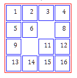
...And here's some interesting findings. I find that both border-collapse and empty-cells work in EPUB (Calibre/Thorium):
This is a table with borders defined red, cell borders defined blue, collapse set to 'separated' and two cells left empty.
Kindle does not honor empty-cells but does follow everything else. Making your borders all 0/none/white and using these two commands might allow you to style the table the way you want, with slight white separation between the colored cells for definition
...Copy link to clipboard
Copied
And here's some interesting findings. I find that both border-collapse and empty-cells work in EPUB (Calibre/Thorium):
This is a table with borders defined red, cell borders defined blue, collapse set to 'separated' and two cells left empty.
Kindle does not honor empty-cells but does follow everything else. Making your borders all 0/none/white and using these two commands might allow you to style the table the way you want, with slight white separation between the colored cells for definition.
Copy link to clipboard
Copied
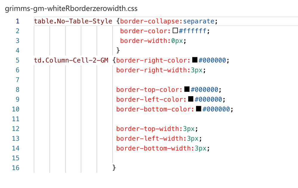
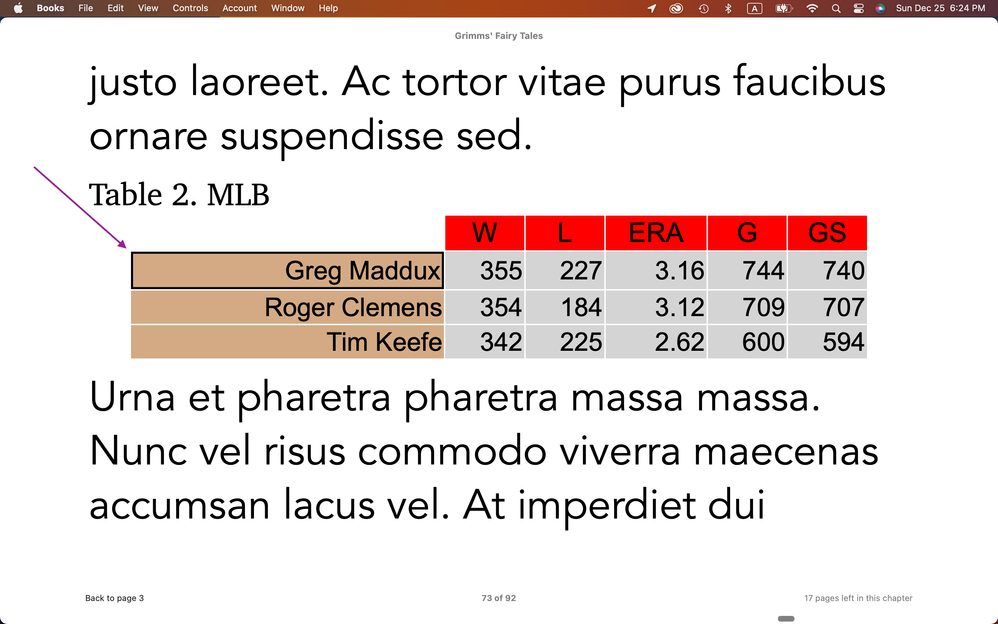
Step 1. I gave 3px and black to the borders of Greg Maddux.
Step 2. The topleft corner of the cell is a clean-cut.
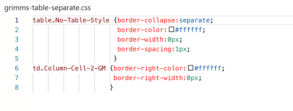
Step 3. I gave 0px and white to all the borders of the table. (border-collapse:separate, border-spacing:1px)
Step 4. It looks better than black border.
Hosun
Copy link to clipboard
Copied
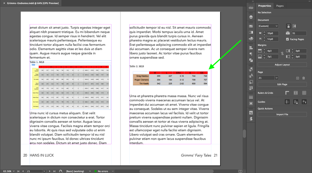
Screenshot 1 (Table 2). I took out caption and table from the text boxes and place them in the text flow to make the live text.
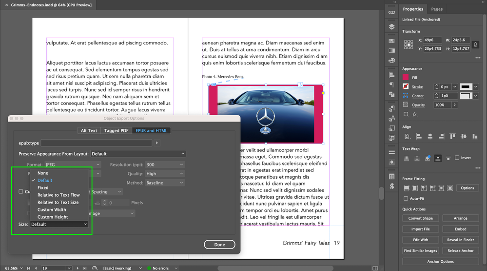
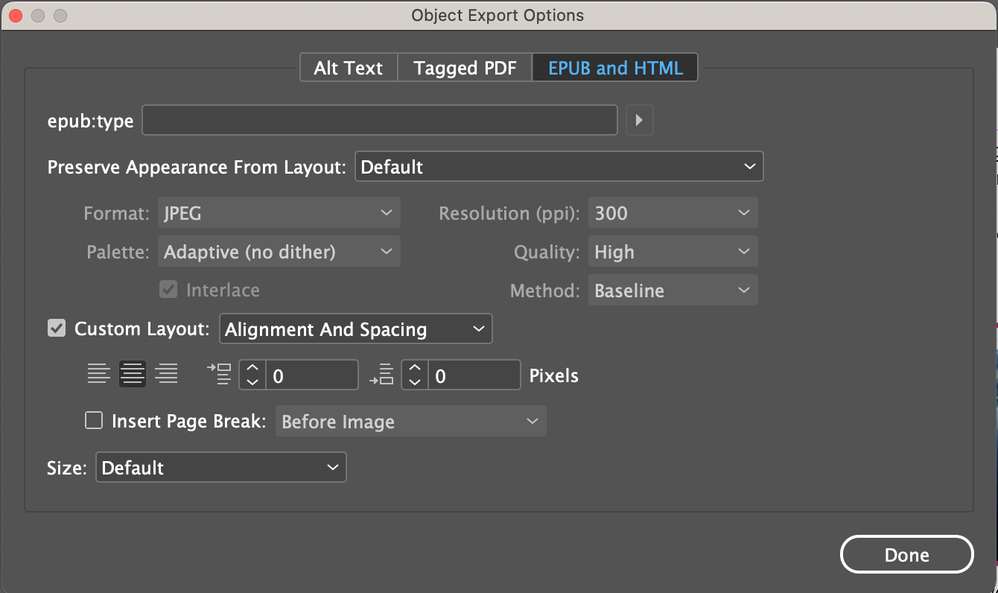
Screenshot 2 (Photo 4). I took out caption. Which one would I choose in Size of the Object Export Options? (in keeping consistency of Table 2 and Photo 4)
Hosun
Copy link to clipboard
Copied
I tried options in Size.
Default and Relative to Text Flow keep consistency in Photo 4 and Table 2.
I see there is no difference between Default and Relative to Text Flow.
Am I correct?
Hosun

Find more inspiration, events, and resources on the new Adobe Community
Explore Now

