- Home
- InDesign
- Discussions
- Betreff: Can I convert images that are in Photosho...
- Betreff: Can I convert images that are in Photosho...
Can I convert images that are in Photoshop's Grayscale mode to CMYK within InDesign?
Copy link to clipboard
Copied
Copy link to clipboard
Copied
Grey images are technically seen as cmyK, only K channel used. I see never a need to convert them to CMYK. The policies are to keep values. But I can apply any color to K images and another to their frames. No need to convert them before plaing them.
Copy link to clipboard
Copied
Greyscale images do not convert in InDesign. They are essentially "black" so will print as such in a CMYK workflow.
Regardless, KDP is an RGB workflow, so all your colours are converted to the sRGB space anyway, including your greyscale. If you send pre-converted CMYK (shudder) it may cause inappropriate color shifts that wouldn't happen if you started with RGB images.
Personally, I would convert all your greyscale images to RGB now and be done with it.
Copy link to clipboard
Copied
It's unclear to me whether KDP print is RGB or CMYK. How have you been able to determine this? In the readme files to their templates, and on their website, they say they want CMYK, at least for the covers (I can't find any specifications for interior images). However, as you suggest, with covers, they do a better job with RGB. With grayscale, it's unclear. I've seen examples of grayscale images printed at KDP from CMYK images that have a wider dynamic range than the same RGB images.
What they seem to be is a CMYK process that's optimized for the sRGB gamut. I'm going to test this. I created three identical copies of my book, one with Grayscale images, one with RGB, and a third with CMYK, and am in the process of uploading them to KDP. Once I have all three proofs in hand, I'll report back here with the results.
Copy link to clipboard
Copied
"What am I doing wrong?"
I do not think you are doing something wrong.
If you want to output RGB with InDesign for a grayscale image, simply select the image, not its container frame, and fill the image with a black RGB color swatch.
Leave it as that when you like to convert the black RGB to a rich black CMYK when you export to PDF and the conversion is done in the PDF. InDesign's export will do this right if you are using a PDF/X preset with color conversion.
EDITED:
Seems that I was wrong if the RGB values for this black are exactly 0|0|0. Then InDesign will treat the black as [Black] 100%. Not only in the Separation View, but also if you export to PDF/X and you do a color transformation to CMYK.
Solution: Use RGB 1|1|1 for example.
( See Rob Day's post and experiments below. )
FWIW: If you do not fill the grayscale image with a swatch, InDesign handles the color as if it is [Black], the K channel for the black ink of CMYK. So you get no rich black if you output to PDF and do a color conversion to CMYK at the same time.
Regards,
Uwe Laubender
( Adobe Community Professional )
Copy link to clipboard
Copied
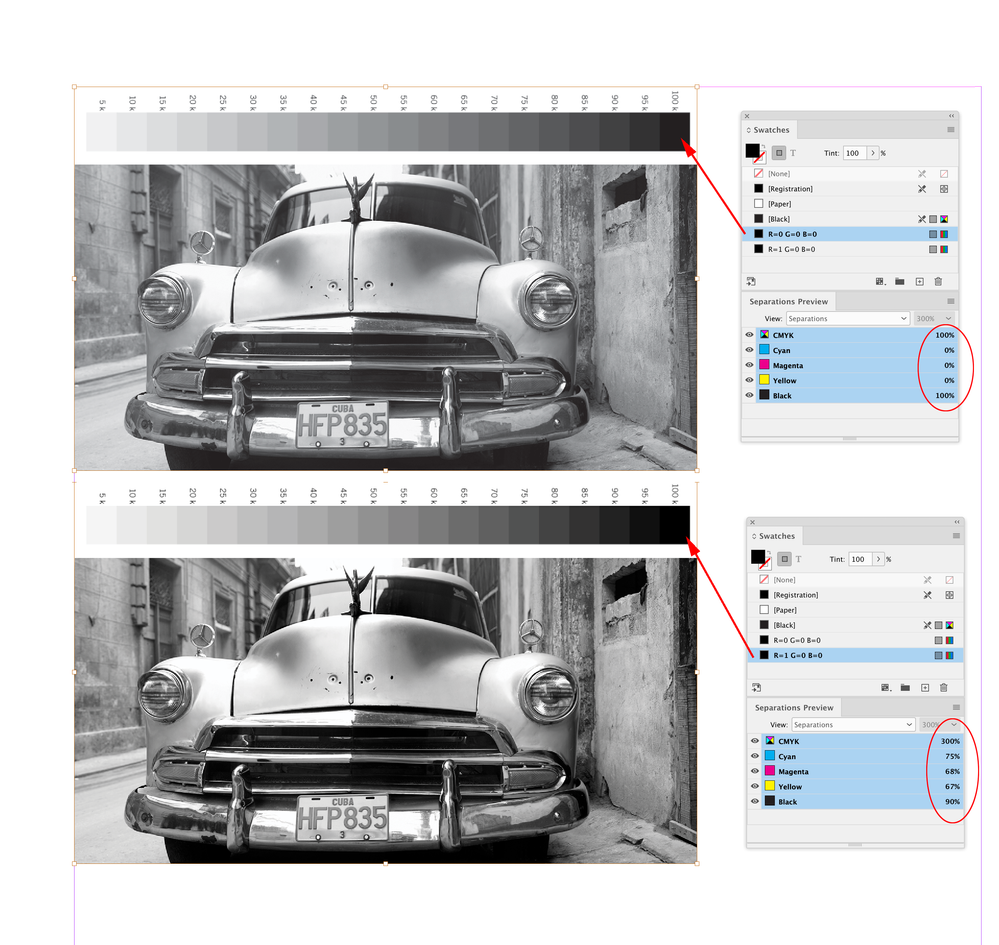
Hi Uwe, I’m not sure if this is a bug or a feature, but if I "fill" a grayscale with RGB 0|0|0 and check its output values in Separation Preview, 100% gray still outputs as 0|0|0|100.
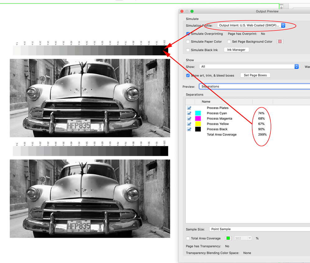
But, if I make an RGB swatch that is not absolute black (e.g., 1|0|0) I get a conversion into the document CMYK profile’s black point—so for default US Web Coated SWOP I get 75|68|67|90. I checked back to CS6 and it seems like it has always worked this way.
Another option, if you know the printer is going to output the provided CMYK values, would be to apply a rich black CMYK swatch, which would allow more control over relationship of CMY to Black—something like 40|35|35|100 would probably have a better chance of remaining neutral if the gray balance is off:
Copy link to clipboard
Copied
Hi Rob,
wow, thank you for testing this. I see the same. Also with InDesign CS6.
A RGB black with 0|0|0 will be treated as 100 K in separation preview.
One with 1|1|1 will be separated to a rich black.
Regards,
Uwe Laubender
( Adobe Community Professional )
Copy link to clipboard
Copied
When I work with greyscale images, I have a custom profile I use to convert to CMYK in Photoshop. This profile generates very little in the CMY range and leaves the black pretty much alone. This stays pretty consistent with not much possibility of colour shifting.
The InDesign trick of assigning a Rich Black colour also works (although I tone back my CMY more for these photos: my usual combo is 20C 15C 15Y 100K.)
Copy link to clipboard
Copied
I could get RGB output by specifying the RGB transparency blend mode and then converting to and specifying sRGB as the output space. But I haven't been able to figure out how to convert to CMYK.
Hi @DavidOfMA , Keep in mind that the Transparency Blend Space only affects spreads containing a transparent object—if the document has no transparency the blend space is not used.
Also, with print documents you have to be careful using an RGB blend space or setting the export Destination to an RGB profile—if you are using black text, it would output as 4-color CMYK and likely cause registration or "bolding" problems on an offset press. Setting the color of the placed grayscales as Uwe suggests would not affect the color space of other objects on the spread.
Copy link to clipboard
Copied
Thanks for this. It may be why, when I used a PDF print driver to output a book created in Word, the text looked semi-bold. In any case, I've gone to using PDF/X-3 to prevent that problem, though this seems to render the images much lighter than I intend them to be. Next round of testing, I'll try the select-and-apply-rich-black trick described above.
Copy link to clipboard
Copied
though this seems to render the images much lighter than I intend them to be.
With PDF/X exports grayscales get previewed via the CMYK Output Intent profile, which would not be the Gamma 2.2 profile you are using in Photoshop—Gray Gamma 2.2 is not a print profile. Applying a rich black CMYK color will darken the image because of the added CMY.
More on InDesign grayscale profiling and soft proofing here:
Copy link to clipboard
Copied
Thanks. It appears, from the print preview I just did on KDP a few minutes ago, that once this file goes through their print prep process, the images look correct and will, presumably print correctly. I've started going through the chain of threads on this, beginning with the one you link to. It's still not completely clear to me how to get a soft preview that comes close to what I'm likely to get once the book is printed. Turning on soft proofing shows dramatically washed-out grayscale images, whereas the few RGB images in the file don't look much different. What am I not getting / doing wrong?
Copy link to clipboard
Copied
Turning on soft proofing shows dramatically washed-out grayscale images, whereas the few RGB images in the file don't look much different. What am I not getting / doing wrong?
To soft proof an ID document in the document’s CMYK space, just turn on Overprint Preview—Proof Setup and Proof Colors would only be useful if you wanted to proof to some other print condition.
InDesign doesn’t have a Grayscale color space the way Photoshop does—with Overprint turned on the document’s assigned CMYK Black Ink profile is used for the preview (not the embedded gray profile). With Overprint turned off you get an Gamma 2.2 (sGray) screen preview, which is only helpful if you are designing for screens.
In Photoshop, if you edit grayscales with a Gray Gamma 2.2 profile assignment, Photoshop’s preview would likely be misleading for press work because Gray Gamma 2.2 is not a press profile. In the linked thread I show how to create a Black Ink gray profile, that will match your InDesign document’s assigned CMYK profile. Here you can see the difference between Gray Gamma 2.2 (top) and Black Ink US Web Coated SWOP (bottom).
Keep in mind that a grayscale filled with RGB black is going to print darker and with denser blacks because the output values would be 4-color CMYK—the downside would be fighting color casts.
Copy link to clipboard
Copied
If you send the job through preflight it will tell you what photos are rgb. Then you can either open original and change to gray scale. But like Willi said it is only grayscale you need.
Copy link to clipboard
Copied
CMYK images, for color at least, should never be used in KDP uploads. They're accepted, and converted as part of the process, but the KDP print process (and Kindle, of course) are optimized for RGB.
That said, grayscale — which as Willi points out are K-only CMYK in format — is pretty much the same no matter what you upload. It would all be in balancing the tonal range at the Photoshop level before export from InDesign. I am not sure if KDP has either color profiles or other specs — that are accurate and up to date, anyway; docs tend to lag way behind tech — to give any guidance for optimizing B+W images.
That is the downside of all the POD wonder: you pretty much have to take what you get. Which is fine for text, line art and snapshots, but not so good for any kind of art photography.
—
Copy link to clipboard
Copied
Thanks. I just bought your book! Once I've gone through it, perhaps some of the questions that mystify people like me will be clarified. I've also submitted three copies of the book, in CMYK, RGB, and Grayscale, to see if there are any subtle differences.
One question came from this process: the RGB version of the PDF is much, much larger than the Grayscale or CMYK. I find this perplexing, since it's dealing with only three channels compared to four for CMYK. Do you have any idea why that is happening? I output all the PDFs using InDesign's PDF/X-3 preset. I had to downsample all images to 300dpi just to get the RGB file size down below KDP's limit (most were around 350dpi), whereas with the other color spaces, the default compression was fine.
Copy link to clipboard
Copied
I'm not heavy on image management issues, because KDP isn't. It's a given that everything changes, more or less continuously, and the docs/help info never comes close to catching up, and when you find an optimized solution, the goal posts move (different print tech, different bureau, different settings). I'm not sure there is any approach except "do your best and take what you get... every time."
I've done three books with significant images and never had any problems just using defaults and no special attempt to game the profiles, settings, standards etc.
I know I've read a lot of complaints from people trying to do high quality/art image work, all touching on things above. I will be interested to see if you can get optimized results, especially for B+W, and if you can continue to get consistent results across time.
—
Copy link to clipboard
Copied
Just to clarify Uwe’s post, you can convert a placed flattened, grayscale image into a different color space inside of InDesign by direct selecting the image with the white selection tool, and apply an InDesign native color or swatch—the mode of the swatch determines the mode of the image in the exported PDF.
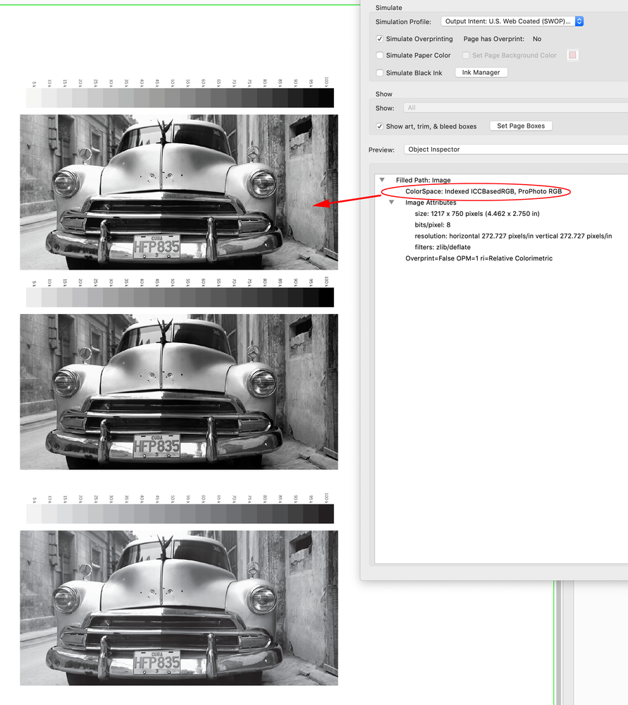
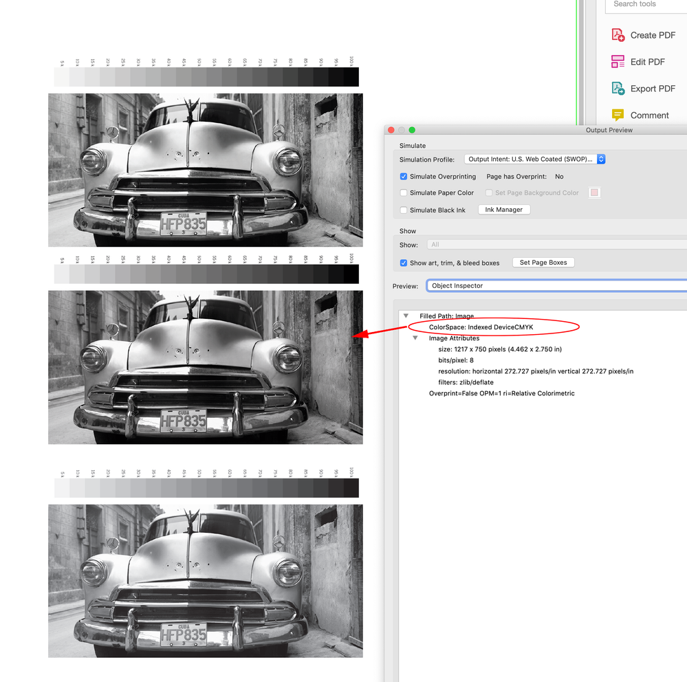
If you Export to the default PDF/X-4 preset with No Color Conversion, AcrobatPro will inspect the image color mode as the applied swatches’s space. The exception is—RGB or Lab black can’t be absolute black. So here I’ve placed the same grayscale 3 times, with the top version’s fill set to 1|0|0 RGB, the middle version is set to 40|35|35|100 CMYK rich black, and the bottom version set to 0|0|0|100 [Black].
AcrobatPro inspects the top image as profiled RGB using the document’s assigned RGB profile, the middle as DeviceCMYK, and the bottom image as DeviceGray:
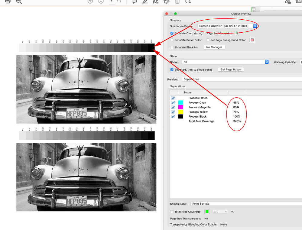
If I check the 50% gray patch in Separations view, the top version is showing the color managed conversion of the ProPhoto RGB color into the US Web Coated SWOP Output Intent profile 50|42|42|5:
The middle version is showing a 50% tint of my 40|35|35|100 rich black CMYK swatch—20|18|18|50:
And the bottom version is showing the original 50% gray as 0|0|0|50:
My example files:
https://shared-assets.adobe.com/link/f5a3b216-e040-403e-452e-9a14d480f31a
Copy link to clipboard
Copied
Thanks. I will use this technique to refine the images, once I have a better idea of how they print with just the K channel. Someone on another forum suggested the same technique, but at with higher values for CMY, and the results were discouraging.
I am guessing/hoping that I can use this method to create slightly different blacks within the same InDesign file, should I want to do that, without having to alter the source, or to give all the images a slight tint, right? That had never occurred to me to do until just now, but it's something I may think about. Do I need to reduce the K if I add significant amounts of CMY?
Copy link to clipboard
Copied
Do I need to reduce the K if I add significant amounts of CMY?
I don’t think so, isn’t your complaint that the grayscale’s appear washed out? The point of adding CMY would be to give the grayscale more dynamic range. Offset inks are transparent, so absolute black in CMYK printing would be black + CMY, not black by itself.
You might have to lighten the grayscale’s midtones to compensate for the added CMY, but you want the image’s black point to be 100% black plus CMY.
I think testing the different color modes is a good idea, but I’m sure every job you send to Amazon is output on a different device, so I don’t think you can get too fussy with color management.
Copy link to clipboard
Copied
Yes, I've already seen, in other books I've done, substantial variation from batch to batch. In terms of convenience and upfront cost, POD certainly beats buying 500-1000 copies of a book and dealing with shipping and returns, but there's also a price to pay in consistency.
Copy link to clipboard
Copied
Hi Rob, your top image shows in Acrobat's Inspector
Color Space: Indexed ICCBasedRGB, ProPhoto RGB
when one of these goes through my Prinergy System, Indexed is treated differently from a normal RGB with an ICC Profile.
I've assumed that Indexed is a separate color space as far as the PDF is concerned.
Having read through this excellent thread, I'm guessing that the Indexed colour(s) are just the Solid Swatch that the greyscale is colored up and the white, and I'm assuming that InDesign is creating the pdf like that because it saves a lot of MB.
I've just finished digitally printing (toner) some booklets for University Photography students. In addition to the issues covered above, I've had to deal with a lot of DeviceRGB and Indexed DeviceRGB. The Indexed DeviceRGB always seem to go to Greyscale (or quadtone cmyk with blank cmy channels). I'm now thinking that its not the Indexed space itself that is causing this but just whether a Swatch is used to colour the greyscale or not and whether it has equalRGB numbers.
I also discovered a few years back that on our Digital Printer you can get higher density blacks (than100k) by presenting it with CMYK and then forcing it to use Black Toner only, it seems that the Black toner gamut is darker than 1colour offset ink.
The downside is if a student wants to mix Colour and B/W in their book then printing the CMYK Black and Whites will always print with a cast.
The advice I give the students is that they need to treat all their B/W the same, either all greyscale or all RGB/CMYK.
If they have some colour images they decide which is more important, absolute greyscale and lower contrast or convert all to cmyk get higher contrast but all print with the same cast. What really doesn't work is mixing cmyk B/W next to a greyscale on the same spread.
The process and advice would be really different for an Offset Press because you properly control the grey balance.
Copy link to clipboard
Copied
I've assumed that Indexed is a separate color space as far as the PDF is concerned.
Hi @reproo2773183 , The bit depth of the grayscale isn’t changing—even though the pixels are being "colored" there are still only 256 possible color values, and I think that’s why Acrobat reports the bit depth as 8-bit indexed.
Also, the 256 color limit shouldn’t affect the conversion from profiled RGB to a selected CMYK space. The AcrobatPro separation values look right to me—the output CMYK values change as expected with different Simulation profiles.
Here I get the expected total ink values when I sample the ProPhotoRGB 1|0|0 patch for US Web Coated SWOP vs FOGRA27. The other gray patches also respond to the Simulation profile
We have been assuming the Amazon output is to transparent offset inks, but if it is toner based that should show in @DavidOfMA ’s proof test.
Copy link to clipboard
Copied
We have been assuming the Amazon output is to transparent offset inks, but if it is toner based that should show in @DavidOfMA ’s proof test.
To the best of my knowledge and experience with KDP, Amazon does not print anything using offset processes. It's all varying toner-based printing.
And the pivotal word there is 'varying.' KDP does not have one shop or even one consistent printing line in any shop. A book might be produced by one line on one order and another (or another shop entirely) the next. While I've found the quality to be consistently very good to excellent — the odd folded or creased page in binding being about the worst fault I've encountered — there is simply no control over the actual press results, not to the level that's being discussed here.
Optimizing images for printing at KDP's resolution and line screens is about as far as you can go. And from there, you're going to see variation in reproduction quality, the more so for 'art' photography where subtle tone and density changes are very noticeable.
POD has come a long, long way. It wasn't that long ago that I railed against it as junk printing for throwaway books. Print quality, binding and finishing is now excellent from most providers — KDP and Lulu being the two I turn to most often — but in the end it's like sending a PDF to a random repro shop. What you get back will be up to professional standards, but no two sources will send back quite the same result.
As with nearly ever other technical layout, submission and production detail, KDP's standards, requirements and details change continuously and seem to often lag behind the real changes (in equipment, RIP, etc.) I mean, this is a service that can't even accurately inform us how to write book listings that conform with their ever-changing feature set. 🙂
—
Copy link to clipboard
Copied
I agree, but it is curious that the KDP recommendation is to provide flattened CMYK with no profiles (PDF/X-1a with no output intent!). The only cases where that works well is when the document CMYK values make it to press unchanged, and the press profile was known at Export.
https://kdp.amazon.com/en_US/help/topic/G201953020
It would be unusual for a composite printer to output document CMYK values unchanged—typically the driver handles the final output color conversions. A well constructed target proof would at least show what’s happening with the recommended DeviceCMYK/DeviceGray colors vs profiled RGB color. A DeviceCMYK color like 0|0|0|50 would have CMY in the output if the driver is making random color conversions.
The device variability could be exacerbated by their unprofiled CMYK recommendation, because each device would have to assume a document CMYK profile, which is not known.
-
- 1
- 2
Find more inspiration, events, and resources on the new Adobe Community
Explore Now


