• Global community
    • Language:
      • Deutsch
      • English
      • Español
      • Français
      • Português
  • 日本語コミュニティ
    Dedicated community for Japanese speakers
  • 한국 커뮤니티
    Dedicated community for Korean speakers
Exit
1

Column for heading, column for body text?

Explorer ,
Mar 25, 2014 Mar 25, 2014

Copy link to clipboard

Copied

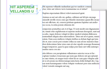
Hiya, I am wanting to have the headings in one column and the body text in the other, like in the image below, the text will need to flow in case there are edits later. Does anyone know how to go about doing this? I am using Indesign CC

Many thanks

Mel

sample for questions 1.jpgHie

Views

2.2K

Translate

Translate

Report

Report
Community guidelines
Be kind and respectful, give credit to the original source of content, and search for duplicates before posting. Learn more
community guidelines

correct answers 1 Correct answer

Guru , Mar 25, 2014 Mar 25, 2014

Do it with anchor object, and make object style from this anchor object.

anchor.jpg

Votes

Translate

Translate
Guru ,
Mar 25, 2014 Mar 25, 2014

Copy link to clipboard

Copied

Do it with anchor object, and make object style from this anchor object.

anchor.jpg

Votes

Translate

Translate

Report

Report
Community guidelines
Be kind and respectful, give credit to the original source of content, and search for duplicates before posting. Learn more
community guidelines
Explorer ,
Mar 25, 2014 Mar 25, 2014

Copy link to clipboard

Copied

Thanks so much, that sorted it nicely.

Votes

Translate

Translate

Report

Report
Community guidelines
Be kind and respectful, give credit to the original source of content, and search for duplicates before posting. Learn more
community guidelines
LEGEND ,
Mar 25, 2014 Mar 25, 2014

Copy link to clipboard

Copied

Hi,

There is often another way to do it differently ... No anchored block, no script... only ID and styles! 

Votes

Translate

Translate

Report

Report
Community guidelines
Be kind and respectful, give credit to the original source of content, and search for duplicates before posting. Learn more
community guidelines
Guide ,
Mar 26, 2014 Mar 26, 2014

Copy link to clipboard

Copied

Well done, Obi-Wan. How did you make the blue text align with the black text vertically?

Votes

Translate

Translate

Report

Report
Community guidelines
Be kind and respectful, give credit to the original source of content, and search for duplicates before posting. Learn more
community guidelines
Guest
Mar 26, 2014 Mar 26, 2014

Copy link to clipboard

Copied

Why don't you show the style definition?

Votes

Translate

Translate

Report

Report
Community guidelines
Be kind and respectful, give credit to the original source of content, and search for duplicates before posting. Learn more
community guidelines
Community Expert ,
Mar 26, 2014 Mar 26, 2014

Copy link to clipboard

Copied

I think this was done by uing a single column frame and adding a large left indent to the main body text style, then adding a similar larg right indent to the heading style, along with a negative baseline shift equal to the leading, but Obi-wan will need to confirm.

If that's correct, though, there is a problem if the heaing falls at the top of a column. It will leave a one-line gap.

Votes

Translate

Translate

Report

Report
Community guidelines
Be kind and respectful, give credit to the original source of content, and search for duplicates before posting. Learn more
community guidelines
Guide ,
Mar 26, 2014 Mar 26, 2014

Copy link to clipboard

Copied

I was able to work out that much, but when I apply the blue style, it doesn't move down to be beside the black text. It's not baseline shift, because in the video, single and multi-line paragraphs all line up with the black text with a single style.

Votes

Translate

Translate

Report

Report
Community guidelines
Be kind and respectful, give credit to the original source of content, and search for duplicates before posting. Learn more
community guidelines
Community Expert ,
Mar 26, 2014 Mar 26, 2014

Copy link to clipboard

Copied

Baseline shift (and it's negative, not positive), worked for me. If you look closely at the video when the text moves you can still see the highlight above which is typical for shifted type.

Votes

Translate

Translate

Report

Report
Community guidelines
Be kind and respectful, give credit to the original source of content, and search for duplicates before posting. Learn more
community guidelines
Community Expert ,
Mar 26, 2014 Mar 26, 2014

Copy link to clipboard

Copied

By the way, that's also how the spacing between sections gets there (which is why it's a problem at the top of the column).

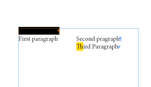
Here's a screen shot showing the shift with the first paragaph highlighted:

Shifted header.png

Votes

Translate

Translate

Report

Report
Community guidelines
Be kind and respectful, give credit to the original source of content, and search for duplicates before posting. Learn more
community guidelines
LEGEND ,
Mar 26, 2014 Mar 26, 2014

Copy link to clipboard

Copied

Hi,

It is indeed magical! 

This night, I accidentally closed the ID file without saving it!  but Peter has almost found! [Peter, to finish, try with several blue lines!]

Regarding the small bug in top, Peter is quite right! but just enlarge upwards the text block to catch up!

Votes

Translate

Translate

Report

Report
Community guidelines
Be kind and respectful, give credit to the original source of content, and search for duplicates before posting. Learn more
community guidelines
Community Expert ,
Mar 26, 2014 Mar 26, 2014

Copy link to clipboard

Copied

Yeah, multiple lines is a problem with just baseline shift. How did you do that?

Votes

Translate

Translate

Report

Report
Community guidelines
Be kind and respectful, give credit to the original source of content, and search for duplicates before posting. Learn more
community guidelines
LEGEND ,
Mar 26, 2014 Mar 26, 2014

Copy link to clipboard

Copied

Peter,

Always magical!

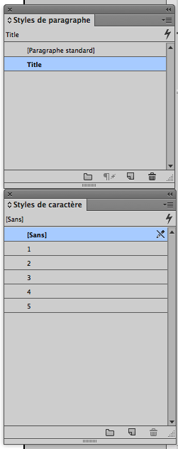
The last secret: Title para style have nested lines styles! Like this:

Capture d’écran 2014-03-26 à 13.33.33.png

Capture d’écran 2014-03-26 à 13.34.49.png

Capture d’écran 2014-03-26 à 13.35.04.png

Capture d’écran 2014-03-26 à 13.35.13.png

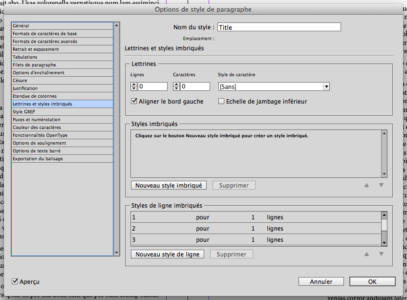
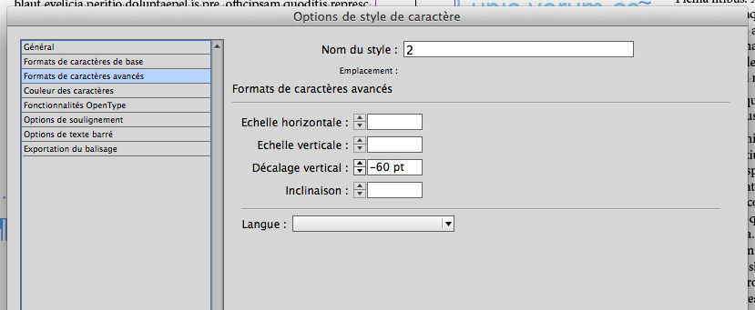
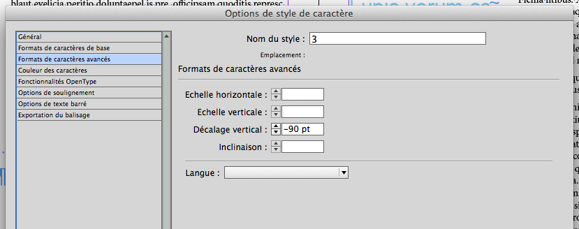
I've created 5 char styles for 5 lines.

Capture d’écran 2014-03-26 à 13.40.46.png

Votes

Translate

Translate

Report

Report
Community guidelines
Be kind and respectful, give credit to the original source of content, and search for duplicates before posting. Learn more
community guidelines
Community Expert ,
Mar 26, 2014 Mar 26, 2014

Copy link to clipboard

Copied

Line styles to add the shift. Very clever indeed.

Votes

Translate

Translate

Report

Report
Community guidelines
Be kind and respectful, give credit to the original source of content, and search for duplicates before posting. Learn more
community guidelines
LEGEND ,
Mar 26, 2014 Mar 26, 2014

Copy link to clipboard

Copied

Peter, I agree with you: I myself would have used Salah's method. I use a [Javascript] that makes it (much better and much more complicated: it can add a vertical thread of the kind hug with gradient and shadow or anything else as thread, adapting it to the height of the text in the anchored block)!

The [JS] searches all the para with a para style given and make the work. Here, it's totally "magical" 

Votes

Translate

Translate

Report

Report
Community guidelines
Be kind and respectful, give credit to the original source of content, and search for duplicates before posting. Learn more
community guidelines
LEGEND ,
Mar 26, 2014 Mar 26, 2014

Copy link to clipboard

Copied

Peter,

We're totally wrong about the little "bug" (top of the page).

It can be fixed by:

Capture d’écran 2014-03-26 à 14.25.56.png

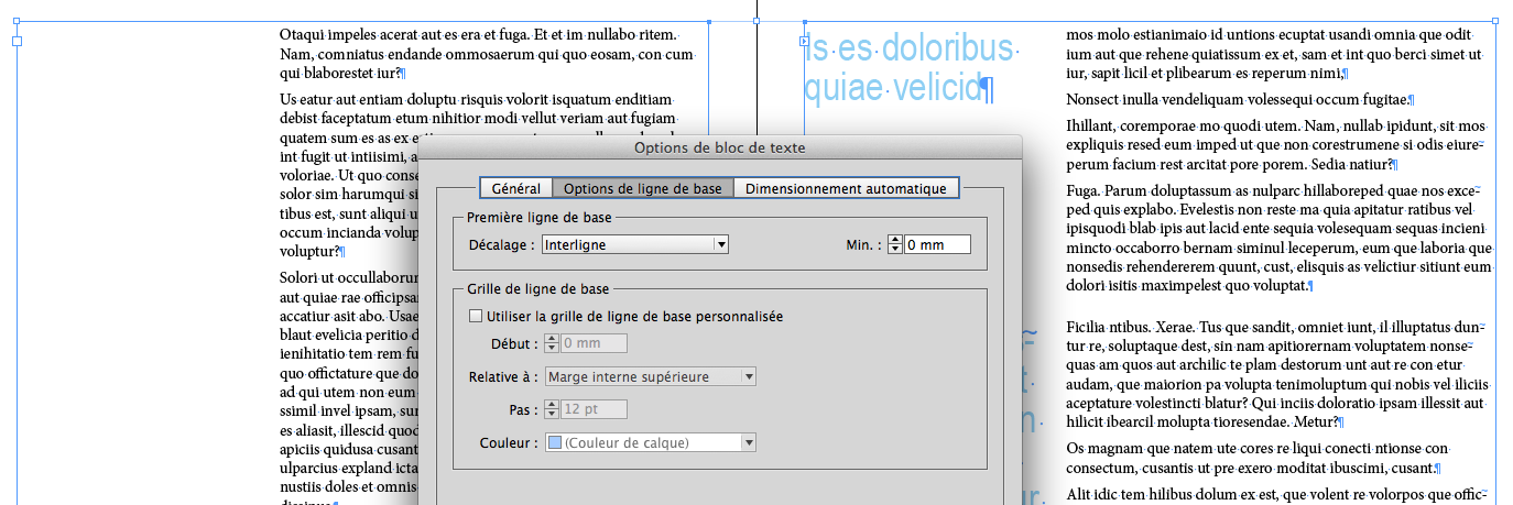
Totally normal because the "Title" para style I use has a leading of... 0 pt!

So, here, It's finally an interesting alternative!

Votes

Translate

Translate

Report

Report
Community guidelines
Be kind and respectful, give credit to the original source of content, and search for duplicates before posting. Learn more
community guidelines
Community Expert ,
Mar 26, 2014 Mar 26, 2014

Copy link to clipboard

Copied

OK, now you've got what I consider a workable solution. You can add space before to get a break between the sections when the heading is not at the top of the column.

Votes

Translate

Translate

Report

Report
Community guidelines
Be kind and respectful, give credit to the original source of content, and search for duplicates before posting. Learn more
community guidelines
LEGEND ,
Mar 26, 2014 Mar 26, 2014

Copy link to clipboard

Copied

Peter, I appreciate the term "workable solution"!    Totally agree with you!

Votes

Translate

Translate

Report

Report
Community guidelines
Be kind and respectful, give credit to the original source of content, and search for duplicates before posting. Learn more
community guidelines
Guru ,
Mar 26, 2014 Mar 26, 2014

Copy link to clipboard

Copied

Obi-wan Kenobi, that's very very nice.

Votes

Translate

Translate

Report

Report
Community guidelines
Be kind and respectful, give credit to the original source of content, and search for duplicates before posting. Learn more
community guidelines
Community Expert ,
Sep 06, 2017 Sep 06, 2017

Copy link to clipboard

Copied

@Can you recommend a way to make this work for margins that are on the outside of each page, rather than on the left of each page?

Votes

Translate

Translate

Report

Report
Community guidelines
Be kind and respectful, give credit to the original source of content, and search for duplicates before posting. Learn more
community guidelines
Enthusiast ,
Sep 06, 2017 Sep 06, 2017

Copy link to clipboard

Copied

LATEST

Hi,

Anchored objects can be set to be away from the spine, so using that method will achieve this for you.

Regards,

Malcolm

Votes

Translate

Translate

Report

Report
Community guidelines
Be kind and respectful, give credit to the original source of content, and search for duplicates before posting. Learn more
community guidelines
Community Expert ,
Mar 26, 2014 Mar 26, 2014

Copy link to clipboard

Copied

Obi-wan Kenobi wrote:

Regarding the small bug in top, Peter is quite right! but just enlarge upwards the text block to catch up!

Not to diminish the achievement here, but I'm always heistant to use a technique that can cause me to have to go through the whole document looking for problems in reflow because I've made an edit that adds or remove a line someplace. I'll admit to extending or reducing the length of a pair of frames at the bottom of a spread in order to get a better flow, but it always comes back to haunt you at some point. At least if you do it on the bottom, it's less jarring to the reader than misaligned page tops.

Using the original anchored object suggestion (and including the positioning in an object style) allows for heading of any length in any position. Yes, you need to create the anchored frames, but once done they stay where they belong when you edit.

Votes

Translate

Translate

Report

Report
Community guidelines
Be kind and respectful, give credit to the original source of content, and search for duplicates before posting. Learn more
community guidelines