• Global community
    • Language:
      • Deutsch
      • English
      • Español
      • Français
      • Português
  • 日本語コミュニティ
    Dedicated community for Japanese speakers
  • 한국 커뮤니티
    Dedicated community for Korean speakers
Exit
0

how to combine image backgrounds so that a border does not appear?

Community Beginner ,
Oct 17, 2024 Oct 17, 2024

Copy link to clipboard

Copied

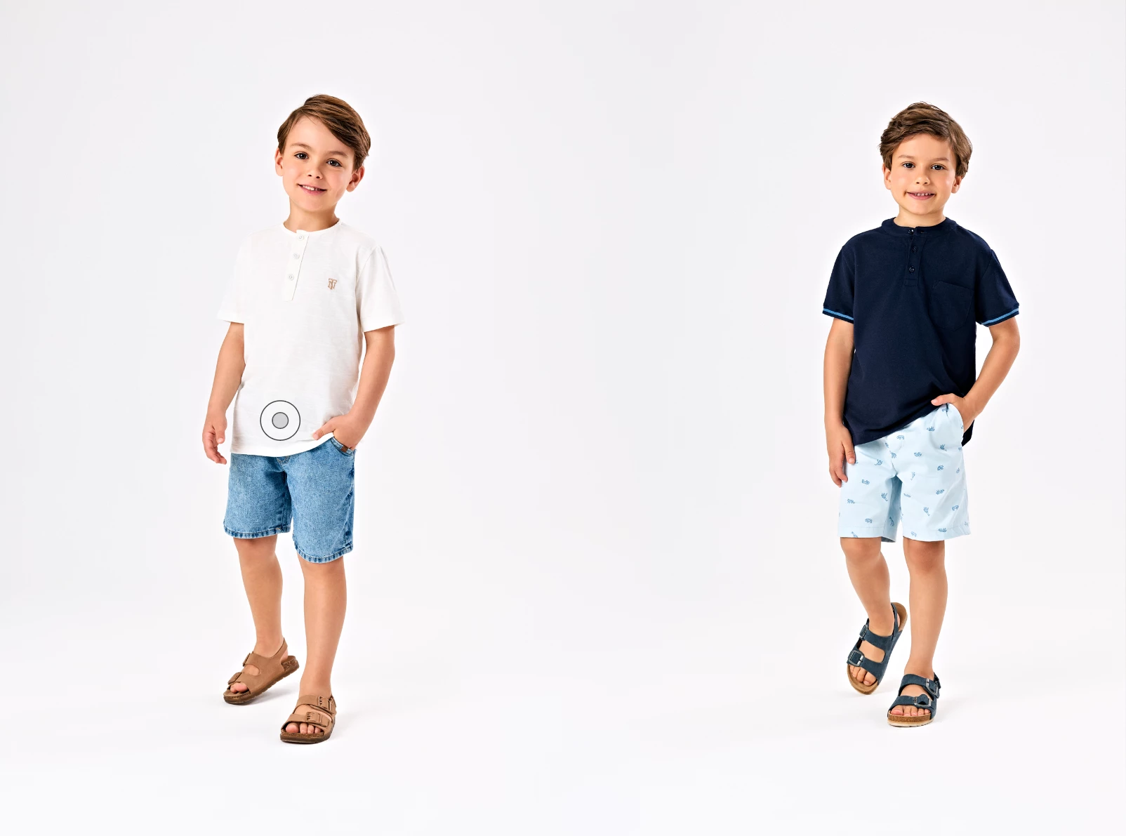
Hello, I will attach an example image, where I would like to know if I have any option to merge the background of the images in my catalog, directly within InDesign without needing to use Photoshop. The idea is that the edges do not appear and the images background borders blend togheter.Original.pngTratada.png
TOPICS
How to

Views

300

Translate

Translate

Report

Report
Community guidelines
Be kind and respectful, give credit to the original source of content, and search for duplicates before posting. Learn more
community guidelines

correct answers 1 Correct answer

Community Expert , Oct 17, 2024 Oct 17, 2024

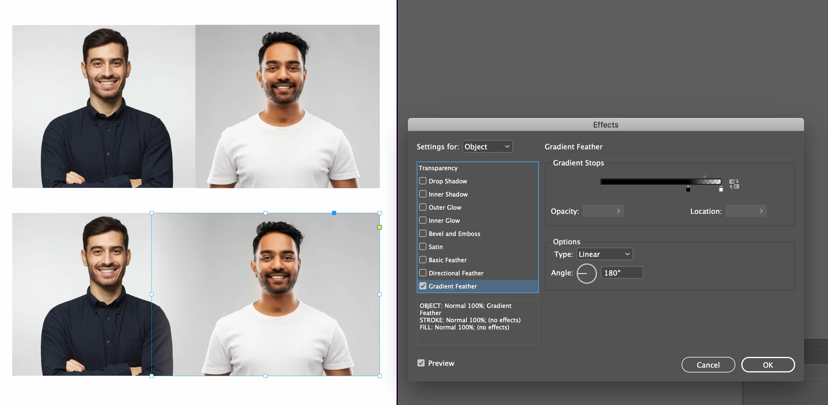
You can overlap the images and then use a gradient feather to blend images.

grad-feather.jpg

Votes

Translate

Translate
Community Expert ,
Oct 17, 2024 Oct 17, 2024

Copy link to clipboard

Copied

Do it in Photoshop

Votes

Translate

Translate

Report

Report
Community guidelines
Be kind and respectful, give credit to the original source of content, and search for duplicates before posting. Learn more
community guidelines
Community Expert ,
Oct 17, 2024 Oct 17, 2024

Copy link to clipboard

Copied

You could play with blend modes (Window > Effects) but I don't see how they will get you where you want to go. Photoshop will, of course. 


~Barb

Votes

Translate

Translate

Report

Report
Community guidelines
Be kind and respectful, give credit to the original source of content, and search for duplicates before posting. Learn more
community guidelines
Community Expert ,
Oct 17, 2024 Oct 17, 2024

Copy link to clipboard

Copied

Yes, this is a Photoshop/image management part of the process. For catalog and library work, the goal is usually to rough-mask the object/model/product, then blend/fade the background to a consistent white/gray/tint within a given range of the content, so that even if cropped the images will blend seamlessly in a layout. It should be done that way on a production basis by the photographer/image manager at a commercial level.


┋┊ InDesign to Kindle (& EPUB): A Professional Guide, v3.1 ┊ (Amazon) ┊┋

Votes

Translate

Translate

Report

Report
Community guidelines
Be kind and respectful, give credit to the original source of content, and search for duplicates before posting. Learn more
community guidelines
Community Expert ,
Oct 17, 2024 Oct 17, 2024

Copy link to clipboard

Copied

You can overlap the images and then use a gradient feather to blend images.

grad-feather.jpg

Votes

Translate

Translate

Report

Report
Community guidelines
Be kind and respectful, give credit to the original source of content, and search for duplicates before posting. Learn more
community guidelines
Community Expert ,
Oct 17, 2024 Oct 17, 2024

Copy link to clipboard

Copied

For a one- or few-shot solution, this is integral to the layout and simplest. But if (as I suspect) it's a "many" that has to be replicated across many pages, solving it at the library image level is a more... foundational? fix. Eliminate the problem in the images, as a shop practice, and not in every placement of the image/s.


┋┊ InDesign to Kindle (& EPUB): A Professional Guide, v3.1 ┊ (Amazon) ┊┋

Votes

Translate

Translate

Report

Report
Community guidelines
Be kind and respectful, give credit to the original source of content, and search for duplicates before posting. Learn more
community guidelines
Community Beginner ,
Oct 18, 2024 Oct 18, 2024

Copy link to clipboard

Copied

Thank you! This is a fast way to do it like i need. 

Votes

Translate

Translate

Report

Report
Community guidelines
Be kind and respectful, give credit to the original source of content, and search for duplicates before posting. Learn more
community guidelines
Community Expert ,
Oct 17, 2024 Oct 17, 2024

Copy link to clipboard

Copied

@Odwazny


Do what @Jeffrey_Smith suggested - but a bit differently.


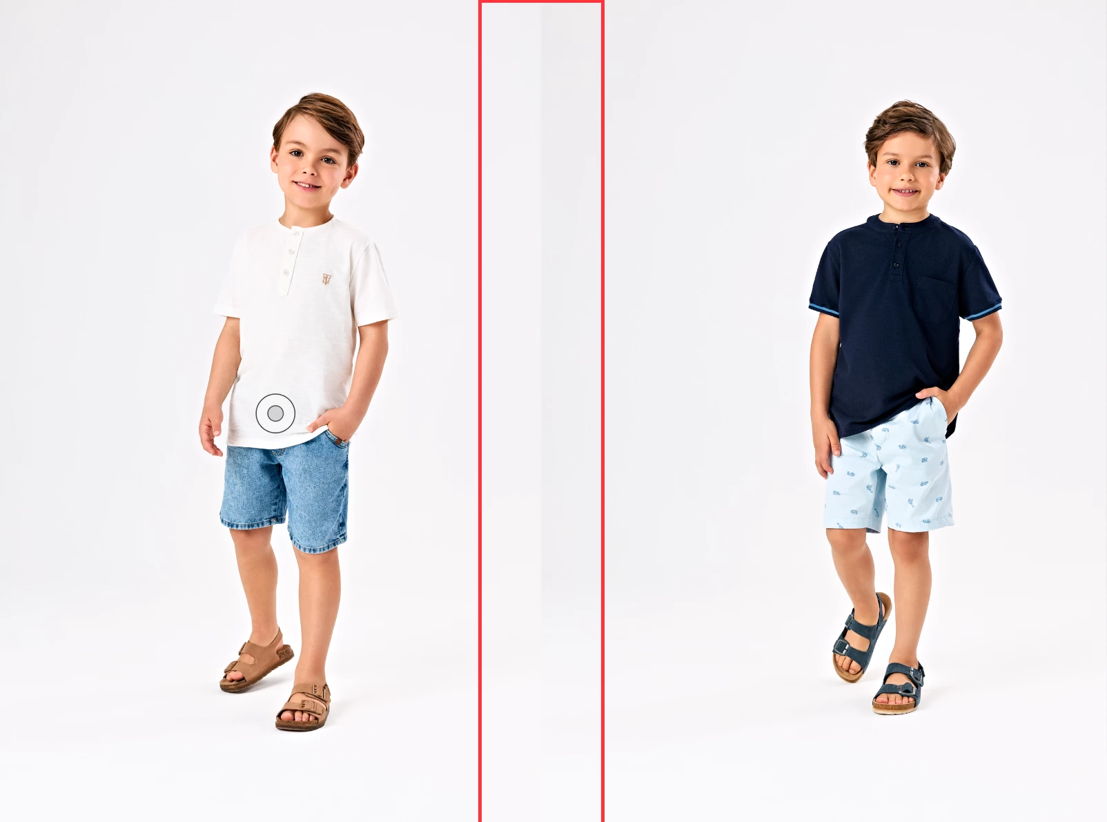
Add 3rd image that will overlap both - like the red frame on your picture - with a fill color - or better yet bitmap averaged from your photos - and blend left and right edges.


If you do it on the Master Spread - assuming all your photos have the same background - you'll have to add this 3rd image "mask" only once. 


Votes

Translate

Translate

Report

Report
Community guidelines
Be kind and respectful, give credit to the original source of content, and search for duplicates before posting. Learn more
community guidelines
Community Beginner ,
Oct 18, 2024 Oct 18, 2024

Copy link to clipboard

Copied

LATEST

That a very good way too! Thank you so much, i'll try.

Votes

Translate

Translate

Report

Report
Community guidelines
Be kind and respectful, give credit to the original source of content, and search for duplicates before posting. Learn more
community guidelines