
Answered

This topic has been closed for replies.
Anya said: "Wow that is really cool. Thanks."
Well, it's just a proof of concept.
Note: I did not test anything else, especially not, if InDesign's optical kerning does its job right in this situation. A minimized solution using this idea would be to create a font that has all glyphs from A-Z and a-z where only the first character in a paragraph is substituted with a GREP Style through the applied paragraph style. This would work for situations where every paragraph is only one line of text. A headline perhaps, followed by a subhead. All other text will be set with the original font.
Below the comparison of my special Heuristica Regular without side bearings and the original one.
I used metric kerning and no tracking with the original Heuristica:
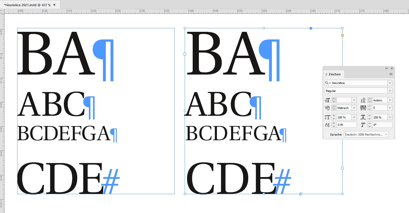
Hm. The original Heuristica used in the right text frame needs more love with built in kerning values. InDesign's optical kerning will do a better job, but still needs some tweaking as you can see with the "DE" combination in the left text frame where I used my special font created with IndyFont…
Regards,
Uwe Laubender
( ACP )
Sign up
Already have an account? Login
To post, reply, or follow discussions, please sign in with your Adobe ID.
Sign inSign in to Adobe Community
To post, reply, or follow discussions, please sign in with your Adobe ID.
Sign inEnter your E-mail address. We'll send you an e-mail with instructions to reset your password.