- Home
- InDesign
- Discussions
- Re: How to draw everything on baseline grid withou...
- Re: How to draw everything on baseline grid withou...
Copy link to clipboard
Copied
I want to size all my objects (text, images, everything) to exact document grid increments for the sake of easy drawing/resizing of objects on new pages.
So I activated snap to document grid.
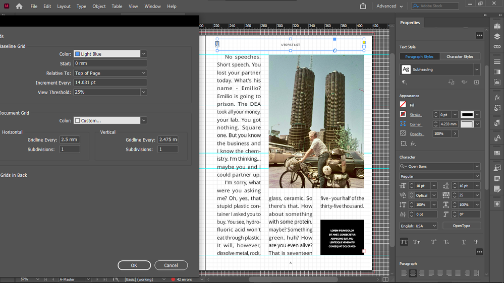
I never need to display my baseline grid because I have set its height to my document grid cell height, so it's incorporated in my document grid.
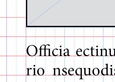
The irritating thing is that everything works well with the document grid increments objects (bottoms, sides) except the upper boundary of images.
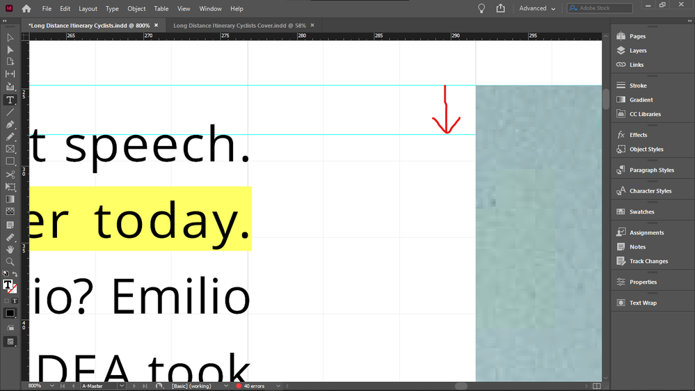
So I always have to crop the top of all images with text on the side down to the median line of the the text line on the top, to get them top-aligned, the cropping shown by the arrow:
So if I do crop them (and I have to, because the disalignment is visible), then all object boundaries are layign on the document grid, except the top of images that have text on the side - so this is quite disappointing.
Because the point is to not see any lines between document grid lines.
The disalignment is especially visible now when I doubled the size of my document grid blocks / and height of my baseline. I did that to be able to see always the real number of baseline grid blocks, no matter the zoom level - because I use them as units, when drawing/resizing my objects on the grid. When my grid block was twice as small, InDesign displayed 4 blocks as 1 block in Fit Spread In Window mode, and that is the mode I use for drawing / resizing / editing - except the top cropping of images I mentioned above.
Forcing my text into every second baseline (for this I must revert my document grid block / baseline grid height to half to get a reasonable leading - which I can't because I must see the real number of blocks at any zoom level) does not solve this issue either, because even if the baseline height is not that tall, the top disalignment betwen the text frame and image is still visible, and additionally, having text in every second baseline only, it causes the top offsets of elements under the text box to be taller, if the number of lines in the text box is even, because then the one at the bottom will be forced to stay empty, adding the impression of extra height to the top offset of the element below it.
Does anyone know such a fix for this issue, that would enable me to keep everything: my large baseline height / document grid cell dimension, not forcing text in every second baseline, and not needing to crop the top of images with text beside them after placing those images - that would create lines inside docuemnt grid cells, and that's what I wanted to avoid by drawing exactly on the document grid, so it wouldn't mess up my vertical math when calculating in my grid units (which I would like to use also as real units, for example when setting offsets, because remembering all the decimals and dimensions of say 3 document grid blocks is not practical).
Thanks.
 1 Correct answer
And it's very unlikely that you will get other text to align using this setting. Here's the only real solution to your request that everything line up on a grid AND there be no gap above text when next to an illustration at the top of a page:
Probably not what you want, again. But if it's not clear by now, what you want is basically impossible. You can have your precise grid that everything snaps to regardless of layout variations, or you can have that top-text/illustration alignment, but (ot
...Copy link to clipboard
Copied
My goal with this would be to:
1. draw all objects on exact document grid increments when composing (my document grid cell height is same as my baseline height)
2. perfect alignments
I hope this can actually work, will report back later after further testing.
Copy link to clipboard
Copied
My dimensions (maybe your dimensions work differently?)
Copy link to clipboard
Copied
I meant how to draw everything on document grid in the title, sorry for the error.
Copy link to clipboard
Copied
I am more than a little baffled at the depth of complexity and confusion in this thread.
This took me about ten minutes to set up from scratch:
...and as nearly as I can tell, it addresses every point the OP is concerned with. It uses three text styles, an object style, and adapts with perfect alignment to every adjustment made.
—
┋┊ InDesign to Kindle (& EPUB): A Professional Guide, v3.1 ┊ (Amazon) ┊┋
Copy link to clipboard
Copied
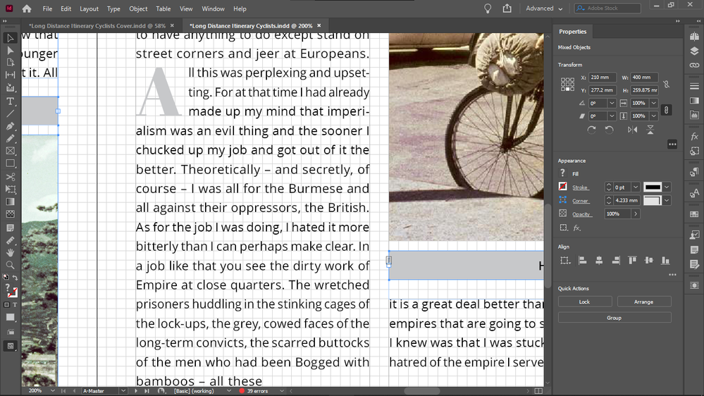
Top of text and top of image is not flush.
That was my issue, I needed to crop the text down.
How can you solve that without cropping off the top of the image?
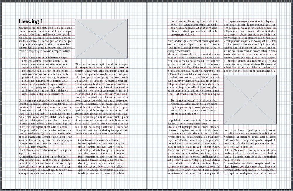
The 2 offsets marked in each image are not the same dimensions.
Okay, you mean maybe they don't have to be? I know they can be equal if you don't draw your objects in exact document grid increments (some object boundaries would be lying in between document grid lines).
Copy link to clipboard
Copied
I needed to crop the top of the image down, not the text. Sorry for the typo.
Copy link to clipboard
Copied
The top of the image and the Heading are aligned to nonexistent differences. The image may distort this slightly. Head right-aligned to save space for this image:
The gutter could be changed to another width.
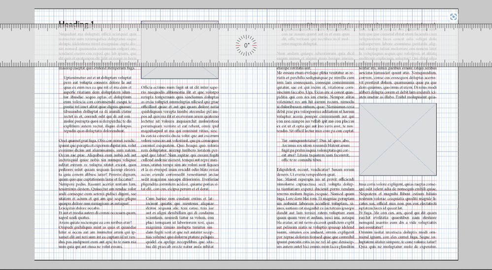
What you are objecting to, at monumental length, is that space above and below a line of text is not identical. This applies exclusively to the inlaid graphics and could be eliminated, while retaining the snap-to-grid layout, by doubling the vertical document grid (here simulated):
You can use any number of such offsets to accommodate for top spacing, but as that differential is universal in nearly every well-laid-out publication in any library, the problem may not be what you are choosing to make it.
—
┋┊ InDesign to Kindle (& EPUB): A Professional Guide, v3.1 ┊ (Amazon) ┊┋
Copy link to clipboard
Copied
That is the vertical disalignment is what I meant, marked with red. Top of image and top of text to its right on the right spread. (Not with the heading.)
I just laid out my observations.
If you say that that is normal and accepted, fine. I want to try to have exact identic offsets, and flush umage top with the text besise it.
I don't understand how doubling the doc grid cell height will achieve equal offsets, but I will experiment with it.
Copy link to clipboard
Copied
But my goal is to be able to have offsets of the exact same dimensions, while being able to scale all my objects to exact document grid increments (to draw them on the grid with Snap To Document Grid enabled), so there would be no object boundaries lying in between document grid cells.
Because moving offset lines and object lines off the document grid would be the only way to fix the issue on your spread.
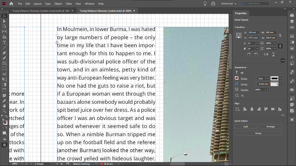
I am drawing everything on exact document grid increments:
But to do that, I must force text to every second line and increase the text height (size) to take up a full baseline height (which for me is same as document grid cell height).
Copy link to clipboard
Copied
If it's not too much time out of your efforts, you might read up on "cap height" and "x height."
That may help you understand this:
- If the tops of the letters touch the top margin, the bottoms will be above the first baseline in the frame. You will have gross and ugly misalignment.
- If the tops of the letters touch the top margin and the bottoms rest on their baseline, you will have an unreadable block of solid letters (with caps extending above the prior baseline). Here is type set to the specs you are trying to achieve:
- This is not a fault of InDesign, any font designed for readability (that is, not one of the display fonts with identical cap and x heights), or of typography in general. It is in fact close to 100% universal.
- No final publication has the grid lines in it to emphasize these small offsets. For some vast majority of readers, the "extra space" is somewhere between invisible, unnoticed and understood to be part of typographical layout.
In other words, you can't simultaneously have space and no space. And no properly typeset page can achieve what you are laboriously trying to achieve, any more than you can have a round square or a circle with corners or a square millimeter that's three inches across.
But you're welcome to keep at it, I guess.
—
┋┊ InDesign to Kindle (& EPUB): A Professional Guide, v3.1 ┊ (Amazon) ┊┋
Copy link to clipboard
Copied
James, you forgot to mention Ascenders and Descenders... 😉
Copy link to clipboard
Copied
Hi Chris, all fonts have different metrics, which don’t necessarily align with your document grid setup.
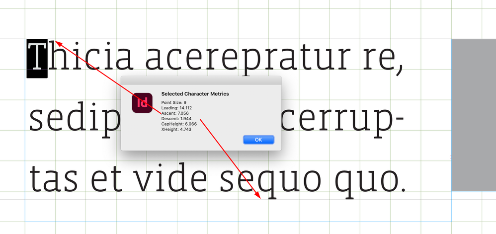
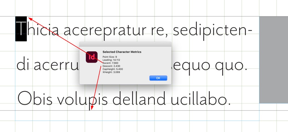
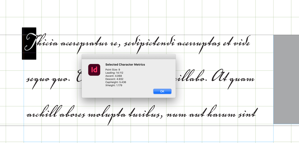
To illustrate Jame’s last post, I can get a font’s metrics (Cap Height, x Height, Ascent, Descent) via scripting and those numbers change depending on the font.
I could set up a document and baseline grid to match the font’s Ascent line—the distance from the baseline to the top of the ascender (which is designated by the font’s designer). This puts the text’s ascenders near the top of the grid line, but the descender drops below the grid line:
The above is close to what you are looking for, but you’ll be a slave to the grid—simply change the point size or the font, and the text will no longer align to the grid. This font’s ascent is about a half point higher, so nothing lines up:
This font’s ascent and descent are almost equal—the descender hits the grid line, but the text doesn’t optically align because of the very small x-height:
Copy link to clipboard
Copied
That is what I wanted, to be a slave of the grid.
I think that's why InDesign disables Smart Guides when Snap To Document Grid is activated, because you are either supposed to align things by using only Smart Guides, or by using only the Document Grid.
People in this forum doesn't seem to use the Snap To Document Grid, and prefer Smart Guides.
InDesign makes it a choice, and I have choosen to be a slave of the Document Grid, as you say.
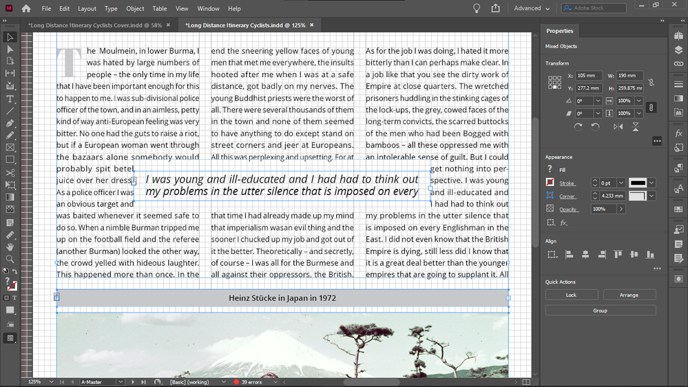
It's not a problem if you put text that is very different in a separate object. Styles difference like bold or italic doesn't cause problems, even smaller font size changes, don't for example look at my excerpts: they are much larger in size, but they play well with my system of forcing text in every second baseline (and perfectly identic offsets everywhere), they don't cause any issues:
Copy link to clipboard
Copied
But I am forcing my text in every second (base)line, by choosing a font size vs leading that will force that, so I don't have the crammed text problem:
Copy link to clipboard
Copied
Maybe that was not apparent for you and for others in this thread, since I never display my baseline grid, because it's the same height as my doc grid height - that my text is forced into every second baseline. That's how I get the proper leading distance and place for ascenders, descenders, no crammed text.
Copy link to clipboard
Copied
My text is forced into every second baseline, so i don't have the problem you describe.
My baseline grid was not enabled in any of my screanshots before in this thread, so I am not sure that those who commented realized that I forced my text by purpose to every second baseline, so it doesn't created the crammed text problem you describe:

If it's not too much time out of your efforts, you might read up on "cap height" and "x height."
That may help you understand this:
- If the tops of the letters touch the top margin, the bottoms will be above the first baseline in the frame. You will have gross and ugly misalignment.
- If the tops of the letters touch the top margin and the bottoms rest on their baseline, you will have an unreadable block of solid letters (with caps extending above the prior baseline). Here is type set to the specs you are trying to achieve:
- This is not a fault of InDesign, any font designed for readability (that is, not one of the display fonts with identical cap and x heights), or of typography in general. It is in fact close to 100% universal.
- No final publication has the grid lines in it to emphasize these small offsets. For some vast majority of readers, the "extra space" is somewhere between invisible, unnoticed and understood to be part of typographical layout.
In other words, you can't simultaneously have space and no space. And no properly typeset page can achieve what you are laboriously trying to achieve, any more than you can have a round square or a circle with corners or a square millimeter that's three inches across.
But you're welcome to keep at it, I guess.
—
By @James Gifford—NitroPress
Copy link to clipboard
Copied
I didn't mean to quote your whole reply, sorry for that, I only quoted the first 2 points, i don't know why did it grab your whole reply.
Copy link to clipboard
Copied
I didn't mean every second baseline, I mean that my baseline is the double of the x height, what you said in your previous comment that you need to double it to eliminate the spacing issue.
Copy link to clipboard
Copied
My text is forced into every second line.
Copy link to clipboard
Copied
And it's very unlikely that you will get other text to align using this setting. Here's the only real solution to your request that everything line up on a grid AND there be no gap above text when next to an illustration at the top of a page:
Probably not what you want, again. But if it's not clear by now, what you want is basically impossible. You can have your precise grid that everything snaps to regardless of layout variations, or you can have that top-text/illustration alignment, but (other than as in one of the last two examples I've posted, which are otherwise nonsensical) you can't have both.
—
┋┊ InDesign to Kindle (& EPUB): A Professional Guide, v3.1 ┊ (Amazon) ┊┋
Copy link to clipboard
Copied
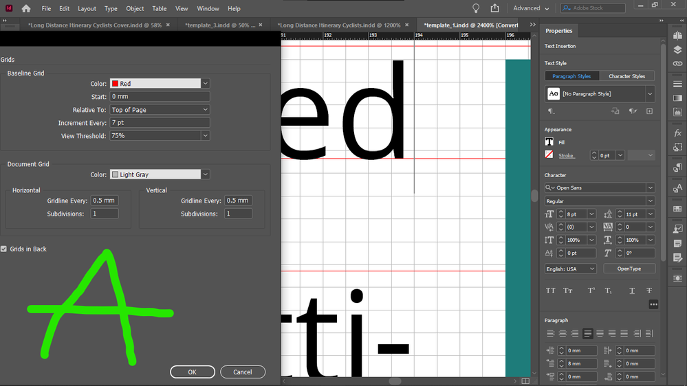
It seems that I didn't achieve any actual difference in alignment with my tweaks (marked with B) compared to the original setup of my template (marked with A):
I will have to start it over.
Copy link to clipboard
Copied
What I did here it seems:
If you want to scale all objects on exact document grid increments, and get your x height flush with the top of the images simultaneously, make the line height (base line height) twice the x height, and the x height will be flush with the top of images.
In the original copy text of my template:
Magazine Template by -BeCreative- on Envato Elements
The best template that I could find out there (screenshot A) the x height is significantly lower than the top of the image, which is a visible vertical disalignment.
I am not sure that increasing the font size would have solved that issue, but that is not possible anyway becaiuse the font size is fixed - as per requirement.
And, the text is in every second baseline in the original copy text of the template (Screenshot A).
And my solution on the B screenshot is also wrong, because the x height should be flush with the top of the image, not the cap height.
Why?
Copy link to clipboard
Copied
I mean why is the text in every second baseline in the original template copy text?
Copy link to clipboard
Copied
And this is what happened when I reverted my font size and line height and baseline grid dimensions to the original template, before I started my tweaks
(I did not change back my document grid so I have hidden that):
You recommend me to go back to the original setup (done by the template author - top template from Envato)? I think yes because nobody seems to like teh setup I made...
Anyway the odd lines requirement rule that emerged with my setup are you sure that it's not a thing in the original setup?
Copy link to clipboard
Copied
Additional screenshot about the reverted original settings:
