Copy link to clipboard
Copied
In the past, my understanding has been that you need to copy your image to the clipboard, place your cursor at the insertion point, and then when you paste, your image will be placed at that location in the text in your text frame... but you have to drag the image down so it doesn't overlay text above it, and then you have to add a bunch of CRs to move the text that should be below it, so it moves down below. The image is in place, but doesn't displace the text.
However, I was just placing some images, and I pasted in a couple of pictures that showed up right where I wanted them (below the para I was pasting beneath) and it automatically pushed the subsequent text out of the way, so that it appeared below the bottom edge of the photo. The image was effectively *in* the text flow, and it didn't require any of that usual positioning, or extra CRs to get things positioned properly. Needless to say, this is a LOT faster when I have a bunch of images to place... but I have no idea what I did that made it behave that way. Now, when I paste an image, it does it the old way again, I have to manually create the right positioning/space for each picture.
How do I get it to do that nice *in the flow* thing again?
<Title renamed by MOD>
 2 Correct answers
How do I get it to do that nice *in the flow* thing again?
The Return that has the graphic needs to have Auto Leading. It's the only time I use it. If you have, say, 11/13, then your image has 13 points to display itself.
No extra returns, no dragging, just auto leading. Then format the paragraph return with Space above and below, alignment, etc.
The post you are referencing appears to be using Inline graphics and not the more complex anchors. Anchors are totally worth exploring—and offer far better controls—but inline graphics are easy to understand without much effort. I think the variations you are dealing with are impacted by the leading (line spacing) values off the empty paragraph you are pasting into:
In this first shot, my leading is fixed at 12 pts.
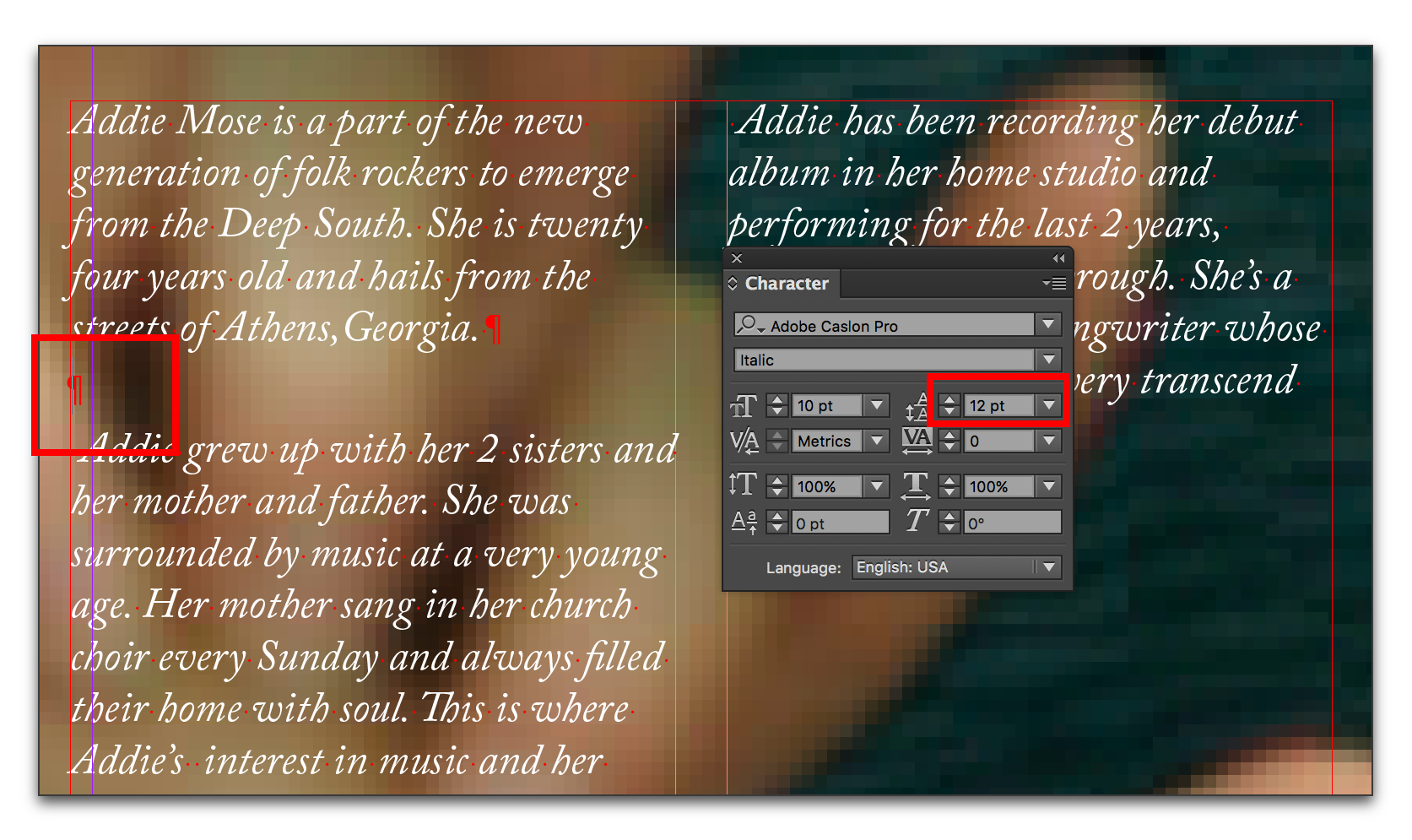
The pasted image overprints.
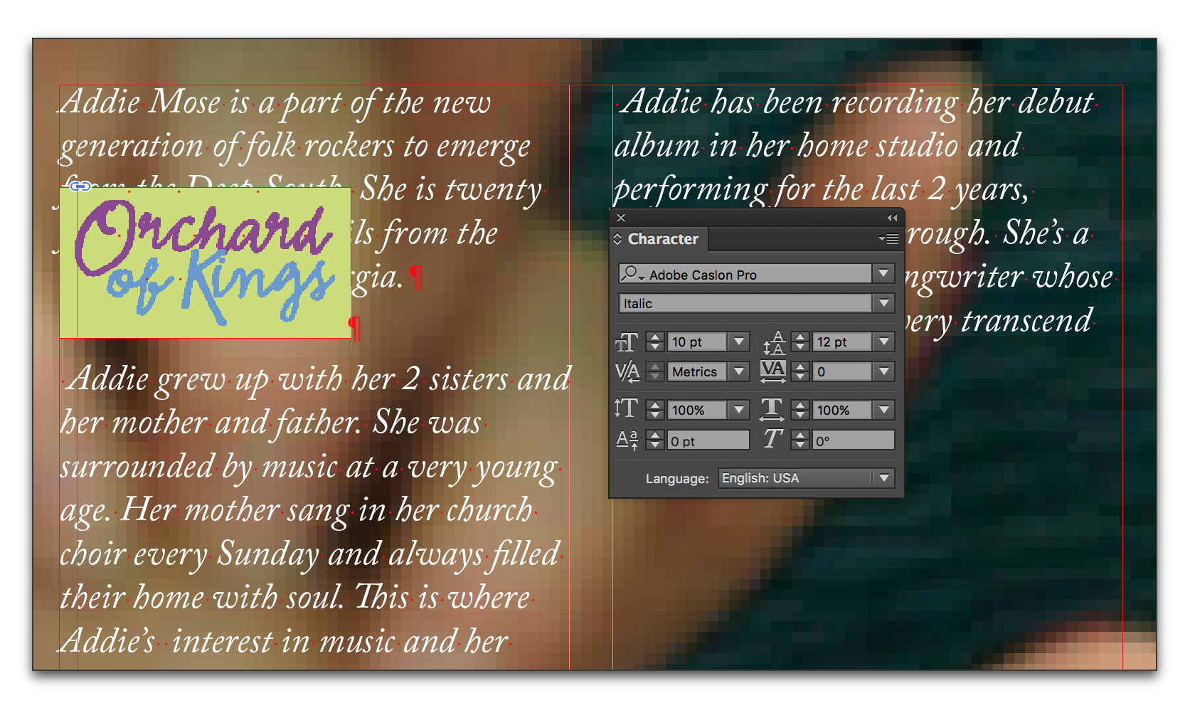
Here my leading is set to auto:
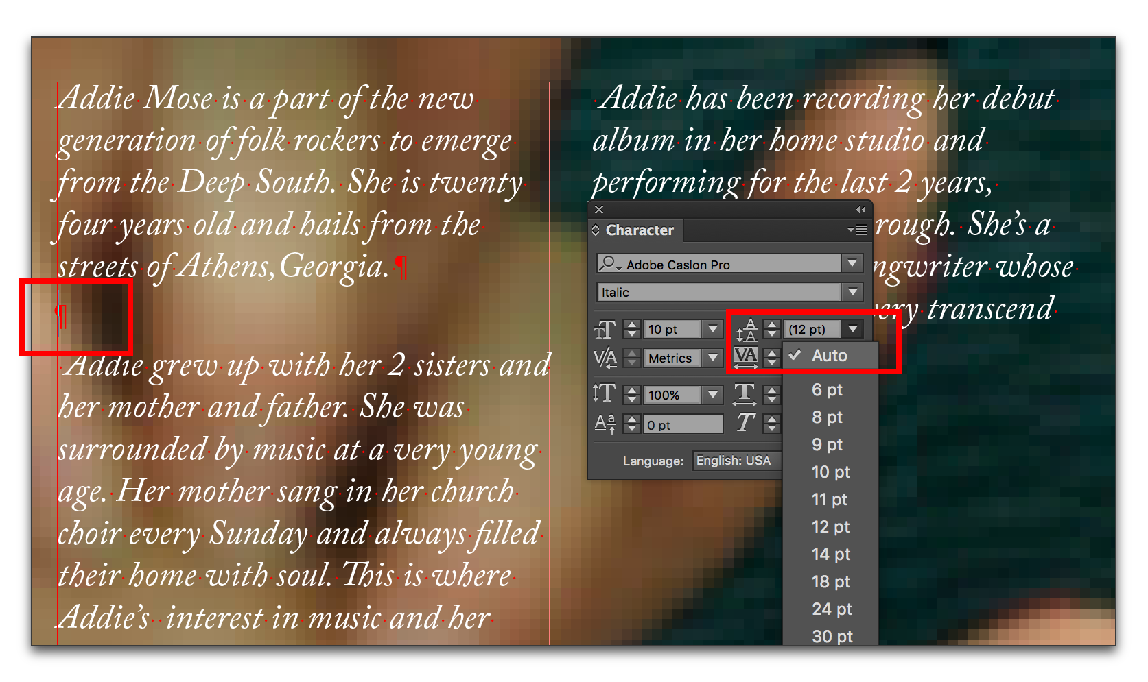
The pasted image forces
...Copy link to clipboard
Copied
CRs shouldn't be necessary.
Either you place an image in-line so that it moves with the text (Anchored Object):

This is sometimes useful, especially with icons and other small graphics.
Or you create a frame and place the image in that frame (respectively you create the frame during image placing).
In both cases you can add a text wrap to that frame, so that the text flows neatly around the frame, the way you select it.

You may even include images with an alpha channel and wrap around that channel.
Copy link to clipboard
Copied
I'm following a process I read on a few blog posts some months ago (I can't find them anymore, though).
I start with a text frame like so:
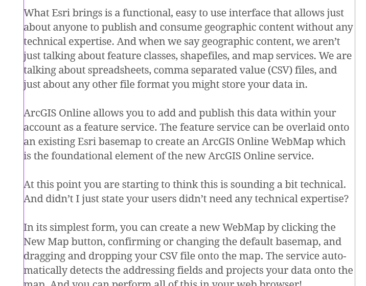
I then create an extra line to paste the image into
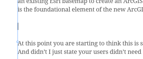
When I first paste the image in, its bottom is at my insertion point (note the "At this point..." text) and the image extends upward, covering the text that is there (It doesn't push it out of the way, but covers it)

I click & drag the image downward, and it reveals the text it was covering, but now goes behind the text below it. I end up having to add carriage returns to get the "At this point..." paragraph to drop below the image bottom.
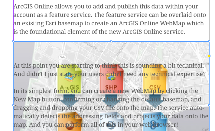
However, I was pasting in images, and a few of them skipped all of this, and the pasted image just showed up below the para I pasted below, and it pushed the next para below the image automatically. I have no idea why that happened, though. I imported each image in the same way, and pasted in the same way (as far as I know).
Copy link to clipboard
Copied
The post you are referencing appears to be using Inline graphics and not the more complex anchors. Anchors are totally worth exploring—and offer far better controls—but inline graphics are easy to understand without much effort. I think the variations you are dealing with are impacted by the leading (line spacing) values off the empty paragraph you are pasting into:
In this first shot, my leading is fixed at 12 pts.

The pasted image overprints.

Here my leading is set to auto:

The pasted image forces the text out of the way.
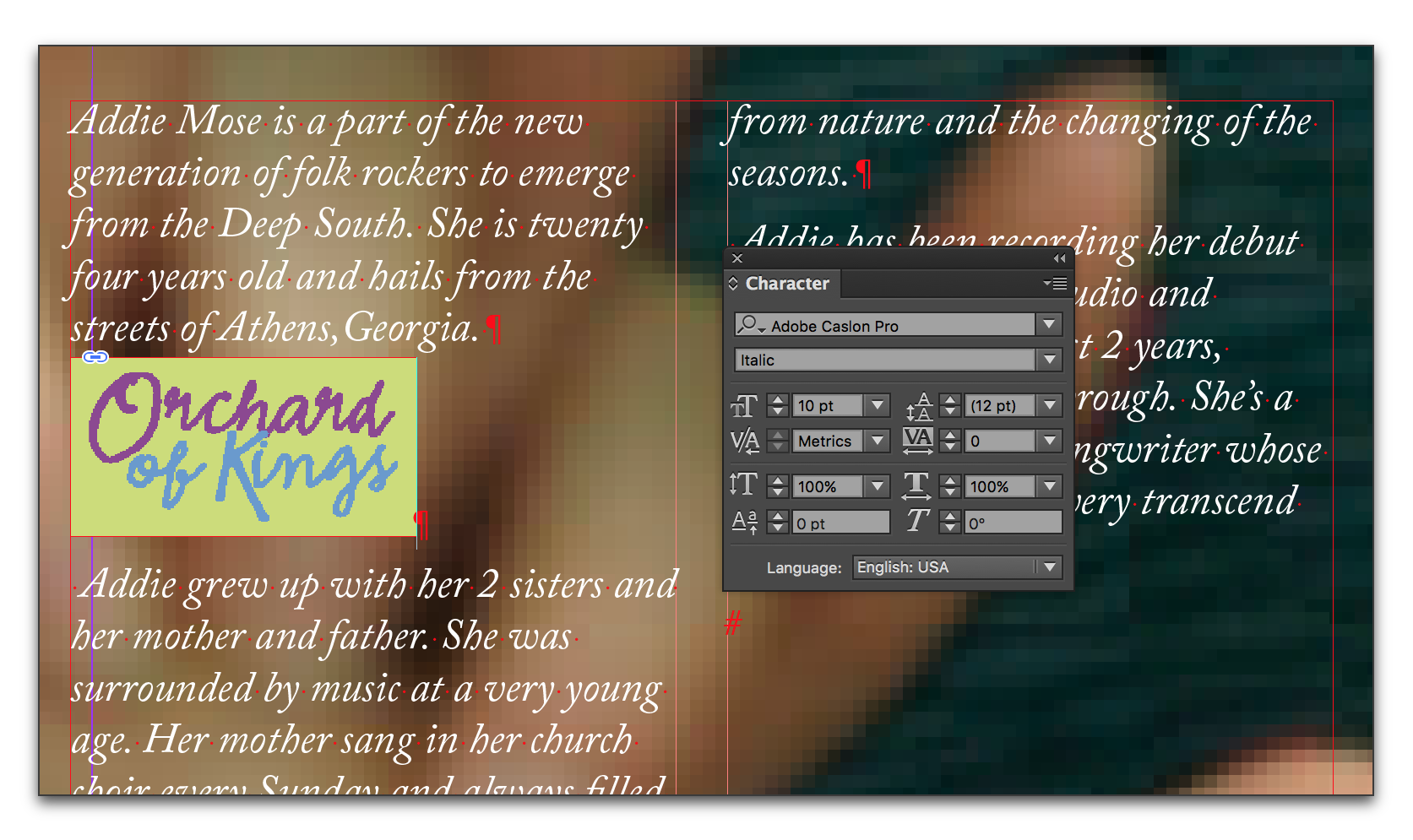
Use this information to set up a paragraph style, called for example, "Anchor" to control the leading, along with any desired indents, alignment and spacing before and after. It will make things easier for you, and you can update the para style and update all the image settings at once.
Copy link to clipboard
Copied
Brilliant! This works perfectly.
Copy link to clipboard
Copied
This worked for me. Thank you!!!
Copy link to clipboard
Copied
How do I get it to do that nice *in the flow* thing again?
The Return that has the graphic needs to have Auto Leading. It's the only time I use it. If you have, say, 11/13, then your image has 13 points to display itself.
No extra returns, no dragging, just auto leading. Then format the paragraph return with Space above and below, alignment, etc.
Copy link to clipboard
Copied
Thank you very much jane-e and BarbBinder. Looking at it now, it makes sense - auto leading allows InDesign to expand leading to accommodate the height of the pasted item... but I imagine you can see why that was unintuitive, and nearly invisible to me as to what was actually going on.
I will have to check out anchors as well.
Copy link to clipboard
Copied
Jay,
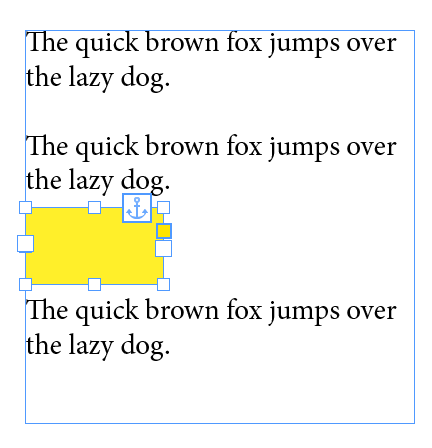
When you cut with the Selection tool and paste with the Text tool (which is the old-school method), you will find that you have an Inline Anchored Object.
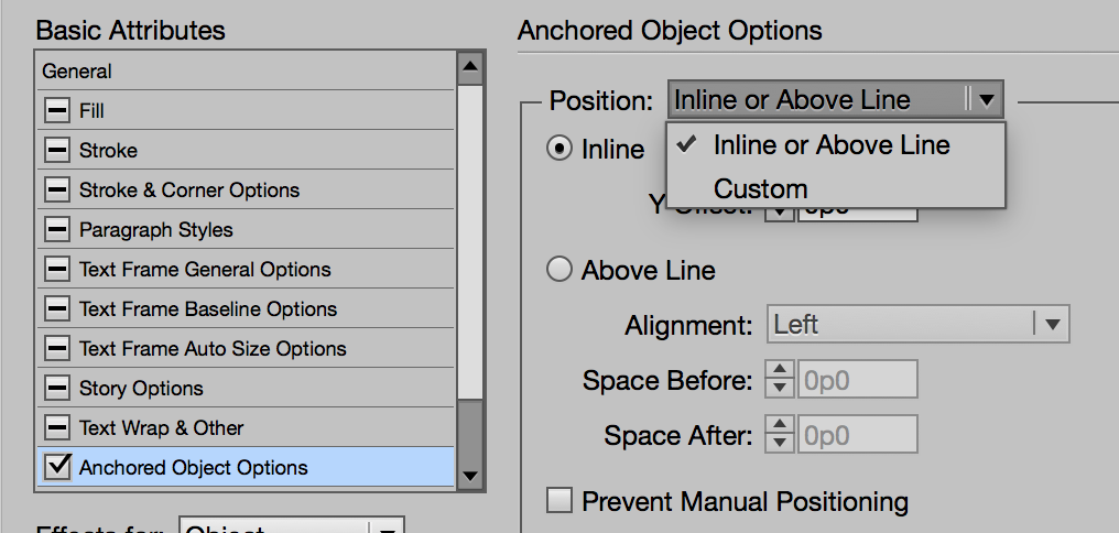
Option + Click that Anchor to play with the settings for Inline and Above Line, then click the drop-down and change to Custom and play some more. Make sure Preview is on, of course. And after you have played, read up on Anchors. Here is one place to start: https://helpx.adobe.com/indesign/using/anchored-objects.html
Pro tip: to release the anchor, select the frame with the Selection tool > Cut > Paste
Have fun!

Copy link to clipboard
Copied
Very helpful. Thanks!
Right now, I am importing an image with CMD + D, placing it over my column of text to line up with the guides, dragging the corner in to make the image narrow enough to fit within the text column, cutting (CMD + X), placing my cursor, applying the style to my empty line so it has the auto leading, pasting in the image, and then moving on to the next one. Is there anything I can do to make the process more efficient if I have like 50-100 of these to place?
Copy link to clipboard
Copied
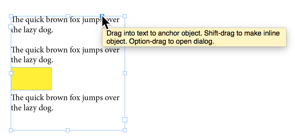
After you place the image, instead of cutting it, you can Shift + Drag the Anchor widget to your blank line with Auto Leading and a Paragraph Style. Also, apply an Object Style to the frames. That way if you change your mind about how you want them to be anchored, you can redefine the style quickly. Uncheck the attributes you don't want to include.
Copy link to clipboard
Copied
Thanks!
Copy link to clipboard
Copied
I made a video to show how to do this multi-step trick to getting a picture to reflow and following inline text in Indesign:
Find more inspiration, events, and resources on the new Adobe Community
Explore Now

