Kelli Jae Baeli
Inspiring
September 24, 2019
Question

Keeping text out of the gutter on Amazon KDPP

  • September 24, 2019
  • 2 replies
  • 2907 views

I need some clarity on print novel formatting errors from KDPP. Amazon suddenly started rejecting print manuscripts due to infringement on the gutter by text. (I've never had this issue before).  I have always set all the margins and gutter to their specification, but still, the problem persists. I tweaked it enough last time to get the project through, but i have another thirty-two novels of mine that i will be updating in ID, and need to understand why this is happening and how to avoid it. Adobe support has been no help at all on this. They either address something i did not ask, or they condescend by explaining to me what a gutter is.
Here's the screenshot from Amazon KDPP

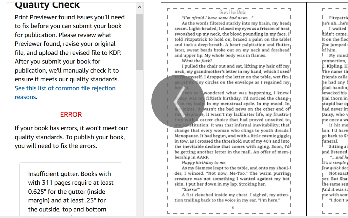
and here are my settings.


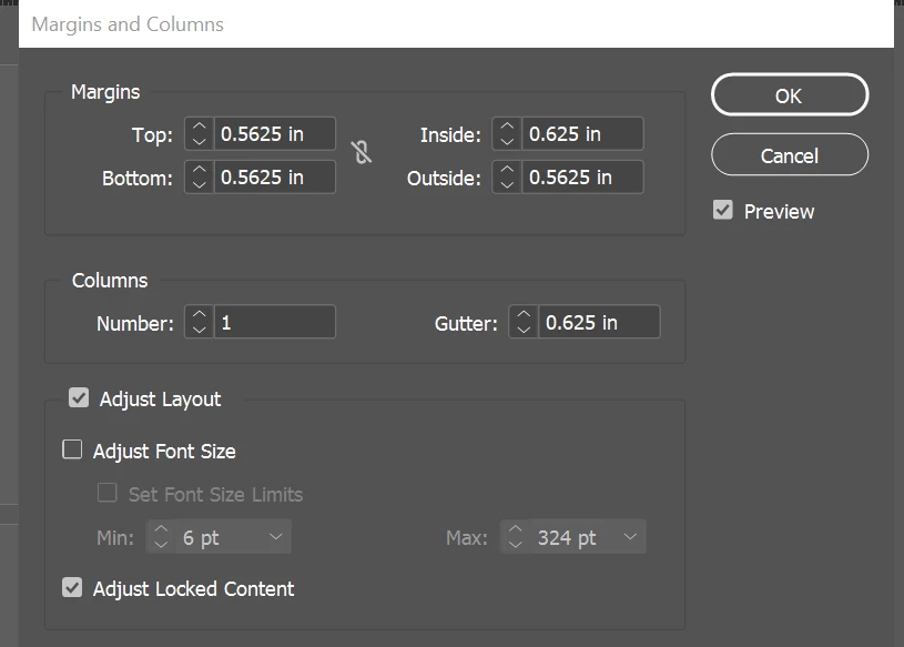
So perhaps the question is, what is the difference between margin/gutter settings AND the text frame that might be on the page? I place my text frames according to the guides created by the settings. Since most of these issues with KDPP seem to be about text infringing on the gutter, even when the page settings are correct, how do I keep this from happening? Don't the guides for the text frames match the appropriate space where text is allowed? If the proper settings won't do it, what will?


I appreciate any insight.


This topic has been closed for replies.

2 replies

James Gifford—NitroPress
Legend
August 9, 2024

Just for any future reference, this post is confusing a couple of different book layout terms. What KDP refers to as "the gutter" is what most publishers and designers would simply call "the inside margin." This misuse comes, probably, from Word, which has a completely confusing double definition of "the inside margin" and a separately settable value called "the gutter" — which is almost/kinda accurate. In absolutely strict terms, the inside margin is the space between the text and other live content and the inner edge of the sheet/page. The "gutter" is a variable amount that is lost to reader view from the bound edge to the point where text etc. can be clearly read. Designers set the inner margin; the gutter is mostly determined by the binding process. But, probably courtesty of MS-speak, KDP has blurred and confused the two so that even somewhat experienced designers have no freakin' idea what they're talking about.


And, of course, the "gutter" on the above menu refers to the space between columns and has nothing to do with margins — which again is completely correct, but somewhat antiquated usage.


Back to 2024, now.

Inspiring
August 9, 2024

Yes, the gutter thing annoys me. I actually do know what a gutter is and it has always annoyed me that Word and KDP do not distinguish between it and the inside margin. Up until now, I've always made sure both are set to their requirements, just in case, but it doesn't help in this situation. Lightning Source does know the difference, and I've done a few layouts for LS-published books and despite the fact that they're quite persnickety themselves about their requirements, as least you can get answers and fixes for them when they come up. (For example, they're very picky about Ink Coverage being under 240% (I think?) in color layouts, which they really should be.)  On the other hand, getting anything out of Amazon KDP is like pulling teeth.

—Michael
Kelli Jae Baeli
Inspiring
May 9, 2023

Wow, no responses? I'm still having this issue...can't anyone offer any sort of solution?

Inspiring
August 9, 2024

I wish you'd had some advice on this, because I'm currently having the same problem.


I have a very complex layout, and changing the margins will throw it off, create new pages and pushing my graphics out of place and will force me to have to reset the entire layout with new pages, which also means I'll have to redo my cover to accommodate the extra pages.

This is a MAJOR pain, because I had the margins set according to Amazon KDP's requirements but they still want more room.


Here's the thing though. It's apparently my font, Adobe Jenson Pro, which has serifs, and the serifs are overhanging into the gutter. I think the question should be is there anyway to tell InDesign to just not let that happen? Something similar to optical margins. Maybe something in the Paragraph Style that tells it to not let the fonts overhang no matter what.


So, that's all I've got. Maybe check to see if Optical Margins is turned on. This causes text to overhang the margins. In my case, it's turned off and I'm still having the problem, but maybe check anyway.

—Michael
rob day
Community Expert
Community Expert
August 14, 2024

Again, I'm not arguing that the Amazon bots are not overzealous. Clearly, they are. But art is about choices. Maybe some people don't want their serifs to stick out. Maybe some people have reason why they don't want it to happen. In this case, I love my elegant classic serifed fonts, and I certainly don't care whether they stick out or not. But in this case I don't want it to happen, not for artistic reasons, but because I want my effing book to get published. But if it truly is about the artistry as you claim, then surely artists have broken the rules more than anyone else. That's how they make something new and challenging. They don't do that by sticking to the accepted rules of centuries.


Maybe some people don't want their serifs to stick out.


All of this relates to InDesign’s OMA feature—if you turn it off, the punctuation will not hang outside of the text frame. You could file a bug report or feature request, but there is little chance Adobe will alter an important typographic feature like OMA because of a printer’s quirky preflight requirements.