

Paragraph rules: fixed distance

Copy link to clipboard
Copied
Hi there… i couldn’t find the answer to this question in the forum, so…
I would like to create a rule above a heading that has always the same distance between the top of my heading and the paragraph rule above it. Independently the heading font size. Let me explain.
Say i have a heading font size of 72 pt and a heading rule above with an offset of 24 mm. When i change the heading font to example 36 pt the distance between the top of the heading and the heading rule increases, because the offset setting is still 24 mm. To keep the distance the same i need to change the heading rule offset. Is there a way or a work around to keep the distance always the same, independently the heading font size and without changing the heading rule offset manually every time?
Hope you understand what try to achieve! Thanks!


 28
Replies
28
28
Replies
28
Copy link to clipboard
Copied
It's not available in the InDesign interface. If you don't get an answer here, you might ask in the InDesign Scripting forum (if it's scriptable).
Copy link to clipboard
Copied
Thanks. I will do that.

Copy link to clipboard
Copied
Hi grif030 ,
a wonderful example for a feature request:
Distance from Rule Above or Rule Below should be a percentage of the Point Size or even better, the Cap Height of the font used in a paragraph style.
Go to InDesign Uservoice, do a feature request, come back here to post the link to the request so that we can vote for it:
Regards,
Uwe
Copy link to clipboard
Copied
"Not available! …" [no comment]
David Blatner [thanks! 😉 ] indicates us an interesting approach (not needing a script) that could be totally acceptable despite its weird lack of precision! …
https://indesignsecrets.com/topic/paragraph-rules-fixed-distance-above-text
Best,
Michel

Copy link to clipboard
Copied
its weird lack of precision
As the font size is reduced the ascender distance is also reduced, but the offset amount doesn’t change. My #11 script, which uses the ascent has the same problem.
Copy link to clipboard
Copied
I would think in the end it‘s what the OP wants because, while the white space doesn’t measure the same, optically it looks right. The rule thickness on a large reduction is optically heavy if that matters?

Copy link to clipboard
Copied
When i change the heading font to example 36 pt the distance between the top of the heading and the heading rule increases, because the offset setting is still 24 mm.
How many variations of the headline are there? Can’t you make the adjustment in your header style sheets?
Copy link to clipboard
Copied
I want to to use this in a magazine design. So the size of the headings are changing constantly, depending on their length and the space there is on the page. So changing them manually is timefull and creating different paragraph styles is pointless.
Copy link to clipboard
Copied
Hi grif030 ,
to expand my suggestion about a feature request:
An option for stroke weight of Rule Above and Rule Below should also be a percentage value of the Cap Height of the applied font of a paragraph style.
Regards,
Uwe
FWIW: Baseline shift values and other properties like Underline or Paragraph Border weight should also be part of the "percentage value" campaign 🙂
Copy link to clipboard
Copied
An option for stroke weight of Rule Above and Rule Below should also be a percentage value of the Cap Height of the applied font of a paragraph style.
Hi Uwe, I think a percentage of the cap height feature might be difficult sell because the cap height will vary relative to the font design.
The rule offsets are calculated from the baseline, because the baseline is universal with all fonts—or at least should be. The other font attributes like cap height, ascent, ascent line, might be variable.
These red guides would all vary with the font design, and couldn’t reliably be used as a percentage for the offset position, so the starting 0 point for my blue rule has to be the baseline:


Copy link to clipboard
Copied
Hi Rob,
I'm fully aware of that.
But I think both values, Cap Height or Ascender Height could be wrong; it's always depending on the used font and the visual approach of the first line in the paragraph.
A nearly perfect solution could be based on the amount of white space we see in the first line of text including the distance to the Rule Above. That could work for a variety of fonts. Not all.
Below the difference between cap height and ascent offset:
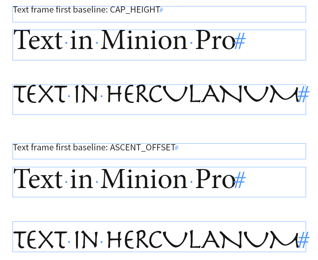
Here the text frame preferences' first baseline is set to the visual height of character "T":

FWIW: With a font like Herculanum my script doing the outline of "T" is failing!
I had to tweak the value for first baseline a bit to get the right optical result above.
Reason: The baseline of the text in Herculanum is a bit above the bottom of the glyph outlines of "T".
Regards,
Uwe
Copy link to clipboard
Copied
A nearly perfect solution could be based on the amount of white space we see in the first line of text including the distance to the Rule Above. That could work for a variety of fonts. Not all.
I’m guessing the engineers wont like the unpredictable font variables—I think they settled on the baseline as 0 because it’s the most predictable line.
With script fonts the cap height can start below the baseline.

Copy link to clipboard
Copied
Hi Rob,
calculating white space of text could be one of the functions of Adobe Sensei.
Currently build in with Content-Aware Fit.
Adobe is advertising Adobe Sensei in "What's New in InDesign" as very first item:
New and enhanced features | Latest release of InDesign
Regards,
Uwe
Copy link to clipboard
Copied
calculating white space of text could be one of the functions of Adobe Sensei.
Hi Uwe & Michel, It seems like the problem with a percentage amount is the percentage should be based on a before and after change, and not a font metric like cap height or ascent. Seems like Sensei works by knowing the actual starting size.
I’m wondering if the better scripting approach is using a dialog to capture the new text size and then apply the change as a percentage to the text. In that case the white space and rule thickness would be optically correct
This AppleScript asks for the desired point size change, and alters both the point size and rule thickness:
tell application "Adobe InDesign CC 2018"
set myDialog to make dialog with properties {name:"Text Size"}
tell myDialog
tell (make dialog column)
--Integer Edit
tell (make dialog row)
make static text with properties {static label:"Size"}
set myRealEdit to make real editbox with properties ¬
{edit value:12.0, maximum value:1000, minimum value:0, small nudge:1, large nudge:10, min width:50}
end tell
end tell
show
set n to edit contents of myRealEdit as real
destroy myDialog
end tell
tell active document
set ov to properties of view preferences
set properties of view preferences to {horizontal measurement units:points, vertical measurement units:points}
set s to object reference of selection
if class of s is text then
set p to point size of s
set pct to n / p
set ra to rule above offset of s
set rw to rule above line weight of s
set point size of s to n
set rule above offset of s to ra * pct
set rule above line weight of s to rw * pct
end if
set properties of view preferences to ov
end tell
end tell
Here I'm changing 44pt to 20pt
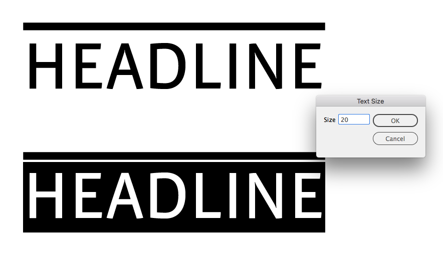
The result is an optical match

Copy link to clipboard
Copied
I really like this AppleScript approach, Rob. Nicely done.
Mike
Copy link to clipboard
Copied
Hmm! …
Rob, don't think I could not agree you on this argument but I'm not truly "shocked" by the original question!
Take another look to the third screenshot I gave post 21!
I don't see something visually and desperately awful but just an user graphical choice that I don’t feel well-founded and interested to appreciate.
[personal comment]
Btw: In fact, personally, I won't use your way here, playing with so various sizes of headers in the layout of a magazine! (but I'll keep the code for another use! Thanks for it!  )
)
Best,
Michel
Copy link to clipboard
Copied
Personally, if I change the point size of a heading, I want them all to change (so prefer style-based solutions), both in the size of the font and the thickness of a rule—which doesn't seem possible. And if a script is not needed, then all the better.
In the thread, Rob has provided such a capability for the rule weight change—for Mac users. But I use Windows so it needs be a JavaScript. I do greatly appreciate the work Rob put into this thread to provide such a solution for how I would want such headings to act.
However, if someone doesn't want the rule thickness to change, nor the offset, then using only a top border seems to work well and it can be part of a style. So that solution seems best to me under the "don't change the rule thickness" scenario.
Mike
Copy link to clipboard
Copied
I think some of the discussion is a red herring. Like in the image where Rob is mixing Universe with Voluta and Copperplate. At least if this is a headline where the likelihood of mixing and matching is pretty low.
QXP can use discrete offsets (points or whatever measurement system one wishes to employ, but they end up in the current ruler measure) or by using percentage (but it's limited to 100%. If percentage is added to ID, it should lift that limitation).
When the text frame is set to use cap height and when using a single font for the headline, using percentage, there is little change to the offset distance when changing fonts and no appreciable movement of the offset when changing text point size. I tried from 60pt to 12pt in several typefaces, including Voluta. With a font such as Voluta, there is overshoot of the text frame for some ascenders, but visually that's what such fonts are suppose to do.
Mike
Copy link to clipboard
Copied
At least if this is a headline where the likelihood of mixing and matching is pretty low
Maybe a bit more likely than changing point size to fit copy 

Copy link to clipboard
Copied
I'm a pragmatic guy! …

The same "yellow gap"! …

… Masking them:
Just For Fun! [placing the cursor in the para you want to play with!]
// by FRIdNGE [07/04/2019]
// Written by Michel Allio
app.scriptPreferences.measurementUnit = MeasurementUnits.MILLIMETERS;
// Choose a Para Style as Reference:
var myRefPStyle = app.activeDocument.paragraphStyles.item("Reference"),
myRefPointSize = myRefPStyle.pointSize,
myRefParaRuleShift = myRefPStyle.ruleAboveOffset,
// Choose a letter and vectorize it to get its real height ("W" is perfect here! …) and type its value here:
myRefRealPointSize = 2.819;
// That's all! You can play now! …
//---------------------------------------------------------------------------------------------------------------------------------------------------------------------------------------
app.selection[0].ruleAboveOffset = (app.selection[0].pointSize*myRefRealPointSize/myRefPointSize) + myRefParaRuleShift - myRefRealPointSize;
//---------------------------------------------------------------------------------------------------------------------------------------------------------------------------------------
Best,
Michel
Copy link to clipboard
Copied
So the size of the headings are changing constantly
So you’re changing point size to fit copy? The typographic ideal is usually the opposite, the reader wants consistency in the text formatting—paragraph and character styles ensure that consistency.
Copy link to clipboard
Copied
Hi Rob,
That is an other discussion 🙂
Because of the use and aim of the magazine i want to use the heading typography more creatively.
Copy link to clipboard
Copied
HI,
It"s really simplistic to play such a game with a one-single-cell table!
The only difficulty would be then to reduce the width of the cell to the text but a script can simply do it.
Personally, I'ld play with a script that calculates the shift of the para rule according to the height of the first line! …
So, just 1 click to finish the game on a specific para style!
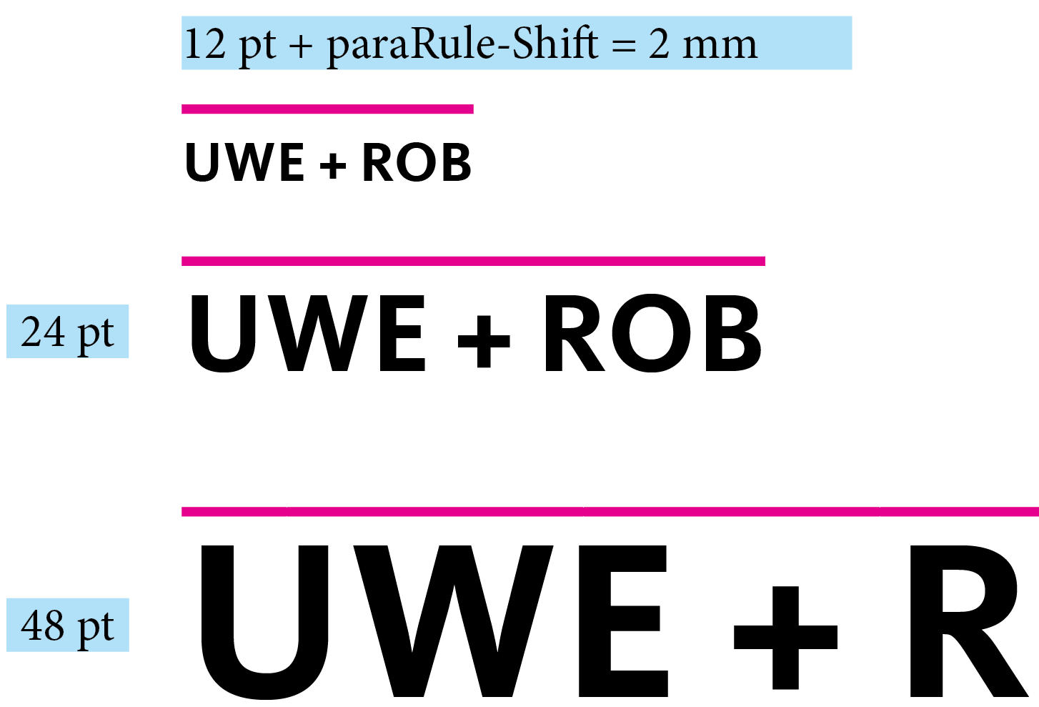
//----------------------------------------------------------------
Let's take a sample! 
The user builds a para style with a 12pt char size where the shift of the para rule is 3mm!
He (She) increases the char size to 16pt! … The para rule shift needs to be now 3.65mm.
Then, … 20pt! … para rule shift = 4.30mm.
Are you able to give me the para rule shift if the char size is now 30pt?
Have a good day!
//----------------------------------------------------------------
Best,
Michel, for FRIdNGE
Copy link to clipboard
Copied
The user builds a para style with a 12pt char size where the shift of the para rule is 3mm!
He (She) increases the char size to 16pt! … The para rule shift needs to be now 3.65mm.
Then, … 20pt! … para rule shift = 4.30mm.
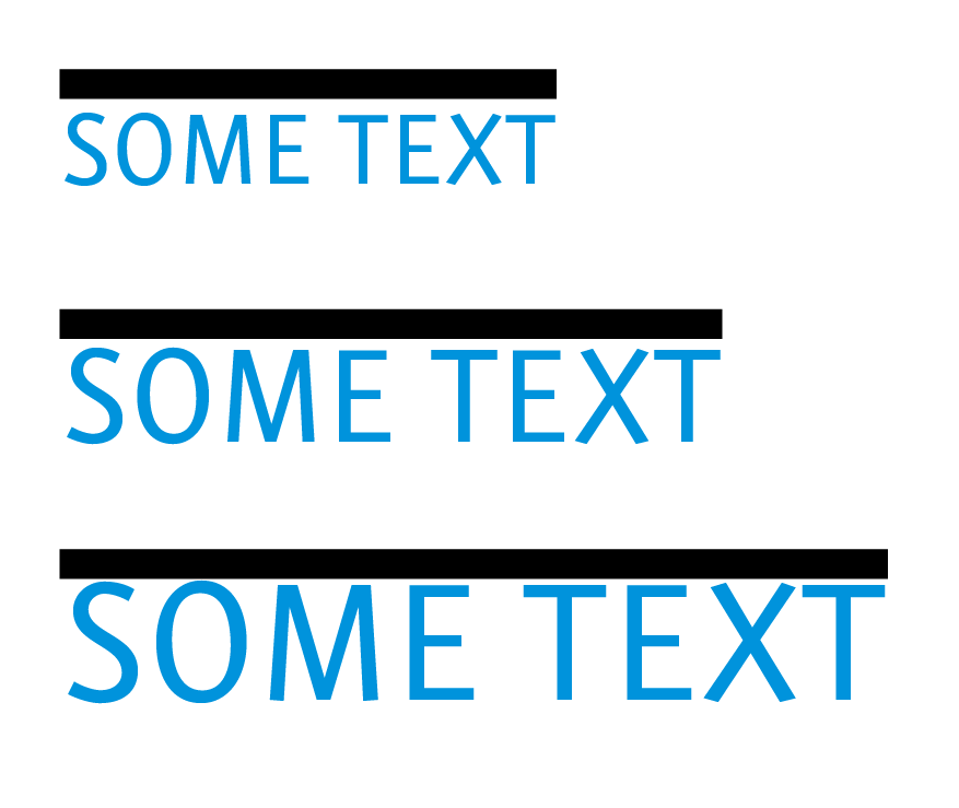
I think using a percentage of the point size would be close but not exact. The rule above offset is calculated from the font‘s baseline, so for a percentage to work you would have to know the distance from the baseline to the ascent—the point size is the distance from the descenders to the ascenders plus some invisible padding.
This is what I get using your MM example using the point size percentage:

And it would be relative to the font design:
-
- 1
- 2

Find more inspiration, events, and resources on the new Adobe Community
Explore Now
 AdChoices