Perfect hyphenation/ justified type like top book publishers
Hey everyone,
For the last weeks I have checked the hyphenation/ justified type from different top book publishers/Bestsellers on Amazon, specifically Novels. Their pages generally just look beautiful.
They have few Hyphens but still an overall good looking Page without too much or too little of a Gap - it just seems perfectly balanced.
Now, i tried to replicate that/ achieve a similar result (For the last weeks), but for some reason it doesn't work. I played with the sliders/Percentage within Indesign both within Hyphenation and Justification, watched different Tutorials on that, read through different articles, but I still get too much Hyphens - and if I configure it specifically for less Hyphens, the Gap just looks unbalanced...
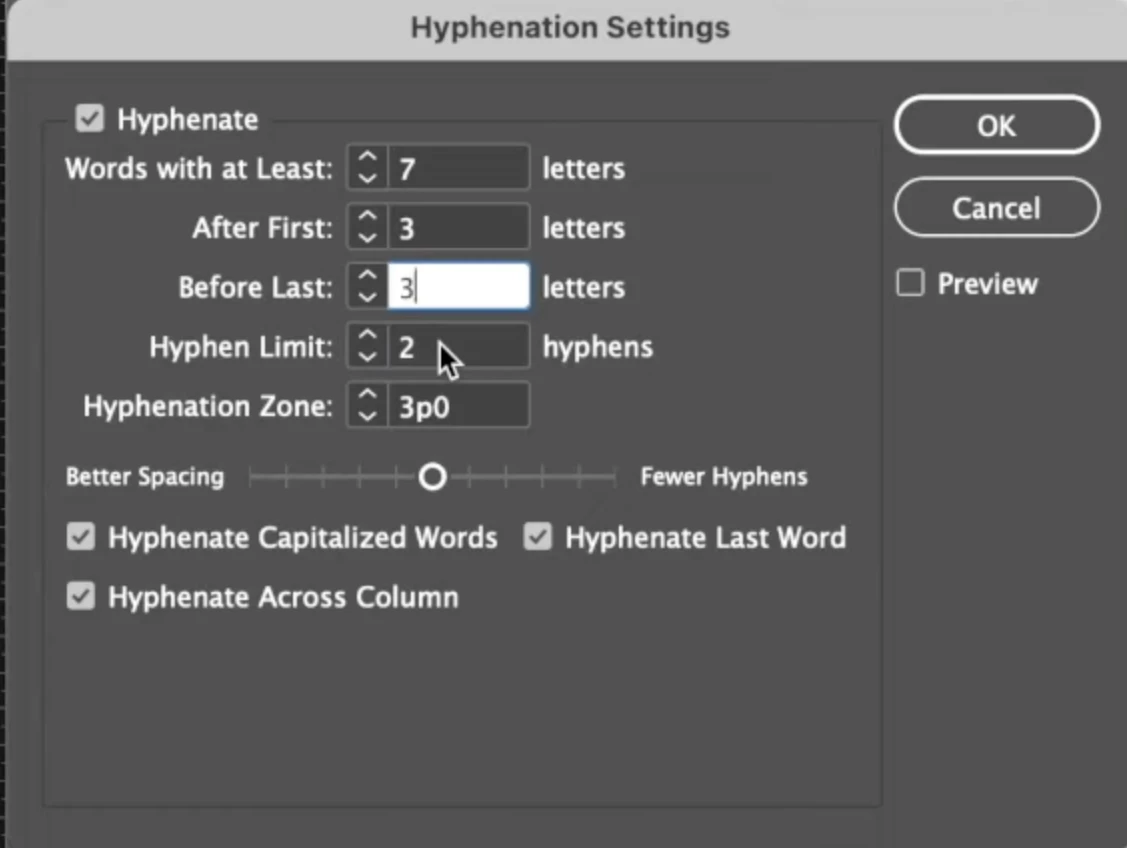
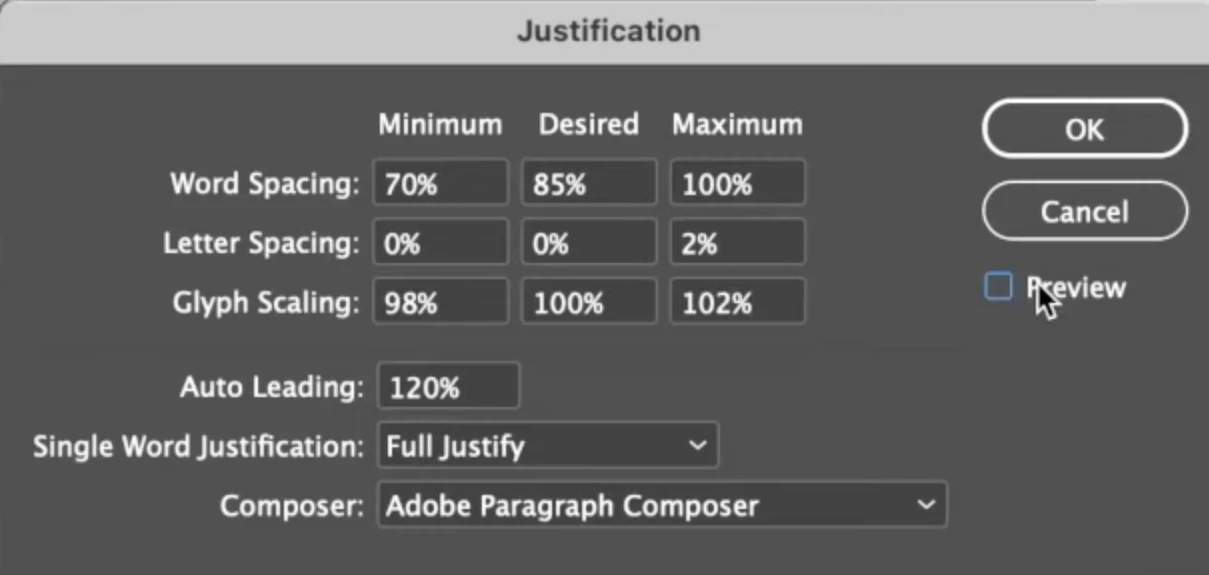
Just to give an example. You can find online a Tutorial from Charles Nix, the Creative Type Director from Monotype, where he does a very simple Video speficially on that. After I applied the settings, it just didn't look good in my eyes - too compressed and overall still too much Hyphenation on some pages. So I wonder, what is it that Top Book Publishers do, when preparing a Book for that.
Here are the settings he recommenend:


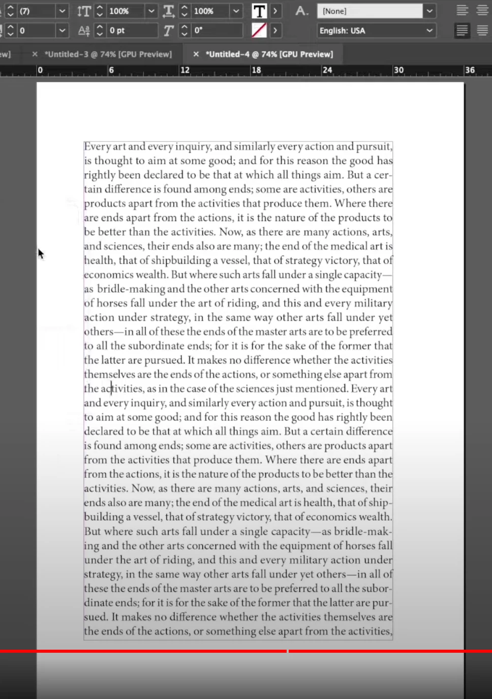
And here is the result of his text.

It looks definitely good yes. I count 5 Hyphens, which in my eyes should be the maximum on one page - but for some reason with my Document (Font: Adobe Garamond Pro / 11.5points) it is too compressed with that settings and still has on a lot of pages too much Hyphens.
Like i said before, i tried different settings within those 2 menus (Hyphenation/Justification) but I don't come to a result that can compare itself with the High-Class of Bookformatting.
I also have to say, while closely looking on the text when applying Glyph Scaling of 98 /100 /102, I can definitely see the difference with some lines - definitely visibile for me. When choosing 99/100/101 it is much better, but then the Gap changes for some Paragraphs to something unbalanced...
For now I have no idea how those top Book publishers accomplish their beautiful Page-look. I thought i try my luck asking here with the hope that perhaps someone knows how to do that.
Greetings
Yannic

