Sara: did you understand the answer to this question? It's in the thread, but I'm wondering if it was as clear to you (a newer user) as it was to the rest of us. Here's a visual recap—and this has nothing to do with the baseline grid, as per Jongware. It's off in my screen shots.
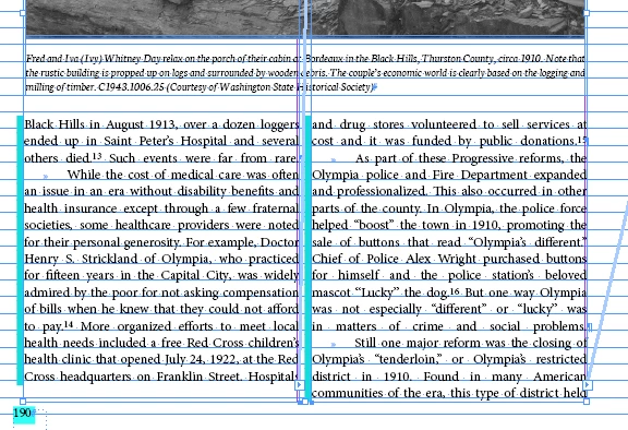
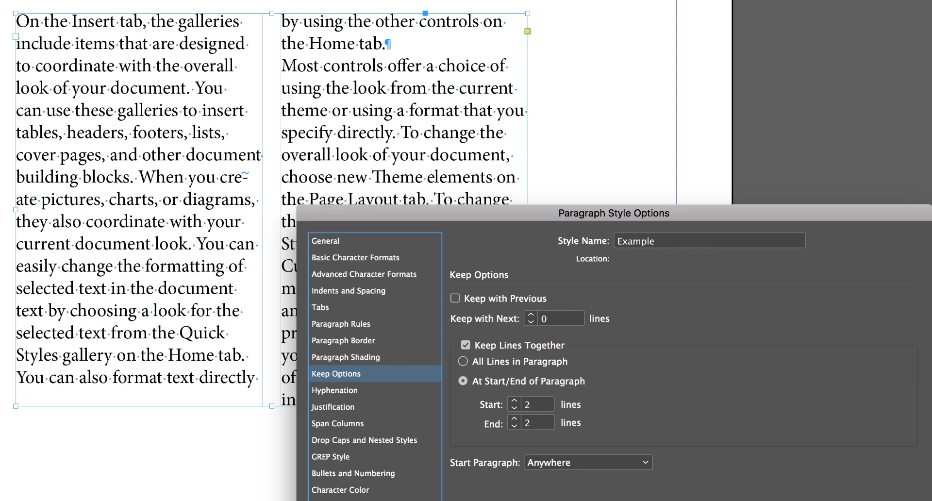
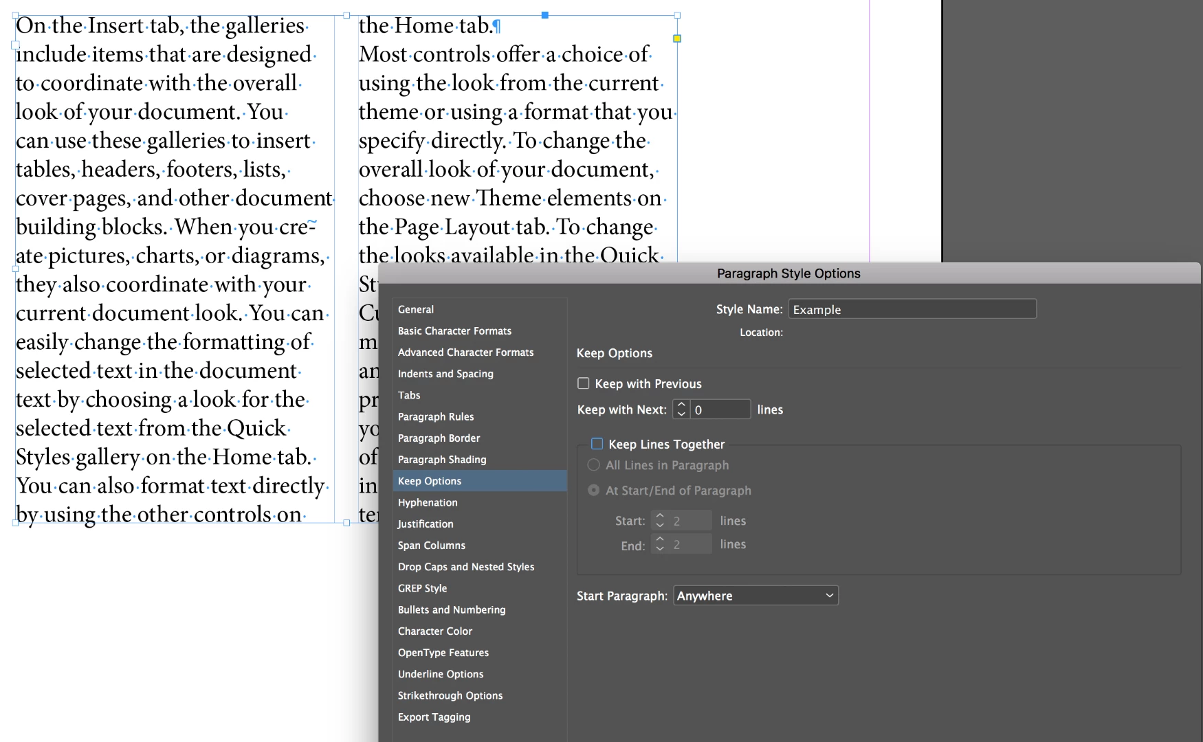
1.) there is room for one more line in column 1, but the text isn't using it. As Vinny said, when Keep Lines Together is activated, and at Start/End of Paragraph is set to 2 lines, this will happen. (Single lines of a paragraph that are separated from the others in the same paragraph are called Widows and Orphans, but InDesign doesn't use that terminology here, for whatever reason.)
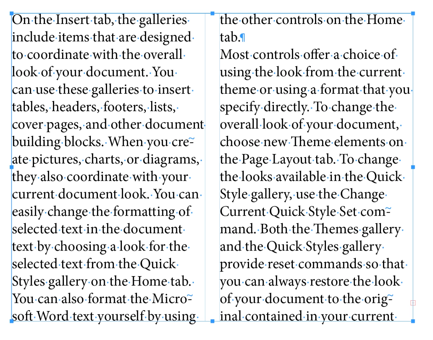
2.) So, if you are OK with single lines (see "the Home tab." at the top of column 2?) you can turn this off. Or better yet, keep it on and copyfit—which means rewriting the text to fit the space.
3.) As per Bob's comment, add or delete a few words until the text flows back into the space. InDesign lets it because there are still two lines together at the top of the next column. I also mentioned tracking (adjusting the letter spacing) but only if it's too subtle to be observed. It's consider cheating by many. Copyfitting by adjusting the content is the correct way.
I'll point out that it's also not good practice to end a paragraph with a word all by itself like in my last screen shot ("tab."), but that's a topic for another day.
Sara, when my students enroll in an InDesign class, they expect to learn the software. They have no idea that when they log into my classroom on the first morning that we won't just be talking about InDesign features—there are all sorts of rules they need to learn about setting type and designing pages as well. And there's a learning curve on both. If you are interested in page design/typography resources, just let us know.
~Barb