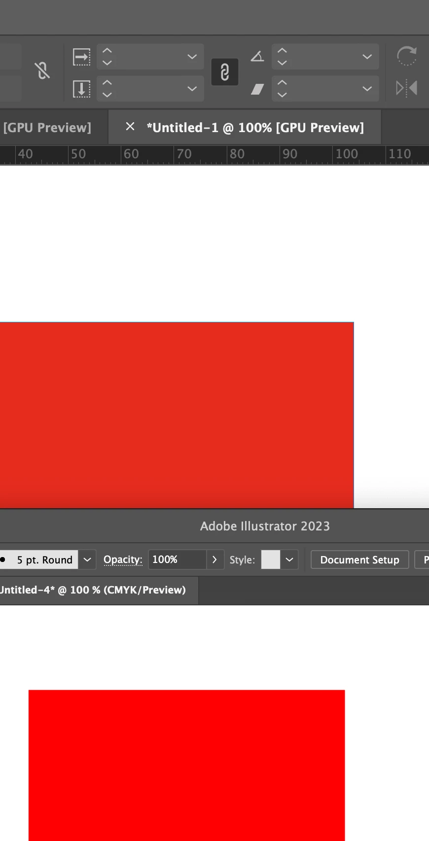
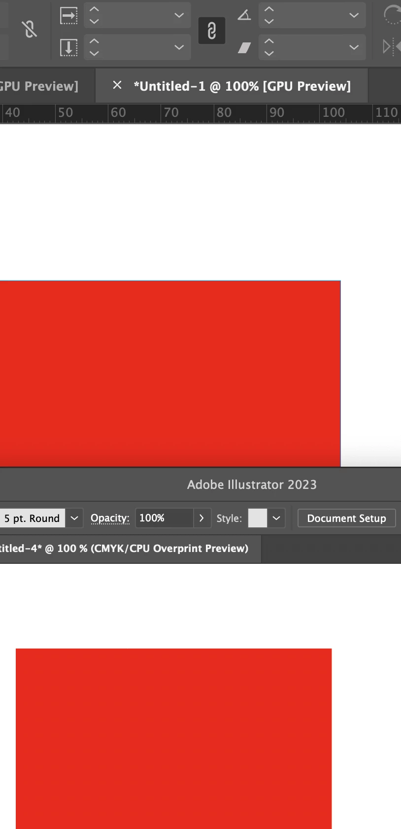
Same color in Indesign looks different in Illustrator
Hi there,
Been reading about this topic but havent found a cure yet.
Ill try to make it as simple as possible:
- A square with the color of 0/92/92/0 in Illustrator and a square with the color of 0/92/92/0. No copying, one made in AI, one in ID
- The color in AI looks almost neon, however the ID one looks dull.
- I use the same color profile for both apps (synced profile) (aRGB + FOGRA39)
- both documents are CMYK
- both apps have same settings
- both run in GPU preview
The fun part: If I copy the neon looking red from AI to ID, it will look dull. If I copy the dull red from ID to AI, it will look neon.
If I turn on overprint preview in AI the red looks the same as in ID (which does not have overprint preview turned on).
The red does not change in ID if i turn on overprint preview at all. It does however, when i do the same in AI.
There is no proofing checked in boths apps.
Can you please help me? Its driving me insane. Working on a project I often do some design / creative work in AI and the finished product in ID. I do not copy between them, If i do, i place things inside, but looking at two versions of the same color is annoying and in the end you are not even sure what its supposed to look like.
Thanks!!


