.random..
Inspiring
March 21, 2025
Answered

Simple UI Fix to Speed Up Workflow -- One Click Should Select the Whole Field

  • March 21, 2025
  • 1 reply
  • 812 views

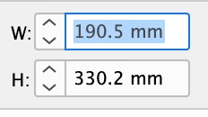
One small tweak that would significantly improve efficiency:

When clicking into an input field in the toolbar, the entire value should be automatically selected.

Right now, clicking into a field just places the cursor at the end of the number. This means we have to either:

  1. Manually delete the existing value before typing a new one.
  2. Double-click to select the whole field, then type the new value.

Instead, the default behavior should be that a single click highlights the entire field, so we can immediately type in a new value and press Enter.

This would eliminate unnecessary clicks and make input adjustments much faster.
It should also be an easy fix in the code!

Correct answer leo.r

Click the field title/icon to select the field value automatically. For example, W or H in this case:


1 reply

leo.r
Community Expert
leo.rCommunity ExpertCorrect answer
Community Expert
March 21, 2025

Click the field title/icon to select the field value automatically. For example, W or H in this case:


.random..
.random..Author
Inspiring
March 21, 2025

Oh come on — that’s perfect!
This will save me a ton of time. I’m sharing it with the rest of the team right away, because I’m pretty sure no one else knows about it.
And my colleague is absolutely right — this is definitely an easter egg.


.random..
.random..Author
Inspiring
March 28, 2025

I even thought it was very well known. I at least tech it to my students, one click on icon/character, enter value then tab to next field etc and hit return when you're done.


I've been thinking a lot about this, and honestly, this solution just doesn't make sense to me. In some panels, you can't even click on the icon, so it's not consistent throughout the application.

Take, for example, the Align panel—when I click on a numeric value showing the distance between two objects, I expect to be able to type a new value right away. Instead, I often have to click multiple times or use a keyboard shortcut just to make a simple change.

The same issue applies in other panels too—Stroke Weight, Transform, Corners, or Opacity. In all of these, when you click into a field, it should automatically select the entire value so you can start typing immediately. That’s a standard and expected UX behavior.

If someone wants to edit just a specific character, they can simply move the cursor with the arrow keys. But the default should prioritize speed and efficiency—click once, start typing.

Right now, it feels inconsistent and honestly a bit frustrating. This kind of interaction design just slows things down and interrupts the flow, especially when you're working on something detail-oriented.