Inspiring
September 13, 2024
Question

What is the Difference Between 'Normal' and 'Regular' Font Weights in Source Hans Sans JP

  • September 13, 2024
  • 2 replies
  • 1308 views

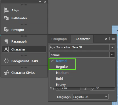
So can anyone actually tell me the documented difference between "Normal" and "Regular" in terms of font weight? See screen shot of Source Hans Sans JP.


..because now font weights are beginning to look like a barista's blackboard. 


<Title renamed by MOD>


This topic has been closed for replies.

2 replies

rob day
Community Expert
September 13, 2024

documented difference between "Normal" and "Regular"


Regular is a lighter weight than Normal.


Here ’s Regular in red and Normal in black:


James Gifford—NitroPress
Brainiac
September 13, 2024

Maybe in general (although I'd take nothing for granted in font naming!), or in Western fonts, but not in this case:


James Gifford—NitroPress
Brainiac
September 13, 2024

Looking at the font samples in the Adobe font page, it looks like a steady progression of weight from Light-Normal-Regular-Medium-Bold-Heavy. I see a very slight weight difference for Regular, almost exactly in between Normal and Medium.


All things considered, I'd use Normal for all body text and reserve Regular, if at all, for small text that might reproduce too lightly.