cryssie101
Participating Frequently
May 25, 2018
Answered

Horizontal alignment of two sizes of text in text frame (InDesign)

  • May 25, 2018
  • 4 replies
  • 898 views

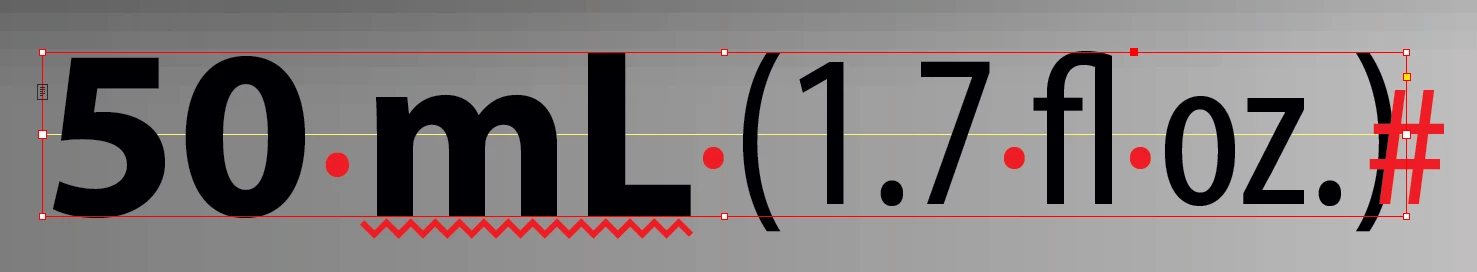
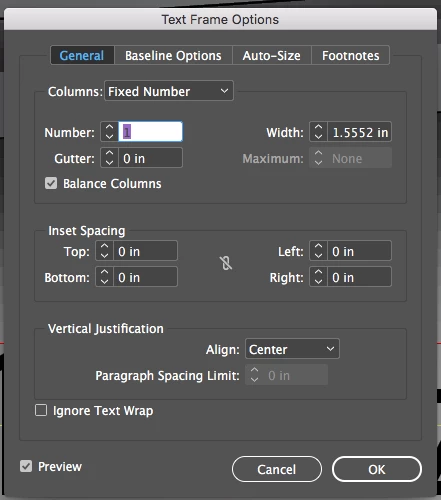
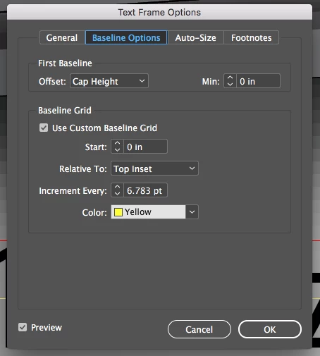
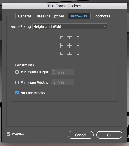
Hello everyone! So I seem to be having a problem with horizontal alignment within my text frame. I was hoping to find a easy way to align the center of all the text horizontally (as you can see mainly with the ( ) - they are hanging below the "L" instead of centered. I have my frame options set to center. to auto size height and width. I have attached screen shots below.

Any help in this matter would be greatly appreciated!

Thanks everyone!

This topic has been closed for replies.
Correct answer John Mensinger

This is typical of the default relationship of parentheses to the baseline in many typefaces. (Text frame alignment settings can't affect that.) You could:

Select one of the parentheses and apply a positive baseline shift until you like its height (use fraction-of-point increments, if necessary). Leave it selected and make a new character style based on it. With that, you can set up GREP styles to always apply that character style to parentheses without need for further intervention on your part.

4 replies

cryssie101
Participating Frequently
May 25, 2018

Thank you so much! I appreciate all your help and answers guys!

rob day
Community Expert
Community Expert
May 25, 2018

I think the Fit Frame to Content or Autosize commands always place the bottom of the frame on the baseline (not the descender line) and the top of the frame to the First Baseline Offset setting.

So if you are trying to optically center upper & lowercase text in a frame with a color fill, you could try this:

Use an inset to create padding. Here mine is equal

Use x-Height for the offset so the top of the frame aligns with the x-height.

An uneven inset:

Barb Binder
Community Expert
Community Expert
May 25, 2018

Hi Cryssie:

The parentheses' position is controlled by the font. If you want to move them up, I'd use a baseline shift. If that gives the look you like, you can automate this with a grep style.

~Barb

~Barb at Rocky Mountain Training
John Mensinger
Community Expert
John MensingerCommunity ExpertCorrect answer
Community Expert
May 25, 2018

This is typical of the default relationship of parentheses to the baseline in many typefaces. (Text frame alignment settings can't affect that.) You could:

Select one of the parentheses and apply a positive baseline shift until you like its height (use fraction-of-point increments, if necessary). Leave it selected and make a new character style based on it. With that, you can set up GREP styles to always apply that character style to parentheses without need for further intervention on your part.