Copy link to clipboard
Copied
Sorry for the vague title, I don't know how else to describe it. When I see videos/screenshots of others' Lightroom on iPad Pro, it looks like this:
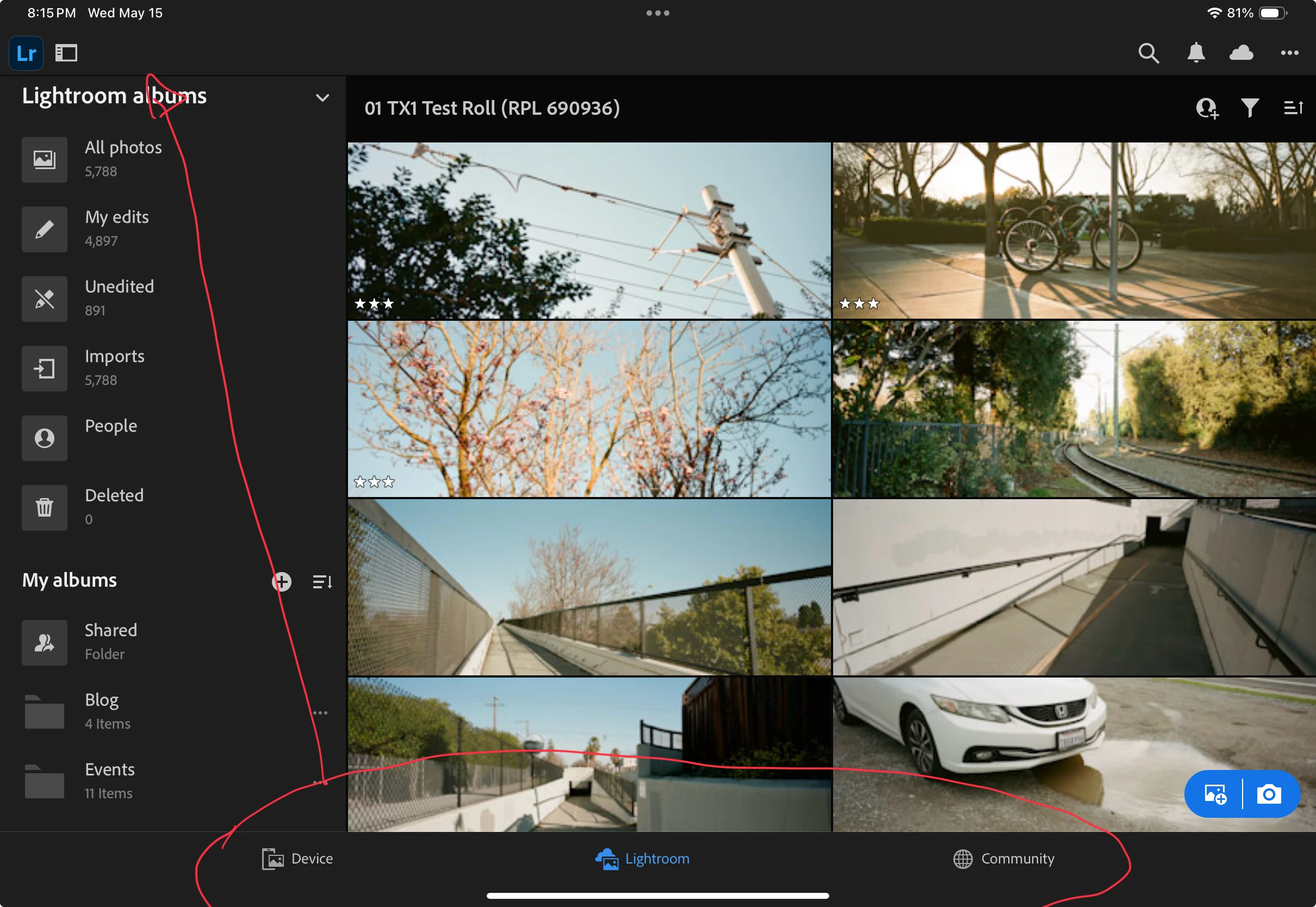
Note the desktop-like layout, where Home, Shared, and Community are at the top.
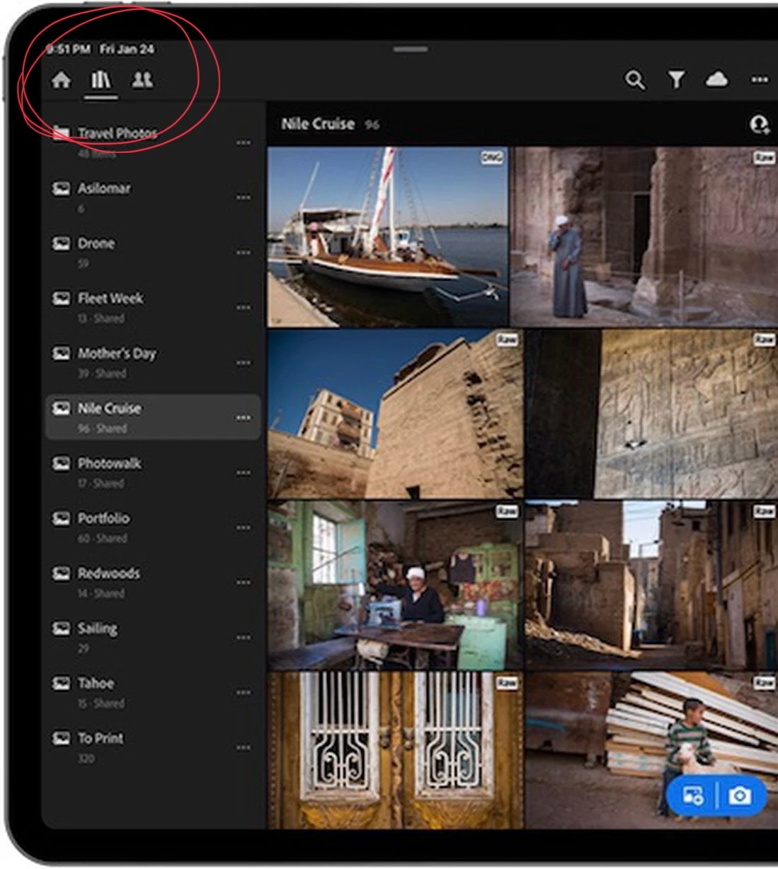
However, mine looks like it's laid out the same as the iPhone version:
Does anyone know why? (And no it's not an 11in vs. 12.9in iPad thing, I've seen YouTubers with their 11-in iPad also having the proper, desktop-like layout).
I have the new M4 iPad Pro, if that makes any difference.
The first screenshot is from a previous version of Lightroom Mobile. Your second screenshot shows the current version.
Copy link to clipboard
Copied
The first screenshot is from a previous version of Lightroom Mobile. Your second screenshot shows the current version.
Copy link to clipboard
Copied
Oh wow, so the "big iPhone" layout is actually the new one? I wonder why Adobe regressed here, the big ugly tab bar is such a waste of space...
Copy link to clipboard
Copied
I wouldn't call it a "regression", it's simply a UI change made to incorporate the new feature of being able to view, edit and delete images in the Apple camera roll directly from within the Lightroom app.
Copy link to clipboard
Copied
You are right, but I can't help but think there's a better way to do so than adding a big tab bar with 3 buttons. Lightroom Desktop has a "local" tab above the album list. Oh well 🙁