Copy link to clipboard
Copied
Hi everyone!
We've made some improvements to the experience of browsing and selecting the best fonts for your project.
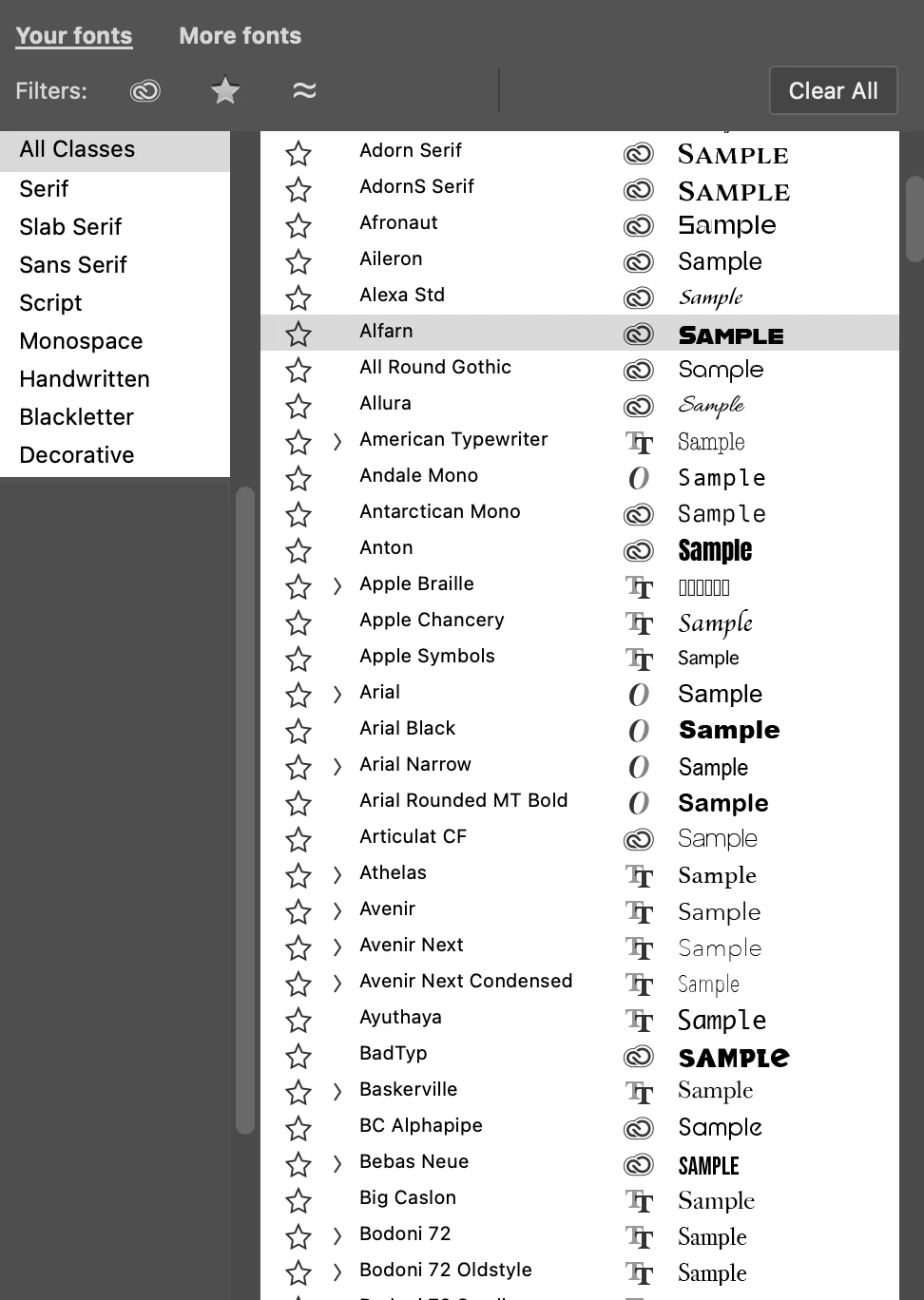
You can access the enhanced font browser in 3 places:
1. Options bar
2. Character panel
3. Properties panel (when a Type layer is selected)
What's new
Feedback and votes
Please try this new font browsing experience and vote via the Beta Feedback panel to let us know if it's ready to be released.
Additionally, please let us know any feedback or ideas for improvement you have here in this thread!
Thank you!
Copy link to clipboard
Copied
I think it is a great idea, some improvement in this area was long due. Still, if I display the fonts list from the options bar, in the regular PS version I can see up to 20 fonts on my display (I've set the preview size to huge). In the beta version with this new system, barely 13 fit the list before it cuts off. It's not the end of the world but I'd like being able to see as many fonts as possible.
As an improvement, I have always longed for the ability to set my custom sample text (instead of the word "Sample"). See this: https://community.adobe.com/t5/photoshop-ecosystem-ideas/photoshop-allow-user-to-change-font-sample-...
Thanks.
Copy link to clipboard
Copied
It's a nice feature Pete, but a bit slow.
OK, I have restarted myu computer which helped a bit.
Reset Preferences, which helped a bit more.
I was thinking that it built a cache so the next time you selected a filter, it would be faster, but that doesn't seem to be happening. The first filter I chose takes 1 to 2 seconds, and subsequent filters seem to take longer. Least ways that's my impression. Before I restarted and reset Preferences, it was pretty much freezing my system!
I definitely like it though.
FYI I have 201 font groups in Windows 11
i9-13900K
RTX4080
64GB RAM
Two 2TB Samsung 980PRO (plus a bunch of other fast NVMe drives.)
So what's slowing it down?
Copy link to clipboard
Copied
Thanks @Trevor.Dennis, curious -- are you filtering within Your fonts or the More fonts?
One other thing you could try is to clear the Photoshop font cache...can you give that a try?
Steps are here: https://helpx.adobe.com/photoshop/kb/troubleshoot-fonts-photoshop.html
If it's still slow, let us know and we'll take a deeper look at it.
Regards,
Pete
Copy link to clipboard
Copied
OK, I'm confused now. I'm using the More Fonts filters. AFAICT the Your Fonts filters are unchanged and those filters are instant.
.
So I am guessing that the delays I am seeing are a factor of my internet connection? I am rural New Zealand with no chance of getting connected to the fibre that runs across the road from me It's only thanks to the nearby school that we have fibre to the cabinet
When using the More Fonts filters I see anything from 1 to 10 seconds delay, but when I fiirst looked at this, I was not understanding that I was seeing the Adobe (Typkit as was) fonts, so that delay is not unreasonable. Does that sound right?
Copy link to clipboard
Copied
While I can't tell how much delay is reasonable in relation to the Internet connection, I can confirm that the "More fonts" section works with some delay. The first time around I thought it was some trouble with Photoshop, then I realised that it was connecting to Adobe fonts, so I assume some delay is to be expected, same as with the Library panel, or any non-local feature.
At least for me, the new features this panel introduces more than make up for a small delay, but I reckon that with slower internet connections, non-local features (in general) can be harder to work with.
Copy link to clipboard
Copied
@Carlos_Oliveras -- Great to hear that you're enjoying the new feature set for browsing fonts! Thanks for the feedback. I'll check with the team on what would be expected/reasonable amount of delay when clicking through More fonts (Adobe fonts).
@Trevor.Dennis -- Yes, makes sense. That's too bad about fiber not being available for you yet, it looks so close! Hope they're able to extend it across the street. hah!
Will see what expected delay here is/should be.
Trevor, you also wrote,
"when I fiirst looked at this, I was not understanding that I was seeing the Adobe (Typkit as was) fonts" -- Should I take that as this should be more obvious from your perspective? Or would you expect "More fonts" to be explicit in saying "Adobe fonts"?
Copy link to clipboard
Copied
@Pete.Green thanks but don't worry about the delay (at least for what I'm concerned with my connection) - I understand that a certain delay is to be expected given that it is connecting to Adobe Fonts (not browsing files on my computer). Sorry if I was not clear enough, I'm ok with how it works (except for not being able to set a custom sample text... but that's another story).
Copy link to clipboard
Copied
This is a good idea. We want to use it in our law firm website's journal work.
Copy link to clipboard
Copied
Hi!
Can you please tell me how to turn this feature off? As a designer, I do not want or need more in my windows/drop-down menus. Please, tell me how to turn this feature off/revert to a previous version.
Copy link to clipboard
Copied
Hi, I hope it is possible to turn off this new font browser, I don’t need it! As a graphic designer I do not need more fonts...
Thanks
Copy link to clipboard
Copied
Hi @Jac_Irwin and @Cornela ,
Thanks for your feedback. I wonder what in particular is problematic for you and how we can make this font browser experience better for you?
In general, if you don't want to browse the additional fonts, you can stay within the "your fonts" section of the font browser.
Are there other things that are getting in your way?
Regards,
Pete
Copy link to clipboard
Copied
Personally, It is just too much visually. I also do not need an additional font browser. I would like the ability to revert back to the previous style of the drop-down, where the font browser did not show up. The new drop-down font window is huge and intrusive and is not needed by everyone, it would be nice to be able to turn it off. 🙂
Copy link to clipboard
Copied
Thanks @Jac_Irwin ,
The previous dropdown was also a font browser, for your local fonts, this one adds the ability to browse the Adobe Fonts library. The latter part it sounds like you don't need, assuming I understand you correctly.
Without purely reverting to the previous dropdown, curious how we could make improvements to this updated interface for you that would make it more on-par/performant with the previous font dropdown/browser experience?
Regards,
Pete
Copy link to clipboard
Copied
I agree. Visually this is too much. And it doesn't work very well. For instance I have Neue Haas Grotesk (installed via Adobe Fonts no less) and it's not appearing in the browser when I type "Neue," "Haas," or "Grotesk." It feels overdone and I want to turn it off. It's getting in the way of working right now.
Copy link to clipboard
Copied
Hate it. Takes up too much room for artists and designers and makes my character window almost unusable. Can't select font because the window flickers and won't stop on the font I select.
Copy link to clipboard
Copied
Before I could start typing a font and then hit enter when it showed up. Now I can't seem to do that which interrupts my workflow. Is there a way to do that?
Copy link to clipboard
Copied
Huge workflow killer. Goes on showing that people behind this don't even use Photoshop / aren't designers or use a laptop trackpad so it's easy for them to hop between a keyboard and a mouse every time they need to change a font.
I can't believe I have to spend time here instead of working, reading people's rants on an issue that should be a non-issue to begin with. Talk about a poor feature roadmap... So disappointing to be going backwards.
Copy link to clipboard
Copied
Hate it! Takes up too much room and now my font window doesn't work properly. Makes the font window flicker, and won't allow me to correctly select a font. Hate it! Nothing but problems!
Copy link to clipboard
Copied
I agree! Nothing but problems!
Copy link to clipboard
Copied
How can I turn off this ridiculous, unrequested "improvement"? It's a complete failure at UI integration. Fly-out happens on the secondary monitor, causing the user to move their mouse even farther away from the rest of the settings and my work. Typing a font name (e.g. Arial) and hitting return does nothing (W11) - forcing the user to interact with the panel (a sub-UI all it's own).
Copy link to clipboard
Copied
p.s. I don't normally chime in on these kinds of posts, but I've been using Photoshop since before it had layers. 'Improvements' like the "improved font browser" seem to be driven by a business objective and not actually intended to help the user accomplish their goals any faster with less cognitive load. We are already thinking about a hundred other things, including a series of 'next steps' to achieve our desired outcome. It's best not to get in the way of that. And if the product team wants to oil some squeaky wheel, add it as an optional feature. Too many features? Then rethink if you really needed to change or add anything to the UIUX, and instead, politely tell the squeaky wheel to get on board with what everyone else has used a million times a day for the last 20 years.
Copy link to clipboard
Copied
You're not alone. This is one of the worst features in a long while.
Whoever greenlit this in the state it's in has likely faked their UX certificate.
Copy link to clipboard
Copied
This is one of the worst features in a long while. Are you seriously releasing this as-is?
This feels like it was thought up and implemented by someone who doesn't even use Photoshop. Completely workflow breaking and brings nothing good to the table in practice, only in theory. And some very poor UX theory that is.
Please at least add the ability to revert to the old font browser and don't be sadistic.
The author of this thread comes off as confused in replying to everyone who's voicing the same grievances as I am. This can only lead me to be assured that the person, along with the team behind this feature, simply aren't designers and haven't checked this with actual designers using Photoshop. It's a really bad look. The font browser is one of the most fundamental parts of Photoshop.
Copy link to clipboard
Copied
Photoshop Beta has restored font menus to full-screen size as before.
Thanks, Pete.Green
When I use dual displays in this configuration, when I bring up the Font menu from the Properties panel it appears on the extended display.
I would prefer it to appear on the main display.
Thanks.