• Global community
    • Language:
      • Deutsch
      • English
      • Español
      • Français
      • Português
  • 日本語コミュニティ
    Dedicated community for Japanese speakers
  • 한국 커뮤니티
    Dedicated community for Korean speakers
Exit
111

P: Photoshop 23.2.2 Share Button is distracting

Community Expert ,
Mar 15, 2022 Mar 15, 2022

Copy link to clipboard

Copied

In photoshop 2022 (version 23.2), photoshop implemented a Blue Share button in the

top right corner of the app workspace that is supposed to turn into a button of the sme color as

the other tool options bar icons.


With the latest 23.2.2 update the Blue Share button does not go away after first use as described

on this page under Easily find the Share button


https://helpx.adobe.com/photoshop/using/whats-new/2022-1.html


I reset the photoshop preferences as i do after every photoshop update by trashing the preferences folder.


Share button that the Blue Share button is supposed to appear as after first use
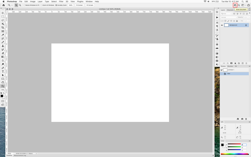
 

sh1.png


In the 23.2.2 update the button still stays as a Blue Share button after first use


sh2.png


Bug Fixed
TOPICS
macOS , Windows

Views

16.8K

Translate

Translate

Report

Report
Community guidelines
Be kind and respectful, give credit to the original source of content, and search for duplicates before posting. Learn more
community guidelines

correct answers 2 Correct answers

Adobe Employee , Aug 18, 2022 Aug 18, 2022

Updating status.


Please use Preferences > Interface > Neutral Color Mode to adjust the Share button's color.

To learn more, see Use Preferences to set a neutral color scheme for Photoshop


Status Fixed

Votes

Translate

Translate
Community Expert , Aug 18, 2022 Aug 18, 2022

Finally an option to change the blue button to not blue 😁

2022-08-18 11_34_22-Untitled-1 @ 50% (RGB_8).png

Votes

Translate

Translate
replies 206 Replies 206
206 Comments
Community Expert ,
Jun 14, 2022 Jun 14, 2022

Copy link to clipboard

Copied

@davescm That's so much better now 🤣

Votes

Translate

Translate

Report

Report
Community Expert ,
Jun 14, 2022 Jun 14, 2022

Copy link to clipboard

Copied

If you can't beat them, join them...or better yet, overdo them 😉

Votes

Translate

Translate

Report

Report
Guide ,
Jun 14, 2022 Jun 14, 2022

Copy link to clipboard

Copied

quote

Anyway - modifying UIColors.txt still works, but you have to make a new one because it now has two added sections.


By @D Fosse 


I have updated the file on github - Share-button-fix 

20220317_224957_2022-03-17_01-21-19.jpg

Сhecked its compatibility with earlier versions of Photoshop - the presence of added sections does not cause problems.

Votes

Translate

Translate

Report

Report
Explorer ,
Jun 15, 2022 Jun 15, 2022

Copy link to clipboard

Copied

I'm curious to know how % of Adobe users really care or need all those sharing features anyway,
Seriously, stop forcing us to use Adobe Cloud, we don't need it and we won't extra pay for it.

Votes

Translate

Translate

Report

Report
New Here ,
Jun 15, 2022 Jun 15, 2022

Copy link to clipboard

Copied

Bring back the handy SHARE button in Photoshop FILE,it is quick and handy.The blue button on the right is slow and useless as it's saving the photo first to iCloud...

Votes

Translate

Translate

Report

Report
LEGEND ,
Jun 15, 2022 Jun 15, 2022

Copy link to clipboard

Copied

This should be an optional button, not required distraction.

Votes

Translate

Translate

Report

Report
Community Expert ,
Jun 15, 2022 Jun 15, 2022

Copy link to clipboard

Copied

Hi

You can add your vote to this thread

https://community.adobe.com/t5/photoshop-ecosystem-bugs/p-photoshop-23-2-2-share-button-is-distracti...

There's also work around's to make it less annoying in the above link, I don't understand why Adobe keep pushing this eyesore on us 🙄

Votes

Translate

Translate

Report

Report
Community Expert ,
Jun 15, 2022 Jun 15, 2022

Copy link to clipboard

Copied

Yes, please go to the Bugs thread Ged linked to, and vote. We all hate this button and want it gone.


Votes

Translate

Translate

Report

Report
LEGEND ,
Jun 15, 2022 Jun 15, 2022

Copy link to clipboard

Copied

I already voted up on that thread. I was confused by the new "PS Feature Request" process. Oh well.

Votes

Translate

Translate

Report

Report
Community Beginner ,
Jun 17, 2022 Jun 17, 2022

Copy link to clipboard

Copied

Away with [removed by moderator] ! Useless Button!

Votes

Translate

Translate

Report

Report
Guide ,
Jun 27, 2022 Jun 27, 2022

Copy link to clipboard

Copied

I got tired of keeping track of the number of elements inside the file with each update and updating the UIColors file manually, so I updated my script by adding a preset system and a couple of convenient functions that you might need when customizing the interface in some cases.


Votes

Translate

Translate

Report

Report
New Here ,
Jul 10, 2022 Jul 10, 2022

Copy link to clipboard

Copied

Please add quick share back. I understand it was removed due to low usage but the removal has greatly slowed down my process and made it very difficult for me. Also, when exporting it is difficult to know the quality with the number slider. The drop down menu was very straightforward.

Votes

Translate

Translate

Report

Report
Community Expert ,
Jul 10, 2022 Jul 10, 2022

Copy link to clipboard

Copied

Duplicate post. Please don't do this as it can waste our time.

Votes

Translate

Translate

Report

Report
New Here ,
Jul 12, 2022 Jul 12, 2022

Copy link to clipboard

Copied

Please please please back QUICK SHARE FEATURE!

Votes

Translate

Translate

Report

Report
New Here ,
Jul 22, 2022 Jul 22, 2022

Copy link to clipboard

Copied

Thanks for the tip on how to change the colour.

Resetting preferences doesn't help unfortunatly.


Votes

Translate

Translate

Report

Report
New Here ,
Jul 31, 2022 Jul 31, 2022

Copy link to clipboard

Copied

PS has a long standing cutting edge visually atractive UI that doesn't distract workflow.  The subject relitively new addition

of a share document button is designed with a bright blue background. It screeming for the user's attention to click it. Is it tied to buying a subscription - thats the message I pick up.  Bad taste & needs to be corectected. Love ADOBE but this button must be consitant with PS's standard theme with white text and grey bacground.  Being a designer I think its ugly & distracting. THX

Votes

Translate

Translate

Report

Report
Community Expert ,
Jul 31, 2022 Jul 31, 2022

Copy link to clipboard

Copied

Votes

Translate

Translate

Report

Report
Community Expert ,
Jul 31, 2022 Jul 31, 2022

Copy link to clipboard

Copied

Being a designer I think its ugly & distracting.

By @EZNEON


We've yet to hear from a single user who likes it, but quite a few (including me) find it annoying.

~ Jane


Votes

Translate

Translate

Report

Report
New Here ,
Aug 14, 2022 Aug 14, 2022

Copy link to clipboard

Copied

I'm new to PS 22 and am so glad to see that others find the Share button as annoying as I do.

Votes

Translate

Translate

Report

Report
Community Expert ,
Aug 18, 2022 Aug 18, 2022

Copy link to clipboard

Copied

Finally an option to change the blue button to not blue 😁

2022-08-18 11_34_22-Untitled-1 @ 50% (RGB_8).png

Votes

Translate

Translate

Report

Report
Community Expert ,
Aug 18, 2022 Aug 18, 2022

Copy link to clipboard

Copied

Really? You mean it's fixed? A simple preference checkbox is all we ever asked for.


I've just spent a half hour re-modifying UIColors.txt once again, but I didn't have to do that?


EDIT: Indeed. I uninstalled/reinstalled just to get a clean table, and yes! It's no longer blue if you check that button. Wonderful, thank you whoever made that happen!

Votes

Translate

Translate

Report

Report
Community Expert ,
Aug 18, 2022 Aug 18, 2022

Copy link to clipboard

Copied

Yep, unmodified UIColors.txt

2022-08-18 11_34_22-Untitled-1 @ 50% (RGB_8).png

Votes

Translate

Translate

Report

Report
Community Expert ,
Aug 18, 2022 Aug 18, 2022

Copy link to clipboard

Copied

Thanks Adobe - fixed in Preferences  v23.5 🙂

Dave

Votes

Translate

Translate

Report

Report
Guide ,
Aug 18, 2022 Aug 18, 2022

Copy link to clipboard

Copied

2022-08-18_16-30-37.png


Yes, it looks like they just added two new elements and made a checkbox (as far as I remember, this was in early CS versions, when there was a separate switch to gray out the Photoshop logo on the toolbar)

Votes

Translate

Translate

Report

Report