- Home
- Photoshop ecosystem
- Discussions
- Re: Something for the weekend - Part 32 - The Inn!
- Re: Something for the weekend - Part 32 - The Inn!
Something for the weekend - Part 32 - The Inn!
Copy link to clipboard
Copied
Hi
Last week's alley challenge brought some great entries so, for this week, I thought we deserved to relax. In these forums we have the lounge but what we really need is a full blown Photoshop pub.
Of course, every pub needs a name and all traditional pubs need a sign. Pub signs in Britain have been around since the 14th century when King Richard decreed that landlords should erect signs outside their premises or forfeit their ale! These days, the signs tend to bear the name of the pub/inn and can be simple graphics or very detailed paintings. A quick google search will show many examples.
So for this week's challenge, can you name the Photoshop pub and give it a suitable sign. I've kicked us off with the "Layer & Mask" but I'm sure you can do better.
As always, anything goes as long as it meets the forum rules on decency, copyright etc.
Anyone is welcome to have a go - whether you are a complete beginner or a Photoshop expert.
There are no prizes - just the chance to practice, show off, or bring a bit of humour and fun.
When posting back your edited images please use jpeg and downsize to 1200px on the long side.
To download the image below in jpeg format with ICC color profile (sRGB) and without the forum scaling artefacts , right click and then use Save Image As /Save Target As (or similar depending on your browser).
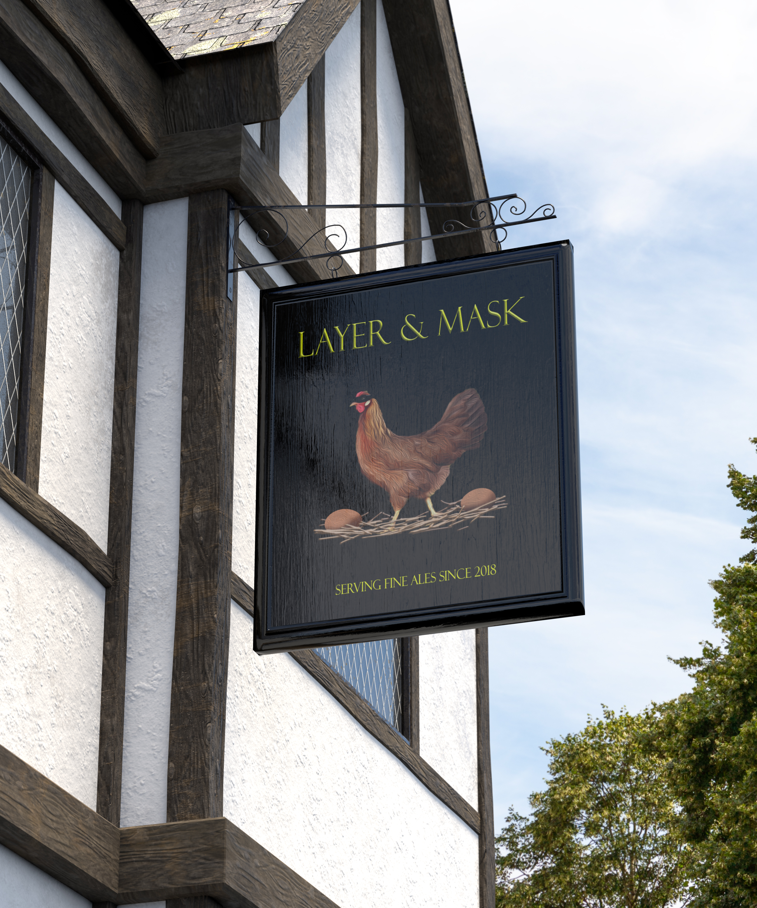
Have fun
Dave
Explore related tutorials & articles
Copy link to clipboard
Copied
https://forums.adobe.com/people/D+Fosse wrote
Trevor.Dennis wrote
Dag is the nearest we have to an art expert. I wonder what he thinks of it?
Nearest?
It's a Jackson Pollock rip-off, obviously, one of the most ripped-off artists in history next to Victor Vasarely and Piet Mondrian.
Jackson Pollock is also one of the most misunderstood. People keep asking what it means. It doesn't mean anything - it's just dripping paint. But nobody has ever managed to infuse automobile paint (that's what he used) with such meditative, zen-like qualities. No, not zen-like - it is zen, the very essence of it.
Very busy these days so can't contribute here, but I still love watching these threads
Dag, I knew you wouldn't let us down, although I'm not sure you meant us to smile at your strong reaction, but it did indeed bring a whopping big smile to my face. ![]() My knowledge of the name Jackson Pollock is limited to its use as a euphemism for the involuntary, forceful expulsion of the contents of one's stomach through the mouth and sometimes the nose [1]. The fact that he used motor oil for his Zen like art is appropriate, seeing as I believe he worked as a motorcycle mechanic when not doing his paintings.
My knowledge of the name Jackson Pollock is limited to its use as a euphemism for the involuntary, forceful expulsion of the contents of one's stomach through the mouth and sometimes the nose [1]. The fact that he used motor oil for his Zen like art is appropriate, seeing as I believe he worked as a motorcycle mechanic when not doing his paintings.
[1] Description stolen straight from this Wikipedia entry .
I covered an exhibition here about twelve years ago, by a Maori artist called Linda Waimarie King. It was all feathers, stuck to canvas, and not what you'd call subtle (she got her tools from Spear & Jackson ![]() ). It didn't do anything for me, and I was taken aback by hearing her explain the paintings to the attendees. I thought that the art should speak for itself, and not need explaining. Graham will like this as she has the same NZ accent he was talking about in a Lounge thread recently.
). It didn't do anything for me, and I was taken aback by hearing her explain the paintings to the attendees. I thought that the art should speak for itself, and not need explaining. Graham will like this as she has the same NZ accent he was talking about in a Lounge thread recently.
Linda joined the camera club for a while, come to think of it, and I remember her getting very pear shaped on a field trip because people were apparently not taking her seriously. She was no photographer.
So what is keeping you so busy at moment? If it is work, I hope they are paying you well. ![]()
Copy link to clipboard
Copied
Well, she may be onto something, but this looks a bit...sentimental to me. The great misunderstanding is that art is about feelings. No! Art is just a non-verbal language. You tell stories, that's all, except not in words.
Listen to genuine Mississippi delta blues, and you know what I mean. Or a good rapper (yeah, I get that even though I'm pushing 60). Not much sentimentality there.
Visual art is, let's face it, very much a White Man's arena, or it has been until now. No idea why that came to be - but anyway, it's great when native people around the world make it into the mainstream. We have some sami artists in Norway who are making a mark by now, and it's the best thing that happened in a long time.
Back when I was fresh out of art school and tried to make it in the art world - I won't bore you with why I later quit the whole game - I used things like tar and rust-protection, filler, masking tape left on the canvas, coffee grind and sand, anything but paint. No sentimentality!
I love her accent, though. I use the int of the brush... ![]()
My favorite artist of all time? Jean-Michel Basquiat. He had everything.
Copy link to clipboard
Copied
Semaphoric -- very imaginative and well crafted.
I am going to haul out my turntable, dust off my vinyls, plug in my amps, and reminisce. Thank you.
Copy link to clipboard
Copied

Dave
Copy link to clipboard
Copied
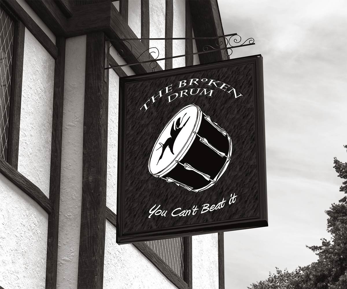
Copy link to clipboard
Copied
Beautiful images!!!
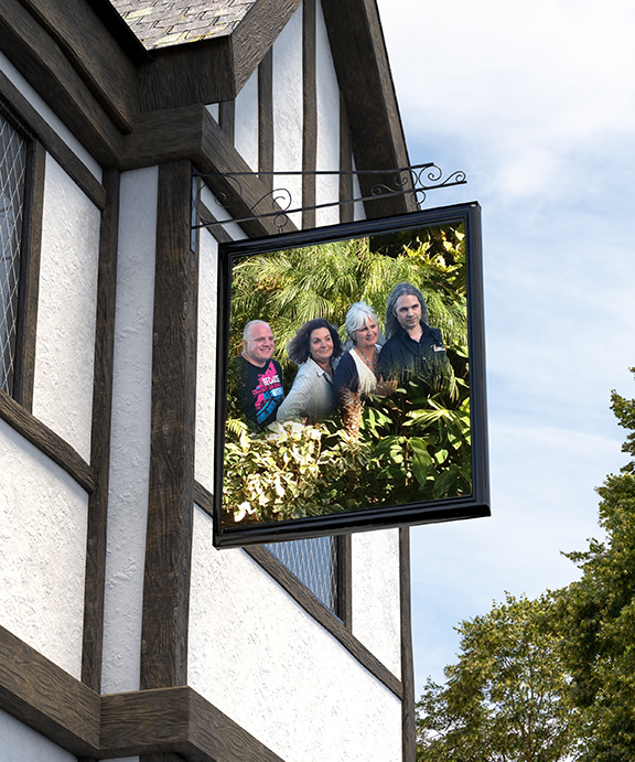
Here is a simple one from our AEL Summit in SF!
Copy link to clipboard
Copied
I like how you space them out boy, girl, boy, girl and black hair, white hair
Copy link to clipboard
Copied
chanaart wrote
Here is a simple one from our AEL Summit in SF!
Is that Tricia (second from the right)?
Copy link to clipboard
Copied
Yes! It is Tricia! And Joseph and Dan! The 4 Amigos in SF!
Copy link to clipboard
Copied
Copy link to clipboard
Copied
Wow! Lots of good ones already.
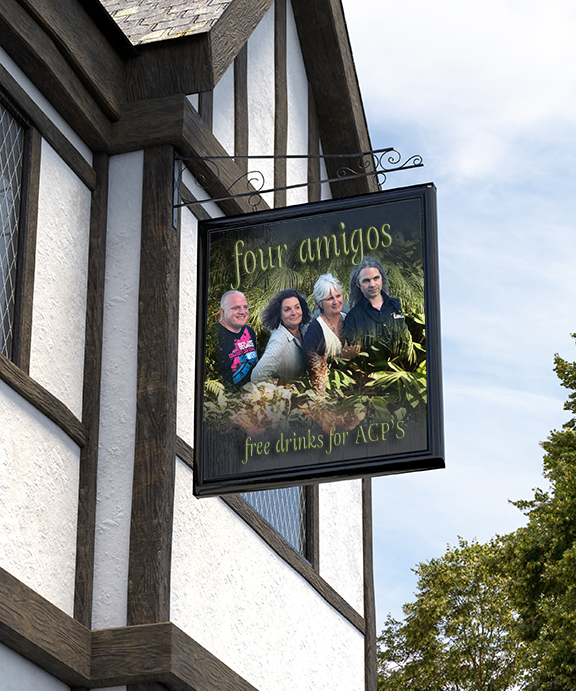
Anyway; here's something still simple, but a bit more whimsical than last week's giant spiders.
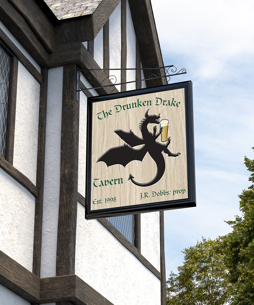
-- OB
Copy link to clipboard
Copied
I would have a drink there OB ![]()
Dave
Copy link to clipboard
Copied
davescm wrote
I would have a drink there OB
Dave
You'd have drink anywhere! ![]()
Chris has been looking at the family history of our tiler who it turned out had a lot more Maori ancestors than he realised. She was able to tell him that his great grandfather died falling off a horse when drunk, and he quipped straight back 'I like him already.' He has been full of one liners, and we'll be sorry to see him go. It reminded me that my granddad used to take the horse and cart to market once a month, and get so drunk he'd sleep all the way home, and the horse would take him there with no direction.
I have just been telling jane-e that Bert Monroy has just uploaded a project to Behance , and by heck, it puts us in our place. It's wonderful that even someone like Bert continues to improve, because while his characters are still similar to his work in Times Square all those years ago, the buildings are sensationally good. I shall endeavour to never do another window by simply filling it with a yellow glow again. It must have taken Bert a lot longer than an extended weekend to produce all that detail, and thinking about it, if Bert was no longer challenged, and finding new ways to do better work, he'd have got too bored with the process to continue.
Copy link to clipboard
Copied
Wow. I suspect that image may have taken him more than an hour or two on a Sunday afternoon!
It reminds me of some very good digital landscape paintings I saw for sale in a gallery, in Scotland. I overheard someone saying "I don't know why they are so expensive, you just take a photograph and press a few buttons in Photoshop......". Arghhhhhhh!!!!
Dave
Copy link to clipboard
Copied
Trevor.Dennis wrote
I have just been telling jane-e that Bert Monroy has just uploaded a project to Behance , and by heck, it puts us in our place.
Here is Burt's video on the Paris scene. It's part of his Pixel Preview course on lynda.com.
Parisian scene: Do the research
and this
Parisian scene: Create perspective
and this
It's awesome that he is willing to share part of his brilliance with us!
Copy link to clipboard
Copied
jane-e wrote
Here is Burt's video on the Paris scene. It's part of his Pixel Preview course on lynda.com.
Parisian scene: Do the research
and this
Parisian scene: Create perspective
and this
It's awesome that he is willing to share part of his brilliance with us!
Thanks Jane. I did have a quick look for relevant videos on Lynda, but a bit too quick it seems. I knew that Bert uses Google Maps > Street View to do additional research, but what I got out of was a way better way to build your perspective lines.
Instead of dropping an arbitrary star of radial lines on the vanishing points, Bert drops a connected two line path in roughly the right place, and fine tunes it into position. He then uses the Direct Selection tool (white arrow) on the inside end of the path to align it to an image feature. But it is the next thing that is so obvious when you think about it, but the context has never occurred to me. Copy and paste the path back on top of itself, and realign to another image feature.
It is stuff like that that Bert is so good at. I can remember the sudden realisation from watching one of his videos that you don't need to apply blur to an entire layer. You can select just the area you want to blur. Obvious, but it hadn't previously occurred to me to work that way. This was years ago BTW.
I've actually been using Lazy Nezumi > Rulers > Vanishing Lines to lay down perspective since it was added not so long ago. It's easy to use, (mostly — I'll maybe put up a wee guide on the not so straight forward bits), but I like being able to drop guide lines by stroking the paths, as it gives you a nice overview, and you can control their impact with layer opacity. One tiny problem is if your canvas is more than three or four thousand pixels wide, a single pixel line disappears. You can firm it up by copying the guide layer of course.
With single point perspective I have been using Photoshop guides, but these can problematic if you have Snap turned on, as your line will do a wee detour as it crosses a Guide. I use a G-key to toggle Snap to get round this.
Copy link to clipboard
Copied
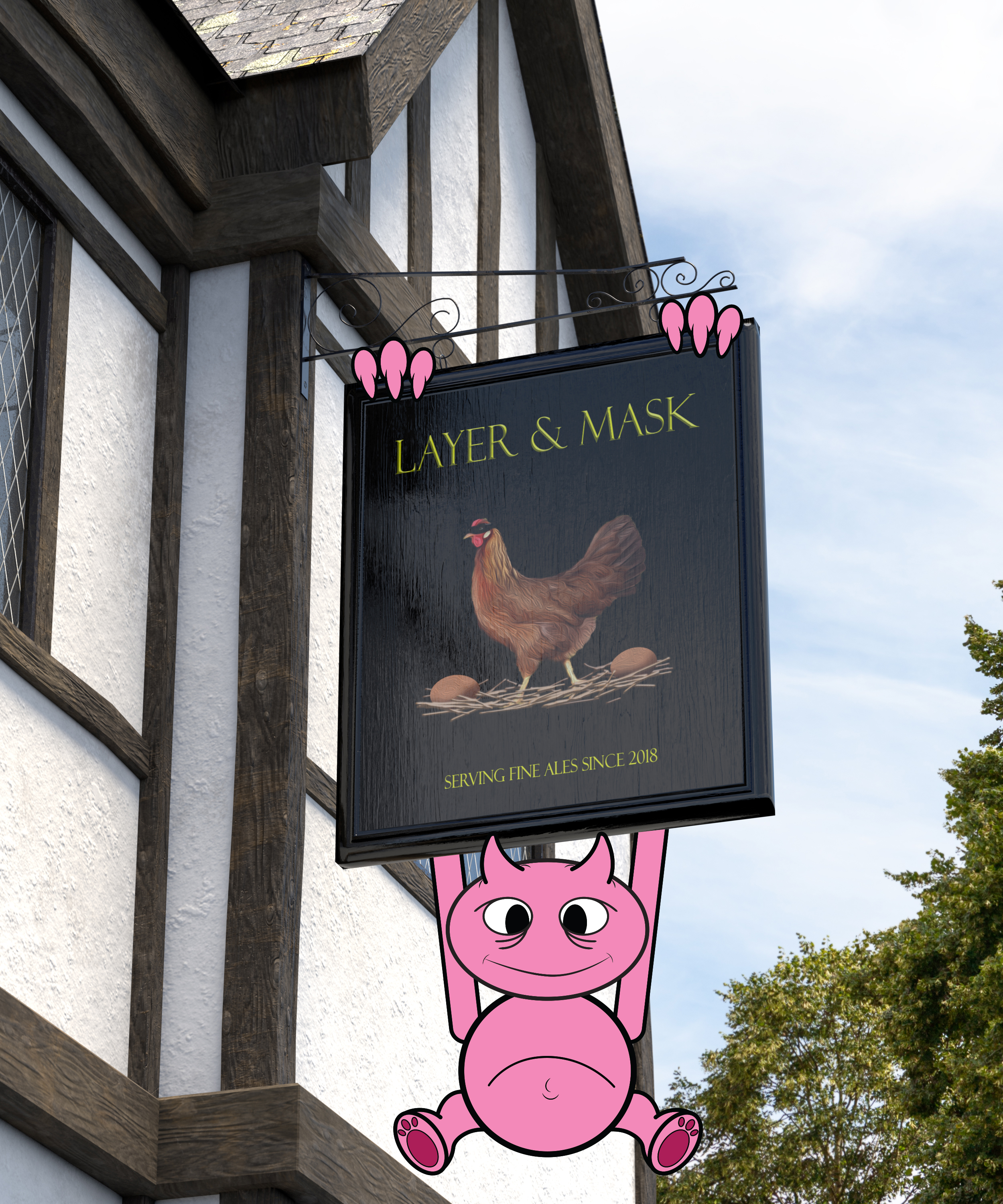
I did not put a lot of time into this as I have things I have to do.... but I could not resist creating a little critter that taunts villagers by climbing on buildings and tossing things at them (will leave that to your imaginations!).
Normally I would add shading and highlights.... but this was just something quick.... also normall I would have given the head more shape and not just an oval... but time constraints.
This was just for fun to brighten your day and make you smile! But I love giving characters a lot of detail.... and even use Adobe Character Animator!
You can view more of my work by visiting my Adobe Portfolio.
https://kennshinabery.myportfolio.com/
Or you can follow me on Instagram... as there I post all kinds of characters that I create.
Kenneth Shinabery (@kennshinabery) • Instagram photos and videos
Copy link to clipboard
Copied
Today Firefox is still rejecting me, but maybe Chrome will like me. We'll see!
Botticelli's Venus was on the splash screens of a number of the earlier versions of Illustrator. Now she tends bar.

Copy link to clipboard
Copied
Nice one Jane! I'll have a pint of Vectors.
It's been a great week for participation with images coming in all week.
A new challenge starts tomorrow.
Dave
Copy link to clipboard
Copied
Dave, it now occurs to me to wonder if you call it "drafts" in the UK? In the US, draft (or draught) means from a keg or cask and not a bottle.
Copy link to clipboard
Copied
Yes Jane, draught beer means the same here.
Dave
Copy link to clipboard
Copied
davescm wrote
Nice one Jane! I'll have a pint of Vectors.
Vectors is not resolution dependent... so the glass never empties ![]()
Copy link to clipboard
Copied
davescm wrote
A new challenge starts tomorrow.
Dave
Before we close this, I have one small question, Dave (and I don't mean to be critical). What is the whitish smudge in the upper right hand corner of the sign?
Copy link to clipboard
Copied
It was a reflection of the sun lamp. I did think of taking it out, but it would be there in a real scene so I left it.
Dave
Copy link to clipboard
Copied
I also thought about taking it out, but it looked realistic, so I also left it. I was just curious about where is came from!


