- Home
- Photoshop ecosystem
- Discussions
- Re: Something for the weekend - Part 9 - Mr Dressu...
- Re: Something for the weekend - Part 9 - Mr Dressu...
Something for the weekend - Part 9 - Mr Dressup
Copy link to clipboard
Copied
Hi
Given that last weekend's angel challenge is still going strong it almost seems a shame to start a new challenge. But Friday is here so it is indeed time for a new one ![]()
This week's challenge is set for us by Jodi_Frye It is a scene from one of her favourite TV show when she was "little" - Mr Dressup. So Jodi's challenge to us, is to use one or more of the characters in a new scene.
Anything goes as long as it meets the forum rules on decency, copyright etc.
Anyone is welcome to have a go - whether you are a complete beginner or a Photoshop expert.
There are no prizes - just the chance to practice, show off, or bring a bit of humour and fun.
When posting back your edited images please use jpeg and downsize to 1200px on the long side.
To download the image below without the forum scaling artifacts, right click and then use Save Image As / Save Picture As (or similar depending on your browser).
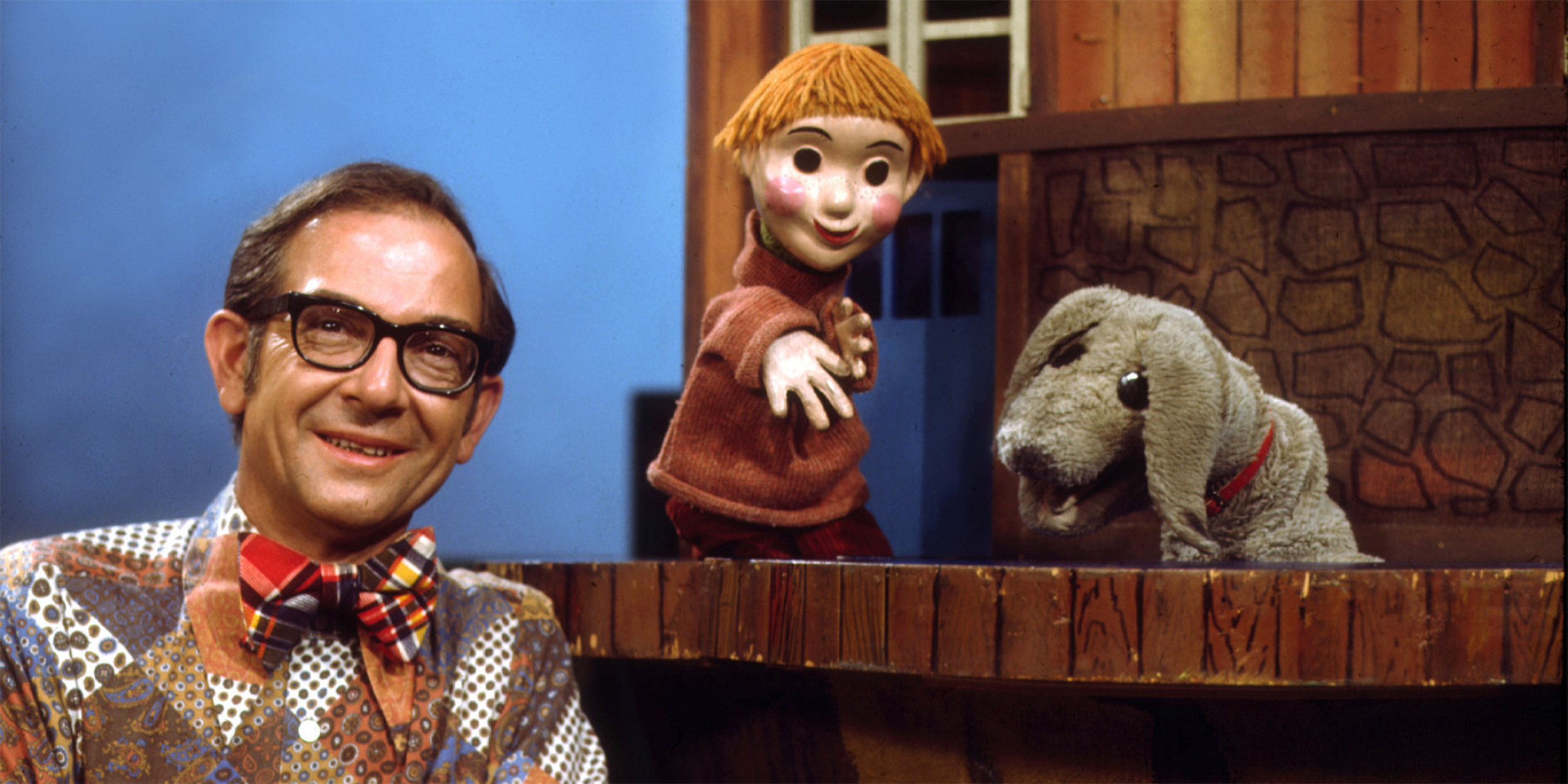
Dave (on behalf of Jodi this week ![]() )
)
Explore related tutorials & articles
Copy link to clipboard
Copied
jane-e wrote
Trevor.Dennis wrote
Ummmm..... Well.... I kind of cheated.... Any time I see a proprietary image, as in one not one that one of us took ourselves, then I pretty much always look for a better version.
I was pretty sure it was a different photo, but was also pretty sure you would say so.
I was inspecting the stitching in the cuff of the shirt and wondering how you got all those perfect stitches, and then started noticing all the other differences that I mentioned earlier that would be pretty hard edits.
Still, it's good!
(And then again, I'm the one who threw in the original photo that the statue was based on!)
Jane, stitching is fairly easy. I did this as an exercise a few years ago (It's 100% illustration. The stitches are dashed line with a tiny bevel & emboss, and a thin black line beneath to give the effect of depth. The main pattern is half tone with render clouds to prevent it being too uniform.

I have watched all of Bert Monroy's Lynda.com tutorials, some of them several times. The level of detail on his Times Square illustration is phenomenal and what I would like to one day aspire to. Bert makes the point that in the two or three years it took him to make Times Square, new Photoshop versions made new things possible, and he redid a lot of it, and you can see what he means.
Times Square by Bert Monroy « Adobe Illustrator blog
This is one of my favourite characters (does anyone know who it is?).
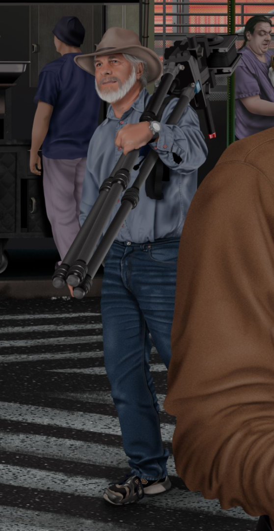
I love the detail in the shirt and jeans.
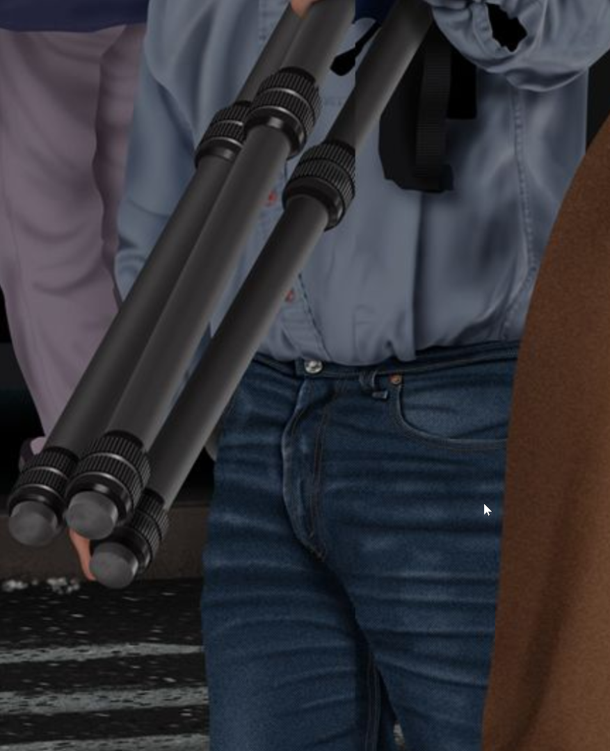
Right I am so full on today it is not funny, so no more forum time till this evening. 😞
Copy link to clipboard
Copied
Awesome job on the seams—I will try it next week when I finally get a small reprieve from work. Thank you for sharing your technique, Trevor!
As to the photographer in Burt's famous painting, is it one of these?
- John Paul Caponigro
- Greg Gorman
- Jay Maisel
- Jack Reznicki
Copy link to clipboard
Copied
jane-e wrote
Awesome job on the seams—I will try it next week when I finally get a small reprieve from work. Thank you for sharing your technique, Trevor!
As to the photographer in Burt's famous painting, is it one of these?
- John Paul Caponigro
- Greg Gorman
- Jay Maisel
- Jack Reznicki
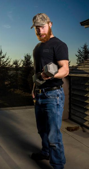
Hey, thanks for the names. I have tried, on several occasions to find a version of the image with names, but I think it might be too big to do that. I can recognise a tiny percentage of them. I think I could have faked Mr Dressup's arm btw. Busy patterns like that are actually easier than say, vertical stripes, and they respond well to Content Aware Fill. When I did this visual gag of our Benjamin with his super powerful new torch, which was bright as day, but had a very narrow beam, I had to add his left hand and foot, and some of his arm because he is holding a gym weight in the source image. To distort the brickwork I work out the perspective and make guides with the pen tool and stroke with a contrasting colour on a high layer. It makes it much easier when the pattern is broken up and you can do it in sections (as in either side of Benjamin's legs.
I'm sure I don't to explain, but the gag was that his narrow beam did not show the dangers lurking just outside the beam in the dark. ![]()

Terri, that's a perfect fit for the subject, and I like the subtle emboss of the pieces. As I like to say on this forum, I bet a lot of this forum's regulars could do the sort of composites and digital art we see from the likes of Erick Johannson (spelling?) and that it is a matter of having the ideas, and seeing it in your head. It can only take one word to trigger an idea. I am supper busy at the moment, but will try and get another Mr Dressup done. Actually, when the idea pops into your head, there is usually no denying it — you can't help yourself and have to make it real.
Copy link to clipboard
Copied
Trevor.Dennis wrote
Hey, thanks for the names. I have tried, on several occasions to find a version of the image with names, but I think it might be too big to do that. I can recognise a tiny percentage of them.
I think I could have faked Mr Dressup's arm btw. Busy patterns like that are actually easier than say, vertical stripes, and they respond well to Content Aware Fill.
When I did this visual gag of our Benjamin with his super powerful new torch, which was bright as day, but had a very narrow beam,
This site has some of the name and lists four photographers, so it must be one of them: Times Square
Yes, you could have created (aka "faked") the arm. But when I examined the stitches (which I was 100% wrong about), I noticed the wall to the left, the angles of faces, the sizes of window, plus the curtains and other things and wondered why you would bother changing all those details. I put the images on top of each other with difference mode and there was too much that changed. That's when I knew it had to be a different picture.
When and if you have time (and if you feel inclined) your can create that arm just for fun and let us see it. ![]()
Love the Benjamin gag—great example of "tunnel vision". It could be used in seminars to illustrate the point.
Copy link to clipboard
Copied
It is with gritted teeth I say this Trevor, but that is kind of good, particularly the way you engineered the arm.![]()
Copy link to clipboard
Copied
Nice job Trevor - I agree with the others the shirt build is very good ![]() .
.
Semaphoric - Love the Saturday night fever image - and did anyone else notice Mr Dressup in the background?
Rista12 - That has a great kids book feel to it. Bad dog !
Keep them coming ... everyone is welcome to have a go.
Dave
Copy link to clipboard
Copied
One should always be Dressed Up . . . on Saturday Night . . .

Copy link to clipboard
Copied
that is brilliant. John Travolta 'eat your heart out' Just notice Mr Dressup in the background watching and matching the original depth of field-clever.
Copy link to clipboard
Copied
That's awesome Semaphonic ! I like how you did his hand as well !! Great render !! ![]()
Copy link to clipboard
Copied
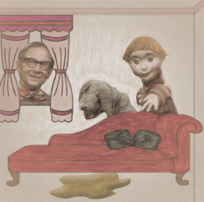
Copy link to clipboard
Copied
Oh this is great Rista !! The illustration works so nicely with the theme. I love it ! ![]()
Copy link to clipboard
Copied
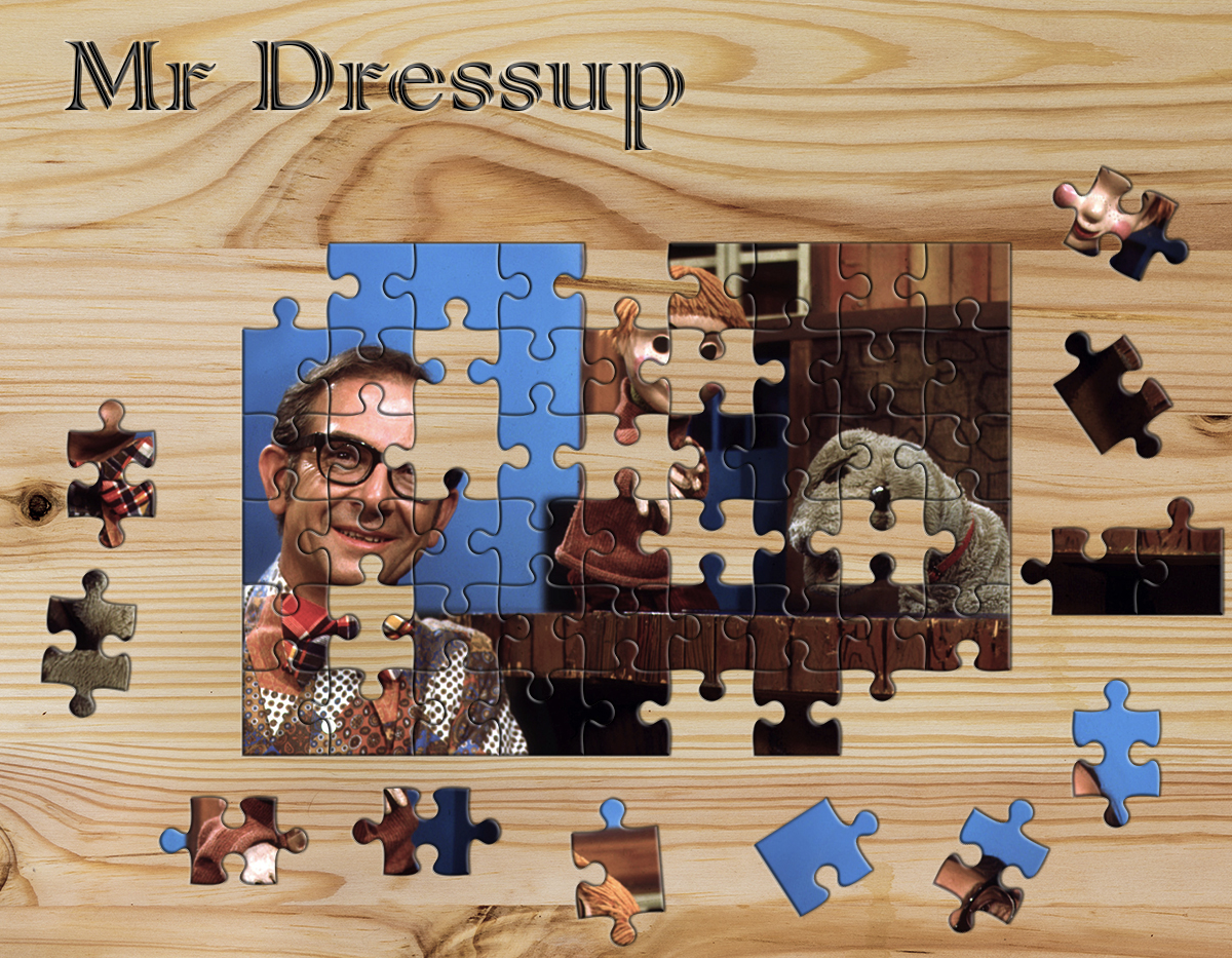
Mr Dressup has gone completely to pieces.
Copy link to clipboard
Copied
Oh this is just perfect Terri !!! It so made me smile ! Definitely goes along with the theme of the show ! I'm sure Mr. Dressup had puzzles in his Tickle Trunk ! ![]()
![]()
![]() Love it !!! Thank you ! ❤️
Love it !!! Thank you ! ❤️
Copy link to clipboard
Copied
https://forums.adobe.com/people/Terri+Stevens wrote
Mr Dressup has gone completely to pieces.
Finished !!
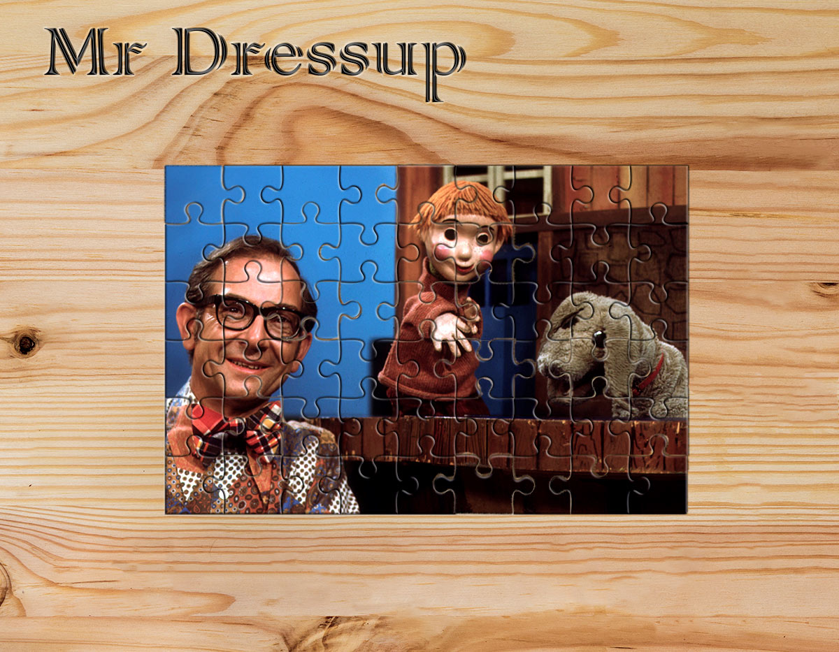
Dave
Copy link to clipboard
Copied
Oh wow !! That's genius Dave !!! Now I'm really smiling !!! That's such an awesome finished puzzle !!! I love it !!! I'm wondering how long it took you to put those pieces in the right spot !! ![]() And then of course recreating the wood backboard. Excellent !!! Really great !!
And then of course recreating the wood backboard. Excellent !!! Really great !!
Copy link to clipboard
Copied
I'm surprised Terri didn't hold back one of the puzzle pieces to drive everyone crazy ![]() .
.
Copy link to clipboard
Copied
Nice puzzle work, Teri and Dave.!
Copy link to clipboard
Copied
Bet you can't do this one Dave ![]() I'll give you a clue, I didn't rotate any of the pieces, but still it's not easy.
I'll give you a clue, I didn't rotate any of the pieces, but still it's not easy.
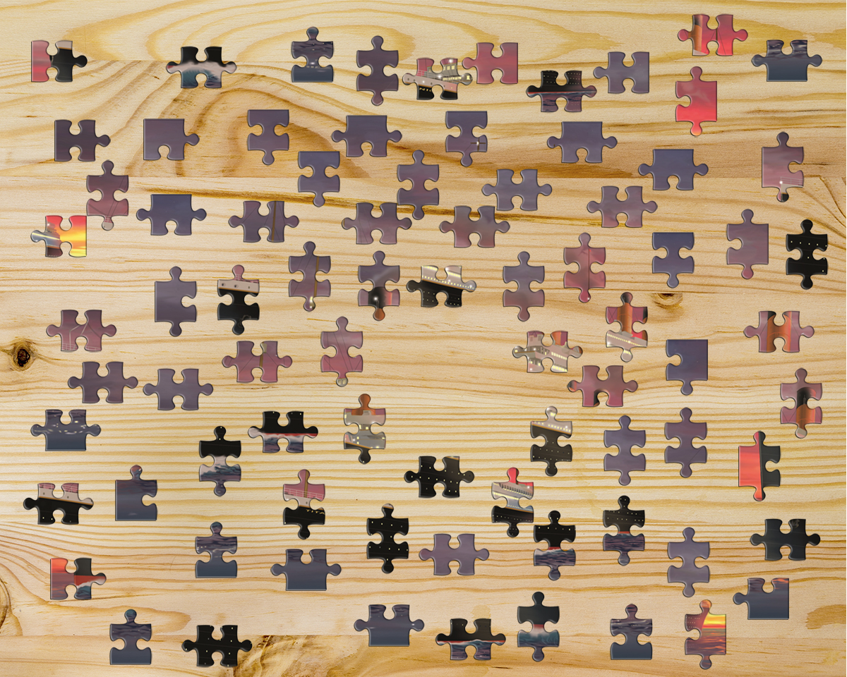
Just in case anyone is vaguely interested in trying this, the completed puzzle looks like this

Copy link to clipboard
Copied
Ha ha that's awesome Terri !! Now I want to put it together for real ... not with a computer. ![]()
Copy link to clipboard
Copied
Your challenge has worked out really well this week Jodi , nearly 1200 views in 5 days so it must interest users on the forum. Pity we can't persuade some of that 1200 to submit something. I wish they would, it's amazing how much a positive comment here can make too the old self confidence and that can stir you on to get even better than you are. One thing I really notice is different people have particular styles that they are able to reproduce every week. For an example of that look at Rista's work , which I love. Having a style is the trait of a true artist, I think, and you only need to go to a gallery to see an exhibition and an artists particular style hits you right in the eye. Unfortunately I work in the commercial world and just do what I'm told , so don't have any particular style whatsoever, but it pays the bills lol
Copy link to clipboard
Copied
I had no idea there were that many views here ! I guess the challenges are a popular place to come check out !! It's quite OK to be versatile though when it comes to art and design. But agreed sometimes a certain style is kind of built in to artists. But you are right that more people need to stop being just lookers and join in on the process. It really is the best way to let yourself see what you are capable of ! ![]()
Copy link to clipboard
Copied
Um, where do you see the views ? I guess I'm blind
edit... forget it ... I see it now under the main post... right ? Goes to show I never pay attention to those details...
Copy link to clipboard
Copied
It's on our main page Jodi
Go to the bottom 'View all unanswered questions and set it too 'All discussions' then find 'Something for the weekend'.


Copy link to clipboard
Copied
lol to late I already responded. I knew you had to have seen that ![]()
Copy link to clipboard
Copied
Madison's Forum News has always fascinated me when it quotes forum stats. The Adobe forums as a whole, get over a million views a day, with a view being counted every time we click to open a thread. The Photoshop forum is one of the busiest, so there have to be a lot of people who lurk without posting.
This is from the latest (February) Forum News. Looks like I was on the low side with my numbers. ![]()

I'd post the link, but I am not sure you can open it without ACP/MVP permissions. I'll add some more useful snippets though, like Nancy is up there with the highest point scorers. John posts in The Lounge, and kglad is nothing short of a legend — he only shows a bit over 300,000 points, but his point counter has been round the clock a few times, and the forum doesn't have room for all the zeros ![]()

Does anyone know of a public link to the Forum News? It is always full of interesting stuff.


