- Página inicial
- Photoshop ecosystem
- Discussões
- Re: Something for the Weekend - Part 92 - Going Un...
- Re: Something for the Weekend - Part 92 - Going Un...
Something for the Weekend - Part 92 - Going Underground.
Copiar link para a área de transferência
Copiado
Hi
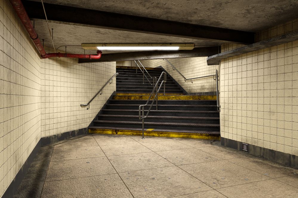
There were some brilliant ideas in last week's cabin and woods challenge. For this week though we have had enough fresh air and are going urban, specifically into the subway. I created and rendered this image in Blender 3D, and used Adobe Substance for texturing.
Now the scene is set, what will you do with it? What story will you tell with your edited image? You can do anything you like, just don't get mugged!
The “rules”:
- Anything goes, as long as it meets the forum rules on decency, copyright etc.
- Anyone, and everyone, is welcome to have a go, whether you are a complete beginner or a Photoshop expert.
- There are no prizes apart from the chance to practice, show off, or bring a bit of humour and fun. Don't be shy, join in and have a go!
To download the image below in jpeg format at 3000 x 2000 pixels and with an embedded ICC colour profile (sRGB), hover over the image and click on the circle with the arrows at the top right. Then, when the image opens in its own window, right click and choose “Save Image As/Save Target As” (or similar depending on your browser)
When posting back your image – please use the Blue reply button in this first post. If posting a comment on someone else’s entry then please use the grey reply button next to their image post.
Have fun.
Dave
Explorar tutoriais e artigos relacionados
Copiar link para a área de transferência
Copiado
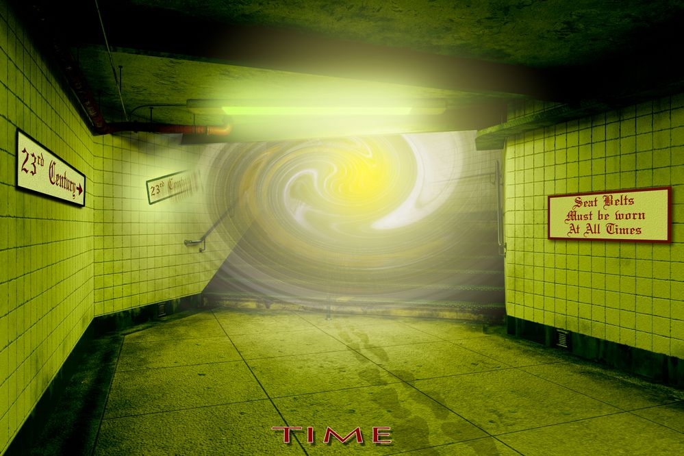
Can you post the untwisted version by itself so we can better help, Hans?
Copiar link para a área de transferência
Copiado
Hi Jane,
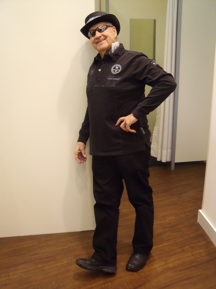
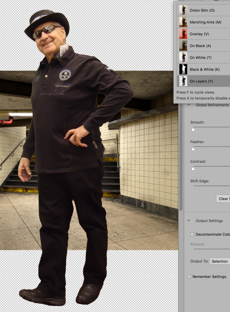
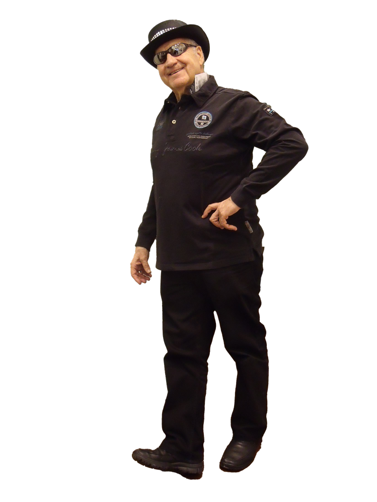
here is the original, which I cutted up. After that I put it into a new image, where it came out surrounded by this white area. "Selection tools" and "blend mode" are foreign words for me at the moment. So I keep using the "Polygon-Lasso-Werkzeug. I would be very happy, if you could provide technical assistance. Ok, here I am in the original :-)))
All the best
Hans-Günter
Copiar link para a área de transferência
Copiado
Hi Hans,
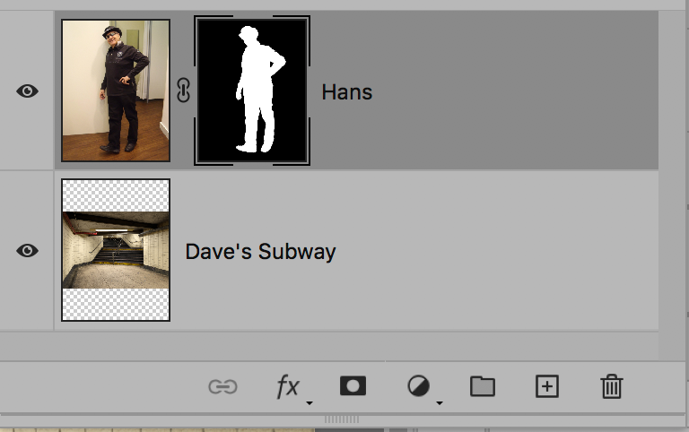
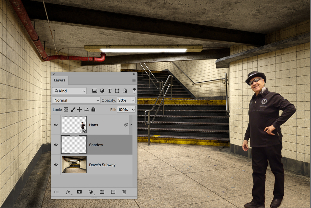
I moved Dave's render to your image as a lower layer. Note that your image is taller.
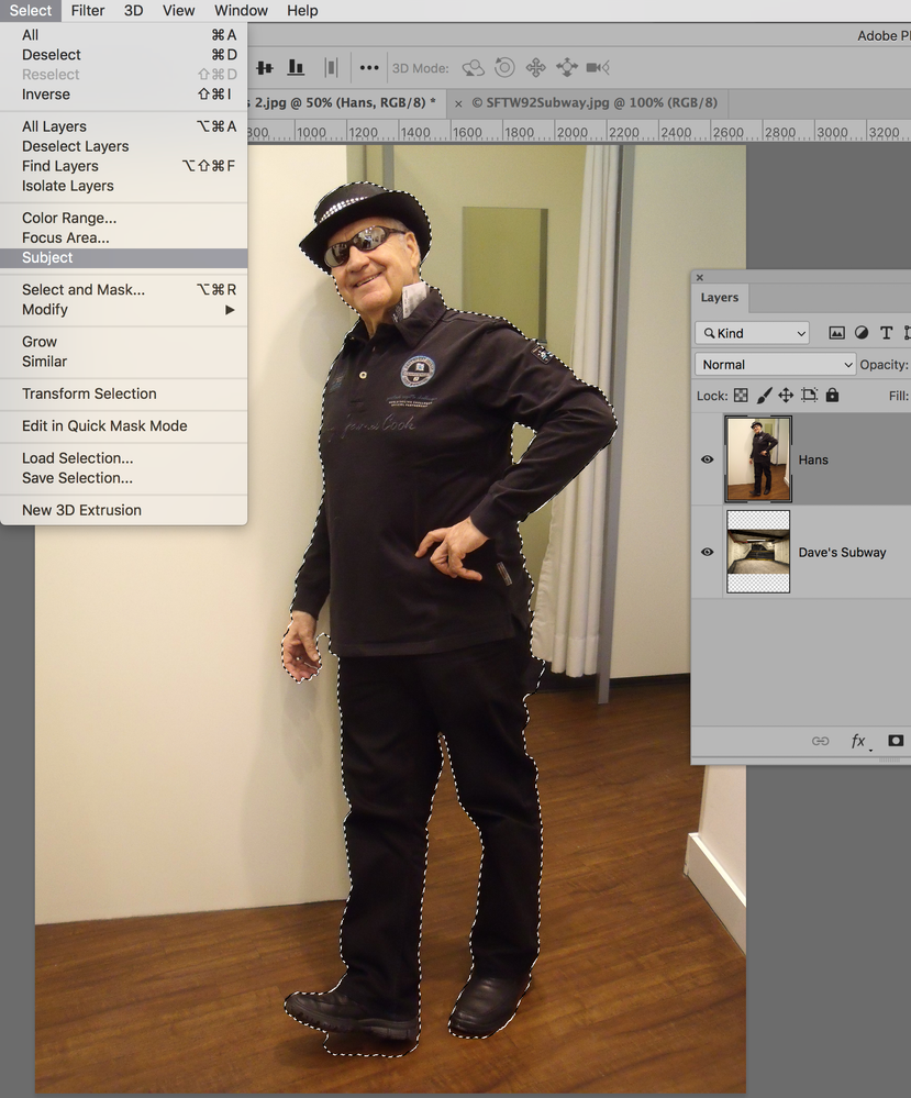
Start with Select > Select Subject, which gives a good start.
Use the Option key (Alt on Windows) plus one of the Selection tools to subtract the parts you don't want where it selected too much. (Shift plus a selection tool will add to the selection.) You can use Option (Alt) with the Polygonal Lasso tool that you said you are used to.
Go into Select > Select and Mask and try the different Views in the right hand panel. Use the tools on the left to make more adjustments to your selection as necessary.
I did this quickly and not perfectly.
In the Layers panel, add a layer mask and make it a Smart Object. Then (in this case) scale it with Edit > Free Transform.
I used the Crop tool to crop out the extra pixels at the top and bottom.
I hope I did okay with the scaling and shadow this time, Dave, after all of your lessons. Let me know!
~ Jane
Copiar link para a área de transferência
Copiado
Hi Jane,
only by a lucky coincidence i got to express my appreciation of your helpful hint, almost would fell victim to the recently loss of email notification.
>>> See for example: Feedback Tracker >>>
https://community.adobe.com/t5/back-room/not-getting-any-forum-emails/m-p/11129902?page=2#M58738
Thank you very much!
Hans-Günter
Copiar link para a área de transferência
Copiado
the image is a Jpg = adds white so change it to a Png for missing pixels

Copiar link para a área de transferência
Copiado
It's been many, many years since I've been in a city that has an "underground", but I've heard that in more recent times, you never are completely sure of where, or even when, you'll end up (queue spooky music)...
Glenn
Dave - your work is truly amazing!!! Thanks for doing this.
Copiar link para a área de transferência
Copiado
Thank you Glenn. Step forward to the next dimension
Dave
Copiar link para a área de transferência
Copiado
I sooooo need to get some work done 😞
Copiar link para a área de transferência
Copiado
Nice job Trevor. A clever reversal of the scene which fits well with the train. Weekends aren't for work though - they are for SFTW 🙂
Dave
Copiar link para a área de transferência
Copiado
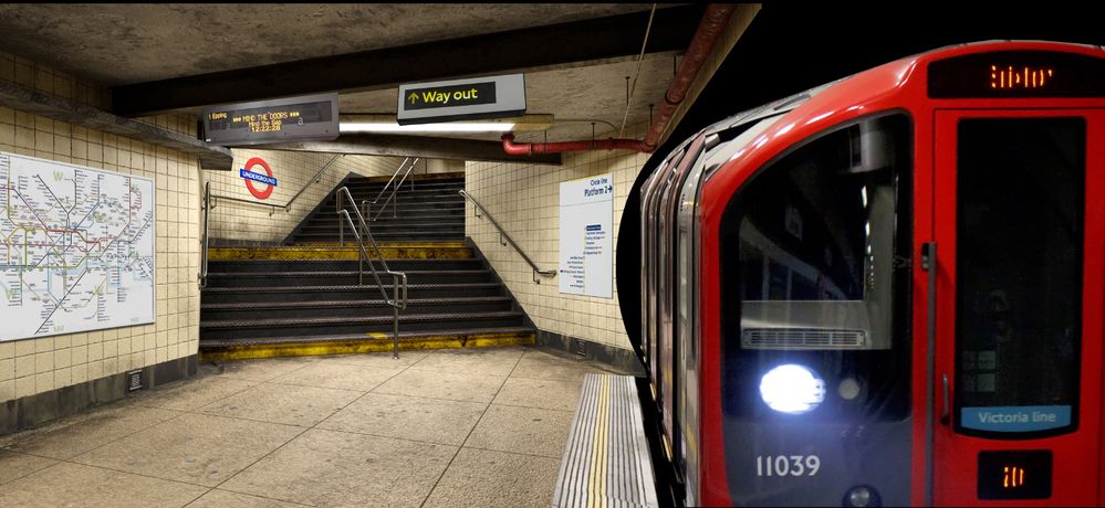
Dave, there are dozens of images of underground trains on Google, but I struggled to find close enough to the subway perspective. So it was easier to flip the subway that the train and have to fix the text. The train is still not right, but it kind of works. When I used to do the Friday Challenge on Steve Caplin's 'How to Cheat at Photoshop' forum he was a total tyrant on perspective. So much so that sometimes he'd rip me a new one and I couldn't see where the issue was. Sometimes we can see that a composited element is not right, but can't put our finger on what the problem is. That's something that comes with practice I'm thinking.
BTW I finished those committee minutes that had loomed over me making me depressed since the beginning of February, so now I can waste as much time as I like.
Copiar link para a área de transferência
Copiado
Perspective is one of those things that you don't notice when it is right, but jars when it is not. It doesn't need to be off by much to become noticable. So I tend to like perspective that is so right I don't notice it or so completely wrong that it is obviously deliberate (my definite bias is to the former though).
Dave
Copiar link para a área de transferência
Copiado
Hi all,
below I quote a thread Peter Grainge, Adobe Community Professional, started in May 07, 2020:
Not getting any forum emails?
I suddenly stopped getting any forum emails. No settings changed and no change to my email address.
It's the same to me and it is a pity that I can't see at once in my eMail letter box, whether there is a comment or a "Like". Do you have noted the same?
Stay healthy
Hans-Günter
Copiar link para a área de transferência
Copiado
I don't use forum emails Hans. I visit here most days and just glance through the notifications for any replies before looking at new posts.
Dave
Copiar link para a área de transferência
Copiado
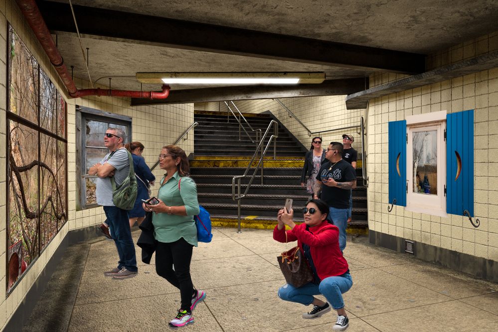
A few windows make a big difference...
Copiar link para a área de transferência
Copiado
That's good hans. They all fit the scene pretty well and are nicely scaled into the background. Think about adding some shadows next time. That rarely means the drop shadow layer style, but try painting a black blob on a layer below each person and blurring it with Gaussian Blur and dropping opacity. Then use the Smudge tool to tweak it pushing and pulling into place. We are usually told to set shadow layers to Multiply, but I rarely notice any difference.
Dave has an advantage here as he can render people into the scene and see exactly how their shadows should fall. It's all part of what make these SFTW threads so useful. I have learned a huge amount since we started them, and that's both from getting stuck and working it out myself, to having other posters tell us how they do stuff. Plus the addage of use it or lose it applies to Photoshop the same as anything else that's a bit complicated. I'd not been using Photoshop much since the forum got stuffed up last year, and I have had to think hard to remember stuff even after that short break. That's what comes from being an old bugger though.
Copiar link para a área de transferência
Copiado
Trevor, in case you meant to reply to my posting and not Hans's, thanks! (I think that is the case because of the lack of proper shadows under the people in my entry.) I should have added the shadows, I am familiar with the techniques but I did not take the time to properly finish the scene, I was in a rush to do something else. The scaling of the people was a lucky accident, all of them come from a single shot of tourists at the High Line area in NYC. That is to say, I just used a plain Transform step to make sure the people in the foreground seemed the right size; the others fell right into place!
Rafael Aviles
Copiar link para a área de transferência
Copiado
Hi Trevor,
no matter to whom you would answer, till today I have tried to practice for many times and so I am excited about next fridays SFTW. I look forward to hear what you will say than. ;-)))
Hans-Günter
Copiar link para a área de transferência
Copiado
Yes, that certainly brightens up the subway journey Rafael 🙂 I agree with Trevor a few subtle shadows would help ground the people
Dave
Copiar link para a área de transferência
Copiado
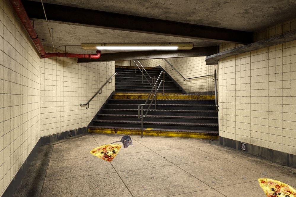
Unlike the NYC rat who had to leave his pizza on the third step from the bottom, this guy made it all the way down.
Jane
Copiar link para a área de transferência
Copiado
Nice idea Jane. Similarly to Rafaels image a very subtle shadow would help to ground the rat and pizza. If you look at any edge, even in soft lighting, there is a darkening of the object and the ground where they meet. That is because those "corners" are not lit from all directions. Look closely at your desk or table where your computer meets it and you will see that slight darkening. By simulating that when compositing we can make it loook realistic. In the 3D rendering world, that is what Ambient Occlusion does. Keep it subtle though, a little bit adds realism, overdone it looks as false as when it was missing.
Dave
Copiar link para a área de transferência
Copiado
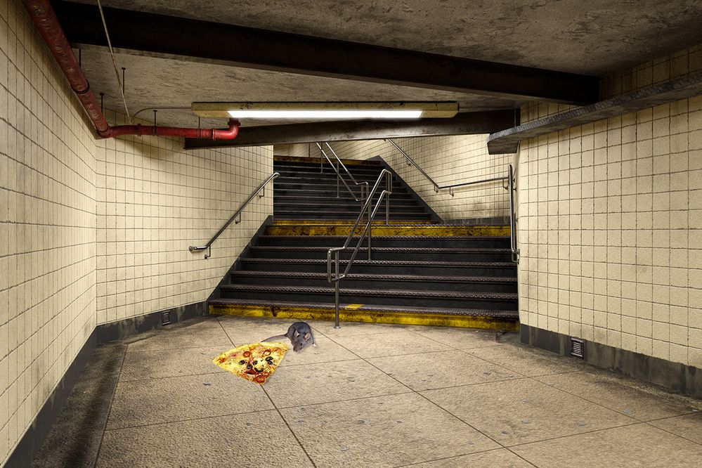
I've added some some subtle shadows, Dave. Thank you for the great advice!
~ Jane
Copiar link para a área de transferência
Copiado
Copiar link para a área de transferência
Copiado
I love it
Copiar link para a área de transferência
Copiado
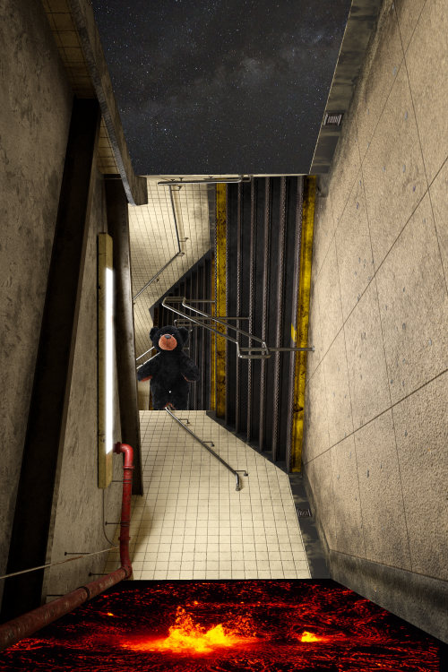
Surprisingly, tipping it on it's side like that works well. I like it.
Dave
Copiar link para a área de transferência
Copiado
I think this image is so cool! I assumed you had gathered parts of different structures and combined them before reading that you had "merely" rotated the image and added the starscape, lava bed, and lost man. Makes me want to start cutting up some images of staircases and hallways. . . .
Encontre mais inspiração, eventos e recursos na nova comunidade da Adobe
Explore agora