- Home
- Photoshop ecosystem
- Discussions
- Re: What Steps Do I need To Take To Create An Imag...
- Re: What Steps Do I need To Take To Create An Imag...
What Steps Do I need To Take To Create An Image?
Copy link to clipboard
Copied
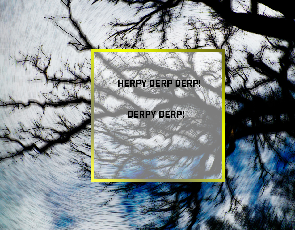
I was wondering if anyone would be willing to take the time to help me to create an image similar to the attached image? I DO NOT want to copy the exact image. I just want to know the following steps to create something similar.
I want to start making images for my social media sites and what I want to do is swap out the background image and change the text. But the design will stay the same. For example, the border color of the rectangle witll stay the same, the transparency will stay within the rectangle, my watermark will stay the same.
I am new to photoshop and the version that I'm using in Photoshop CC release 19.1.8
Yes I'm starting to watch Youtube videos on Photoshop, i.e, creating text, opacity, rectangles and borders, etc. However, I'm not able to fully duplicate the design features of the following image.
So what I want to do is:
1. Open or add any background image
2. Add my watermark
3. Add a rectangle around my text with any solid border color
4. Add/edit text with any font/text size
5. Add the transparency effect within the borders of the rectangle
I'm not sure from what I watch how to create the transparency effect and keep that effect only within the rectangle.
Also, once I have the text, border/rectangle, transparency, and watermark in place, is there a way to move all the layers at once so I don't have to reposition all layers one at a time?
Keith
Explore related tutorials & articles
Copy link to clipboard
Copied
Really quick example:

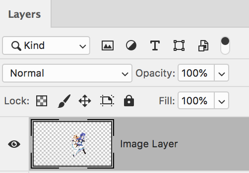
It's only four layers. (Could've been three with the text. I'm just rushing here.) Took about 5 minutes.
To get the transparency effect for *just* the rectangle itself, use the Fill option in the Layers panel. (Make sure the rectangle layer is targeted.)
The border is just a customized gradient added to the rectangle layer as a Stroke layer style.
To move everything together quickly, you could just group everything up by selecting all the desired layers, then clicking the "create new group" icon at the bottom of the Layers panel (looks like a folder). Click the group, then move using the Move Tool.
Copy link to clipboard
Copied
Hi
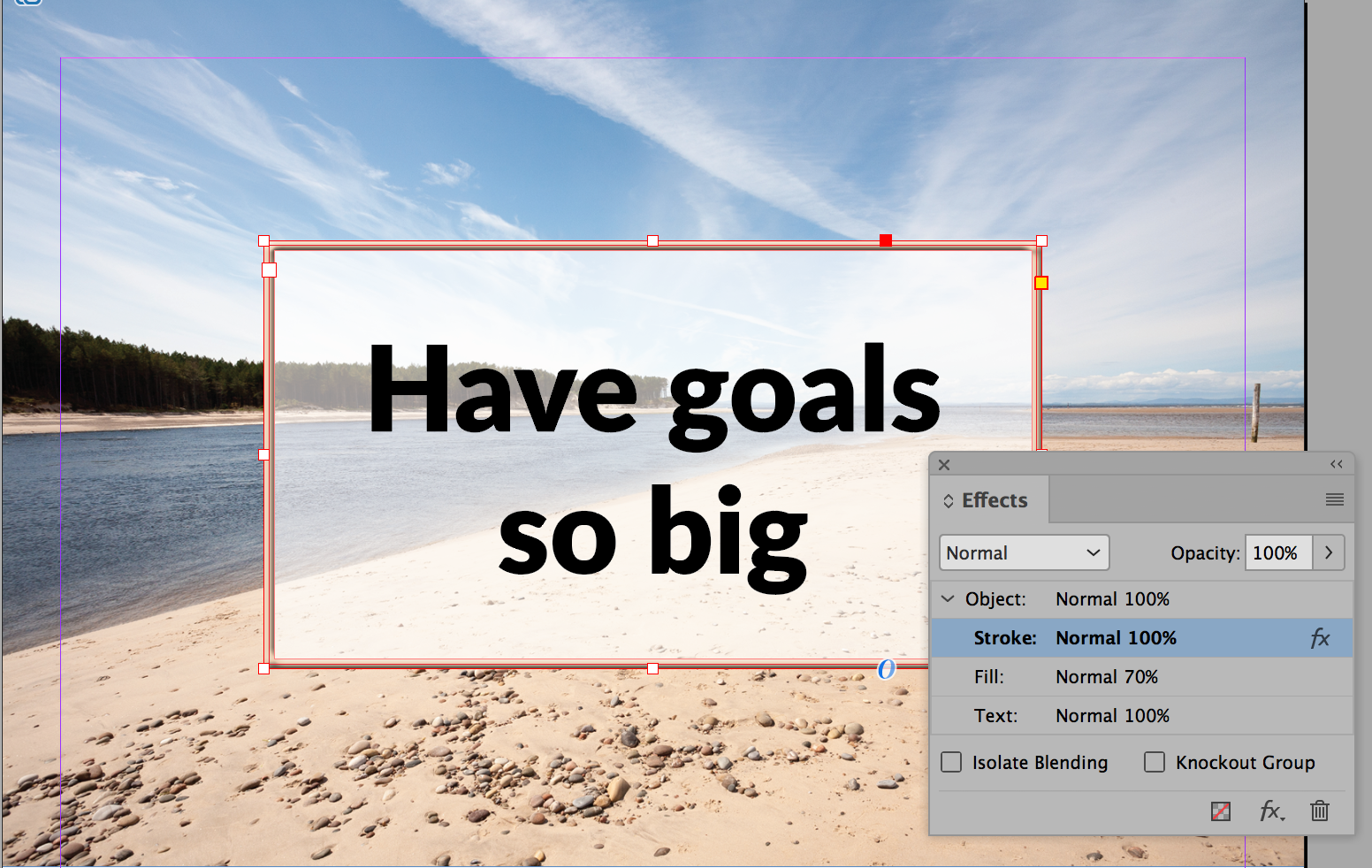
If you have InDesign, do it there. You can set the effects for the stroke, fill, and text separately and not just the entire object. This has opacity on the fill and a bevel on the stroke (because yours did). Then save it as an Object style for reuse.

In Photoshop you will need to use multiple layers. To contain the fill, make a selection first and fill the selection. Then drop the opacity for that layer.
Once you have the layers in place, multiple select them and click the Link icon at the bottom of the Layers panel so you can move them together — or you can group them.
Photo Credit: davescm in the weekly Photoshop Challenge: Something for the weekend - Part 59 - A room with a view.
Copy link to clipboard
Copied
I appreciate everyones effort on their answer. However, since I'm new, I'm not familiar with the terminology you used and I don't know where to select some of the options you suggested. I'll do my best to find them. but I may come back and ask more questions.
I was able to use the 'link' icon at the bottom of the layers panel and then use the move tool to move the entire 'linked' layers all at once. but I was unable to figure out, once they are linked, how can I go back to move just a single layer within the linked layers.
As for the group option, I was able to group them. But when I tried to use the move tool, with the group selected in the layers panel, it only moved the individual layers within the group, not the whole group all together.
Also, what is the difference in linking layers and grouping layers? Advantages/Disadvantages?
Copy link to clipboard
Copied
Hi Keith,
We never know how much someone knows, so, yes, ask again if anything is not clear.
You found Link. To unlink, multiple select the layers again and click the Link button again.
As to one one layer moved when your group was selected, uncheck Auto-Select. It will be in the options bar when you have the Move tool selected.

Groups are much newer than linking layers and can do more. You can put an effect on a group and other things that you are doing yet. For simply moving layers together, either works.
You will find Opacity in the Layers panel. Select the layer first.

To add a bevel or a stroke to a layer, select the layer and click the Fx button at the bottom
What else do we need to clarify?
~ Jane
Copy link to clipboard
Copied
keitha70260201 wrote
However, since I'm new, I'm not familiar with the terminology you used and I don't know where to select some of the options you suggested.
Hi Keith,
Come back and ask as many questions as you need to, but I want to show you a new feature of PS 2019 that I love. Click the magnifying glass in the upper right.
![]()
Switch to the Photoshop tab (second tab) and start to type in what you are looking for. I typed "mo". Now click "Move Tool" and it puts you on the tool and very briefly highlights it with a blue outline.

~ Jane
Copy link to clipboard
Copied
Don't mean to overwhelm but just to pile on because I think it's a good habit to get into: Name your layers in the Layers panel. (Double-click on a layer's name to rename.) Always be naming and organizing, especially with compositions. The layers in a comp can potentially be in the hundreds (sometimes thousands). Don't settle for "Layer 0," "Layer 1," etc. If there's a door featured in a layer, name it "Door." That kind of thing.
Believe me now, thank me later. ![]()
Copy link to clipboard
Copied
I have to echo the statement about naming layers. You don’t want to do like I’ve done way too many times in my Illustration work in Photoshop where I’m doing a lot of work, only to realize that I totally did it on the wrong layer and its too late to fix it
Copy link to clipboard
Copied
Thank you all for your help. I was able to follow the instructions about grouping the layers and then moving the group all at once by de-selecting auto-select. Also I was able to un-link certain layers to move only the layer I want while the other layers were still linked.
Thanks for the suggestion on searching for items using the magnifying glass. It worked as you described.
Thank you also about naming the layers. Great suggestion and I'll follow it.
Just one more thing and I thought I would add this to this discussion. I was able to create an image with my initial features I named in this discussion. Now the issue is how to save it properly so I can add it to instagram. I followed a youtube video on how to do this and it said to save the file in 1 of 2 ways. Either select Image, Image size from the menu or select File, export, save for web.
In either case he said to set the width to 1080 pixels and set resample to bicubic sharper. So this is what I did with the following image. The first image is a screen shot from photoshop:
This following image is a screenshot after I posted the above image to my instagram account:
As you can see a lot of the image was cut off when posted to instagram
Why did it do this?
How can I size the image so it includes more of the image as it is being shown in the photoshop editor?
Copy link to clipboard
Copied
Was that on mobile for the second example? I thought I heard they've yet to allow viewing of anything outside of a 1:1 ratio on mobile properly.
Instagram used to be 1:1 ratio only until fairly recently. Now it can be like 1.91:1 for landscape and 4:5 for portrait.
Copy link to clipboard
Copied
Yes the second image was a screenshot from my mobile phone
I'm not sure what you mean by 1:1 ratio. If you care to explain further what 1:1, 1.91:1 or 4:5 means I would greatly appreciate it
If you have any suggestions to properly fit images created in PS on Instagram, that would be great.
Copy link to clipboard
Copied
Bear with me. I kind of suck at explaining math.
Ratio (in this case, when working with images) refers to the width and height of an image in relation to each other. (Width always comes first, so it's width:height.)
So when I say 1:1, I'm saying the image is as wide as it high, essentially making it a square. This applies to any dimension: 200 x 200 pixels, 400 x 400 pixels, 1000 x 1000 pixels, and so on. They're all 1:1 (square).
You have to apply some math to other ratios. 2:1 would be a much wider image, because the width is twice as wide as it is high. So, 200 pixels (wide) x 100 pixels (high). You can do multiples from there: 400 x 200 pixels, 800 x 400 pixels, 1600 x 800 pixels, and so forth. They're all in the 2:1 ratio. You can go in-between these multiples as well: 1080 x 540, 940 x 470, etc.
Instagram, for some reason, wants a ratio of 1.91:1 with a max pixel width of 1080 pixels. (So 1,080 / 1.91 = 565.4450261780105, so about 565, maybe 566 pixels high depending on how we round. Don't ask me why Facebook/Instagram chose this ratio. It's Facebook.)
4:5 would mean that the height is 1.25 times bigger than its width. (So it's like a portrait rather than a landscape.) If Instagram wanted a max width of 1080 pixels, that means it would have to be 1350 pixels high. (1,080 x 1.25 = 1,350)
For bonus points: Digital cameras typically use 3:2 or 4:3. The former ratio is a little more rectangular than the latter.
Photoshop also has a handy Crop Tool that lets you specify (and play with) ratio if you don't feel like doing the math.
