- Home
- Premiere Pro (Beta)
- Discussions
- Re: Now in beta: selectable Viewer Gamma
- Re: Now in beta: selectable Viewer Gamma
[Released] Now in beta: selectable Viewer Gamma
Copy link to clipboard
Copied
Edit: This feature is now shipping in Premiere Pro v24. Thanks to everyone who provided feedback while it was in beta!
A common question from Premiere Pro customers on macOS is why exported videos look desaturated and washed out when opened in other applications, like QuickTime Player, Safari and other applications on macOS.
The reason for this is a difference between how Premiere Pro displays video and how macOS displays video. Premiere Pro uses television broadcast standards, while macOS uses a less common standard. An excellent description of this issue is available on Todd Dominey’s website: https://www.todddominey.com/2021/01/24/why-are-videos-washed-out-on-the-mac-exploring-quicktime-gamm...
Premiere Pro Beta v24 offers a simple solution to this issue: providing an option for you to choose how video is displayed in Premiere Pro.
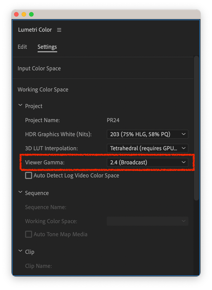
The Settings tab of the Lumetri Color panel now has a Viewer Gamma option, enabling you to choose either the broadcast standard 2.4 gamma or the macOS 1.96 gamma. (The option is also available in Project Settings, Team Projects Settings, Production Settings, and the Color section of Media Encoder Preferences.)
For native Rec.709 video, this feature will work anywhere in the application where the video is displayed, like the Source Monitor and the Program Monitor. For video that is color managed (for example, log video where the color space is auto detected and then tone mapped into Rec.709), Viewer Gamma will affect how the video is displayed only in the Program Monitor.
We would love to get your feedback on this feature!
Copy link to clipboard
Copied
Wow, this is something I think a lot of people have been wanting for a while! I guess the question now becomes, is this setting only advisable to use if the final export is intended to be distributed online or digitally?
What happens if people are viewing the final export on a non-mac display?
In addition, I would assume that if the final export is meant to be shown television or broadcast, we would still likely want to keep it on the broadcast viewer gamma. Is that right?
Please excuse my lack of proper terminology (if any)
Copy link to clipboard
Copied
Hi Andrew,
You are spot on: this feature enables you to choose which gamma Premiere Pro will use to display the video but you still need to choose what is most appropriate for the audience watching your video. If the video is mostly going to be watched on macOS devices, changing the viewer gamma to 1.96 makes sense. If not, leaving it on the default is the better choice.
If you haven't read it already, Todd Dominey's blog post provides good information about this.
Regards,
Fergus
Copy link to clipboard
Copied
YAYAYAYAYAYAYAYAY so exciting to see this addressed! looking forward to testing it a bit with some grading this week but right off the bat my thoughts go to if this is a setting that needs to be manually changed by the user ahead of export. the 2 biggest problems with the gamma shift always seemed to be that 1) everything looked great in-app, it wasn't until after viewing the exported file something was off, and 2) it's most frustrating to users who don't know the technical cause of the shift.
i'm hoping with a simple way to change the gamma of the working color space, there can also be ways to Just Choose The Right Thing:trade_mark: for users without them having to think about it.
Copy link to clipboard
Copied
"i'm hoping with a simple way to change the gamma of the working color space, there can also be ways to Just Choose The Right Thing"
Well, we're always open to suggestions (particularly from you Parker!) but I don't think there's a simple answer to this. It's going to depend upon what devices the exported video is going to be viewed on.
Copy link to clipboard
Copied
Finally! Been waiting around 6 years for this feature (Since apple introduced P3 displays)
Seems to be working great so far. Had a few crashes on my latest project, so cant wait until this is released in the main app!
Also noticed I have to change it every time I open an old project. Presume this is so colours dont seem off on older projects, but would be good to be able to set and forget.
Copy link to clipboard
Copied
Hi Jake,
This is definitely a project setting preference, not an application preference. You do raise a good point 'though about how a customer might want to set a preference that would apply to all new projects. Is that something that would be useful?
Fergus
Copy link to clipboard
Copied
Personally i'd like to just set it for all future projects. Because I found the 2.4 setting to crush all black detail on my macs so it's never been useful for me, if I did anything for broadcast I always used a decklink and reference monitor. So I would most likely always leave this on for web work which is the majority of my business.
Copy link to clipboard
Copied
Thanks for the feedback!
Copy link to clipboard
Copied
We have designed this setting to be sticky. i.e. Once user set the setting to say QT, then this is remembered and all new projects will use last used setting.
For the backward compatibbility reasons, all the older project will use Gamma 2.4 (unless user modify it in new app).
Hope this clarifies.
Copy link to clipboard
Copied
Does that mean if i was to open and close an old project it would stick back to 2.4?
Copy link to clipboard
Copied
Yes, if user open the older project in new application and close it without modifying this setting. Project would stick to Gamma 2.4.
This is done to preserve any potential grading being applid on the older projects.
Copy link to clipboard
Copied
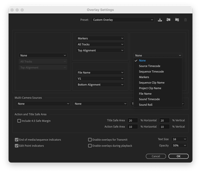
Could Viewer Gamma be added to the options that can be shown with Ovarlays?
So, "Project Viewer Gamma" in addition to Source Timecode, Sequence Timecode, Markers, Sequence Clip Name, Project Clip Name, File Name, Sound Timecode, and Sound Roll.
If not there, displayed somewhere else to quickly know which Viewer Gamma is in use. I would find this helpful when working on different projects for different clients that use different gamma.
Copy link to clipboard
Copied
This is a step in the right direction. What about exporting? Davinci Resolve allows you to choose the colorspace like sRGB and gamma during the exporting stage, but it allows for more options such as gamma 2.2, 2.6 etc. Is Premiere going to be limited to only 2 and 2.4 during the project and then no options during exporting?
We do commercial video work for some big brands and deliver for web, so ideally providing a global project setting that gets premiere pro to look like how it would if we were viewing on youtube would be best as this is likely the most common delivery format these days (Web). 99% of people are not using Premiere Pro for broadcast exports.
My tests have shown that VLC shows content exactly the same as inside Premiere Pro because it can read the gamma tags
Youtube or other websites look like what Quicktime shows, which is washed out/desaturated.
I've even transferred a video exported from my Mac Studio and put it on my Windows PC and noticed it still looked washed out, even on YouTube, yet people are saying this is only a Mac issue. So I'm not sure.
The conversion Lut approach that everyone says to do is not a good one obviously, so my solution has been to literally either deliver the project through Davinci Resolve, or to do a few color grade passes and cross reference until I find a good middle ground (More than I'd like for the final result in terms of saturation, but I try to pick the average between everything)
It would obviously be best if all the big companies worked together to make a standard so everyone benefits...
Copy link to clipboard
Copied
I second this 100%
" global project setting that gets premiere pro to look like how it would if we were viewing on youtube would be best as this is likely the most common delivery format these days"
Copy link to clipboard
Copied
Premiere with DCM off looks the same as vlc because vlc doesnt read the tags either. Quicktime does read them but assumes 1.1.1 means a gamma of 1.95. Premiere exports with 1.1.1 tags, so with this new setting (display colour management on and viewer gamma at 1.96) it does now match quicktime & youtube!
Copy link to clipboard
Copied
@jakew39230329 You touch on a good point: today, Premiere Pro defaults to Display Color Management and Extended Dynamic Range Monitoring being off. In v24 (but not yet in the beta) we are going to change that so they default to being on.
Copy link to clipboard
Copied
You bring up a great point that premiere tags exports at 1-1-1. Shouldn't premiere tag exports as 1-2-1 (with a 2.4 gamma tag) whenever this new setting is set to Gamma 2.4? And then 1-13-1 if Gamma 2.2 is added?
Copy link to clipboard
Copied
@Sight Seven If I understand your request, you're asking for an adjustable/viewable timeline to output color space transform. Is that correct?
Regarding the current feature, are their other view gamma options you'd like to see?
Copy link to clipboard
Copied
I think a 2.2/srgb option would be a good middle ground between broadcast and quicktime.
Copy link to clipboard
Copied
Seems reasonable; we'll look into adding it.
Regards,
Fergus
Copy link to clipboard
Copied
Thanks, I think that could be the best option as videos will only be .2 washed out in quicktime, and .2 too dark for broadcast (and correct on srgb monitors and phones). Whereas videos graded on 1.96 would be .4 too dark on broadcast, and graded on 2.4 would be washed out by .4. If that makes sense.
Copy link to clipboard
Copied
Hi, We have added Gamma 2.2 option along with 2.4 and 1.96
This is available under last beta posted on Creative Cloud.
Please try and share your feedback.
Copy link to clipboard
Copied
Thanks for adding it. Unfortunately the 2.2 setting still crushes black details on my mac, using the default icc, same as the 2.4 setting did. Confirmed this by adding colour bars, and also using a decklink to my LG CX oled tv. Only setting that is close seems to be the 1.96 setting. The 1.96 setting still has some black crush when compared to the exported bars and tone viewed in quicktime but it is less noticable than the other settings due to the raised gamma.
I have attached a screenshot, and raised the blacks to exaggerate the diference. In the DCM help guide it says that some black detail may be lost due to not being able to show rec709 on an srgb display, but quicktime seems to be able to show the details.
Copy link to clipboard
Copied
Seems to work fine with callibrated profile. Must just be a problem with reading apples default icc.
-
- 1
- 2
Find more inspiration, events, and resources on the new Adobe Community
Explore Now


