Captions per-line overlapping
Copy link to clipboard
Copied
Hello Premiere-Pro community.
I've been working on a series of short information films which must be captioned, and consistency is of importance. In earlier versions of premiere the captions I worked with was per-line and the boxed semitransparent background behind the text always merged. I like this style since it's easy to read and doesn't cover to much of the picture. There has been a lot of upgrades with the caption tool (I mean it’s finally usable. Thank you Adobe) but I can’t find a way to merge the background boxes.
When I increase the size on the background boxes they start to overlap. I can choose a size that overlap by a pixel. Hardly noticeable but it’s there and the box can’t be bigger because then the overlap is too apparent.
Now, this irritates me to no end because I can’t for the life of me understand why anyone would want overlapping boxes for the caption background AND its inconsistent with the style I used in the earlier films. Is there a way to fix this? I’ve been searching since the update but can’t find any. If not, I would love to have this in a future update.
Best regards, Gustav.
Copy link to clipboard
Copied
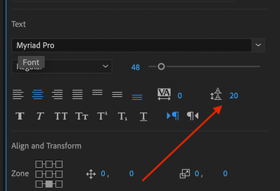
Have you tried adjusting the Leading as well?
Copy link to clipboard
Copied
Exactly the same result as mentioned (always a small overlap or a divide) but I CAN change the size of the box this way. Not really the solution I'm after though. Why isn't there a merge?
Copy link to clipboard
Copied
- Click the three lines next to 'Essental Graphics'
- Click 'text layer properties'
- In the box that pops up, click 'all lines' under fill mode. This has to be done before you ceate the captions though.
Hopefully that helps.
Copy link to clipboard
Copied
If you are using 2025 that would be the Properties Panel > Appearance wrench > Graphics Properties > All Lines.
Copy link to clipboard
Copied
...and then I get I big square box which I don't want. I just want to have the same look as before. Two lines the same width as the lines. Just enough to not block the picture too much but still make the text more readable. Why overlapping boxes doesn’t merge is beyond me. It's quite infuriating.
