jensjakobsen
Known Participant
July 17, 2022
Question

Color profile question - HLG color profiles

  • July 17, 2022
  • 2 replies
  • 2832 views

Hi

I have an issue that drives me bonkers.


I have recorded some video footage with my DJI Mavic 3 Cine drone. I've imported these clips into Premiere Pro. To test - and to make sure I knew the baseline of the colors BEFORE I did any color corrections - I always export a tiny clip for reference, to see if what I'm seeing the the Premiere Pro project is also the the same that I export. But here's the thing that drives me crazy:

  1. The original and the exported clip have the same colors - that's great
  2. The media I can see within Premiere Pro appears to have lost a bit vibrance


THIS MAKES COLOR GRADING IMPOSSIBLE! I need to know exactly what I can expect once I export the media.


So to follow how the media was born, here are the specs for the media for each step:

1. DJI video settings:

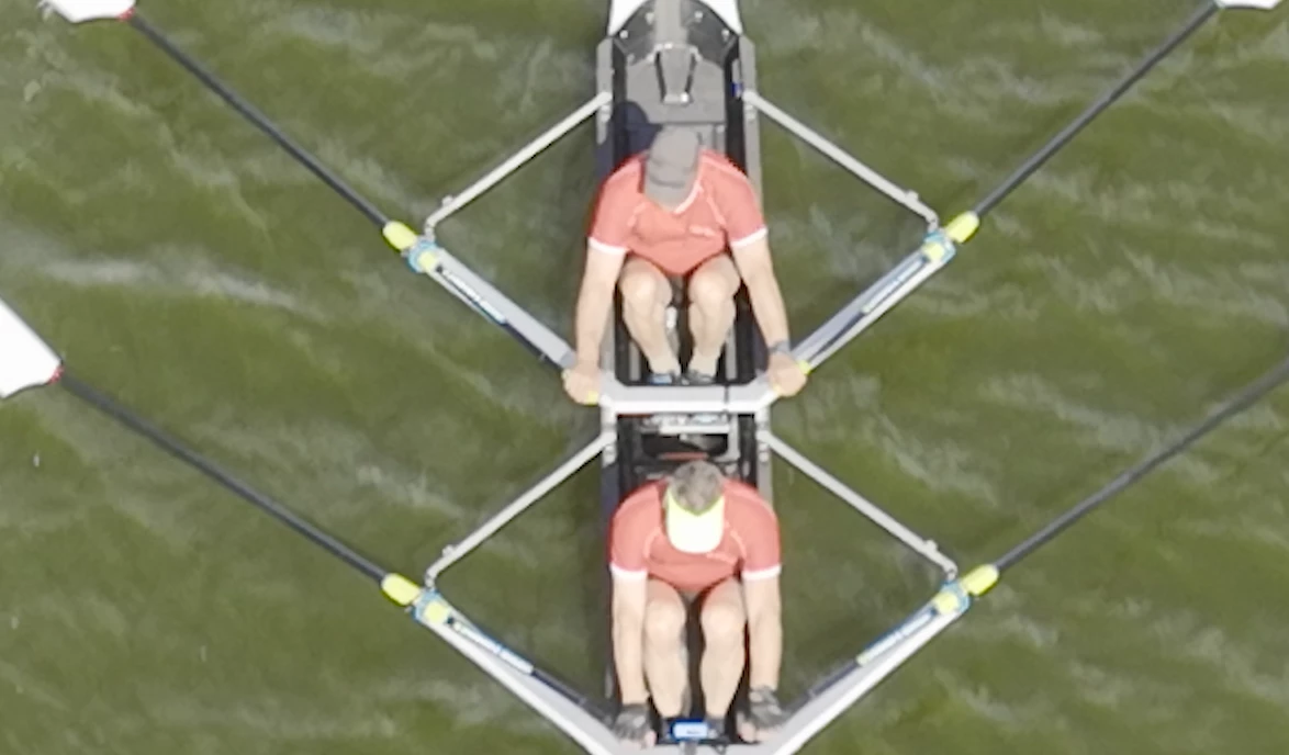
HLG, ProRes, 422 HQ, 5.1K (other settings usch as ISO etc. not important to the issue at hand)

Below is a sample of media


2. Premiere Pro project settings

  1. Color management: 100 (63% HLG, 51 PQ)
  2. 3D LUT Interpolation: Trilinear


3. Premiere Pro sequence settings

Working color space: Rec. 2100 HLG

Codec: Apple ProRes 422 HQ

Working color space: Rec. 2100 HLG (1920 x 1080 in order to zoom via "set to framesize")

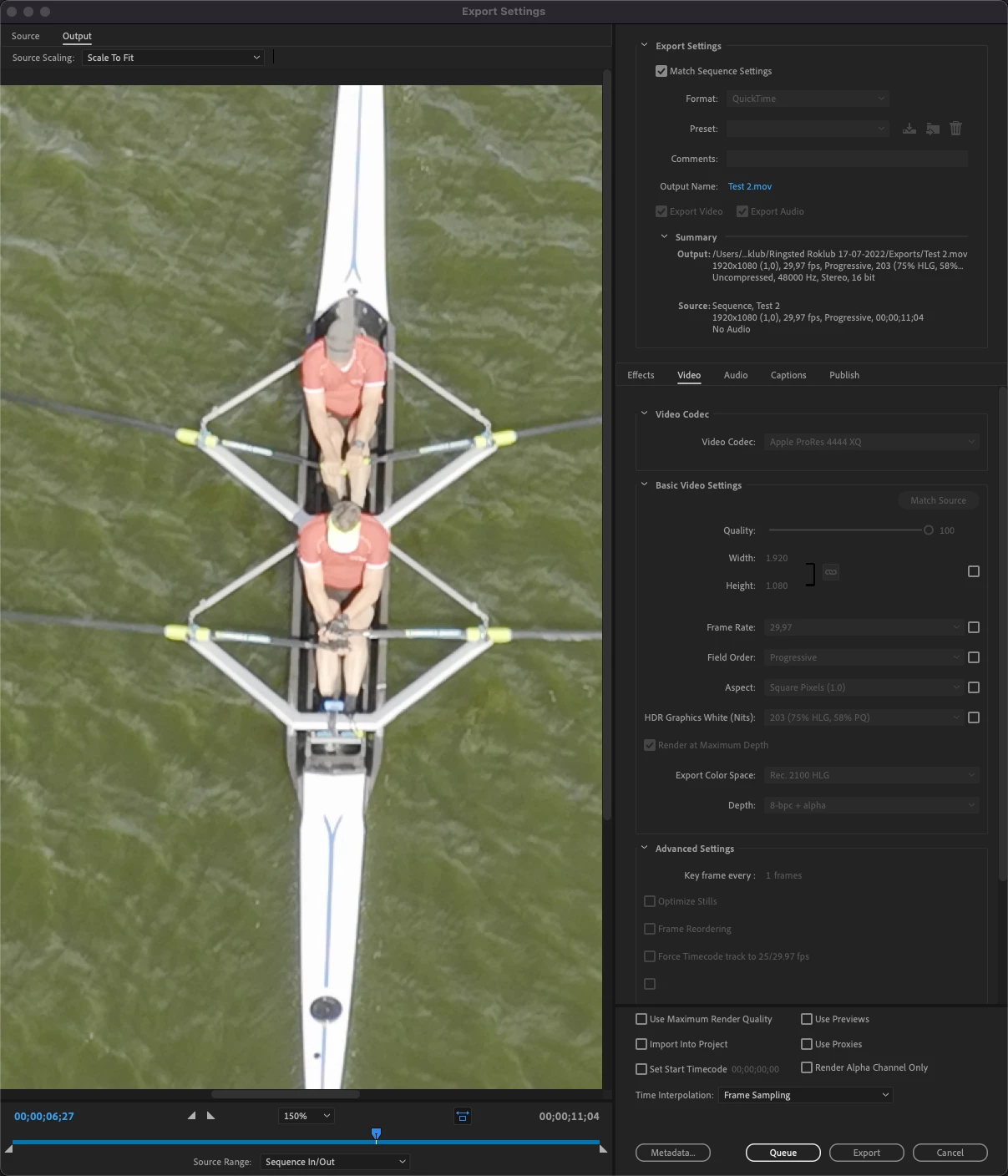
Below is a sample of media (colors have lost vibrance) - 1 image is used as they are identical on source and sequence preview pane


4. Premiere Pro - export settings (colors are still without vibrance):


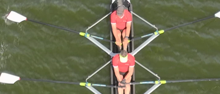
Below is a sample of media once exported (now color vibrance is back on) - which is identical to the very first screendump.

What the heck am I doing wrong???? 


Basically I want the original footage to look the same inside Premiere Pro before I do any color grading, or else I can never trust any color grading if the Premiere Pro edit interface presents me with media where colors have lost their vibrance.


Any help is welcome.

This topic has been closed for replies.

2 replies

Participating Frequently
March 22, 2023

Hi, I don't know if you ever resolved your issue, and I haven't read the other replies here before typing this (because I stumbled upon this while looking for something else, and believe I can help you).

First of all, let's just state that HLG video (such as what we capture on our Mavic 3 Cine drones) would require a proper HDR display in order to see the full colourspace within our image. If you're viewing it on an SDR display (which is most likely the case, sadly) you will lose much of the colourspace information on your preview window.

For this reason, I have an HDR reference display (calibrated) that I use for much of my HLG processing work (indeed, the higher-end MacBook Pro models such as the M1 Max or M2 models, and even the iPad Pro M1 and M2 models provide a full HDR display with a "Reference Mode" in the Display Options to do claibrated grading and editing work).

If you're stuck with the SDR display, what you can do is apply a Colour Space Conversion from HLG (Rec.2100 HLG) to Rec.709 (SDR). This would perform a tone mapping based on whatever conversion you choose... but, this solution is also less than ideal unless you subsequently render out your video in the limited Rec.709 (SDR) colour space. It would show you an accurate expectation of your export, but only if you're exporting in SDR as well.

Your best option, honestly, if you want to work with HDR and actually OUTPUT HDR is to invest in an HDR display. There is simply no way to get 1:1 replication of the HDR colour space on an SDR display.
The following whitepaper expresses the solutions employed by the broadcast television industry for this exact problem: chrome-extension://efaidnbmnnnibpcajpcglclefindmkaj/https://www.itu.int/dms_pub/itu-r/opb/rep/R-REP-BT.2446-2019-PDF-E.pdf

TL;DR - Close Approximation is the best they can achieve (though their method is extremely scientific and minimizes distingusishable differences when converting between HDR and SDR interchangably, something they need to do all the time in that industry).


If, however, you don't REQUIRE an HDR final render... you can STILL shoot in HLG, and perform a colour space conversion to SDR (Rec.709) and you will STILL benefit from the additional colour space information in your source footage (because you'll have vastly more option and control when it comes to tonemapping to SDR).

R Neil Haugen
Legend
March 22, 2023

Thanks for the excellent post ... and the link.


Neil

Everyone's mileage always varies ...
R Neil Haugen
Legend
July 18, 2022

I'm a bit of a color management wonk. And really, have to be as I do professionlly teach pro colorists who need to work in Premiere how to do so. So there are some things and concepts I'm very comfortable with that many users aren't, simply because I spend so much time with colorists.


So I could get into say the issues with the Apple choice to apply an odd gamma to Rec.709 video or this or that ... but realistically, let's keep this practical. I'll only give one really technical reply ...


If you're working in HDR, in HLG or PQ, set the preferences for "graphics white" to 203. That is the correct setting for nearly all HDR work whether HLG, PQ, or DolbyVision. You're running 100, which isn't advised. Ok, enough tech geek. Back to the practical stuff.


First ... unless you've got a highly calibrated system using a BlackMagic or AJA breakout device to a highly calibrated pro level reference monitor, well ... color management is pretty iffy. If not a total mess.


Second, what your camera screen shows, or what any video player shows on most systems, is NOT at all necessarily even close to the actual pixel data. Not even a Red or Arri costing $70G and up have a calibrated screen. If it's crucial, pro shoots have heavily calibrated external monitors setup and even then, they mostly trust the false color or zebras for exposure/contrast things.


And third, for those watching after you publish to either say YouTube or Vimeo, their systems, screens, and viewing environments will change the image a lot more than the difference between your example images. Someone watching YouTube on their phone at noon on a sunny day in a park will see a very different image than on that same phone at night in a dark bedroom.


Pcs and Macs will see a very different image due to several things I'm not going into. Vimeo & YouTube ain't the same. Nor are browsers nor video players.


That's Reality 101. Which sucks, really.


Premiere actually has a better probability of showing a closer-to-accurate view of the actual signal data than any video player. Because it's built to work within professional standards, without juicing the image. And most players and even monitors and TVs are designed to "enhance the viewing experience". Meaning they juice saturation and contrast, typically. But it isn't an accurate view of the pixels.


Yea, it's that much of a mess. And to give you an even better jolt, you've never, ever in your life seen exactly what the pro colorist did who graded any media you've ever seen. Whether in a movie theater or big-screen TV or on your computer's monitor. Ain't possible.


Because every screen is different, and even if you connect identical monitors to the same computer, it can be difficult to match one exactly to the other.


So pro colorists are taught right off the bat that 1) you have no control of what anyone sees after it leaves your system 2) no one will ever see exactly what you see while grading and 3) the only way to work is to set up as close to the standards, and let the work go out into the wild.


And get on with Life.


Yea, you can try and out-guess the 'market' for a job, but in general ... that's a waste of your time.


When doing your color work, learn to trust the scopes far more than your eyes! Waveform YC no Chroma is great for showing tonal distribution and contrast. RGB Parade shows the balance between colors top to bottom across the image. Set your blacks, whites, and middle tones by the scales!


The Vectorscope is the saturation scope. And you can check if say your reds are actually red, not yellowish red. Where your skin tones are. And ... how much saturation you have in the least and most saturated colors in your scene. Plus ... the center of the Vectorscope is neutral, blacks/grays/whites, and it that isn't centered, you've got a color cast going on. No matter what your monitor shows.


If you have a good tonal distribution in the Waveform and RGB Parade, your neutral tones are properly centered in the Vectorscope, and nothing is too low or to much satuaration, that image will look pretty normal on any screen ... for that screen. (It's always relative for every screen as to what is 'normal' on that screen.)


I doubt you have the setup that pro colorists have ... I can't even afford the full-on gear they typically run! ... so the best way you can work is produce something, and get it off your system, watch it on something else.


Say upload to both Vimeo and YouTube, as they process color & tonality differently from each other. Then if you're on a Mac, go watch that on both services on a couple PCs. If you're on a PC, watch it on a Mac. Then stream it on a smart TV.


And between them, you'll get an idea of the range of things people will see. And I think it's a lot wider range than you might realize.


Neil

Everyone's mileage always varies ...
jensjakobsen
Known Participant
July 18, 2022

Thanks Neil for taking your time to answer my question. You are completely right that neither do I have pro equipment nor do I know how they work.


I'm your classical YouTube expert having learned by watching what others have shown me.


Having said that - and though I do agree with you - aside from my own expectations, am I doing anything technically wrong?


I always seem to be able to match the colors from original, to edit, to export BEFORE I color grade anything, so that at least I have a reference point.


 Thanks 

/jens

R Neil Haugen
Legend
July 18, 2022

Well, but is something "wrong", or simply not a best practice, or ... ? Which of course, like everything ... depends ...


For amateur work if it seems to work across a few other devices, hey, it's good enough.


For professional work, if it ain't nailed down, you're going to get your files rejected by the dreaded QC machines if they even get that far.


For the amateur who wants to learn best practices, well, that's a middle ground, really. And a good place to just learn to check the bonafides of the people you're learning from. I'll give a few good resources.


The FAQ I wrote for this forum for the Pr2022 version ... FAQ:PremierePro 2022 Color Management for Log/RAW Media


A relatively short thread on this forum as I posted some information sent to me by Francis Crossman, Program Manager for Premiere Pro ... A User Guide: Color Correction in HDR in Premiere 2022


Another short thread with information I got from 1) the engineers in PrPro and 2) my colorist connections, on how to monitor HDR with Pr2022 (different from previous versions) How to Set Monitors for HDR work in Premiere Pro 2022?


My Adobe MAX 2021 presentation on organizing and working color corrections in Premiere Pro ... free for all to view: S565: Thinking Like a Colorist in Premiere Pro


And some "old" but still valid information on what the color controls of Premiere's Lumetri panel actually do ... rNeil Blog: What Do The Basic Tab Tonal Controls Do?


I highly recommend anything from Jarle Leirpoll's premierepro.net site. He has a number of explanatory things on his site, and the one on using the Display Color Management option is the best pieces ever written on using that and the 'old' system of Premiere's color management. Much of which still applies, too. And yes, even the Adobe engineers think highly of Jarle. And work with him directly at times.


The YouTube channel VideoRevealed by Colin Smith is also first-class information.


As it thepremierepro.com site and YouTube channel with Paul Murphy.


For a ton of highly detailed information, the LightIllusions/Support/Guides page has numerous articles on color management and gear. Including what is a LUT, what is HDR and how to work with it, why use a calibrated display, and information on a lot of gear. They make one of the most heavily used software apps to control color management for post processing houses, theaters, and such.


And back to your work. As I noted, the best thing you can do to get a feel and understanding of what is happening with your pixels is to do that work to view your exports across computer platforms, browsers, players monitors, and TVs.


You'll get a better feel for the range of ways the same file will appear depending on which kit, which viewing app, and what situation. And be in a better position from both emotional comfort and actual knowledge to set up your own system to get usable files out.


This is the only attainable goal: usability across platforms & devices.


"Perfection" just isn't an option. Getting close enough to be usable across devices & platforms ... is. But it's best to get a feel for that variability first.


Neil

Everyone's mileage always varies ...