- Home
- Premiere Pro
- Discussions
- Re: Feature Request for Essential Graphics - Defau...
- Re: Feature Request for Essential Graphics - Defau...
Feature Request for Essential Graphics - Default Background
Copy link to clipboard
Copied
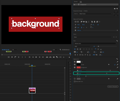
I wish the default text background had a little bit of margin instead of having the borders exatly where the texts end
Copy link to clipboard
Copied
Like this:
Copy link to clipboard
Copied
YES
Copy link to clipboard
Copied
What I meant was the margine. I wish it had a margin instead of being exactly on the edges of the texts
Copy link to clipboard
Copied
Post screenshot of what you exactly mean.
Copy link to clipboard
Copied
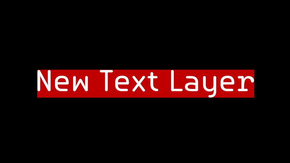
Here's what I mean. This is the default - The edge of the background and the edges of the texts are on the same line. Subtitles would be much easier to read if there were margin - if the background were a bit bigger, and not snapped to the edges of the texts. Besides, who uses this look? At least to me, this doesn't look good. I believe this feature would be more automatic for users if it had a little bit of margin.

