

- Home
- Premiere Pro
- Discussions
- P: Label colours appear to have inverted in Premie...
- P: Label colours appear to have inverted in Premie...

Copy link to clipboard
Copied
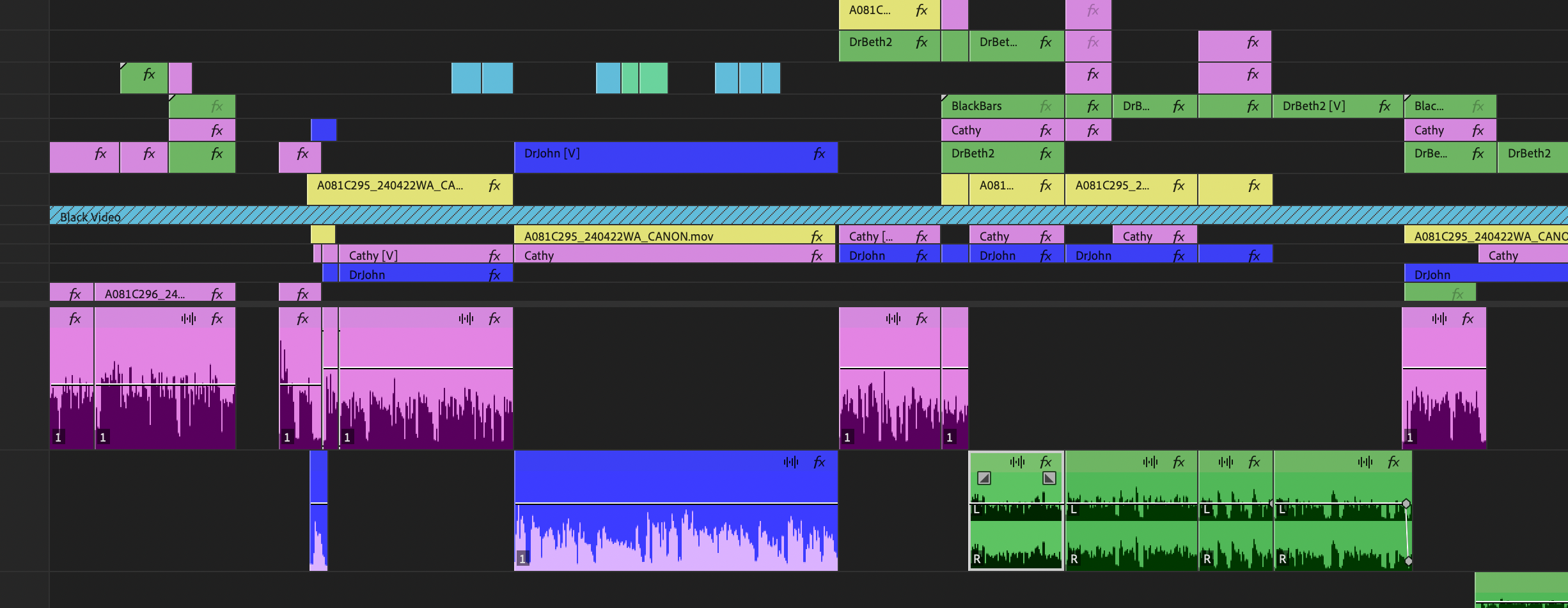
I have opened Premiere Pro today to find all the label colours in my timeline appear to be inverted. The lighter colour is now the main body of the clip and the darker colour is now the waveform. I have tried to go through all the different label group styles. I have also tried uninstalling and reinstalling the application. Does anyone know how to get this back to the default colours.
I have attached an image of what it should look like and what it looks like now.


 1 Correct answer

First, I want to thank you all again for your feedback and comments. We are actively listening and working to address the issues you've raised. I'd like to provide an overview of some of the concerns we've heard so far, to clarify what constitutes a bug and what does not.
Color Text Labels Inverted: Indeed, we've encountered a bug regarding the inversion of color text labels in this latest release. Our team is working diligently to address this issue promptly. In past releases, when a user picke
 301
Replies
301
301
Replies
301
Copy link to clipboard
Copied
Edit: Now that I look at @Mike-Berry's post, I'm not sure this will help. If someone tries this, let us know.
Original post: BEFORE you update, Edit -> Preferences -> Labels. Create and save a preset. Then once updated, select that preset.
On Windows, this is saved to:
C:\Users\[User]\Documents\Adobe\Common\Assets\Label Color Presets
Stan
Copy link to clipboard
Copied
First and foremost, thank you all sincerely for your invaluable feedback. Your insights are crucial to keep refining Premiere Pro and provide the best editing experience possible.
Now, let's talk about the concerns:
Clip Color Text Labels Inverted: Indeed, we've encountered a bug regarding the inversion of color text labels in this latest release. Our team is working diligently to address this issue promptly. In past releases, when a user picked a darker color background, the clip text labels would always appear black. While this provided consistency, it often resulted in readability issues. With the new dynamic color text formula, the text label color adapts based on the colors and brightness of the background, ensuring improved readability and usability. Premiere Pro introduced this dynamic color text formula with the intention to enhance visibility by adjusting the text label color based on the luminance and brightness of the clip.
New Clip Colors: The introduction of a fresh color palette was aimed at alleviating eye fatigue and addressing longstanding clip color accessibility issues. Over the years, brighter colors in dark editing spaces have caused strain, and the previous color scheme ("classic") posed readability challenges, especially with waveform visualizations. The new colors offer improved contrast, enhancing intelligibility and making waveform analysis easier ( faster identification of clicks or other audio artifacts). Additionally, we've updated the color picker formula to optimize contrast ratios depending on the background color that a user selects, further enhancing flexibility and customization options by preserving accessibility as well. I would you invite you all to give this palette a try and let us know your thoughts after spending some time editing with it.
Classic Mode Preset: We've noted your concerns regarding the new classic label mode preset and its difference from the previous releases clip colors. Now, I understand the ask for the new classic preset to maintain the same behavior and clip color configurations based on its different selection states.
So, I have a question to this group... Would you like to see the same color configurations as we had before for background clip and waveform colors for non-selection and selection states as part of the classic mode?
In the previous releases when you select an audio waveform it goes to a grey/white tonality, which brings a lot of readability issues when using keyframes. Would love to hear more around this and what is your expectation for classic mode.
Your concerns and feedback are deeply appreciated, and rest assured, we are actively listening and tracking the requests. I’ll provide updates as soon as I have them.
Once again, thank you for your continued support and engagement.

Copy link to clipboard
Copied
'Would you like to see the same color configurations as we had before...' - - - YES - - YES - leave an option for us to select the exact colors we've grown use to for many years - - and for those that want change that in the opinion of some adds no value - let them select something different
Copy link to clipboard
Copied
i jsut posted about this yesterday. looks terrible, its some are mislabeled, idk about you, but it tricks my brain into thinking i have offline/disabled media.
thanks for also voicing this man
Mod note: This has been edited for content. Reminder: We have minors reading here. Please be careful with the words you use.

Copy link to clipboard
Copied
Is there a solution about this? I really dislike the colors and yes it does trick my brain into thinking it's disabled media. It's very difficult to work with. Please help


Copy link to clipboard
Copied
Every color there is settable by the user. As now, you can set them more so than we could before.
Go to the Preferences/Labels dialog. Click on the color patch of a color you want to change, use the Picker box to change the hue/sat/brightness to taste.
The 'inverted' part is still needing work for many of us, though ... and that is something the devs have to modify yet.

Copy link to clipboard
Copied
" would you invite you all to give this palette a try and let us know your thoughts after spending some time editing with it."
We did, it took 4 seconds for everyone to hate it and be a major barrier to working with Premiere.
Clearly you dont use your own product yourselves otherwise this would never have made it into an update,
Copy link to clipboard
Copied
Clearly you dont use your own product yourselves otherwise this would never have made it into an update
Your post sadly is totally useless to improving the application. It doesn't give any suggestion nor reasons for what you would want to see.
Adobe's staffers, like all other company's I'm aware of, clearly use and do extensive testing. Like, duh?
That many of us users won't like what they come up with is also clearly to be expected, as we all are different. If you have ten different groups of people redesign the same bit of the UI, you will have ten different designs.
All of which make visual sense and are seen as "good to the eye" by the group that designed them. This is normal humans being ... human.
Personally, I'm not a fan of most of the new color scheme, but I can see what they are trying to do. And with some defined corrections given, with the reasons for them, they can get to a better UI than the current ... thing.
Copy link to clipboard
Copied
And to be clear, I commented to the devs in person at NAB what I'd prefer. Which is:
1) the ability for users to choose the "Ancient & Proper" Premiere UI look of the last 5-6 years;
2) the ability for users to choose any background tone from black to white they prefer, as especially for those doing general editing in "bright room" envirionments, even a near-white 'ground' might be preferable to many, and
3) at least 3-4 colors we could choose for the "emphasis" things ... the highlight lines around panels, warning dialogs, and settable text/numerical boxes.

Copy link to clipboard
Copied
I'm with you. This palette is absolutely terrible. Took me about 1 second to hate it. Now, instead of working I'm here in the forum looking to see if I was alone on this. Apparently I'm not.
Copy link to clipboard
Copied
So change it. We do now have that ability, for all but the inverted timeline.
Oh, and the flat upper top of the waveform due to space left for the icons now in the upper right corner of each clip on an audio or video track.
Copy link to clipboard
Copied
It's the timeline I have the real issue with.
Copy link to clipboard
Copied
Timeline colors in general, waveform issue, the 'inverted' brightness of the waveforms at times, what?
Colors in general is fixable, separating the audio & video colors (which on some systems start out the same now) is fixable ... the inverted waveform brightnesses and flat top ain't.
So ...which is the issue bugging you? We're all different, and it's good to get as many eyeballs as possible on this stuff to comment in specifics.

Copy link to clipboard
Copied
I'm experiencing the same issue as many here. The text on video tracks is white and the audio waveforms are dark (with the audio backgrounds being light), where as before it was reversed. After 9 years of using Premiere and growing accustomed to the old way, this switch has been really distracting. I've been trying to ignore it, given it ultimately doesn't affect the edit itself, but I find myself unable to focus on anything other than trying to fix the colors. When I first encountered the change to the labels (last Friday 5/24/24), my app had automatically switched to the new (darker and less appealing) Default label colors. I've since switched back to the Classic colorway, but I'm still facing the issue of the inverted text + waveforms.
To answer your question: yes. I would love if things could go back to the way they were. Perhaps there could be an option where users can decide if they want to use the inverted version or not, along with the option the choose the label colors. Customization and preference are key. Thanks!
Using: Premiere 24.4.1 / Macbook Pro M3 2023

Copy link to clipboard
Copied
"Would you like to see the same color configurations as we had before for background clip and waveform colors for non-selection and selection states as part of the classic mode?"
Yes, classic mode should suggest that it stays as it was before, which is now misleading since it is a new label system with just somewhat of a classic color pallette being used with the new contrast etc. I find the new label system rather distracting, while I understand the importance of a contrast, I prefered lighter sound waves as my eye was less tense by looking at it, now the high contrast between sound waves and the labels makes it really tiring for my eyes due so much contrast being there.
I wish you could manually adjust the contrast as well as have "classic label mode" which would be exactly as the old label system.

Copy link to clipboard
Copied
I think you should allow a classic mode on labels that doesn't add extra contrast. I like the classic colors as I have used them to organize my work for over 10 years, but the newly contrasted audio waveforms seriously hurts to look at. Turning contrast off should be an option.
Copy link to clipboard
Copied
Who did you test the high contrast readability on because the high contrast of waveforms literally makes it painful for me to edit audio?

Copy link to clipboard
Copied
YES Please! a True Classic option is what we need!

Copy link to clipboard
Copied
In the future, instead of just making big changes like this upon update, ask the user if they would like to make changes to their timeline before making succh drastic visual changes. Offer a preview of what the new timeline could look like and allow the user to revert back to the original look if they so choose. This new look doesn't work for me personally and I much prefer the original look and layout for my timelines. In the future, please do not make such drastic visual changes without having an option to reject the changes if we want to reject them.

Copy link to clipboard
Copied
"Would you like to see the same color configurations as we had before for background clip and waveform colors for non-selection and selection states as part of the classic mode?"
Yes we want the option to have everything as it was before. When you've put years into working with a specific layout and colour scheme any changes simply slow down your workflow.

Copy link to clipboard
Copied
New Clip Colors:
...The new colors offer improved contrast, enhancing intelligibility ... let us know your thoughts after spending some time editing with it.
By @Adolfo H.
My thoughs: reducing eye strain is a cool idea in theory, but subtle variations on dark brown, dark blue and dark green do not improve intelligability, and I can't even begin to imagine how dark colours on a dark background are considered "improved contrast". Could not get used to editing with this muddled and muddy colour scheme.
After reading this thread, I was getting very worried that I'd be among the many who experienced no difference when switching from the Default colour preset back to Classic. Happily, it worked perfectly, so thank you Adobe for that, at least.
I do find it very, very frustating that every time I sit down to edit a new project for a client I have to spend half an hour at a minimum trying to understand the new interface changes that come with each update. I've complained about this sort of thing in the past, and this is another classic example of something that should be opt-in, not universally applied for everybody and then they need to find out how to go back to how it was.
Copy link to clipboard
Copied
I've been using Premeire since it first came out. Whatever was going on with the audio waveforms before please put it back. I can't even remember what it looked like and I just updated. I'm currently working on long form and all my clips that have been labeled blue now have pink audio waveforms. PINK! I'd love the option to put it back. Just look at these obnoxious and extremely important to my workflow waveforms.

Copy link to clipboard
Copied
Yes, I want the colors to be as they were in 24.4, I updated to 24.6.1 today and I do NOT like the classic version with the darker wave forms, I like them lighter! Thanks!

Copy link to clipboard
Copied
Try it in 25.0, I'm getting light waveforms using the Default setting. If I use the Classic settings, I get dark, but I can change the Audio color to Green, and I then get light waveforms, and it matches the old color scheme even closer.
Copy link to clipboard
Copied
Go to the edit menu, then preferences, then labels. Towards the bottom right, there should be a drop-down menu for label color presets. Select classic, and it will change the label colors back to the ones before the update.
Mod note: Edited for content.

 AdChoices