- Home
- Premiere Pro
- Discussions
- Re: Premiere Pro Interface Color? Light Mode UI in...
- Re: Premiere Pro Interface Color? Light Mode UI in...
Premiere Pro Interface Color? Light Mode UI interest gauge
Copy link to clipboard
Copied
Calling all video editors!
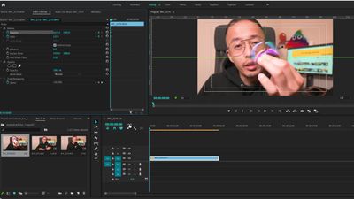
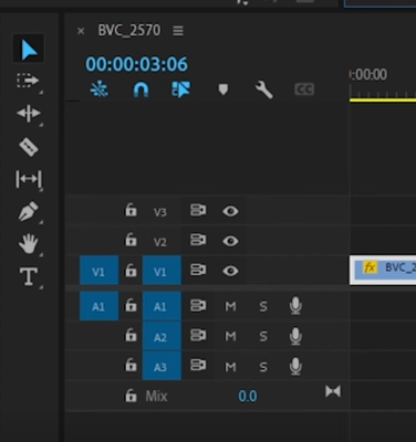
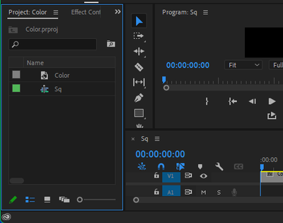
What do you think about the Premiere Pro interface color? Is the scheme sleek and professional or do you wish it was lighter? Is it easy on your eyes during those long edit sessions? Do you wish it came in pink?
Upvote this request in UserVoice for more options!
Light Mode UI – Adobe video & audio apps
Here's more info on our current customizability: Use and customize workspaces in Premiere Pro
Let me know more in the comments!
-Caroline
Copy link to clipboard
Copied
I don't question what may have been said. Not at all. Nor even that one or more may have thought that was the driving reason.
I've talked this through at length with several of the program heads. Over multiple NABs. There was some talk of how to give the best reasoning, but it seemed quite clear the driving force was the M&E types. The program people didn't care a hoot for the change. Wasn't their idea.
M&E have given us some of the more "wondrous" parts of the Adobe apps over the years. Sigh.
Neil
Copy link to clipboard
Copied
Yellow mode, blue mode, light mode, dark mode or whatever.
It is not going to change any time soon despite the call for upvoting the uservoice.
Copy link to clipboard
Copied
Not a fan of Dark Mode for anything. It really screws my eyes up and makes my shoes fall off.
Copy link to clipboard
Copied
{Content removed.}
Moderator note:
Sorry, but the contents of this post were removed as per forum rules.
Using the back-end control system is specifically not approved for general use. It's a debugging platform for the engineers, and they get very unhappy if use of it for anything other than things they direct a specific user to do is mentioned "here" on their forums.
And so suggestions to use that system for any other use is not permitted "here".
Copy link to clipboard
Copied
For me, drak color makes me unfocus.
It will better if user can choose a simple color choice like photoshop, ilustrator, and indesign.
The premiere pro color appearance slider is so poor and does nothing.
Delete it and change it like Photoshop, ilustrator, and indesign color appearance choice.
If you don't know how it look like, just call Photoshop developer and ask him what it is look like.
Raizen 7, 40Gb Ram, RTX 3060, Win 11 -- All of Software in the world are just tools. Buy it if it works for you 🙂
Copy link to clipboard
Copied
Grey and dark gray makes my eyes hurt. I can hardly see where a film clip ends and interface starts. Changing appearance doesn't change contrast so is little help
Copy link to clipboard
Copied
Probably the worst UI I have ever seen in terms of contrast and font size.
Leads to severe eye strain.
Perhaps works for 20 year olds in a black room and a 40 inch monitor.
But the rest of us terrible.
To the point where this is a consideration for not using the app.
A real shame.
Copy link to clipboard
Copied
Then PLEASE go to the link for the Uservoice post given in the first post of this thread!
That's where Adobe's M&E people who determine a lot about these apps from "metrics" get their metrics. Give 'em another vote.
That is the one direct way we users can work to change something.
Neil
Copy link to clipboard
Copied
Moderator note:
This post removed.
On this Adobe forum, using the engineer's debugging panel to mess with application settings is not permitted per Adobe policy.
As that's a great way for users to really, really screw up the application.
Copy link to clipboard
Copied
Since 2019, and nothing happend today 🙂
Appearance color slider is so poor and does nothing.
Raizen 7, 40Gb Ram, RTX 3060, Win 11 -- All of Software in the world are just tools. Buy it if it works for you 🙂
Copy link to clipboard
Copied
This is the topic for discussion... I'm shocked. There are much more serious problems in the toolkit than which color to choose: blue, pink, yellow... Are you crazy or something. Why are we not discussing here on the forum how the Color page, Clip tab, EGP panel should look like. What the hell is going on here? That's how the Premiere product develops.
Copy link to clipboard
Copied
I am wondering how this guy has changed the UI text colour. Can you help (that would be great if I could change the text colour to orange)?
Copy link to clipboard
Copied
Text color looks normal (blue) to me.
Copy link to clipboard
Copied
Nope! That's green-ish. That is changed. If you like you can check his video out (link below) to see if I am wrong:
Copy link to clipboard
Copied
I checked: its blue. Might need to calibrate your monitor.
Copy link to clipboard
Copied
That's calibrated! My Pr UI font color (SS below):
🤔
Copy link to clipboard
Copied
Premiere Pro need a complete UI overhaul in my opinion. It looks and feel old and since i moved to premiere pro i'm bored after 20 min of editing. And i edit a lot every single day. I think it's that it feel clunky like moving giant bricks and less snappier than counterparts like Final Cut or DaVinci. But i will stick with PPro because it is so costumizable with fast workflow with the panels that for me is still the fastest option. Still, is boring as heck editing inside PPro.
A good direction to change is the ability to change Style of icons and background colors. Like for example if one modder wants to make PPro look and feel like a window XP app. Why not? Just release the codes to change some aspect of the application to whom want's to feel alive again while editing.
Copy link to clipboard
Copied
From the point of view of interest, Da Vinci is the leader. There is everything there for full-fledged work. Both plugins are needed and modes of operation and has more flexibility in operation. Adobe is simpler in many aspects. And most importantly, I don't understand why DaVinci contains the entire assembly for editing, including: work with video/audio/effects editing and works faster and more stable. Take the Final Cut, it has no equal in the speed of installation. It flies even when working with 4K files with a lot of applied effects on the timeline. In Adobe, there is no way to work seamlessly in 4K without brakes. A paradox. Who understands what's going on?
Copy link to clipboard
Copied
A couple comments, as I work both in Pr and Resolve daily. And am actually doing some background testing work for another company trying to get some stuff working with Resolve that it normally locks out.
(I can't work in FC, because well ... Apple being the spoiled brat kindergartner they are, you can only play with that in their sandbox.)
Premiere is hands-down more customizable than Resolve. Whether you're talking the UI, which in Resolve is locked down to say about 2 options, or working with outboard control units. Which in Resolve ... again, are totally locked down and the main BM spokes-staffer on the BM boards makes it bluntly clear they will never ever redo or improve the use of non-BM control units.
Because of course, they don't make money selling Resolve, it's entirely provided as a loss-leader to get us to buy BM kit. Of which I have enough that I've got several Resolve studio licenses sitting in a drawer. BUT ... I've no interest in spending several $G to buy another control panel that by design can only be used in Resolve.
Resolve's color tools are awesome ... but then, if you're trying to work with graphics on the fusion page, getting those to work correctly as you're doing color takes ... asking a few questions. Ahem.
Premiere even has a much deeper pool of user settable keyboard shortcuts than Resolve or Avid.
So whether it's the UI or use of outboard controls, or even keyboard shorts, Premiere is far more flexible.
And at this time, stable seems to be more of a dream than reality with both.
It's great that your kit is running Resolve both more stable and faster ... as someone who's on both sets of forums daily, over the last couple years as Resolve's designers have been chasing the Adobe be-everything-for-all-users dream, well ... they've had more bugs and performance issues than they used to.
Some of my many colorist acquaintances are just about ready to finally move from R17 to R18. As they couldn't run the first few release builds safely. Others ... were not having any issues with the R18 beta even. No clue why.
On my 24-core Ryzen 3960x desktop, Resolve and Pr pretty much mactch each other in performance. And I've only had a couple crashing issues with Pr, and have had those also with Resolve. So they're pretty matched.
On my Acer Predator Triton 500 laptop, with the lappie 2080Ti, Premiere works decently. But Resolve ... is a total dog.
There are probably other users where that would be reversed, as at this time, user performance is all over the freaking place, and oft makes no sense. Someone with a near identical desktop as mine posted about the terrible performance they're getting. No clue why ... and that bugs me.
They're tools, fancy hammers ... use what works for the job at hand. And it's rather wise to be able to work in multiple toolsets of course ...
Neil
Copy link to clipboard
Copied
Personally, I'm not too fond of dark mode in general. I don't know why this became the norm. It's a horrible strain on my eyes.
Copy link to clipboard
Copied
That one's easy to answer. Because for high-end pro b-cast/studio work, one tends to edit in darker rooms, and the background is set to the charcoal so there's a difference between the blacks of the image & the background. For that work ... it's easier to focus on the image Q without the UI background taking any eye-attention.
I've suggested to a couple users over the years that it might help if they got the editing lighting down a bit. And yes, as dark as PrPro's background is, it's easier to work in a semi-darkened room.
But for a lot of general editing work, and web-bound stuff ... well, you don't really need the darker background to work well, and yes, it's harder on some eyes especially if the room is fairly 'normal' lighting. So totally agree, it would be good if the app allowed for a fair amount brighter gray.
Neil
Copy link to clipboard
Copied
Moderator Note: Link/text removed. Sorry. Please do not use the internal developer tool to change the application.
It is against the corporate guidelines and is a request from Adobe Premiere Pro engineering.
Copy link to clipboard
Copied
Please bring back a light grey interface option with more contrast. For those of us who need to sometimes edit in a brightly lit setting on a dim laptop screen, even the lightest option on the grey slider is no nearly functional for being able to easily look at the screen.
Copy link to clipboard
Copied
Try this:
Text removed.
Moderator note:
Edited due to Adobe policy prohibiting discussion of use of the engineers console on their forums.
Copy link to clipboard
Copied
This solution really isn't practical because it only brightens the grey background but leaves all the text and menus the ligth grey they already are, creating a very low contrast interface which is hard to see, which is the same exact problem just in the other extreme. Adobe needs to create (or rather, put back) a light grey interface with proper contrast for easy use in brightly lit environments.
Find more inspiration, events, and resources on the new Adobe Community
Explore Now


