

Pesky navigation pane inconsistencies
Hello. I have gone back through the forum and been able to find out most of the answers to my navigation pane issues for WebHelp.
For TOC font, I have edited whtdhtml.htm; for TOC spacing, I have edited whthost.js; for Search, I have edited whfbody.htm; for Index I have edited whibody.htm, and for the pane width, I have edited whskin_frmset01.htm.
And while that has made the pane much better, there are still a few anomalies I can't quite reconcile. For each of the three tabs (TOC, Index, and Search) I am using the same font style and size (currently Times New Roman 14).
The three remaining issues are:
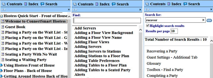
- The TOC tab defaults to open without it being left justified, thus cutting off the book image. I have moved the page (with the question mark) image to the right, but I can't seem to get the main book image to move and/or get the tab to open with it scrolled all the way to the left so that it is not cutting off the book image.
- There is still some inconsistent spacing between entries/results on these three tabs. Changing the space between TOC items was easy enough (changing the var gsMargin value), but I'm not sure of an Index and Search equivalents.
- The settings in the whfbody.htm file are the same as the other two tab settings: setFont("Normal","Times New Roman","14pt","Black","Normal","Bold","none"), yet the search results do not appear bold.
Hopefully, the following illustration shows these three issues a little more clearly.
With our new application primarily set for screens, tablets, etc., I need to really be aware of TOC, index, and search entry sizes and spacing. So, if anyone has any ideas on further refining the far left TOC book placement, the spacing between results across tabs, and the lack of bold font on the Search tab, I'd really appreciate it.
Thanks,
Kevin