

Question
Responsive HTML5 Output: How to auto adjust the screen resolution for all devices?
Responsive Layout HTML 5 output has to adjust the screen resolution and setting whereever the output is viewed ie. Desktop, Laptop, Tablet or Mobile.
But I can view the output of Desktop only in 95% zoom of the computer, in 100% zoom in desktop shows the output in the below format:
Desktop view:
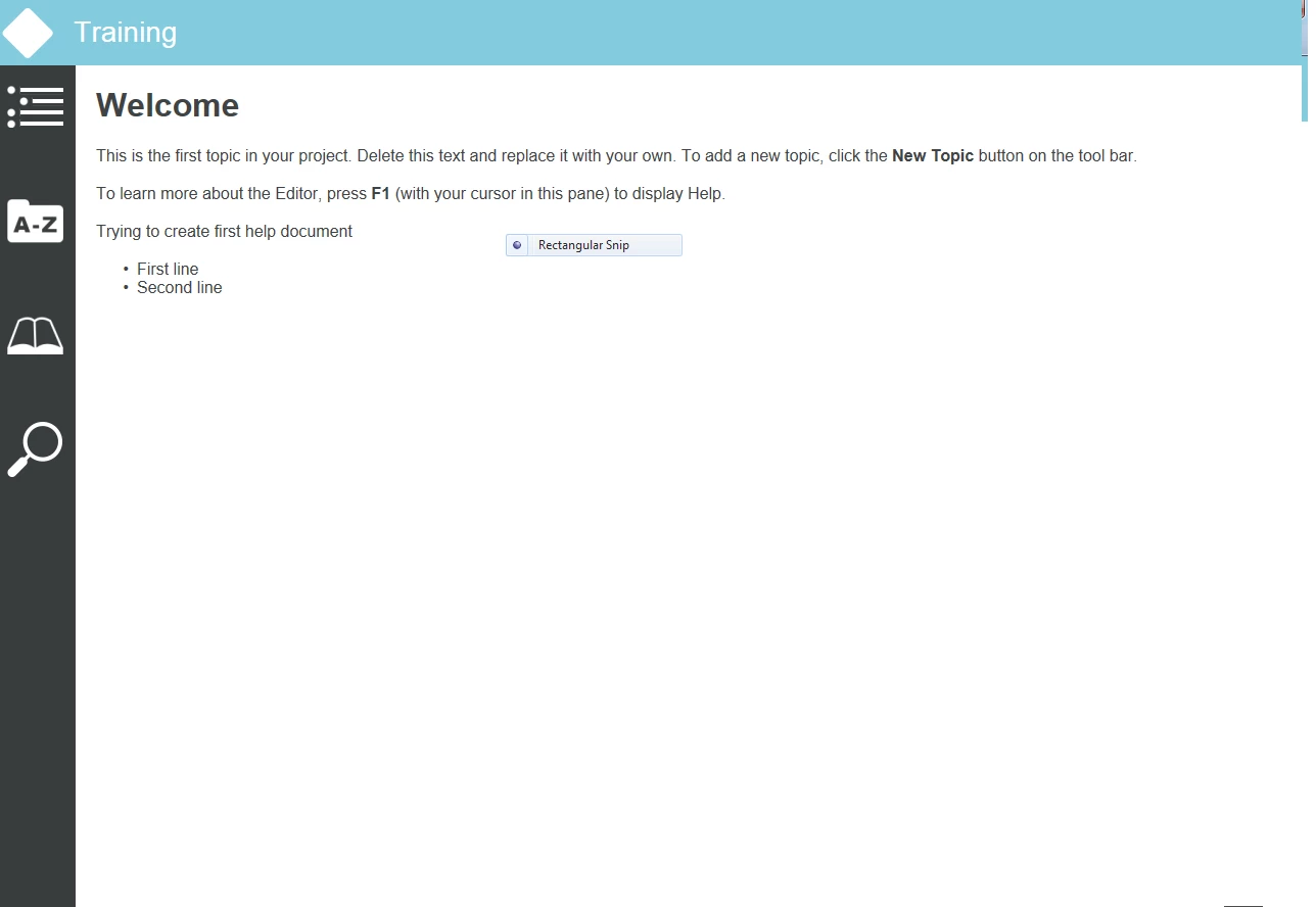
in 100% zoom: Its a bug, we need to fix it as like the second screen capture
in 95 % zoom on desktop:

We need solution for this since we cannot refer the User the browser type & fixed screen resolution,
so I need my output should auto adjust to all screens and browsers, kindly fix me as early as possible, since I have been at the final phase of the project
 AdChoices