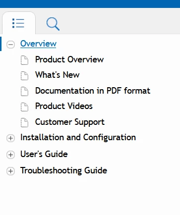
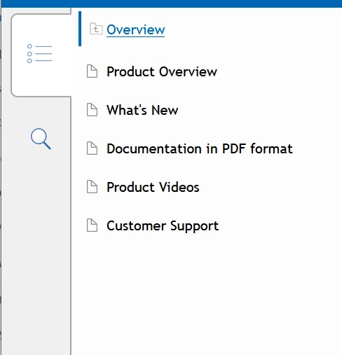
What you are seeing is the tablet view. It only displays the contents of the current toc folder/book. You click on the top entry (with the little folder icon with an arrow in it) to go back up one book. In your example, clicking on Overview should then display all the top level books you have set up. (I'm only explaining because I think it's an easy thing to overlook, especially on a desktop browser.)
If you don't want to turn off responsiveness, you could change the width that triggers the switch to tablet and mobile layouts. You'll find that in the Media Query section of the skin, assuming you're using Azure Blue Responsive. Try switching it to a smaller number so that tablet and monile views only kicks in for even smaller screens


 AdChoices