Copy link to clipboard
Copied
Greetings,
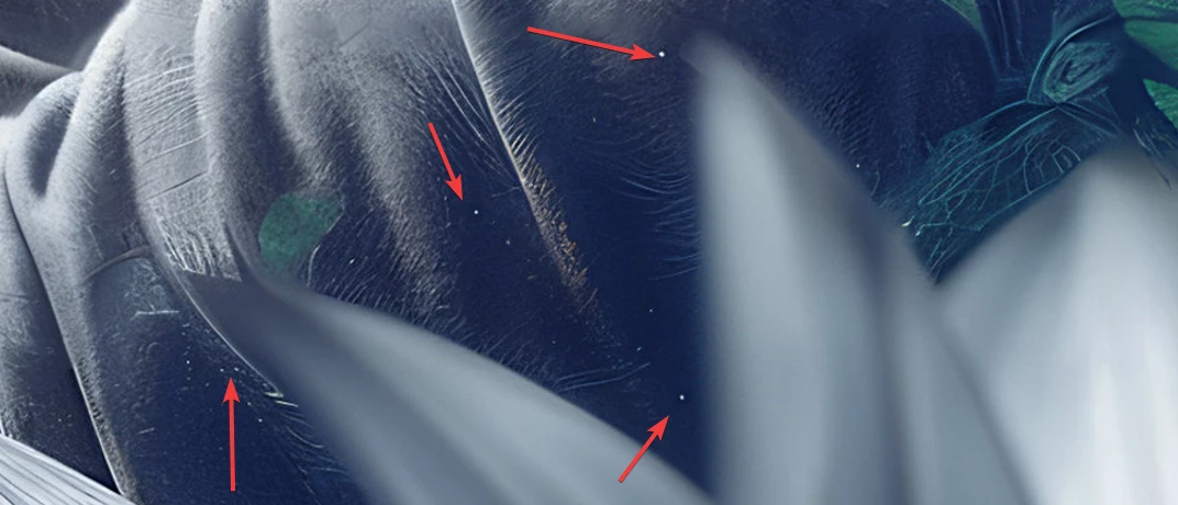
I recently embarked on my journey with Adobe Stock by uploading four of my images, and I'm pleased to share that three were accepted. However, I'm seeking guidance and insights regarding the rejection of one image to enhance my future submissions. My initial thought is that it could be due to minor white artifacts noticeable in certain areas of the first image, though I'm uncertain if this is a significant factor for rejection. Additionally, there's a finger in the image that appears somewhat unusual, but considering the illustrative nature of the work, I didn't anticipate it being an issue. Maybe the top-right part is too noisy.
Any advice or feedback would be greatly appreciated.
Thank you in advance!
You're right about the misshapen finger. I believe Adobe moderators have been told to immediately look at the hands and reject any that even slightly misshappen, illustrative nature or not. I also found that dot on her cheek a little weird. And yes...those things that look like dust spots need to be eliminated. If you haven't been, view your assets at 100% minimum before submission. 200% is better. I even occasionally do 300%.
It's a lovely image, and it appears that you've already identified the flaws for which it was rejected. The good news is that you should be able to re-edit and re-submit.
Moderators refuse at the first flaw they see. So yes, the finger is a good candidate. But there is nothing done with correcting only the hand. Correct everything you see and try with a resubmit.
The illustrative nature of your asset should not be a reason to accept flaws.
On a personal note (but really personal), I think that this asset is too crowded.
I've found, that if you view your asset at 200%, you will detect most flaws, that are disturbing. You can go into higher magnification to
...Copy link to clipboard
Copied
You're right about the misshapen finger. I believe Adobe moderators have been told to immediately look at the hands and reject any that even slightly misshappen, illustrative nature or not. I also found that dot on her cheek a little weird. And yes...those things that look like dust spots need to be eliminated. If you haven't been, view your assets at 100% minimum before submission. 200% is better. I even occasionally do 300%.
Copy link to clipboard
Copied
Yeah, you're right about the misshapen finger. I wasn't sure if the illustration would slide by, so thanks for pointing it out. Getting human features right, especially faces and hands, seems to be the toughest part. About those black dots, I thought they were part of the AI's style, but guess I was wrong. I'll watch out for that next time. And thank you for the tip about checking at 200% and 300%. It's very appreciated 🙂
Copy link to clipboard
Copied
It's a lovely image, and it appears that you've already identified the flaws for which it was rejected. The good news is that you should be able to re-edit and re-submit.
Copy link to clipboard
Copied
Thanks a lot! 😊 I did put in the effort to identify the issues, but it's always reassuring to have confirmation from experienced people like you. Your feedback is valuable and much appreciated.
Copy link to clipboard
Copied
You're welcome. Learning to "see" an image like a Moderator takes time and practice, but you'll get there !
Copy link to clipboard
Copied
https://contributor.stock.adobe.com/en/portfolio please visit my site
Copy link to clipboard
Copied
A) Why?
B) This link takes me to my own site, where you need to sign in to access it. And everyone else's, I suspect.
Copy link to clipboard
Copied
Hi Daniellei4510 please solve my issue adobe rejected my AI images
Copy link to clipboard
Copied
First of all, it's best that you start a new thread, instead of posting on this one, which is month's old. Secondly, you need to post a couple of the rejected images or else we can not be of help.
Copy link to clipboard
Copied
Hi Daniellei4510 please solve my issue adobe rejected my AI images
By @Maryam359765646t18
You need to solve your issues, we can advice on how and where to look, but you need to solve the issues.
Copy link to clipboard
Copied
Your link is generic and shows my portfolio, when I use it, it shows @daniellei4510's. when he follows it. If you want to show of your accepted assets, you need to publish a link to your public portfolio. But that won't give us insight to your refusals. The are private to your account, and as long as you do not show them, they will stay private.
Copy link to clipboard
Copied
Moderators refuse at the first flaw they see. So yes, the finger is a good candidate. But there is nothing done with correcting only the hand. Correct everything you see and try with a resubmit.
The illustrative nature of your asset should not be a reason to accept flaws.
On a personal note (but really personal), I think that this asset is too crowded.
I've found, that if you view your asset at 200%, you will detect most flaws, that are disturbing. You can go into higher magnification to see the defect but what is not detectable at 200% won't be troubling at 100%.
Copy link to clipboard
Copied
Makes sense. If they find one flaw, why spend time further to find more.
Copy link to clipboard
Copied
Optimized for speed. You never know which of the many quality issues triggered the refusal. And it may be that by correcting all issues, you will get an IP strike. Refusals are done faster then accepting an asset.
Copy link to clipboard
Copied
You're right, avoiding multiple rejections is key, so I'll be thorough with the corrections. Honestly, I didn't focus much on the details for my other three accepted images; looks like luck was on my side there. 😅 I agree, the image is a bit busy. My aim with these images is to create something unique and meaningful. I'm fond of this style and have more like it, but now I'm hesitant to upload them, wondering if they'll be well-received. Could it be an issue with the cropping that's causing a lack of focus in the image?
Also, thanks for the tip about the 200% zoom for inspections. That's going to be my new standard. Really appreciate your help!
Copy link to clipboard
Copied
You're welcome. Do not trust your luck. even that you can be lucky and get an asset through that has flaws, if the flaws are dusturbing, the buyer will complain.
Copy link to clipboard
Copied
@Abambo mentioned a good point. I can agree that you have too much visual information in the image. It is a bit cluttered.
Copy link to clipboard
Copied
Got it, that makes sense. I'll work on sharpening my eye for the upcoming images, haha.
Thank you for the comment sir!
Copy link to clipboard
Copied
I recently embarked on my journey with Adobe Stock by uploading four of my images, and I'm pleased to share that three were accepted.
By @Keven5E0A
===========
Congratulations! 3 out of 4 is a very good acceptance rate, especially for a new contributor.
I think what you're doing is interesting. It's more complex than what we normally see here. Good work.
Copy link to clipboard
Copied
Appreciate it! I'm familiar with the 'rule of thirds', but wasn't aware of these specific type of guides.
Striving for uniqueness was my goal, and it appears I've succeeded. In a world where many images draw inspiration from models such as Midjourney, I find it crucial to preserve originality. At the same time, it's vital to ensure the style resonates with a specific niche, so let the time pass :-).
Copy link to clipboard
Copied
The Fibonacci Sprial or Golden Ratio has been in use for thousands of years.