Inspiring
March 29, 2019
해결됨

Attached photo rejected for exposure issue, but 2nd similar photo was accepted. ???

  • March 29, 2019
  • 3 답변들
  • 1868 조회

First photo was rejected, the one below was accepted.  Any idea why???  If anything, the 2nd one accepted was somewhat underexposed, but I liked that contrast.

Note, both of these are smaller versions ... Adobe wouldn't accept the full resolution photos here in the forum.  The ones I submitted did NOT have my logo.

I'm new to Adobe Stock, working through my confusion.  Thanks for any help!

이 주제는 답변이 닫혔습니다.
최고의 답변: Zesty_Marshmallow157F

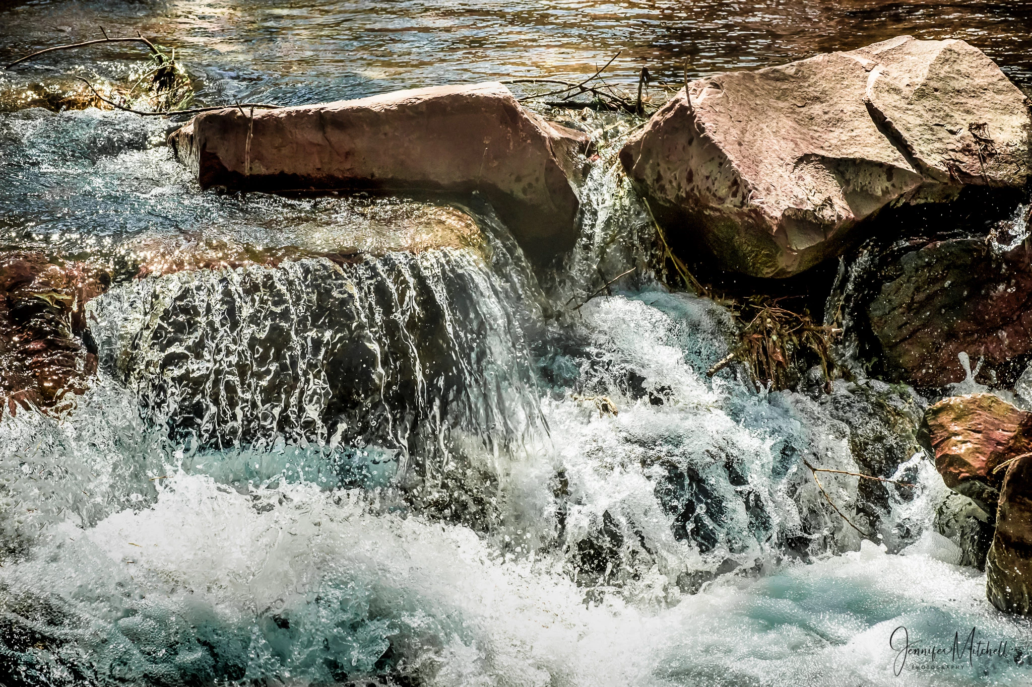
It's OK now. Still a little bit greenish. And yes, you still could edit out some of the shadow areas, because I think there is structure there in, without overdoing.

and may be there is a possibility to bring a little of structure in this area, , effectively darkening the top of the rock a little bit.

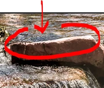
To be honest, I think the only edit that still needs to be done is to take out a little bit of the greenish tone on the water.


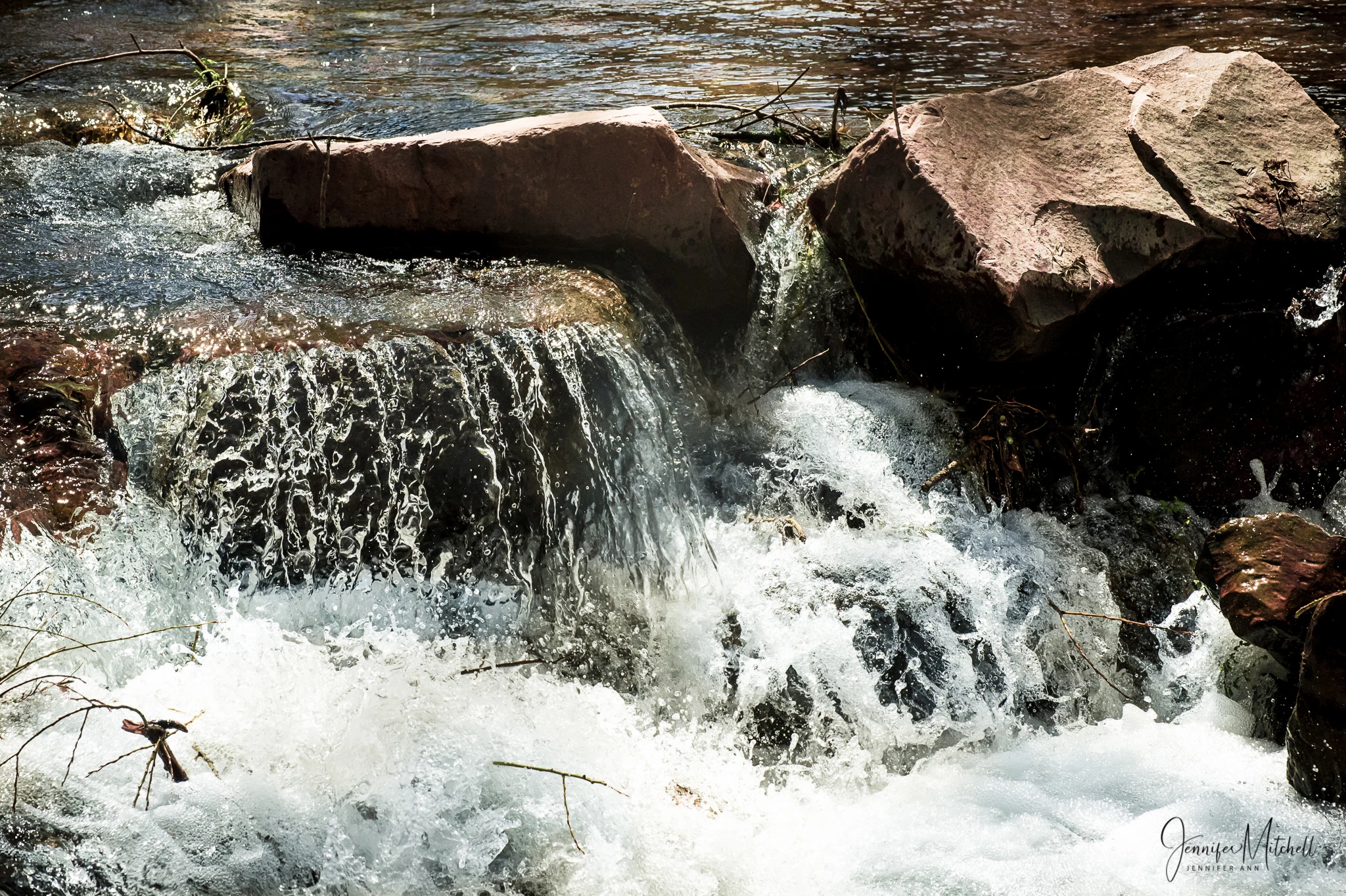
OK, here is my final edit.  I took advice from all of you, and also did a couple other tweaks ... I darkened the water behind the big rock on the right a bit, and then decided to darken the water in the bottom left to help balance the top right corner, and to add detail to the frothing water in that spot.  BTW, I use mainly Lightroom, love it ... occasionally go the PS when I need to do things like cloning, etc.

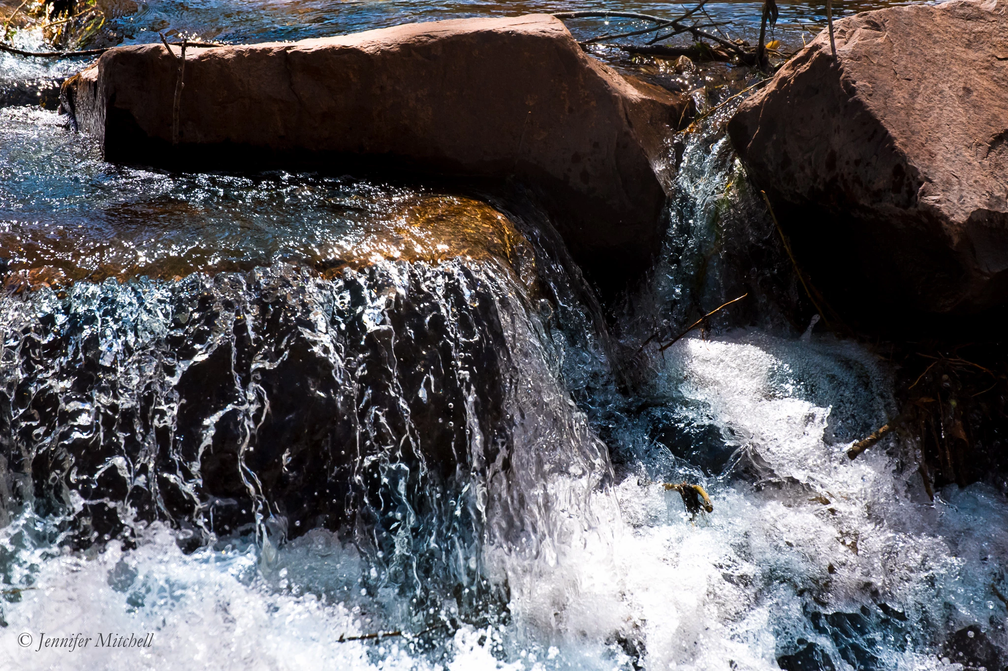
I don't know if I've ever done this many revisions!  I hope the photo is worth all the effort.  I'm going to re-submit this now.  Many thanks to all of you for your help!

3 답변

Inspiring
April 2, 2019

Here's an edited version of the first (rejected) photo.  Any comments will be appreciated.

Note: the full resolution photo submitted does NOT have my logo on it.

joanH
Inspiring
April 2, 2019

Hi teal001, Well, what a difference. Very nice work. Just a bit more white balance to mute the high-key white and you are ready to resubmit. How does this look to you Abambo ?

Regards, JH

jacquelingphoto2017
Community Expert
Community Expert
April 1, 2019

Hi tea

I've noted that sometimes when there's a rejection for exposure, I reduce the black and shadows and that does the trick. Frankly in my opinion both are a bit dark in the shadows and could have been adjusted so that more details of the shadowy arears become visible. However as you said one, the more vibrant was accepted.

Therefore if you have photoshop, try these adjustments. Reduce the black, and shadows. Add some clarity, and vibrance. Up the temperature and reduce the tint a bit (not much). Depending on how it looks when you're through with those adjustment, you may also increase the exposure a bit. The one that was rejected looks really flat.

I hope you find this helpful

Regards

JG

Inspiring
April 1, 2019

Thanks for your input, JG.  I feel the 2nd one (that was accepted) is really verging on too dark.  The 1st one (rejected) is lighter, and I like the composition better.  It that the one you feel is really flat?

joanH
Inspiring
March 31, 2019

Hi tea1001 - You have your name on both so both should have been rejected. No signatures or logos are accepted by Adobe. The second signature is smaller than the upper photo here. Best wishes, JH

Inspiring
March 31, 2019

Joanh, as I noted in my post, the full resolution photos I submitted DID NOT HAVE MY LOGO.  The first photo was rejected for exposure.

Inspiring
April 1, 2019

Hi tea1001, Thank you for your kind reply. Well here it is April 1 and I am fully awake and ready for a new month.

I would like to take a bit of a new look at why one photo was accepted and one was rejected. I know why you might like to have more contrast, however, let's look at the customer's point of view. A buyer will probably be able to add any amount of contrast they desire. The two shots are very near the same except for cropping and a closer view of the water. As a buyer, I would not like the harsh overly dark division between the splash and the black part of the rock. As the buyer, I would take only one rather than buy two of "nearly:" the same shot. The cropped shot got rid of some unnecessary junk - sticks and twigs etc. for me. As a buyer, I am attracted to the golden light of the water running over the upper flat rock. Exposure feels warmer and exciting in the accepted shot. Buyers can build a full-color palette based on that golden color.

So, when you look at these two photos, take the potential buyers point of view. All too often the photographer or artist is not considering the client's concerns - only trying to make their work more pleasing to their creator's eye - trying to fit their work to the buying general public likes.

Please remember, the stock reviewer knows Adobe customers and what they buy. And every buyer has a budget to follow.

Keep up the good work.  Best regards, JH


JH, thanks for your input again.  I want to be sure we're talking about the right photo.  You said "Exposure feels warmer and exciting in the accepted shot."  It is the first, the rejected shot, that is warmer ... and I like it better, the composition also.  Please clarify which shot you like better.