- Home
- Using the Community
- Discussions
- 4/15 Forum Upgrade- ask your Jive 8 questions here...
- 4/15 Forum Upgrade- ask your Jive 8 questions here...
4/15 Forum Upgrade- ask your Jive 8 questions here!
Copy link to clipboard
Copied
We're upgrading the forums on 4/15 at 10pm PDT. The user interface will be a bit different (see a brief overview). If you have any questions or issues after the upgrade, please report them and ask them here!
Copy link to clipboard
Copied
Is the same forums that the prerelease programs are moving to? (Crosses fingers)
Copy link to clipboard
Copied
Hey Brad,
I'm not sure- we're currently on Jive 7 here and are just upgrading to 8, so things won't be too, too different. Does anyone know which software the prerelease forum uses? I'm unfortunately not familiar with the prerelease forums!
Copy link to clipboard
Copied
Sounds like it isn't. The prerelease forums don't mention Jive. Too bad. 😞
Copy link to clipboard
Copied
Hey Madison,
Will the new upgrade include any sort of backend private tagging section for bug numbers, keywords, or other links?
Regards
PG
Copy link to clipboard
Copied
Hey Pete- not that I'm aware of I'm afraid!
Copy link to clipboard
Copied
Alright- addressing a few items brought up here:
- Fixed width- I'll ask the team internally about this!
- Badges not matching- this is actually as designed in the Top Participant widget. The top participant widget shows points for just that individual forum, the hover card shows points in all forums.
- Padding under status level (rockstar) text: great feedback! Adding to list
- Confusion surrounding posting a new discussion- we're getting lots of feedback on this and will see if there's anything we can do to make the process more clear. To start- there's a new section at the bottom of the pages with the new layout (all spaces should be getting updates/this new layout by the end of the week) to start a new discussion (for example: Downloading, Installing, Setting Up )
- There is a staff badge, it's just the red A instead of the orange Staff text:

- Jeff Almasol - since the Character Animator space is a bit more customized, would you like to sync up Monday to review the changes? You're the space owner, correct? Let me know and I'll set something up!
Copy link to clipboard
Copied
Hi Madison,
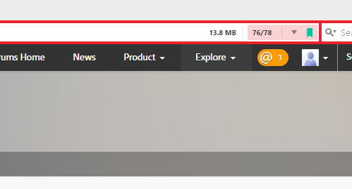
The look and feel of the forums is a great change. Especially using a mobile device. I haven't checked the page weight using a mobile device yet. The desktop version's weight went up from the mid 6 megabytes range to just above 7 Meg's though. The desktop weight and mobile weight was previously the same.
That's a lot of weight if someone is on a limited data plan. While I am not around as much these days, I do usually do so using a mobile device unless I need to look at an example file or provide one.
To make things worse, if I am out of the office and read a message I intend on providing a sample file for or first download their sample, I then use the mobile hotspot and connect to it via the laptop. I can rack up quite a lot of data usage just for helping one user.
I am hoping that the new format is truly more mobile friendly in this regard.
Thanks for reading.
Mike
Copy link to clipboard
Copied
In my opinion the new software is terrible. Why on earth do I have to always click the Content link to see all the posts? I come here to help other users and to learn from other posts that have been answered. The now standard view of the LR forum only shows around 10 posts.
That means I won't be coming here as often as I did. So please change this for the good of the forums.
Copy link to clipboard
Copied
First time user, having a job finding my way around.
I have a question, not able to find where to post it.
Question = Quicktime support has been stopped what will be the alternative for Adobe After Effects?
Copy link to clipboard
Copied
Hi Madison,
I had a jolt when I logged-in to the new forum today ![]() .
.
I'm all in favor of Mobile friendly, better search and faster performance. These are all positive things which I'm happy to see added to the forums.
On my HiDef display, I keep my browser text size fairly large to see better. My settings threw the new JIVE forum into Mobile mode which I discovered later is very different from Desktop mode.
Being in Mobile mode, I was utterly confused, couldn't find an Editor & had one heck of a time finding the create new Discussion link. From a usability standpoint, I think that creating a new Discussion needs to be more prominent; not hidden under Actions.
I also think the UI/UX designers got a few things bassackwards by de-emphasizing Badges and ultra-emphasizing the point system (Shields). You certainly don't need to be an expert contributor to earn points. Stars made a bit more sense. But an arbitrary shield with a 4, 5, 6, 7... has little or no meaning to people. Why is it so prominent?
Nancy O.
Copy link to clipboard
Copied
pardon me but i`m losing my mind here I cannot see where the post a new discussion link is? Very frustrating.
Copy link to clipboard
Copied
You're not alone. It took me 30 minutes to find it, too.
Most likely, you are in Mobile mode so it's under the Actions link (not exactly prominent, is it?).
If you're not on a mobile device, Zoom out in your browser Ctrl + - (minus) a couple of times to get back to Desktop mode. It's in the usual place.
Nancy O.
Copy link to clipboard
Copied
The colored shields are just plain dumb as they stand, whoever suggested this idea is quite frankly brain-dead. What do you think they mean to a new forum user, absolute zilch - you have to be a dodo NOT to see that one. The irony is there is no obvious link or place where you can actually see what the shields mean. Not even a key somewhere prominent on the forum pages. Maybe an idea would be to make them clickable, no that obviously would be far too simple to even consider. The merit badges are now taking a secondary role and now completely meaningless. I dont particlulary agree with awarding badges but if they are to be awarded for contribution and content then for christ sake have the sense to make them meaningful or just take the bloody things away.
Copy link to clipboard
Copied
i`m on my macpro, zooming in and out didnt do it for me Nancy, but thanks for the feedback, I still can only see product explore at the top (ask, learn, connect) I presume ask or learn would allow me to post a question... is this design to force people to search long and hard before they can post a question or gain feedback on a design process? its driving me crazy here. Under actions I dont see anywhere that allows me to post a new discussion...
Copy link to clipboard
Copied
bluefire777 wrote:
I still can only see product explore at the top (ask, learn, connect) I presume ask or learn would allow me to post a question... is this design to force people to search long and hard before they can post a question or gain feedback on a design process? its driving me crazy here. Under actions I dont see anywhere that allows me to post a new discussion...
Are you missing something like this when you are at the top level in the forum?


You may also like to know that if you want to test something on this forum, then this is the best place to go:
Copy link to clipboard
Copied
these are all I can see, the "forums home" and then under explore/Ask, which I presume one can ask something there but I don`t know how...


Copy link to clipboard
Copied
I just want to post an issue and I have NO IDEA where to do this. The UX/UI is poorly designed. Let's get his fixed ASAP.
Copy link to clipboard
Copied
this is pathetic, I cannot even find all my previous placed discussions, (the apple forum is so much better than this)... so angry right now i`ve been waiting all day ![]()
Copy link to clipboard
Copied
right, I see now... you have to choose PRODUCT then choose the software, then in there you will see "actions" on the right, click it to "create" discussion, or scroll toward the bottom of that page for "start a new discussion"... ![]()
Copy link to clipboard
Copied
MadisonLeupp wrote:
If you have any questions or issues after the upgrade, please report them and ask them here!
Adobe Inbox in Desktop mode.
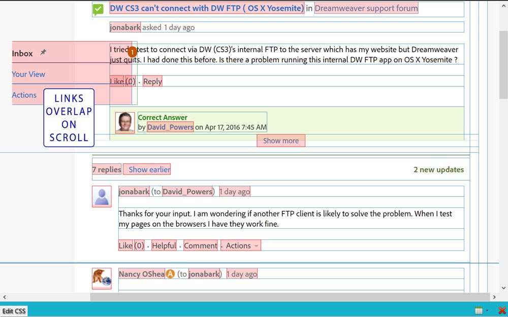
- Couldn't find a Reply link (same as Forums). Later learned it was changed to Comments??
- When I'm typing a reply, the interface frequently locks-up and becomes non-responsive or it does something really strange and takes me into an Actions dialoge. When I go back to Inbox, the thread is gone.
- As far as I can tell, the only active links are Helpful and Comments. The Like() is useless and Actions drop-down is empty. What's the point of having them?
- All links have same muted-text so it's not easy to tell which are active and which are disabled.
Nancy O.
Copy link to clipboard
Copied
As a follow up to my Inbox issues, below are some screenshots you can show your JIVE developers. I used my browser tools to outline block level elements and I gave a rose background-color to linked regions. As you can see, the usability problems stem from overlapping links.

A 2nd one from the Comment/Reply panel.
Now I understand why I was landing in ACTIONS when editing a reply.

MOBILE MODE - usability issue
The viewport meta tag: Scaling has been disabled. This removes the ability for users to pinch and zoom as may be required to view content. That needs to be corrected ASAP.
Nancy O.
Copy link to clipboard
Copied
Hi all,
Want to quickly thank everyone for your feedback- we've documented it all in our issue/feedback/feature request tracker.
Thank you!
-Madison
Copy link to clipboard
Copied
Hi Madison,
Déjà vu
My replies with links are going to the dreaded Moderator's Queue.
I'm melting, I'm melting....
Copy link to clipboard
Copied
Hi Madison, here's another screen shot. Look at the right side of the browser's url--which itself doesn't show for brevity. I am capturing entering the ID | Content section.

Also, I just noticed when uploading the above screen shot, there really ought to be more contrast to the upload pop-up. White on white with thin blackish rules just isn't enough contrast to me.
Mike
Find more inspiration, events, and resources on the new Adobe Community
Explore Now
