

- Home
- Using the Community
- Discussions
- Re: Comments on the new layout of the Forum FAQ
- Re: Comments on the new layout of the Forum FAQ
Comments on the new layout of the Forum FAQ

Copy link to clipboard
Copied
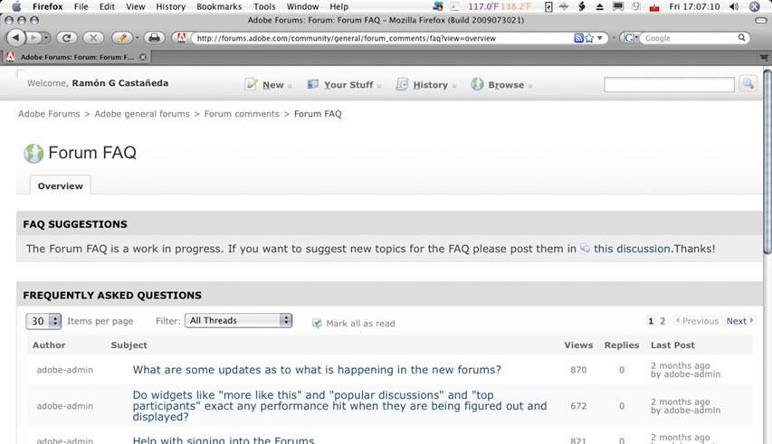
I change the layout of the Forum FAQ a bit. Since the FAQ is read-only for non-moderators I moved the actions down, I don't see the point in a Top participants widget since it is all managed by JC anyway, so I was able to give the discussions the full width allowed by the template:
http://forums.adobe.com/community/general/forum_comments/faq
How do you like it? Is this something to try for the Forum comments forum as well?


 26
Replies
26
26
Replies
26

Copy link to clipboard
Copied
It would be an improvement for all the forums.

Copy link to clipboard
Copied
Agreed. They should all be full width like that.
Copy link to clipboard
Copied
I would rather the action box stay on the right, but the forum stretch the full width of the browser window. (like many of us do with the local css code) I wouldnt like scrolling to the bottom anytime an action is needed.
And many forums have placed helpful links to associated forums to the right, which are very convenient. This design would remove all that.
Copy link to clipboard
Copied
I suppose that's true, but only the Action box is really needed, I think. Maybe that could be at the top - there's a lot of wasted space by that massive black box.
Copy link to clipboard
Copied
... and links to associated forms, that's true.
Copy link to clipboard
Copied
Curt Wrigley wrote:
I would rather the action box stay on the right, but the forum stretch the full width of the browser window. (like many of us do with the local css code)
So would I, but that is not an available template.
I wouldnt like scrolling to the bottom anytime an action is needed. And many forums have placed helpful links to associated forums to the right, which are very convenient. This design would remove all that.
The actions at the bottom is a major downside. That is really only possible for the Forum FAQ since it is essentially read-only. For here I am more thinking about a three column header at the top by putting some HTML in manually. One column for the current sticky topics, one for the actions available for everybody and one for the subforums. Or two columns with the actions and subforums underneat eachother. Then the discussions in full width, and at the bottom a regular actions block which includes the privileged actions. I

Copy link to clipboard
Copied
The FAQ layout would be a great improvement in all forums. The only thing from the right needed at the top is Start a Discussion.
A certain contraction, and it would be even closer to the fair forums.

Copy link to clipboard
Copied
Jacob Bugge wrote:
The FAQ layout would be a great improvement in all forums. The only thing from the right needed at the top is Start a Discussion.
A certain contraction, and it would be even closer to the fair forums.
I've been dabbling with the idea of making a single column layout for the Overview page on the Photoshop Windows forums but i don't know if it would make much of a difference because it would still change to a 3 column layout inside of the threads themselves.
Copy link to clipboard
Copied
Is it not possible to do more or less the same in the threads?
Copy link to clipboard
Copied
not with our access levels, we can only modify the Overview pages.
Copy link to clipboard
Copied
Does anyone at Adobe have higher levels of access?
Copy link to clipboard
Copied
of course they have, but i didn't get a chance to see what options they have that we don't For all i know it could be as simple adjusting the Overview page or as complex as having to modify the code to make the necessary changes.
Copy link to clipboard
Copied
OK, I was thinking that beyond a certain point maybe you have to ask Jive to change things. Do you have to ask anyone, or could you go ahead and modify the Overview page at least? Of course, in here the Overview page is very similar to the Discussions page - right down to having an 'Overview' link 
Copy link to clipboard
Copied
I could but i won't. I keep the moderating to a minimum outside of the Photoshop forums, especially on the forums that already have hosts so ask Jochem. And besides, the stickies take up enough space as it is, making the Overview page single column would likely push the thread listing completely below the fold. That's also why i didn't implement this in the Photoshop forums, it would require way too much vertical scrolling.
Copy link to clipboard
Copied
I borrowed the Testing forum to show 2 possible designs. Do you prefer one of those over the current layout of the Forum comments forum?
http://forums.adobe.com/community/general/forum_comments/testing
Copy link to clipboard
Copied
Hi there
I tweaked it a bit. Popped in an image with a transparent background. (The white stood out too much against the blue)
Cheers... Rick 
Copy link to clipboard
Copied
I prefer the least possible info at the top. Starting every session by scrolling down is annoying.

Copy link to clipboard
Copied
The top one needs tweaking to display properly in IE7:

If the idea is to have the Subforum and Actions boxes side by side (as opposed to one above the other like the lower one), then that would be a good solution. Is it possible to have both - so there's room for useful links in a third box, say?
Noel
Copy link to clipboard
Copied
I prefer the top version, and both are far better than the present one.

Copy link to clipboard
Copied
is the author column actually needed on the left? i could live without it.
Copy link to clipboard
Copied
Changing the options in the column list is not an option the templates offer. And at this point I am not willing to go the way of overriding the stylesheets provided to hide the column that way.
Copy link to clipboard
Copied
Inasmuch as this is all I see, it suits me fine. 
Copy link to clipboard
Copied
I agree with Ramon. Id rather use the local css mod to allow full browser width, than to load the top of the forum. The proposed layout would consume too much vertical space; meaning little to no posts viewable without scrolling.
Copy link to clipboard
Copied
If the Actions & Notifications box to the right were moved just a tiny bit up, we could have the same wide thread list in this forum as in the FAQ section.
I should like that. And then the same in the other forums, of course.
-
- 1
- 2

Find more inspiration, events, and resources on the new Adobe Community
Explore Now
 AdChoices