- Home
- Using the Community
- Discussions
- Re: Most of us read left-to-right...
- Re: Most of us read left-to-right...
Most of us read left-to-right...
Copy link to clipboard
Copied
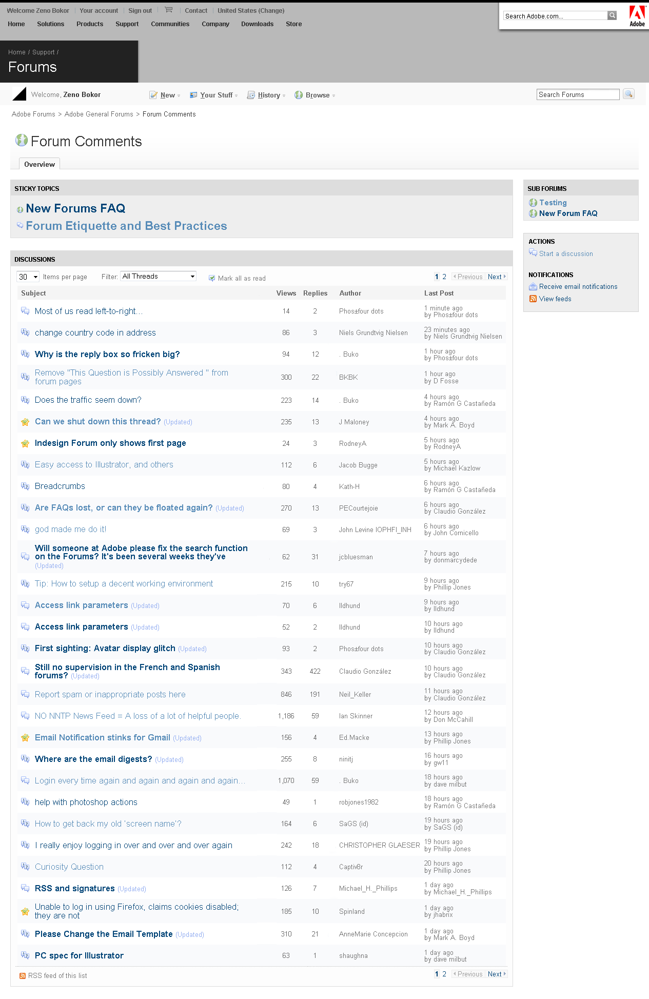
...And by putting the Author of a thread starter in the left-most column of the thread index page it seems to me that the natural emphasis is focused on the wrong thing.
The important thing is the Subject, and it should be given that position.
In fact, I don't even care who starts a thread; I wouldn't even need to see that until I open the thread.
Further, I'd rather not see a column dedicated to the authors of posts at all. I'd rather see their names on a line beneath the title of the thread or the reply.
Copy link to clipboard
Copied
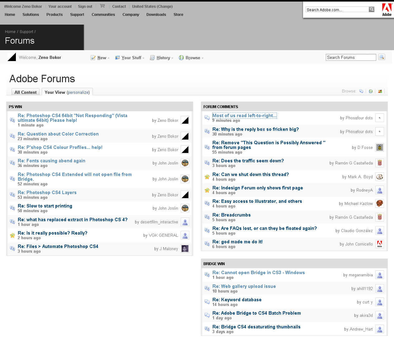
i'd say abandon the normal forum view and set up your own, something like this. It also loads faster than having to reload every forum that i visit in a new tab

Copy link to clipboard
Copied
See, that's cool and all, for the people who CAN do that, or for those who know about it, or even know how to do it once they're aware of it...shoot, I'm pretty savvy and resourceful, but I need help with some of that stuff.
The problem is the default view for all the people who CAN'T do that, don't know about it, don't know how to do it.
The thing is, none of us should HAVE to fuss with scripts and workarounds, and deep fiddley configurations like that.
It's counterintuitive, it's bad UI, it's off-putting to all these new visitors Adobe is hoping will be more pleased with the new, "modernized" forum software. And it's especially bad to the thousands of us who got used to the speed and efficiency of the older WebX format.
Copy link to clipboard
Copied
my point is that while true, it takes a bit of time to set up, once it's done you won't ever want to go back to normal forum view as it's much more streamlined this way. It also doesn't require any scripting, you just go to the forums main page, chose Your View, click on personalize and and drag in a couple of Recent Discussions widgets that you then set up to monitor the forums you're interested in(and optionally pick a layout). The only major change that i made in there was to remove the fixed width to give me more space to work with.
I wonder though how easy/hard it would be to move the column with the thread creator between replies and last post and also remove the his icon to get something like this. It sure would look better but heck knows how this stuff is implemented under the hood

Copy link to clipboard
Copied
I'm working on some mock-up redesigns, too.
What good will come of the work? Probably none.
But it might be pleasing to hear a few people raise a cheer about it.
Copy link to clipboard
Copied
Thanks for the how-to!
BTW, what was your nickname, "before"?
Copy link to clipboard
Copied
who? me? i wasn't anything "before", my join date is correct ![]()

Copy link to clipboard
Copied
The thing is, none of us should HAVE to fuss with scripts and workarounds, and deep fiddley configurations like that.
hear hear. i'm not fiddling with anything until the dust settles. i want to see it in all it's painful ignominy. and i want to see it if and when they decide to fix it. if i last that long...
Copy link to clipboard
Copied
There are many work-arounds/tricks/style-sheets, etc, that a number of posters have come up with. The problem with all of them is that those 'fixes' don't work for everyone.
Someone needs to 'beat' on the Wizards at Jive Software so that we, the users, have some control about the layout. If that can't be done then Adobe is betting on the wrong horse.
Copy link to clipboard
Copied
I tried the link below submit product Feedback it went to clearspace. But only allow designers or Companies to reply, not end users.
Copy link to clipboard
Copied
Bob_Peters wrote:
Someone needs to 'beat' on the Wizards at Jive Software
The thought that a company that has given us these miserable forums can have even a single wizard in its employ is hilarious. ![]()
Copy link to clipboard
Copied
Ramón G Castañeda wrote:
Bob_Peters wrote:
Someone needs to 'beat' on the Wizards at Jive Software
The thought that a company that has given us these miserable forums can have even a single wizard in its employ is hilarious.
Ramón, I don't know what ever caused me to say such a silly thing when there is overwhelming evidence that you are correct. I'll chalk this one up to a lack of caffeine.
Copy link to clipboard
Copied
I bet the Jive people are a bit taken aback at the comments, as well as the multiple work-arounds being produced. I suspect this isn't the kind of audience they usually have.
Copy link to clipboard
Copied
Kath-H wrote:
I bet the Jive people are a bit taken aback at the comments, as well as the multiple work-arounds being produced. …
Do you really think they're bothering to read us?
Copy link to clipboard
Copied
I think the feedback is getting through, I trust JC on that.
Find more inspiration, events, and resources on the new Adobe Community
Explore Now