

- Home
- Using the Community
- Discussions
- Re: Please make Verdana the default font, not Aria...
- Re: Please make Verdana the default font, not Aria...
Please make Verdana the default font, not Arial

Copy link to clipboard
Copied
Adobe Forums admin folks (John C, perhaps?), please have mercy on your users and make Verdana the default for posts, and not frickin' Arial. Verdana was designed for on-screen reading, while Arial was barely designed for reading at all. I'll set this same paragraph again in Verdana below, so you can see the difference. Assuming you can change the default font at all, of course.
Adobe Forums admin folks (John C, perhaps?), please have mercy on your users and make Verdana the default for posts, and not frickin' Arial. Verdana was designed for on-screen reading, while Arial was barely designed for reading at all. I'll set this same paragraph again in Verdana below, so you can see the difference. Assuming you can change the default font at all, of course.
That's the same point size in both paragraphs, btw. Isn't that better? Don't you wish this paragraph was in Verdana as well?
Cheers,
T


 57
Replies
57
57
Replies
57
Copy link to clipboard
Copied
Thomas Phinney wrote:
Adobe Forums admin folks (John C, perhaps?), please have mercy on your users and make Verdana the default for posts,
I'm sure Eric or Mark could come up with a script to override Arial and replace it with Verdana during a short coffee break.

Copy link to clipboard
Copied
Hahahah, fine I can take a hint! 
http://userstyles.org/styles/17023
Copy link to clipboard
Copied
Eric @ MCA wrote:
Hahahah, fine I can take a hint!
Thank you, thank you, THANK YOU!
You're just freakin' awesome, Eric! You have improved the look of the entire forums dramatically. 
Copy link to clipboard
Copied
The new look is stunning! Thank you once again, Eric.


Copy link to clipboard
Copied
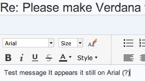
Test message It appears it still on Arial (?)
Copy link to clipboard
Copied
You have specifically chosen Arial as your font style family in the Font Family drop-down menu.
Message was edited by: Eric @ MCA

Copy link to clipboard
Copied
I'm not sure I'm following what your latest script is supposed to do.
I selected Verdana in the Full Editor font list. I type and it remains as Verdana until I click anywhere in the message composition area. It then reverts to Arial
If I hit "Return" it reverts to Arial.
Or is your script just meant to display all body message body text as Verdana as I look at it in the thread?
If so, it's useless for me, because I have Firefox set to display it as Trebuchet.
Copy link to clipboard
Copied
Yeah, it just overrides body to be Verdana so if you are already forcing it all to Trebuchet you won't see any difference.
If someone specifically changes to a different font in post editor, I'm not sure what is controlling that. I can still select text and make it Arial using the Font Family drop-down, for example, so I suspect that will be overriden by whatever the editor chooses. Let's test...
Arial test
Helvetica test
Terminal test
Times New Roman test
Trebuchet test
Verdana test
EDIT: Yes, if someone overrides the font, it still overrides my style. Probably because it is a special span within the body text.
Copy link to clipboard
Copied
Eric @ MCA wrote:
Yeah, it just overrides body to be Verdana so if you are already forcing it all to Trebuchet you won't see any difference.
That's what I figured. I had already opened up the javascript, because I was going to edit the style to force Trebuchet, but since the script doesn't actually configure the editor's font menu, I decided to remove the script.
Still, you rock, Man, for how far you're climbing above and beyond the call of duty.
Copy link to clipboard
Copied
No. When I openned the reply window at first, it showed Font Style and I just started typing. then I clicked on what I typed and it showed Arial, not Verdana.
I can select it, but it defaults to Arial if I just start typing.
I shouldn't have to choose it if its been changed to the default type. And it bounces back to Arial if you click outside the period at end of sentence. As long as you don't, it remains selected.
Copy link to clipboard
Copied
For me it doesn't default to Arial automatically inside TinyMCE. But I don't have Arial installed, so maybe that is why.
Copy link to clipboard
Copied
PjonesCET wrote:
Test message It appears it still on Arial (?)
The point is that if you have Eric's style installed, you'll see whatever anyone else posts in Verdana, not Arial, and most importantly the site's default font in effect becomes Verdana. Look at the thread index page in my posted screenshot.
It's a veritable godsend.

Copy link to clipboard
Copied
I have installed all Eric's scripts for Opera, and they all work perfectly.
Eric @ MCA wrote:
Hahahah, fine I can take a hint!
http://userstyles.org/users/21328
I tried to modify the font script by adding Calibri to the top of the font list, but I got some sizing issues, so I decided to stick to Verdana.
Excellent work!

Copy link to clipboard
Copied
[Edit: I am trying to scratch everything I posted. For some reason I'm stuck in this quote box.]
Copy link to clipboard
Copied
[Edit: I am trying to scratch everything I posted. For some reason I'm stuck in this quote box.]
switch to html mode when that happens and delete everything from there... 
Copy link to clipboard
Copied
Please ignore. Just testing the Cyrillic support by Verdana.
Нежно простившись с любимой блондинкой, простой американский патрульный Дэнни Фишер (Джон Сина) выходит вечером на дежурство. Федералы как раз в это время давно и внимательно наблюдают за прогуливающимся
по улицам вором Майлзом Джексоном. Пока наш коп в компании озабоченного напарника объезжает улицы родного города, поступает просьба о поддержке от ФБР. Преследуемый нарушитель спокойствия на глазах у законников проворачивает сложносочиненную комбинацию, кладет всех подельников и на красивой машине с чемоданом бриллиантов и возлюбленной готовится удрать в другой штат, когда на его пути возникают полицейские. Наш невозмутимый герой, невзирая на валяющегося с простреленным задом напарника, арестовывает Джексона, но любимая женщина похитителя в процессе задержания трагически попадает под джип. Арестованный внимательно смотрит на грудь копа. Там написано «Д. Фишер». Спустя год он бежит из тюрьмы и, пробив имя, видимо, по телефонной базе, звонит детективу Фишеру с предложением отметить годовщину знакомства, прихватив для верности любимую девушку полицейского в заложники.
Excellent support!

Copy link to clipboard
Copied
Just click below the box.

Copy link to clipboard
Copied
I am with Thomas. As he says, Verdana was designed specifically for improved on-screen reading, while Arial is only a fake Helvetica. And Helvetica was designed for improved reading on print, quite a long time before even TV was invented.
Helvetica/Arial are difficult to read on screen, specially at small sizes such as the one used by default here. And they make no noticeable difference between I (uppercase i) and l (lowercase L) as Verdana does: Il.
Copy link to clipboard
Copied
Claudio González wrote:
I am with Thomas. As he says, Verdana was designed specifically for improved on-screen reading, while Arial is only a fake Helvetica. And Helvetica was designed for improved reading on print, quite a long time before even TV was invented.
Helvetica/Arial are difficult to read on screen, specially at small sizes such as the one used by default here. And they make no noticeable difference between I (uppercase i) and l (lowercase L) as Verdana does: Il.
Its defficult to read on paper aa well, along with Arial. "My" preference for reading on screen and reading is ITC Benguait.
Copy link to clipboard
Copied
PjonesCET wrote:
Its defficult to read on paper aa well, along with Arial.
You do know that Arial is the M$ ripoff of Helvetica, right?
Copy link to clipboard
Copied
And while we're talking about the "Full Editor" what the heck causes it to behave so erratically?
The cursor jumps to unexpected places all the time when you try to edit and otherwise manipulate text like anywhere else online or in any offline applications in common use.
Having the dumbed-down formatting tools is all well and good, BUT PLEASE MAKE THEM BLOODY WORK LIKE THEY SHOULD, AND LIKE MOST PEOPLE EXPECT THEM TO WORK!
Copy link to clipboard
Copied
It's all a bit half-baked. Maybe a few more weeks in the oven will help.
Copy link to clipboard
Copied
Another vote for Verdana!
Copy link to clipboard
Copied
As I said earlier, I support the choice of Verdana as a default font wholeheartedly (I am also a typography freak).
But I sometimes wonder at the lengths people will go to, and the discussions that go on, about what in effect is the just the appearance of the forums.
They are a tool for information exchange – not a way of life for godsake!
Do you worry about what colour a spanner is before you will deign to use it?
Copy link to clipboard
Copied
Well, first, most of the users of the forums are designers of one sort or another, and are sensitive to appearances. Adobe is supposed to be a design-sensitive company.
But more importantly, the choice of typeface is one of functionality as much as "appearance." It's precisely because the forums are supposed to be a tool for information exchange that I'd like them to be easier to read... for everyone. Sure, I can use the trick mentioned above so *I* will see the forums in Verdana, but that's not really the point.
Cheers,
T

Get ready! An upgraded Adobe Community experience is coming in January.
Learn more
 AdChoices