

Typeface choice gone

Copy link to clipboard
Copied
The Advanced Editor window has experienced some changes today. One of the unwanted ones is that the hability to choose typefaces is gone, or extremely well hidden.


 55
Replies
55
55
Replies
55
Copy link to clipboard
Copied
Firefox/Mac:
The text in message #19 looks like Times to me. And I see the text I'm writing in the same font...
Copy link to clipboard
Copied
Explorer/Win:
Now I see message #19 and what I'm writing in what looks like the Adobe font...
Copy link to clipboard
Copied
Safari/Win:
A third variation: Message #19 in Times and what I'm writing in ... Arial?
I would think that there seems to be something wrong here...

Copy link to clipboard
Copied
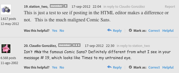
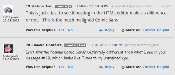
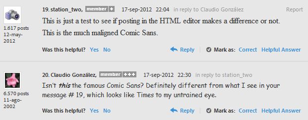
station_two wrote:
This is just a test to see if posting in the HTML editor makes a difference or not. This is the much maligned Comic Sans.
It makes a big difference (in certain browsers) if you spell the font name correctly or not.
<span style="font-family: ComicSansMS;"> ≠ <span style="font-family: Comic Sans MS;">
Copy link to clipboard
Copied
Pat Willener wrote:
...It makes a big difference (in certain browsers) if you spell the font name correctly or not...
Regardless, why do I see the quoted message in what looks like Times?
And, quite frankly, I am fed up of writing my answers in Times and seeing them posted in the Adobe font. And with no ontrol over the typeface used. Yes, I know that I can write them in whatever font I want in Word and then copy and paste them here, but that's not the point.
Copy link to clipboard
Copied
Claudio González wrote:
Regardless, why do I see the quoted message in what looks like Times?
I believe that when the browser does not recognize a font, it will display the text in the browser's default font.
Below I will type something in OCR A Extended; most likely you will see the same Times font:
The quick brown fox jumps over the lazy dog.
Copy link to clipboard
Copied
Yes, I do see the last line in what looks like Times. Which raises an interesting point. When I write messages, do I see the same Times because the browser does not recognize the Adobe font???

Copy link to clipboard
Copied
Claudio,
I apologize for my lack of vigilance.
Pat is right, and there is even more to it:
When you write your posts, normally or in the advanced editor, you see the default font in your browser.
So it is (only) possible to change the look of post writing by changing the browser default.
I had overlooked the fact because the forum uglifies the font at the rather small font size and (maybe even more) because I have been too busy (and too slow) to notice that I was actually seeing the fairest font, which I have as the default; I should have realized (I hope), had I used certain characters.
Now I am quite enjoying it.
But it seems that each post gets transformed intto the forum font, unless specifically coded.
Presumably, a coded post with a non default font get transformed into the available default font of its kind (serif/sans serif/whatever).
Copy link to clipboard
Copied
Well, I have just checked and it's true: there is no font in my systems with a name remotely resembling Adobe Clear, so my browsers are showing the text in my messages as the default font of each.
This is very recent; I noticed immediately after the last change, in which the choice of fonts was removed from the advanced editor in the message box. And it is also very annoying, at least for me, to have to write my messages in one font to see them posted in a completely different font.
As there has been no official reaction, I guess this is just one of the new things that we have to learn to live with. Regardless of the opinion of users. 
Copy link to clipboard
Copied
Another new feature I had forgotten to mention. When I open any window, if the cursor happens to be in the place of any of the spots displaying windows (member badge, name), the corresponding window is displayed at the upper left hand corner of the screen.
Copy link to clipboard
Copied
I fully understand your points, Claudio, but there seem to be some differences in the way things work, whatever it depends on.
For me, the window opens right on top of what I am trying to read. I thought they had implemented the EAM (Eyetracking Annoyance Maximizer) as a special service to the whole community, but maybe you have the TLC version.
Copy link to clipboard
Copied
It can't depend on the phases of the moon; changes are too erratic. It seems to depend on the whims of the designers, who act as it they were the owners of the forums...
For me, the problem is that, once we get a new "feature", it stays there regardless. And for good, as they ironically say in English.

Copy link to clipboard
Copied
How about using just the good old fashioned simple plain fonts like monospace or Courier New.
After all it's the solution that matters most to Adobe customers
Copy link to clipboard
Copied
With this site it's 2 steps forward, 2.3 stumbles back.
The inability to change font to one of the prescribed fonts has led us down the path to talking about fonts that do and do not exist for use everywhere (there are fairly few). Adobe's Typekit (some techonology or other they bought) is supposed to fix that, but it just doesn't work right with the most popular browser. But no matter. No doubt Adobe has noticed all this and will be removing the HTML capability soon.
Here's a new phrase we can all use, and that I think we can ALL agree on and stand behind...
Close enough for Adobe work!

-Noel
Copy link to clipboard
Copied
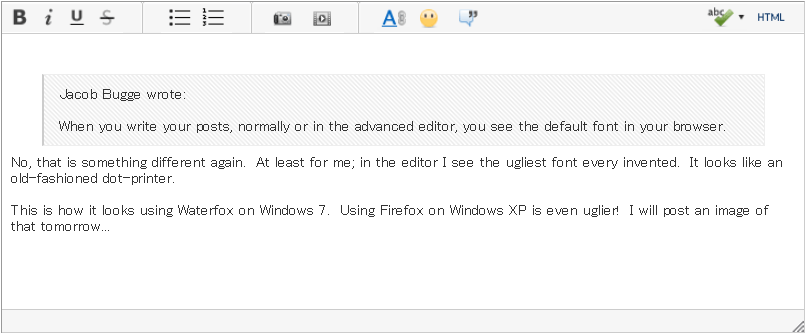
Jacob Bugge wrote:
When you write your posts, normally or in the advanced editor, you see the default font in your browser.
No, that is something different again. At least for me; in the editor I see the ugliest font every invented. It looks like an old-fashioned dot-printer.
This is how it looks using Waterfox on Windows 7. Using Firefox on Windows XP is even uglier! I will post an image of that tomorrow...

Copy link to clipboard
Copied
Pat Willener wrote:
This is how it looks using Waterfox on Windows 7. Using Firefox on Windows XP is even uglier! I will post an image of that tomorrow...
Not so bad...
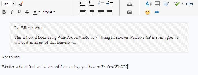
Wonder what default and advanced font settings you have in Firefox/WinXP?
Copy link to clipboard
Copied
The point is this: Why should it be different from one user's system to another?
- Intentional randomization just for the excitement of it all?
- A "fresh" user experience every visit?
- Adobe wants to convey the message that they really don't understand web content creation?
- Avoidance of that awful deja-vu feeling?
- Completely incompetent web programmers?
Sure is a good thing President Obama appointed the CEO of Adobe as a member of his Management Advisory Board on productivity, the application of technology, and customer service.
-Noel

Copy link to clipboard
Copied
Noel,
Thanks for that. I needed a good laugh this AM. 
Hunt
Copy link to clipboard
Copied
The typeface you used is very small for my eyes, but I seemed to understand "customer service" in your final sentence. Either you are joking, or I am severely in need of new glasses...
Copy link to clipboard
Copied
Yes, the "good thing" part could be interpreted as a joke. The rest of the post is true enough.
I know you're loathe to use your browser zoom, but give it a try some time, even if for just reading one sentence. That said, I'm resisting using anything but 100% zoom at every turn myself.
-Noel
Copy link to clipboard
Copied
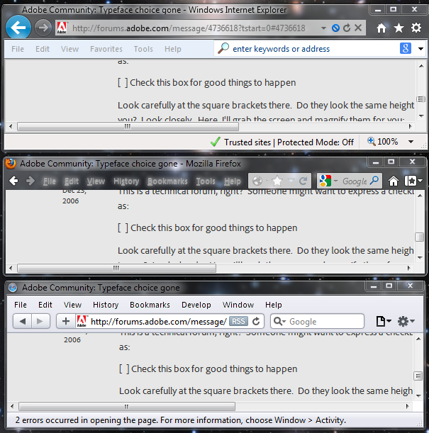
I just discovered another quirk in the font(s) chosen here.
This is a technical forum, right? Someone might want to express a checkbox as:
[ ] Check this box for good things to happen
Look carefully at the square brackets there. Do they look the same height to you? Look closely. Here, I'll grab the screen and magnify them for you:

Who designed this? Stevie Wonder? 
-Noel

Copy link to clipboard
Copied
They're the same height for me. Your screenshot magnification smacks of bad subpixel rendering (check out those colors!). that may have something to do with your problem...

Copy link to clipboard
Copied
Thanks for your response, John. I'm glad to hear it's not broken for everyone.
For me It looks the same in IE9, Firefox, and Safari.
There is no problem with my rendering. There is a problem with the font. That it is being used with Windows systems rendering like this indicates Adobe either doesn't actually test this stuff, of doesn't care.
By the way, those ClearType colors are there precisely to aid with subpixel rendering, and they help make the text look finer and BETTER, as I have ClearType tuned for my particular displays and preferences. You're missing out on a particularly clear display if you don't have them.
It looks the same in IE9, Firefox, and Safari, by the way.
-Noel
Copy link to clipboard
Copied
I realize ClearType is subtle, and it's easy to point fingers at things like the color precompensation (especially when you don't have it or haven't experienced it), but I thought you'd like to see a macro photo of how it actually works when seen on the monitor. It essentially provides additional horizontal resolution, making the monitor more like an effective 300 x 100 ppi with regard to text rendering.
![]()
In fact, without it finely-rendered characters actually look MORE color-fringed.
-Noel
Copy link to clipboard
Copied


 AdChoices