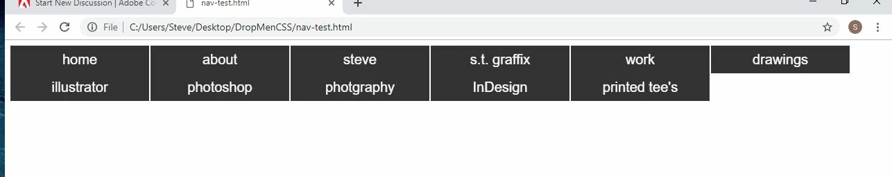
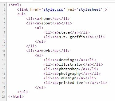
For starters, your HTML document is incomplete and your unordered list is malformed. Also what thought have you given to how this menu should work on mobile phones and small tablets that a) don't have a mouse and b) don't have enough real estate for a complex menu?
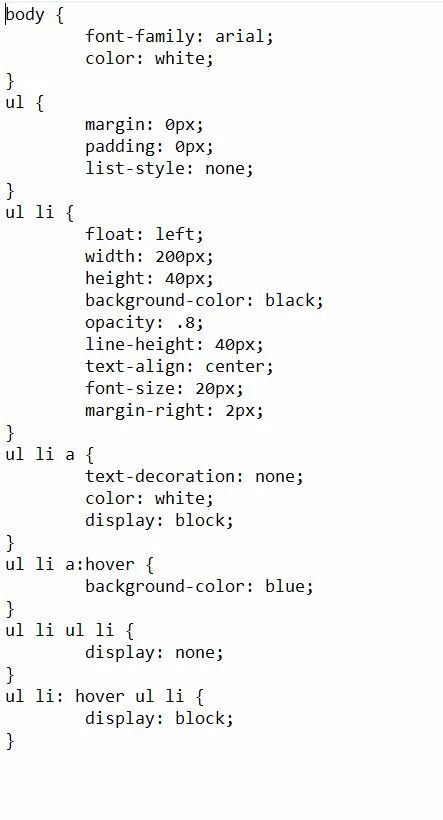
Below is my revised version of your code.
<!doctype html>
<html lang="en">
<head>
<meta charset="utf-8">
<title>Navigation Demo</title>
<meta name="viewport" content="width=device-width, initial-scale=1">
<meta http-equiv="X-UA-Compatible" content="IE=edge">
<style>
body {
font-family: arial;
color: white;
}
nav ul {
margin: 0px;
padding: 0px;
list-style: none;
}
nav ul li {
float: left;
width: 200px;
height: 40px;
background-color: black;
opacity: .8;
line-height: 40px;
text-align: center;
font-size: 20px;
margin-right: 2px;
}
nav ul li a {
text-decoration: none;
color: white;
display: block;
}
nav ul li a:hover { background color: blue;
}
nav ul li ul li { display: none; }
nav ul li:hover ul li { display: block; }
</style>
</head>
<body>
<nav>
<ul>
<li><a>home</a></li>
<li><a>about</a></li>
<li><a>steve</a>
<ul>
<li><a>s.t. graffix</a></li>
</ul>
</li>
<li><a>work</a>
<ul>
<li><a href="drawings.html">drawings</a> </li>
<li><a href="illustrator.html">illustrator</a></li>
<li><a href="photography.html">photograhy</a></li>
<li><a href="photoshop.html">photoshop</a></li>
<li><a href="indesign.html">indesign</a></li>
<li><a href="printed-tees.html">printed tee's</a></li>
</ul>
</li>
</ul>
</nav>
</body>
</html>


 AdChoices